Studio Pronk.
30 artworks by Studio Pronk..
Last artwork was added this month.



Studio Pronk.
About Studio Pronk.
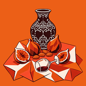
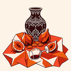
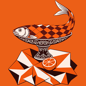
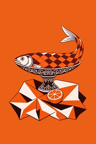
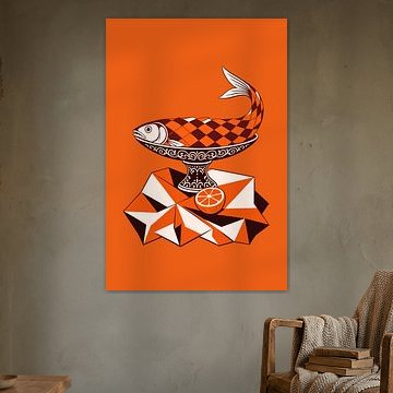
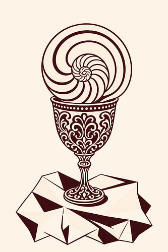
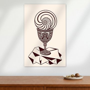
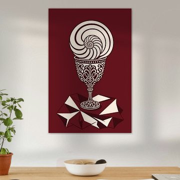
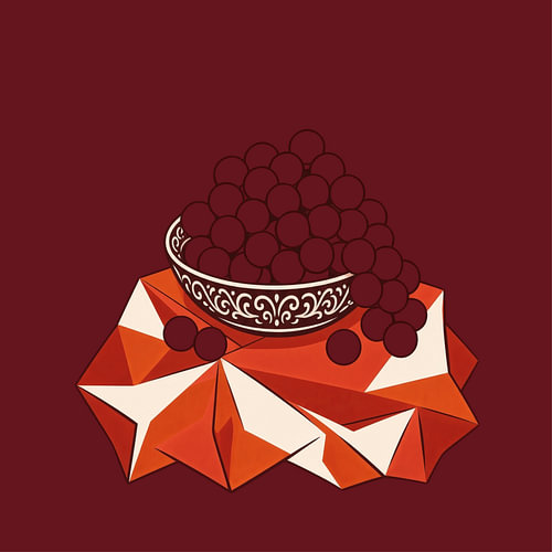
Studio Pronk creates still lifes that show off.
The ‘show-off’ still life is a Dutch invention: the exuberant
still life from the Golden Age, in which an overturned glass, a half-peeled citrone, and a heavy silver bowl boasted together about how good life was. I take that genre out of the museum and lay it flat. No dark sheets or candlelight, but hard surfaces,
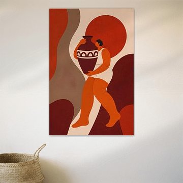
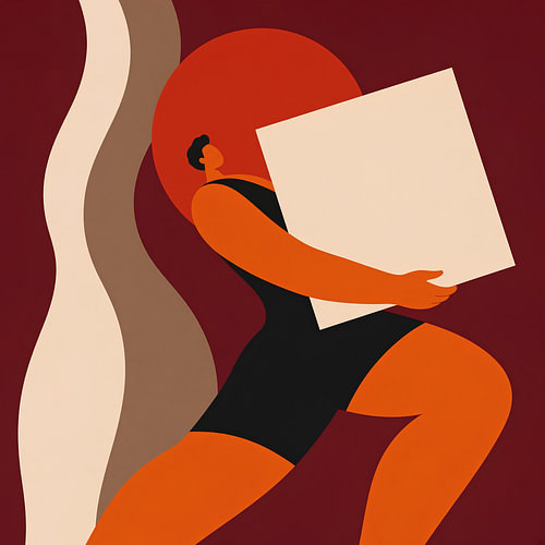
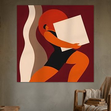
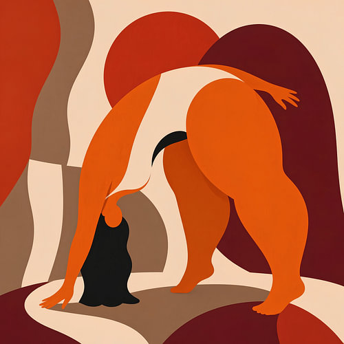
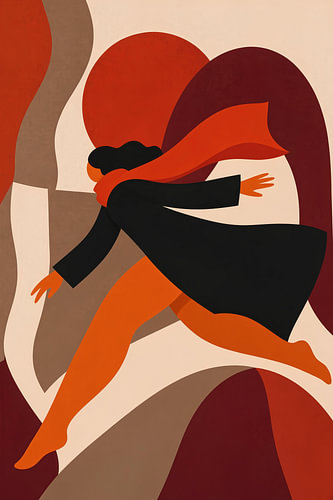
thick lines and five colours.
My work begins digitally. I use AI to quickly view dozens of compositions
side by side, because a still life stands or falls on the
relationship between the objects, and you can only judge that once you see them.
What emerges from that is never the final piece. I redraw every shape from scratch
as a vector, discard half the details, redraw the lines so that
they vary in thickness, and compose the colour palette by hand. That
step is the work. It’s also the reason why my works aren’t smooth:
a line that wobbles slightly reads better from three metres away than
a perfect one.
I work in series. Twelve works with the same colour palette and the same
line thickness, of which you can hang two or three side by side without
it looking cluttered. My colours come from the 1970s:
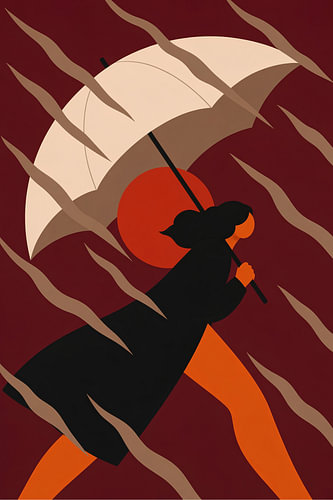
deep orange, coral, burgundy, off-white. My visual language is derived from
Dutch screen-printed posters from that same period and from the
paper cut-outs of Matisse.
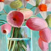
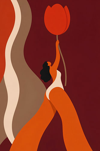
What I am looking for is the moment when a tulip is no longer a tulip but
a shape, whilst still remaining a tulip.