
Bruges
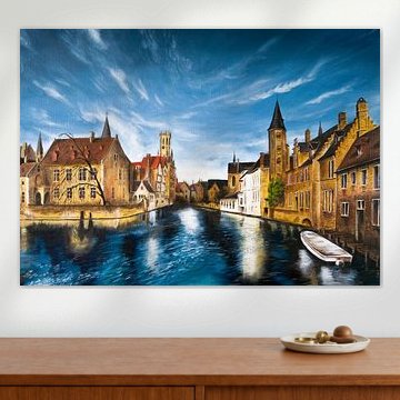
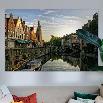
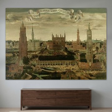
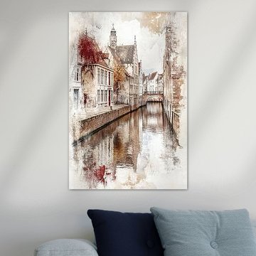
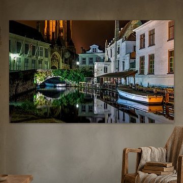
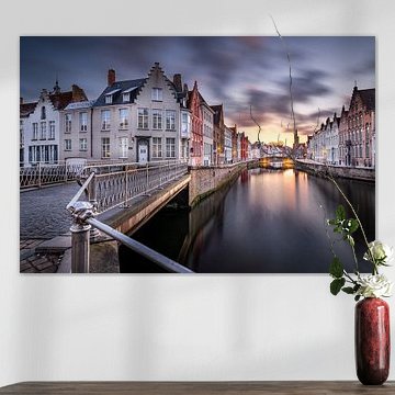
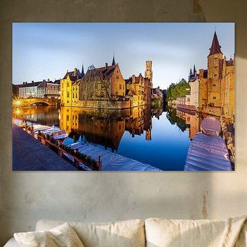
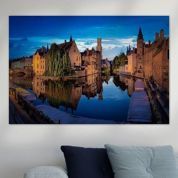
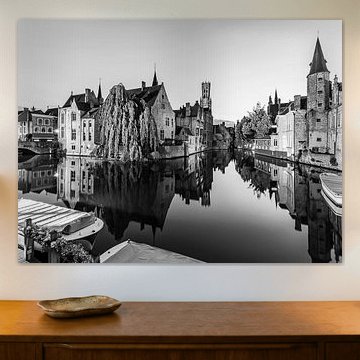
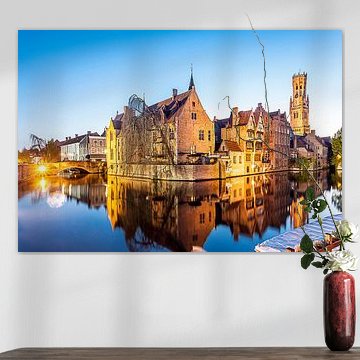
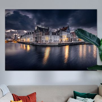
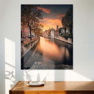
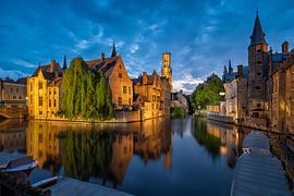
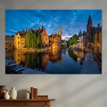
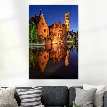
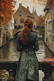
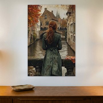
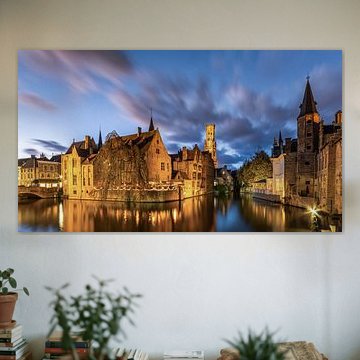
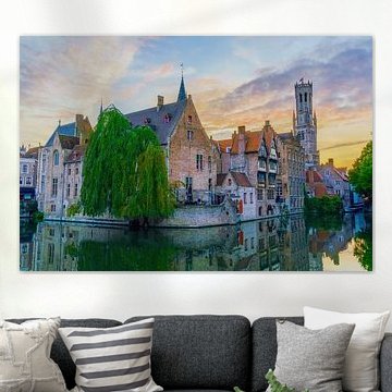
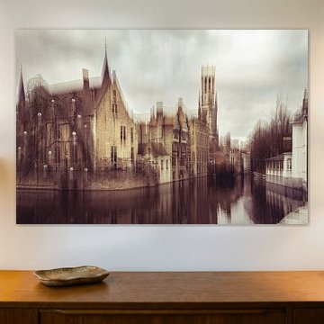
Bruges captivates with its timeless canals and medieval charm. The city's cobbled streets and Gothic spires inspire a sense of calm nostalgia, which translates beautifully into wall art. Our collection features reflective waterways, golden-hour light, and historic architecture that complements both classic and contemporary interiors - artworks like Rozenkaai Brugge België capture the serene atmosphere of the Rozenhoedkaai at dusk, while Sunset in Bruges, Belgium adds romantic warmth with its mirrored sunset glow.
At Art Heroes, every piece is made to order by talented European artists. Explore the collection as Canvas, Poster, ArtFrame™ and more - each option designed to fit your space perfectly.
-
More artworks below this tip
Pairing warm tones with neutral foundations
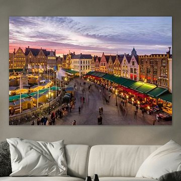
The mauve, pink, and brown tones create a warm atmosphere when placed against neutral walls or furniture. These sunset hues work beautifully in living rooms with beige, cream, or soft grey surroundings. A good example is Sunset over Rozenhoedkaai, Brugge, which brings warmth without overwhelming your space.
AnthiStylist & Customer service Questions? Check out our FAQ
 -
More artworks below this tip
Finding the right wall in your home
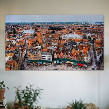
Architectural scenes with detailed composition work well where you can view them from a comfortable distance. Try placing them in hallways, above dining furniture, or facing your seating area. This gives you space to take in the full scene, like with Bruges Sunset Over Rozenhoedkaai Canal.
KatharinaStylist & Customer service Questions? Check out our FAQ
 -
More artworks below this tip
Choosing your print based on popularity
Brown, blue, and mauve are the most popular colors across this collection, giving you flexibility in matching existing interiors. These dominant tones appear across different subjects and styles, so you can find something that suits your space while staying within a cohesive color story.
RosanneStylist & Customer service Questions? Check out our FAQ







































Trusted and loved
Customers rate us 4.8!
High-quality materials
Sustainable and long-lasting beauty
Different sizes
From small to large, anything is possible.
Made for you
Made the moment you order.


More like this


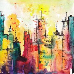


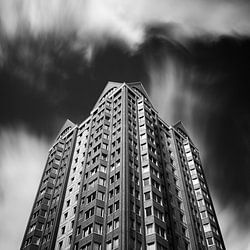


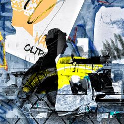
Which material suits your Bruges artwork best?
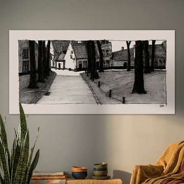
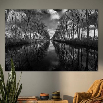
Bruges art pairs beautifully with ArtFrame™ thanks to its nostalgic mood and rich color palette combining brown, blue, and mauve tones. Alternatively, consider Poster or Canvas for a more traditional presentation. Choose ArtFrame™ and you benefit from two key advantages that enhance this particular collection. First, the easily interchangeable print system lets you refresh between calm canal scenes and romantic cityscapes whenever the mood strikes - perfect for a collection with such varied photographic and painted perspectives. Simply swap the print in minutes without replacing the entire frame. Second, the premium aluminum frame in gold or silver beautifully complements the warm browns and cool blues typical of Bruges imagery, while the black or white options suit the black-and-white artworks in this collection. The modern frame style creates an elegant contrast with the historic character of the city. Still doubting which material suits your interior and chosen Bruges artwork? Use our Material Advisor to find the perfect match.
How to combine Bruges art with other decor
Create a cohesive gallery wall by pairing Bruges artworks in calm, nostalgic tones with complementary decor that reinforces the romantic atmosphere. Combine blue-toned canal photography with soft textiles in mauve or cream, and add vintage brass accessories or warm wooden frames nearby to echo the brown hues. Plants like eucalyptus or olive branches work well alongside these artworks, adding organic texture without overwhelming the serene mood. For a layered look, position smaller Bruges prints on floating shelves with old books or ceramic pieces in similar color families. This approach lets you build a curated corner that feels personal and inviting, connecting the historic beauty of the city with your own space.
Where Bruges art works well in your home
A hallway is a good spot for Bruges artworks, particularly pieces in calm blues and nostalgic browns that set a welcoming tone the moment you enter. The romantic mood of canal scenes and medieval architecture creates an intriguing first impression without demanding too much attention - ideal for a transitional space where you pass through regularly. The mauve and white tones also help narrow corridors feel more open and inviting. Choose vertical formats to emphasize ceiling height, or create a horizontal gallery arrangement to draw the eye along the length of the hall, making the space feel more deliberately designed.