




























Anton de Zeeuw
Photographer
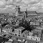
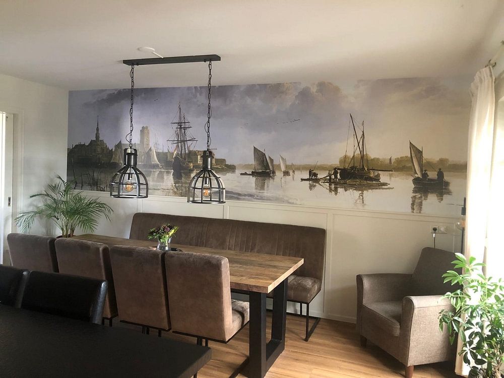
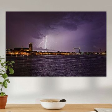
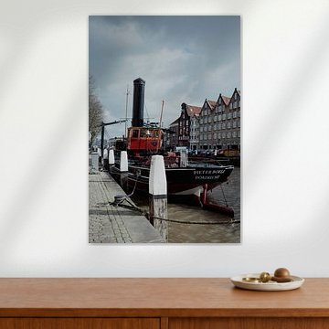
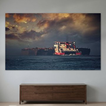
Why does Dordrecht capture the Dutch Golden Age so beautifully? Its waterfront scenes balance calm waters, historic towers and soft skies in ways that bring quiet elegance to any wall. These artworks range from 17th-century harbor views to modern twilight photography, all sharing a serene, nostalgic quality.
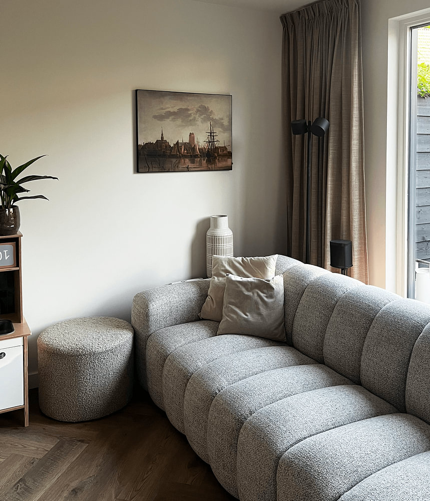
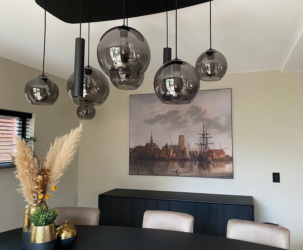
From warm golden tones in View of Dordrecht from the Dordtse Kil, Jan van Goyen to deep blue evening skies, the palette suits both classic and contemporary interiors. The recurring waterside compositions work especially well in living rooms or hallways where you want atmosphere without visual noise.
Available as Canvas, Poster, ArtFrame™ and more - choose what fits your space.
Grey acts as a neutral anchor that lets softer colours stand out without overwhelming your interior. It pairs easily with both warm and cool tones, making it versatile for layered styling. The grey and mauve combination in Harbour entrance with the Woudrichem beacons complements blush cushions, lavender throws, or muted violet accents beautifully.

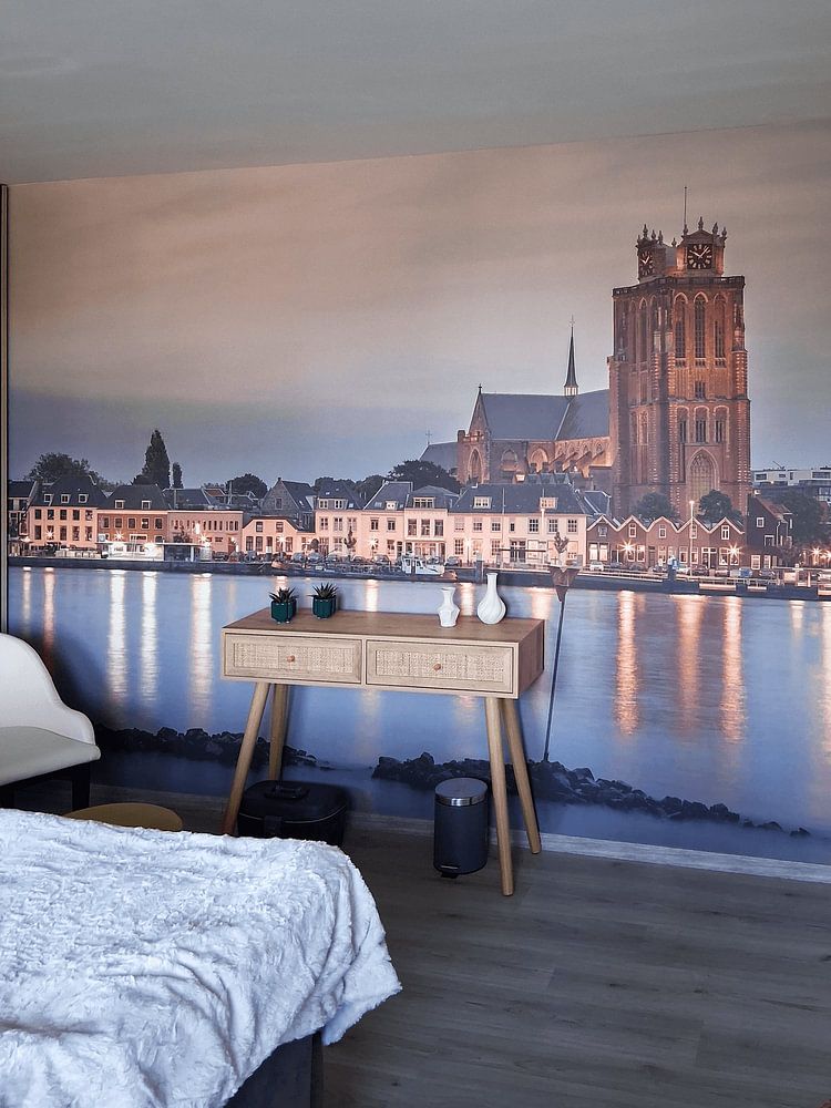
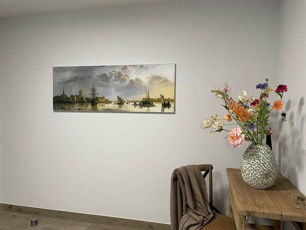
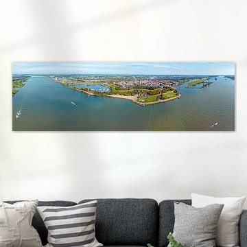
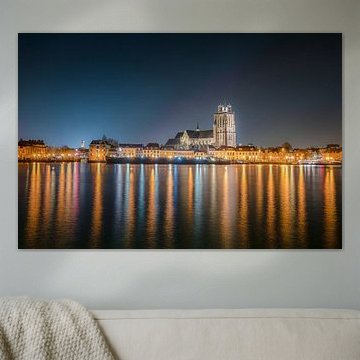
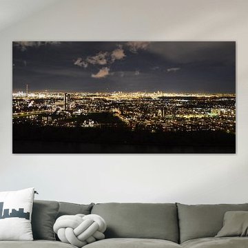
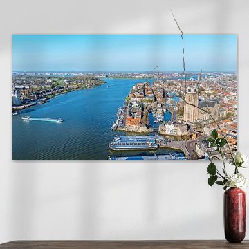
Waterfront imagery brings a sense of openness and calm, which works particularly well in spaces with natural light and uncluttered layouts. Think living rooms with large windows or dining areas that feel spacious. Panorama of Dordrecht in the evening light suits rooms where you want to enhance the feeling of light and breathing space.

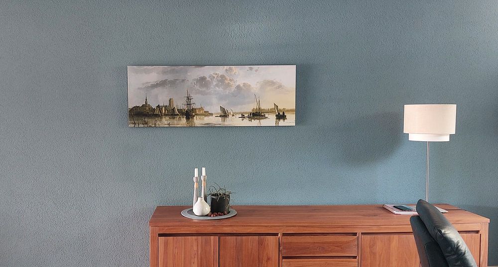
Panoramic compositions work beautifully above long furniture or in wide hallways where vertical space is limited. The extended horizontal format draws the eye along the full width of your wall. Panorama of Dordrecht in the evening light shows this format at its best, capturing the sweep of the waterfront and skyline in one uninterrupted view.

Customers rate us 4.8!
Sustainable and long-lasting beauty
From small to large, anything is possible.
Made the moment you order.
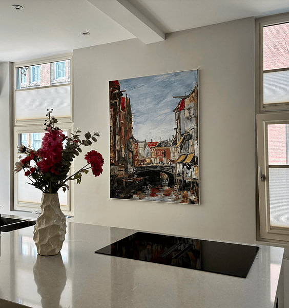
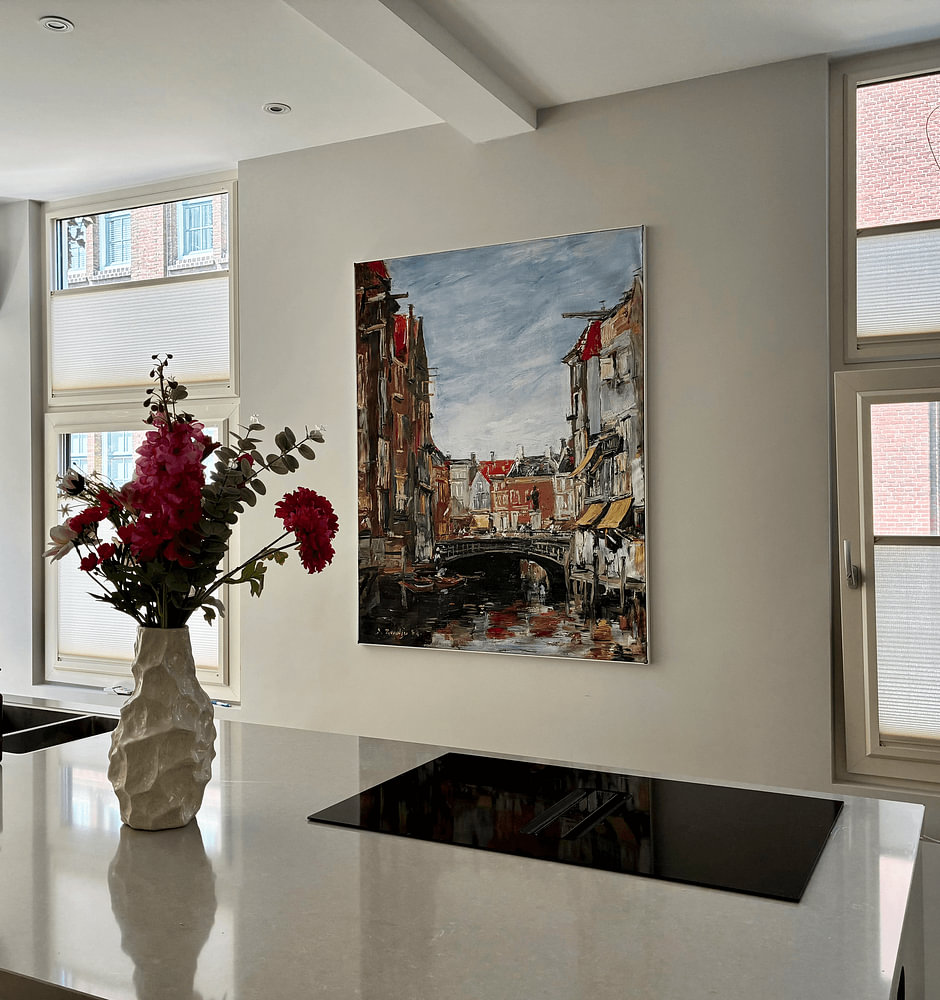
Dordrecht artworks suit a range of formats, though horizontal prints often work particularly well for capturing the town's riverside character and historic skyline. A horizontal piece above a sideboard or console table creates a balanced focal point that draws the eye across the room. If you're working with a narrow wall or hallway, a vertical format can emphasize architectural details and add height to the space.
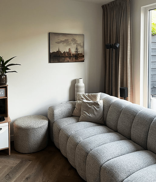
A living room is a good spot for Dordrecht artworks, especially if you want to bring a calm, nostalgic atmosphere into a shared space. The blue and grey tones found in many pieces complement relaxed gathering areas where natural light can reveal subtle details throughout the day. These colors pair naturally with neutral furniture and create a welcoming backdrop for conversation without overwhelming the room.
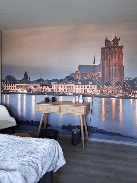
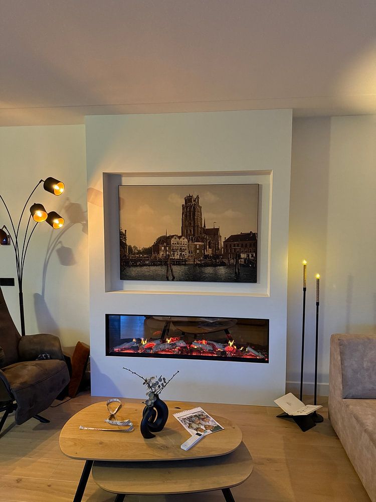
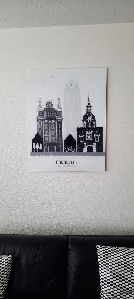
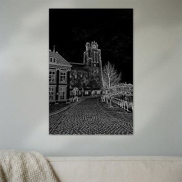
Dordrecht artworks fit beautifully within Scandinavian interiors, where simplicity and natural tones take center stage. The blue and grey palette blends seamlessly with light wood, white walls, and linen textures typical of this style. Black and white versions add graphic contrast to minimalist spaces, while brown tones warm up rooms that lean cooler. Pair these artworks with uncluttered surfaces and organic materials to let the nostalgic mood shine through.