
Frans Francken
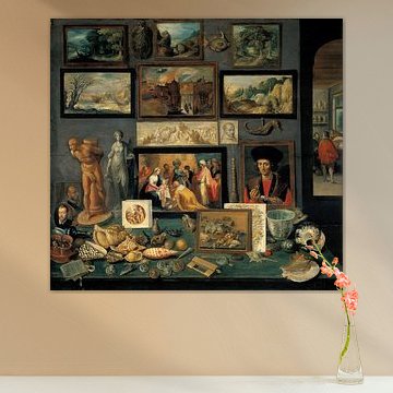
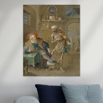
Want to step into the intricate world of seventeenth-century Antwerp? Frans Francken the Younger mastered the art of narrative detail, as seen in Chamber of Art and Curiosities, Frans Francken the Younger, where every shelf brims with treasures. His paintings layer myth, allegory, and courtly life into compositions that reward close looking. Rich earth tones - bronze, olive, terracotta - pair beautifully with classic and eclectic interiors alike.
Whether you choose Canvas, Poster, ArtFrame™ or another finish, each artwork is made to your chosen size. Discover Francken's Cabinet of Curiosities, witches' kitchens, and grand mythological processions - and find the piece that fits your space.
-
More artworks below this tip
Anchoring a Living Room Display
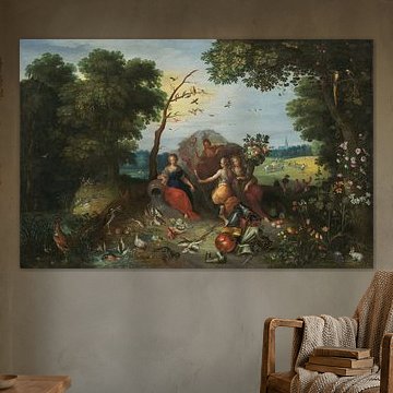
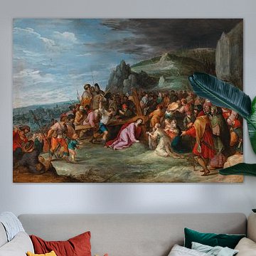
Large-scale historical scenes work well as anchor pieces above a sofa or sideboard. The intricate composition in Landscape with Allegories of the Four Elements, Jan Brueghel & Frans Francken draws the eye and becomes a natural focal point. Leave breathing room around it - avoid clustering too many smaller frames nearby - so the lush landscape detail can speak for itself without visual competition.
RosanneStylist & Customer service Questions? Check out our FAQ
-
More artworks below this tip
Pairing with Earthy Interiors
The warm brown and olive green tones in The Collection of paintings of Sebastiaan Leerse, Frans Francken (II) work beautifully alongside natural materials like oak furniture, linen textiles, or terracotta accents. These earthy hues create a calm, grounded atmosphere that feels cohesive. Balance the historical richness of the scene with simple, modern pieces to keep your space approachable.
LianneStylist & Customer service Questions? Check out our FAQ












Trusted and loved
Customers rate us 4.8!
High-quality materials
Sustainable and long-lasting beauty
Different sizes
From small to large, anything is possible.
Made for you
Made the moment you order.


More like this


Which colors from Frans Francken work in a classic interior
Frans Francken artworks feature rich brown, olive green, and bronze tones that pair beautifully with classic interiors. These warm, earthy hues complement traditional wooden furniture and ornate details. Combine the browns with cream upholstery and the olive greens with gold accents for a refined, cohesive look. Bronze tones work particularly well alongside dark wood sideboards or classic bookshelves, creating depth and warmth in your space.
Why Frans Francken art works well in your living room
A living room is a good spot for Frans Francken artworks, especially if you want to create a calm, nostalgic atmosphere. The earthy brown and beige palette brings warmth without overwhelming the space, making it ideal for relaxed gatherings. Hang the artwork above your sofa or sideboard where the nostalgic mood can set the tone for the entire room. The joyful undertones in these pieces add character while maintaining a serene environment.
Which format suits Frans Francken best on your wall
Frans Francken artworks are available in horizontal formats that work well above longer furniture pieces like sofas or dining tables. A horizontal piece creates visual balance and draws the eye across the wall, making your room feel more spacious. Place it at eye level, roughly 15 - 20 centimeters above your furniture, to achieve a well-proportioned look. If you're working with a narrow wall or hallway, consider a vertical format instead to make better use of the available space.