
Jan Toorop
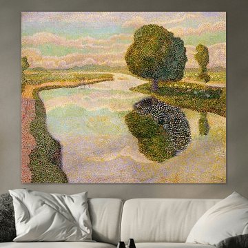
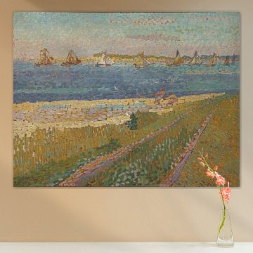
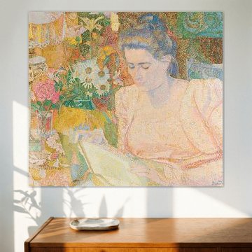
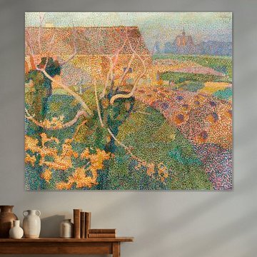
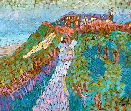
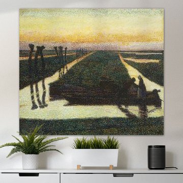
Want to bring peaceful Dutch coastal beauty into your space? Jan Toorop's pointillist technique transforms simple landscapes into vibrant, tranquil compositions. His distinctive dotted brushwork captures light dancing across dunes, waterways and gardens with remarkable softness, making each scene feel both intimate and expansive.
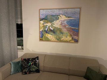
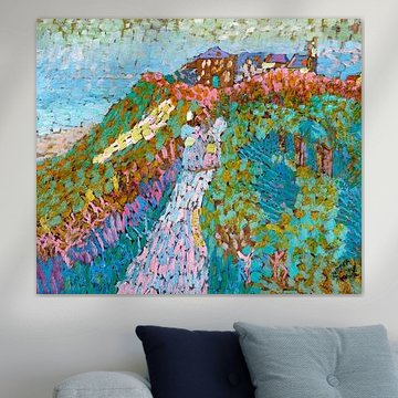
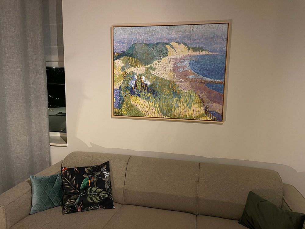
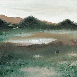
From serene beach scenes like Sea and dunes near Zoutelande, Jan Toorop, to quiet garden portraits, Toorop's muted greens, blues and earth tones suit contemporary and classic interiors alike. His calm, contemplative style works beautifully in bedrooms, reading nooks or any space where you want to create a restful atmosphere.
Available as canvas, poster, ArtFrame™ and more - choose what fits your interior.
-
More artworks below this tip
Layer sage green with warm neutrals
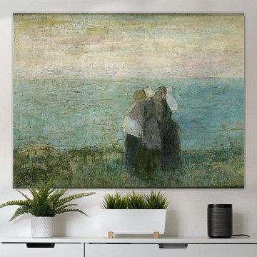
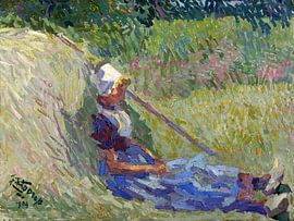
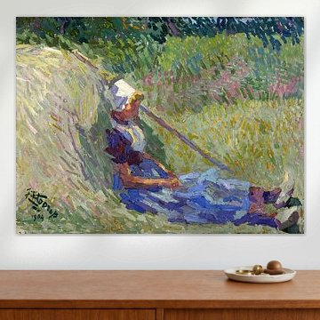
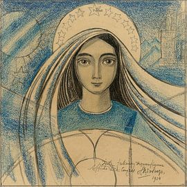
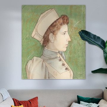
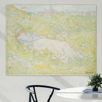
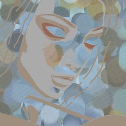
Soft greens anchor a room when combined with warmer shades like beige or brown. This balance keeps interiors feeling fresh without turning cold. The sage and emerald tones in Women by the sea, Jan Toorop work alongside terracotta pots, wooden frames, or cream-colored walls for a harmonious, lived-in look.
RosanneStylist & Customer service Questions? Check out our FAQ
-
More artworks below this tip
Pair earthy tones with natural materials
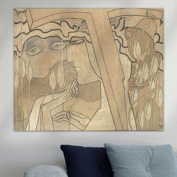
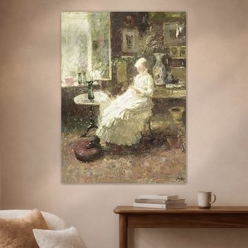
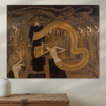
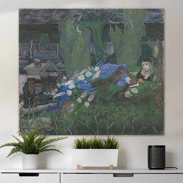
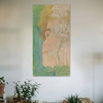
The muted palette works beautifully alongside rattan, linen, or oak furniture. Beige and taupe shades bring warmth without overwhelming your room. Try pairing the soft browns in O Grave, Jan Toorop with woven textiles or ceramic accents to create a grounded, natural feel throughout your space.
AnouschkaArt Stylist Questions? Check out our FAQ






















Trusted and loved
Customers rate us 4.8!
High-quality materials
Sustainable and long-lasting beauty
Different sizes
From small to large, anything is possible.
Made for you
Made the moment you order.
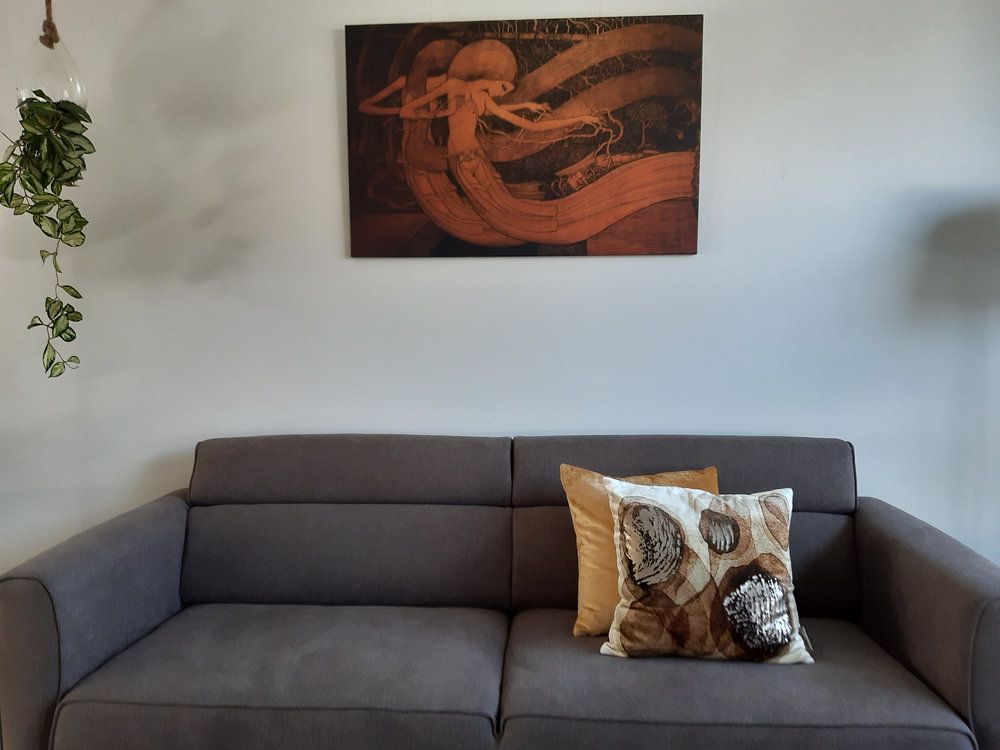
How they hang in other homes
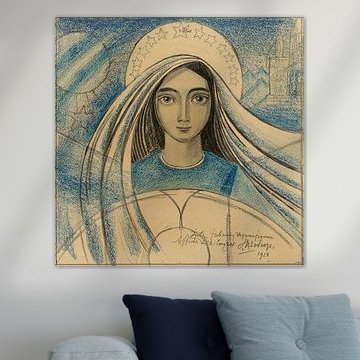
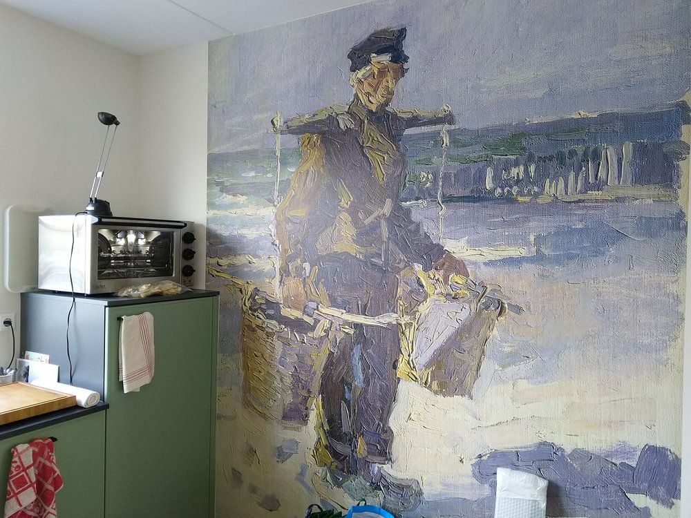
Get inspired by beautiful artworks on other people's walls and see how they truly enhance an interior.


More like this

How to style art by Jan Toorop in your interior
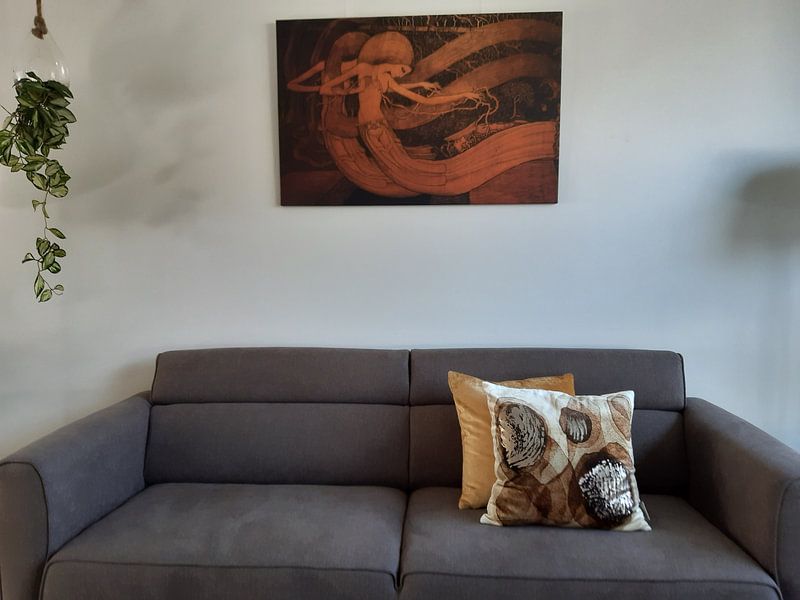
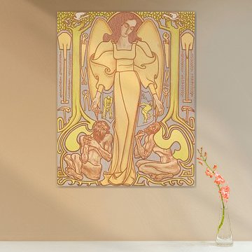
Art by Jan Toorop brings a calm, nostalgic atmosphere that pairs beautifully with natural materials and muted tones. Combine his artworks in a gallery wall with botanical prints or abstract pieces to enhance the dreamy quality. Place a trailing potted plant or woven basket nearby to echo the organic forms often found in his style, creating a cohesive corner that feels thoughtful and serene.
Which colors in Jan Toorop artworks suit Scandinavian interiors
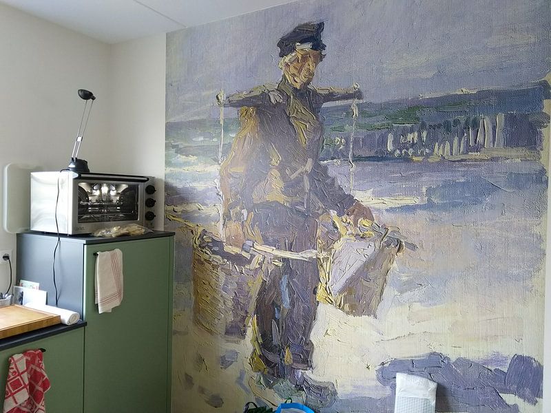
Jan Toorop artworks feature beige, taupe, sage green, brown, and olive green - a palette that aligns perfectly with Scandinavian interiors. Pair the soft beige and taupe tones with light oak furniture and linen textiles for a warm, inviting feel. The sage and olive greens work beautifully against white walls and natural wood accents, adding subtle depth without overwhelming the space. This combination keeps your room bright and airy while grounding it with earthy warmth.
Which material suits art by Jan Toorop best
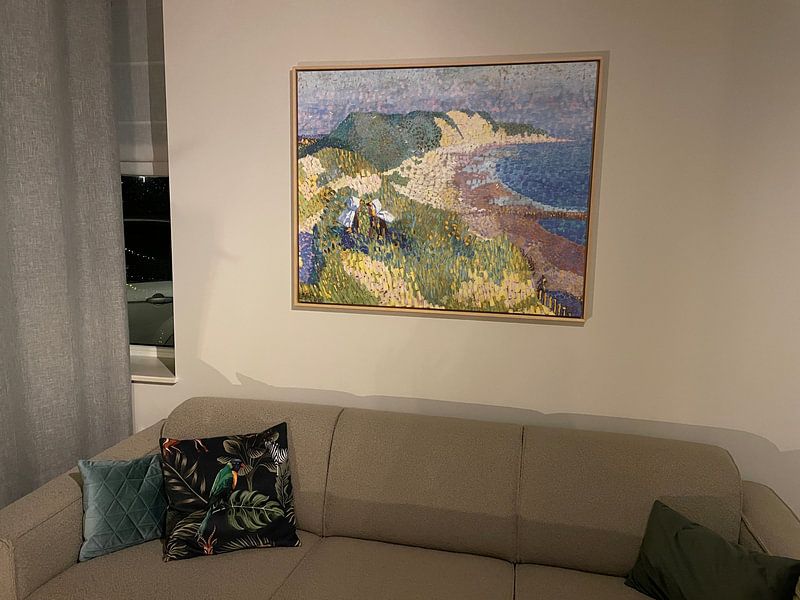
A Poster is an excellent starting point for Jan Toorop artworks, preserving the delicate tones and nostalgic mood with clarity and richness. Canvas and ArtFrame™ offer alternative textures that suit different rooms. Choose Poster and you benefit from fine-art quality museum-grade prints that do justice to the subtle beige, sage green, and taupe hues, ensuring every brushstroke and line remains sharp and true to the original. The thick 260-gram satin photo paper adds a luxurious feel that complements the dreamy, introspective character of his artworks. You also gain UV-resistant inks that keep those gentle earth tones vibrant year after year, protecting the calm atmosphere from fading over time. Still doubting which material suits your interior and chosen Jan Toorop artwork? Use our Material Advisor to find the perfect match.