Jan van der Heyden
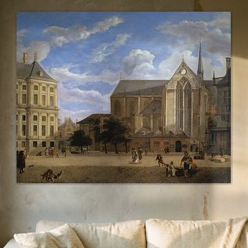
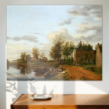
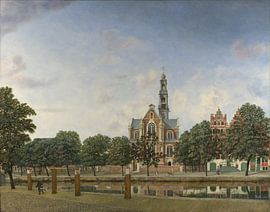
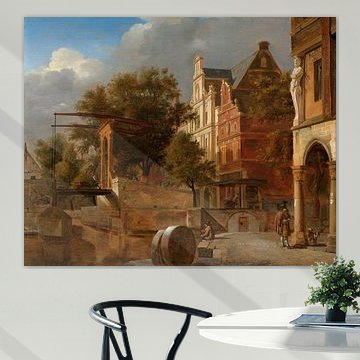
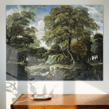
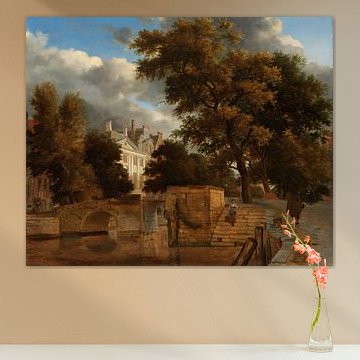
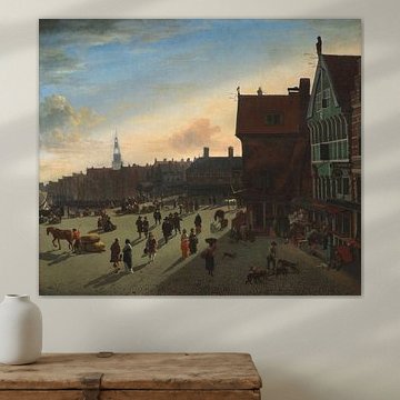
Jan van der Heyden captured 17th-century Amsterdam with remarkable architectural precision. His calm, nostalgic townscapes bring the Dutch Golden Age into contemporary interiors, where sage greens, warm bronzes, and soft blues create a sense of timeless tranquility. These detailed canal views and historic squares, like The Dam in Amsterdam towards the Townhall and Nieuwe Kerk, Jan van der Heyden, complement both classic and modern spaces with their balanced composition and serene atmosphere.
We offer Jan van der Heyden's artworks custom-made on Canvas, Poster, Wallpaper, and more. Choose what suits your space and discover the collection.
-
More artworks below this tip
Choose your format to suit your wall
No single format leads this collection - popularity is evenly spread - so let your wall space guide you. A vertical format suits narrow walls beside doorways or windows, while a horizontal layout works well above low furniture like sideboards or benches. Choose what fits your space.
RosanneStylist & Customer service Questions? Check out our FAQ
 -
More artworks below this tip
Pair warm browns with natural textures
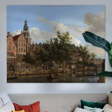
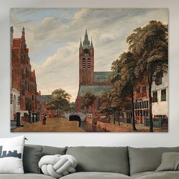
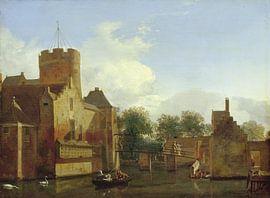
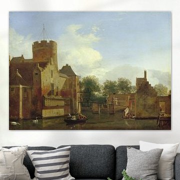
Brown dominates many artworks in this collection, making them easy companions for wooden furniture and woven textiles. The earthy brown and beige palette in View of the Oude Delft Canal, Delft, Jan van der Heyden pairs well with oak side tables, linen curtains, or rattan accents - grounding your room without overwhelming it.
EileenStylist & Customer service Questions? Check out our FAQ














Trusted and loved
Customers rate us 4.8!
High-quality materials
Sustainable and long-lasting beauty
Different sizes
From small to large, anything is possible.
Made for you
Made the moment you order.


More like this







Which colors from Jan van der Heyden suit a classic interior?
The warm brown and beige tones in Jan van der Heyden's work pair beautifully with classic interiors. Combine these earthy shades with sage green accents in cushions or curtains to create a refined, layered look. Taupe and blue add subtle depth when you want a softer palette. These colors work particularly well in spaces with wooden furniture or traditional moldings, where the historical character of the artworks feels at home.
Where to hang Jan van der Heyden in your living room
A living room works well for Jan van der Heyden's paintings because their calm, nostalgic mood invites quiet contemplation. Hang one above your sofa to anchor the seating area, or place it on a sideboard wall where it can be appreciated without competing for attention. The detailed architectural scenes reward closer viewing, making them a good spot for walls you pass frequently. Pair with warm lighting to bring out the richness of the brown and beige tones.
What format works best for Jan van der Heyden artworks?
While Jan van der Heyden's paintings are available in different formats, horizontal orientations suit the wide street views and cityscapes often found in his body of work. Place a horizontal Canvas or ArtFrame™ above a console table or along a hallway wall to guide the eye naturally. If you're working with a narrow wall beside a doorway or window, a vertical format can work better to fill the height without overwhelming the space.