
Lauwersmeer
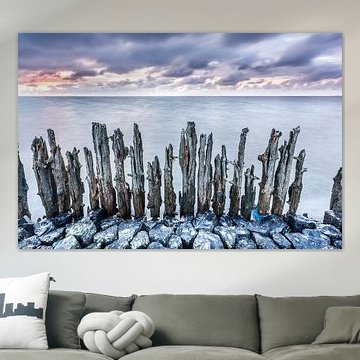
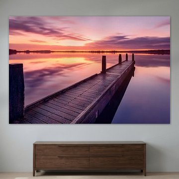
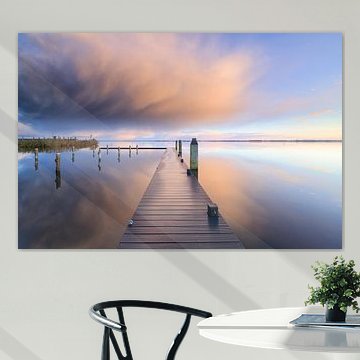
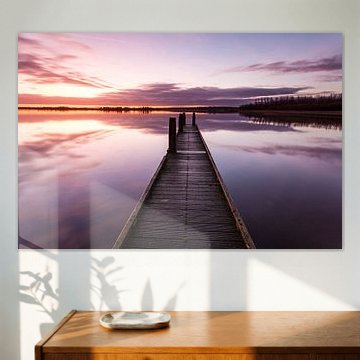
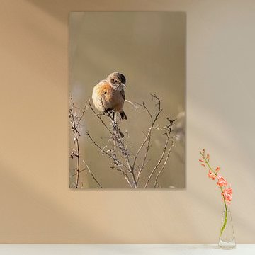
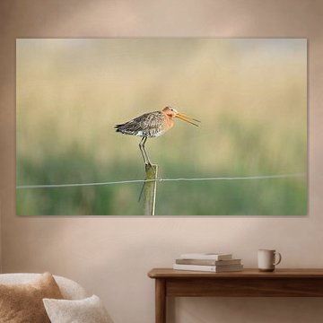
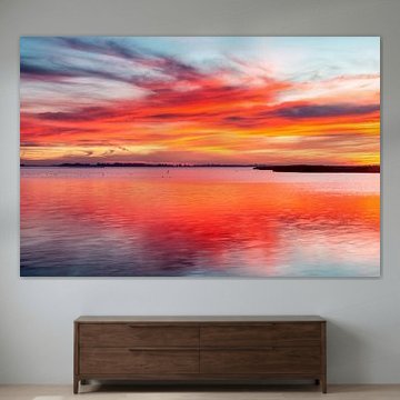
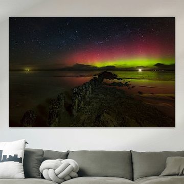
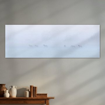
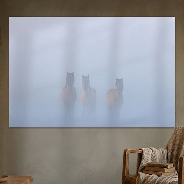
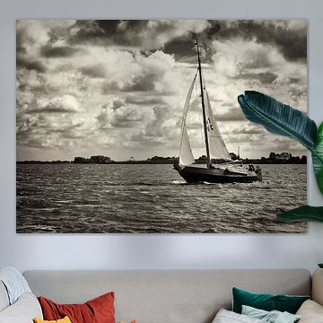
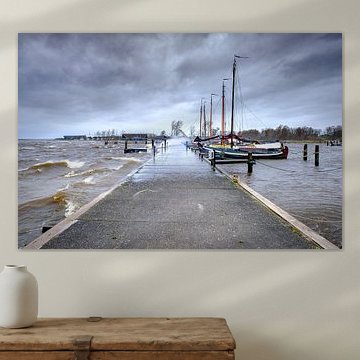
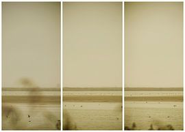
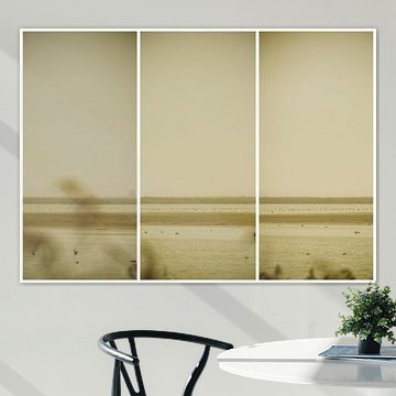
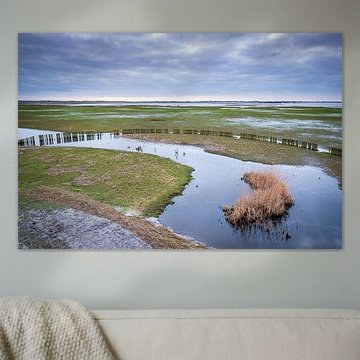
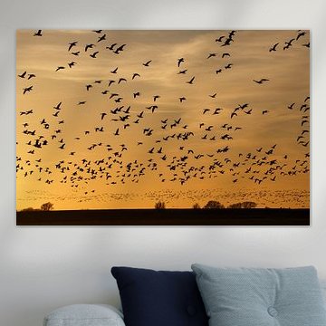
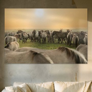
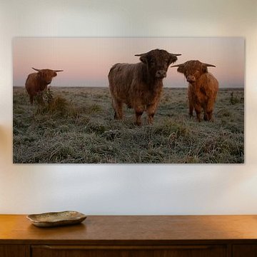
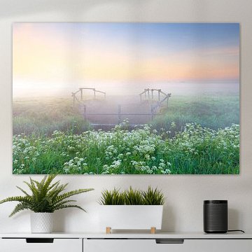
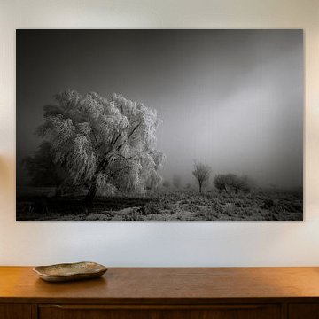
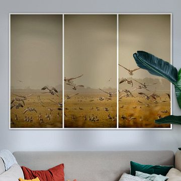
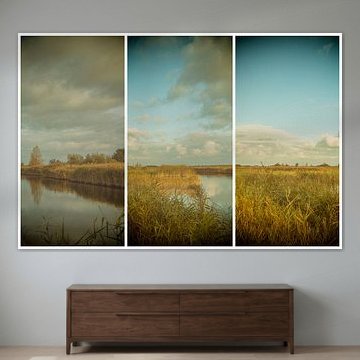
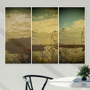
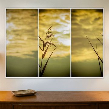
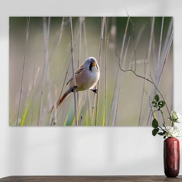
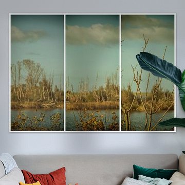
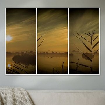
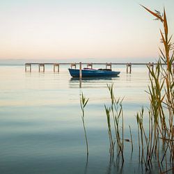
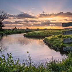
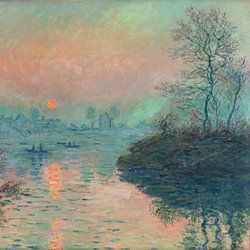
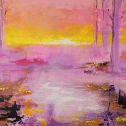
The Lauwersmeer region captures something rare: vast skies meeting still waters, where light shifts from soft dawn pinks to golden dusk. These artworks reflect that quiet drama, from weathered wooden posts standing in tidal flats to flocks of geese silhouetted against amber horizons. Serene tones - mauve, sage green, lilac - create a calm, contemplative mood that fits naturally into modern, Scandinavian, or coastal interiors. Whether you're drawn to the melancholic beauty of Old sea wall Moddergat or the dreamy haze of wetland triptychs, each piece invites stillness into your space.
At Art Heroes, every artwork is printed to order by talented European artists. Choose from Canvas, Poster, ArtFrame™ and more to match your style.
-
More artworks below this tip
Choose the Room That Matches the Mood
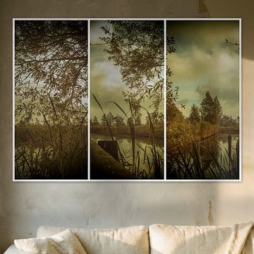
Calm, dreamy atmospheres suit spaces where you relax or recharge. Consider placing a Lauwersmeer artwork in your bedroom, hallway, or home office - anywhere you value a sense of stillness. The mysterious, moss-covered woodland in Where the Trees Wind Their Way – Forest, Moss and Light brings a grounding, natural presence to quieter corners of your home.
AnthiStylist & Customer service Questions? Check out our FAQ
 -
More artworks below this tip
Pair Cool Blues with Warm Natural Tones
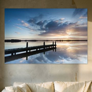
The dominant blue tones in many Lauwersmeer artworks create a calm, atmospheric base for your room. Try pairing them with warm accents like oak furniture, linen textiles, or terracotta accessories to add balance and warmth. The cool morning palette in Water level gauge at Oostmahorn at sunrise works beautifully alongside honey-toned wood or soft beige walls.
LianneStylist & Customer service Questions? Check out our FAQ
 -
More artworks below this tip
Hang at Eye Level in Quiet Spaces
Tranquil scenes work best in rooms where you want to unwind or focus. Hang your Lauwersmeer artwork at eye level - roughly 145 - 150 cm from the floor to the centre of the piece. This placement invites you to pause and take in the calm. Beacon of light in Friesland suits a bedroom wall or a reading corner perfectly.
AnouschkaArt Stylist Questions? Check out our FAQ
















































Trusted and loved
Customers rate us 4.8!
High-quality materials
Sustainable and long-lasting beauty
Different sizes
From small to large, anything is possible.
Made for you
Made the moment you order.


More like this





Which format suits Lauwersmeer artworks best
Horizontal formats work particularly well for Lauwersmeer artworks, capturing the expansive character of this Dutch landscape. A horizontal print fits naturally above a sideboard or along a hallway wall, where the wide composition can breathe. If your space has a tall, narrow wall, a vertical format offers a good alternative that draws the eye upward while maintaining the collection's atmospheric qualities.
Lauwersmeer colors that complement Scandinavian interiors
The blue, grey, and taupe tones found in Lauwersmeer artworks pair beautifully with Scandinavian interiors. Combine the soft blues with natural wood furniture and light grey textiles to create a cohesive, calming scheme. The brown and mauve accents add warmth without overwhelming the minimalist aesthetic typical of this style, making these artworks easy to integrate into existing decor.
A good spot for Lauwersmeer art in your bedroom
The bedroom works well for Lauwersmeer artworks because the calm and dreamy moods present in this collection support relaxation and rest. The soft color palette - especially the blues and greys - creates a tranquil atmosphere that complements a space designed for unwinding. Hang your chosen artwork above the bed or on the wall opposite to anchor the room's peaceful character.