
Paul Signac
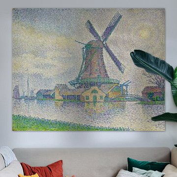
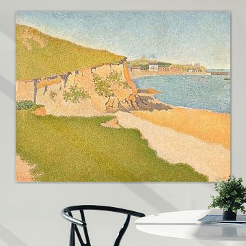
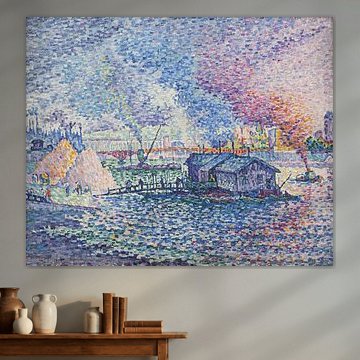
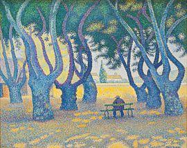
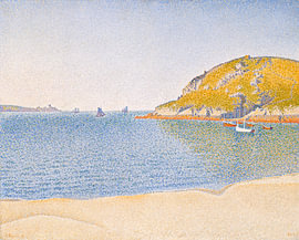
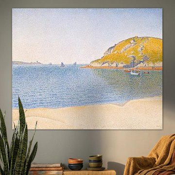
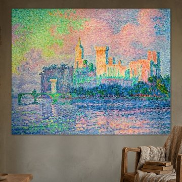
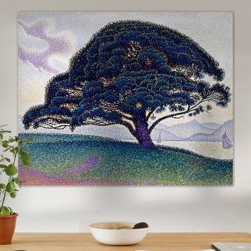
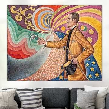
Paul Signac's pointillist technique transforms light into color. His dots of vibrant hues create landscapes that shimmer with Mediterranean warmth. Each artwork reveals calm harbour views, sunlit trees, and coastal serenity.
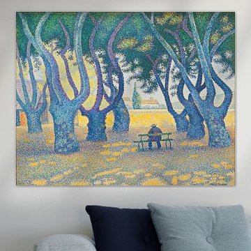
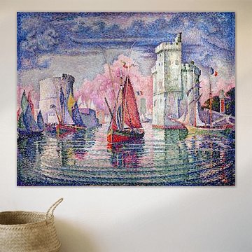
From the dappled shade of Place des Lices, St. Tropez, Paul Signac to industrial port scenes, Signac captures both natural beauty and urban energy. His pastel palette - soft mauves, sage greens, and luminous blues - fits contemporary and classic interiors alike.
At Art Heroes, we print each piece to order. Choose your size and material, from Canvas to Poster and more, to match your space perfectly.
-
More artworks below this tip
Create a focal point in social spaces
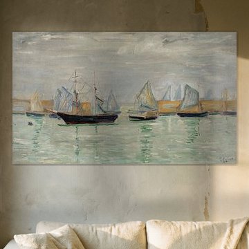
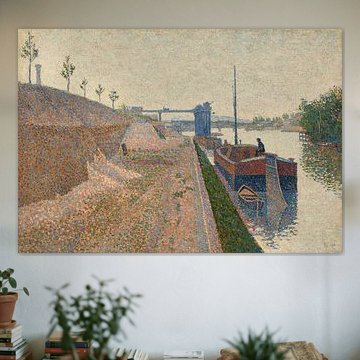
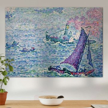
Coastal and riverside scenes work beautifully in living rooms or dining areas where conversation flows naturally. The architectural detail and waterside atmosphere encourage relaxed gatherings. Consider placing Tugboat At the Pont Neuf, Paris 1923 Poster above a sideboard or sofa to anchor your seating arrangement with soft, natural tones.
AnthiStylist & Customer service Questions? Check out our FAQ
 -
More artworks below this tip
Consider your wall space when choosing
Horizontal compositions suit wider walls above furniture, while vertical arrangements fit narrower spaces like hallways or between windows. Think about the proportions of your wall before selecting your format - landscape orientations often work well above sofas, while portrait formats complement taller, narrower areas.
RosanneStylist & Customer service Questions? Check out our FAQ
















Trusted and loved
Customers rate us 4.8!
High-quality materials
Sustainable and long-lasting beauty
Different sizes
From small to large, anything is possible.
Made for you
Made the moment you order.


More like this


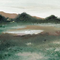

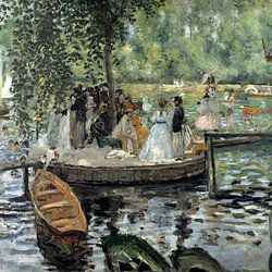
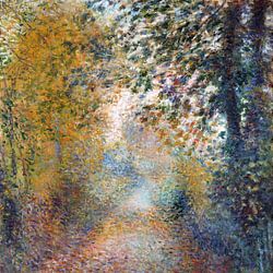

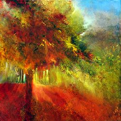
Why a bedroom works well for art by Paul Signac
A bedroom is a good spot for art by Paul Signac, especially when you're looking to create a calm retreat. The beige, taupe, and sage green tones that characterize many of his artworks bring a gentle, natural quality that helps you unwind at the end of the day. These muted hues don't overwhelm the senses, making them ideal for a space where rest matters most. The nostalgic mood in his pieces adds a thoughtful, serene layer that complements the quieter moments you spend there.
Which colors in Paul Signac art suit Scandinavian interiors
Art by Paul Signac pairs beautifully with Scandinavian interiors, where simplicity and natural tones take center stage. The sage green and grey shades in his artworks echo the earthy, understated palette typical of Nordic design, while beige and taupe add warmth without disrupting the minimalist feel. Combine these softer hues with light wood furniture and white or cream walls to keep the space airy and balanced. A touch of mauve can introduce subtle contrast that feels fresh rather than heavy.
Styling Paul Signac artworks with calm décor elements
Art by Paul Signac works well when you build around its calm and nostalgic moods. Pair these artworks with natural materials like linen cushions, ceramic vases, or woven baskets to reinforce the organic, grounded feeling. Soft lighting - think warm-toned table lamps or candles - enhances the quieter, reflective quality of the pieces. Introduce plants with muted green foliage to echo the sage tones and bring life into the arrangement. Choose your size and material to fit your wall space and personal style.