
The park
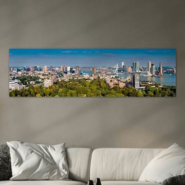
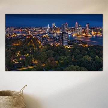
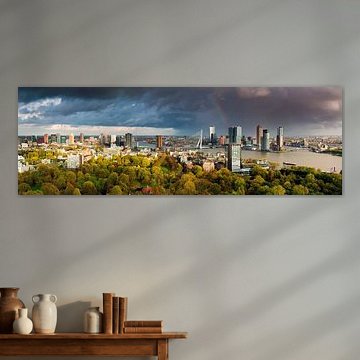
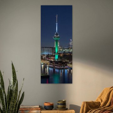
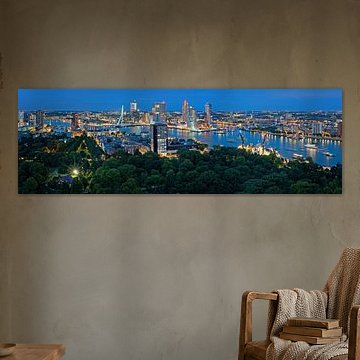
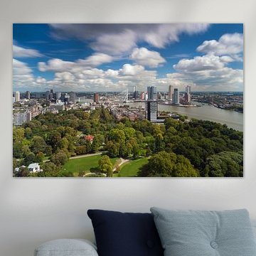
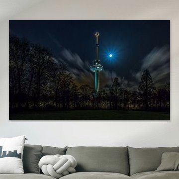
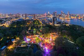
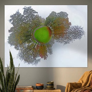
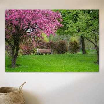
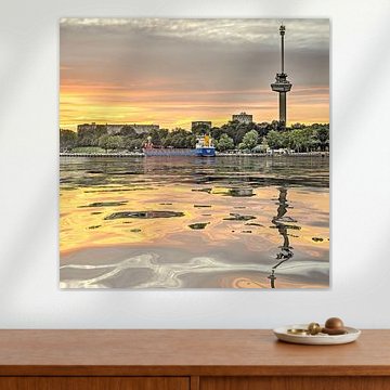
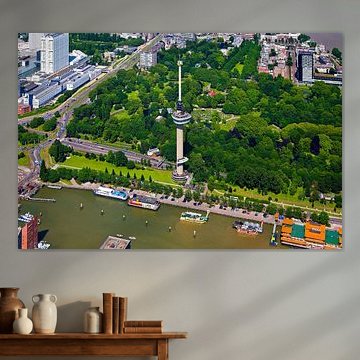
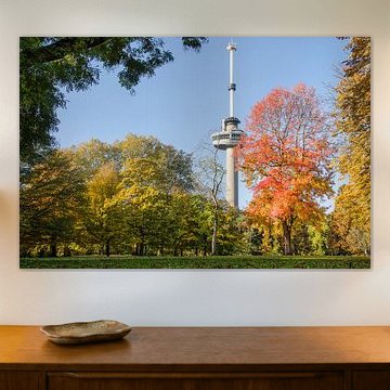
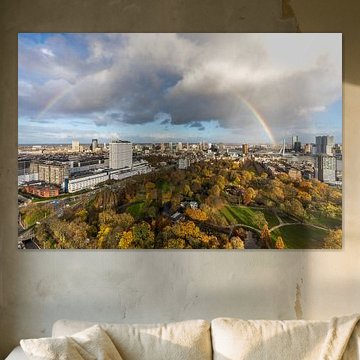
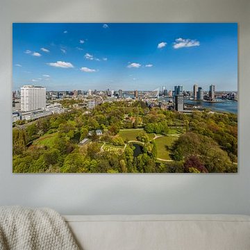
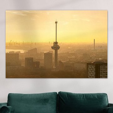
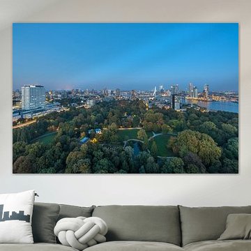
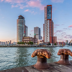
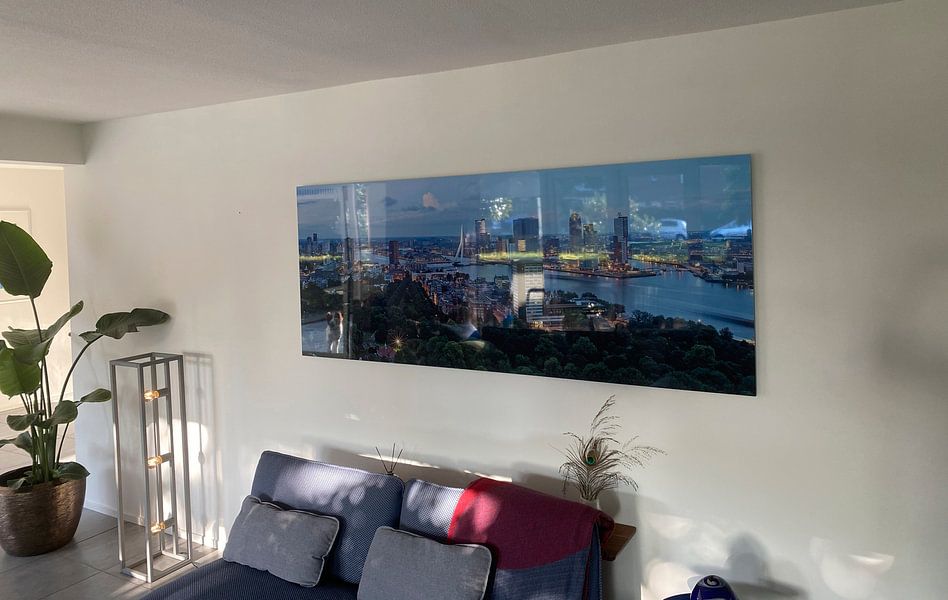
Urban green meets city skyline in park photography that balances calm and energy. These artworks capture Rotterdam's breathing spaces - lush foregrounds, illuminated architecture, reflective water. Panorama Rotterdam from the Euromast frames the Euromast view with cruise ships and tree-lined quays, while twilight shots reveal how parks soften concrete edges. Earthy greens, deep blues and warm evening tones suit modern and industrial interiors alike.
Choose your size and material - from canvas to ArtFrame™ and beyond - to bring Rotterdam's signature contrast home.
-
More artworks below this tip
Combining blue tones with neutral surroundings
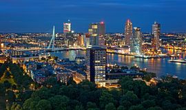
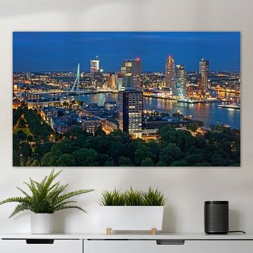
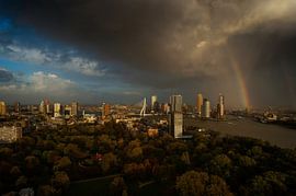
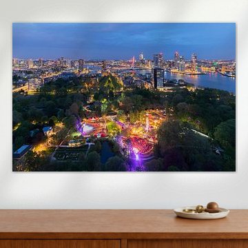
Deep blue evening skies create a striking focal point against pale walls or natural wood furniture. The anthracite and navy tones in Rotterdam panorama | Kop van Zuid | Euromast pair well with warm beige, soft grey, or cream textiles. This contrast brings out the illuminated cityscape without overwhelming your room.
GinaStylist & Customer service Questions? Check out our FAQ
 -
More artworks below this tip
Positioning your artwork near windows
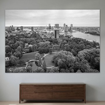
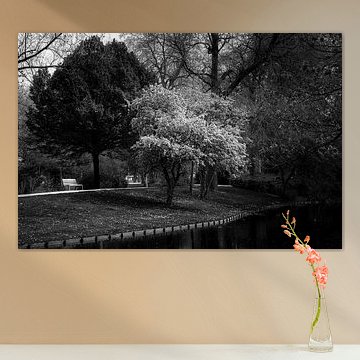
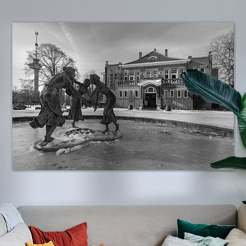
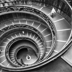
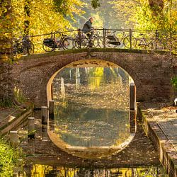
Natural light can transform black-and-white photography in your space. Hang these artworks where daylight highlights the contrast between light and shadow throughout the day. The reflective water and blossoms in Rotterdam in black and white respond beautifully to changing daylight, revealing new details from morning to evening.
AnthiStylist & Customer service Questions? Check out our FAQ
 -
More artworks below this tip
Choosing artwork for open-plan spaces
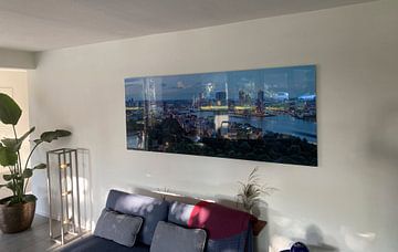
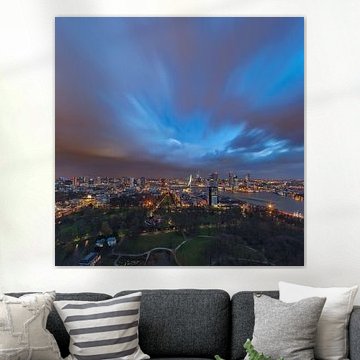
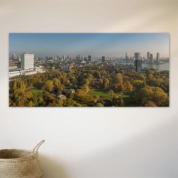
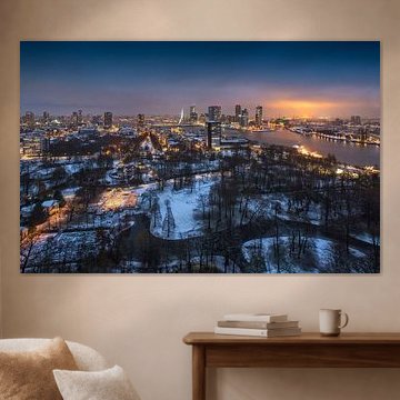
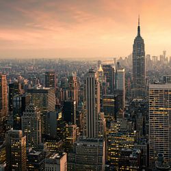
Panoramic cityscapes work well in rooms where you view them from different angles - living areas that flow into dining spaces, or hallways with sightlines into adjacent rooms. The aerial perspective in Rotterdam blue hour | Erasmus MC draws the eye and creates a sense of depth, even when seen from across the room.
LianneStylist & Customer service Questions? Check out our FAQ





































Trusted and loved
Customers rate us 4.8!
High-quality materials
Sustainable and long-lasting beauty
Different sizes
From small to large, anything is possible.
Made for you
Made the moment you order.


More like this

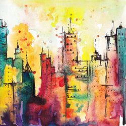
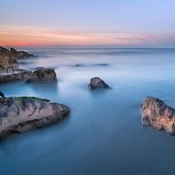
How to combine The park artworks in your space
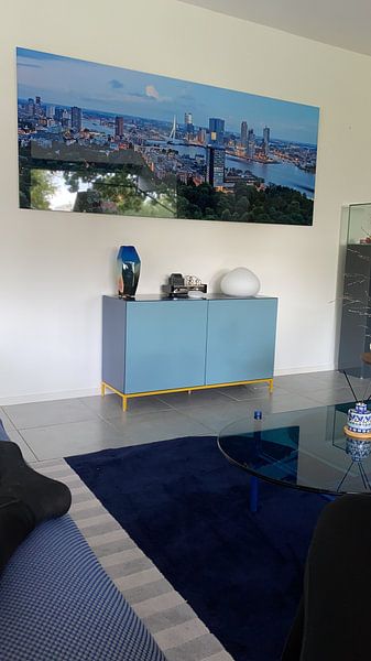
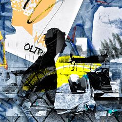
The park collection works beautifully in a gallery wall arrangement where you layer different formats and techniques. Combine photography with digital art to create depth, or pair calm pieces with more vibrant ones for visual rhythm. Add potted plants or natural wood frames nearby to echo the outdoor theme. You can also group several artworks in complementary moods - pairing powerful compositions with calmer scenes softens the contrast while keeping the energy alive.
Colors from The park that suit Scandinavian interiors
The park offers blue, green, and olive green tones that align naturally with Scandinavian style. Pair the softer blues and whites with light oak furniture and linen textiles for a fresh, airy feel. Olive green and black-and-white pieces add grounding contrast against pale walls without overwhelming the space. Choose Canvas or ArtFrame™ in white or silver frames to maintain the clean, understated look Scandinavian interiors are known for.
Why The park works well in your home office
The park is a good spot for a home office where calm and focus matter. Blue and green tones help create a restful backdrop that supports concentration without distraction, while the vibrant pieces can energize creative work. Choose larger formats in ArtFrame™ to fill the wall behind your desk, or go for Poster if you prefer flexibility. The variety of moods lets you adjust the atmosphere to match how you work best.