-
More artworks below this tip
Format choice: portrait and landscape formats score equally
Both portrait and landscape orientations are popular in this collection, giving you flexibility based on your wall space. Portrait formats suit narrow walls or spaces beside doorways, while landscape prints fill horizontal areas above sideboards or sofas. Choose what fits your wall dimensions best.
AnthiStylist & Customer service Questions? Check out our FAQ
 -
More artworks below this tip
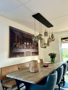
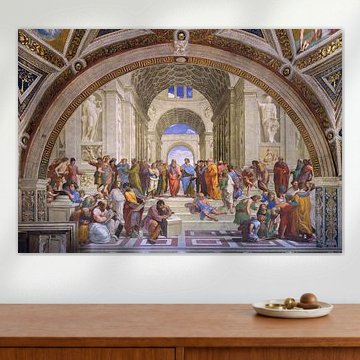
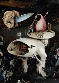
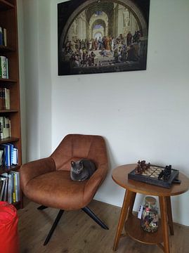
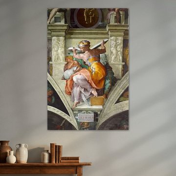
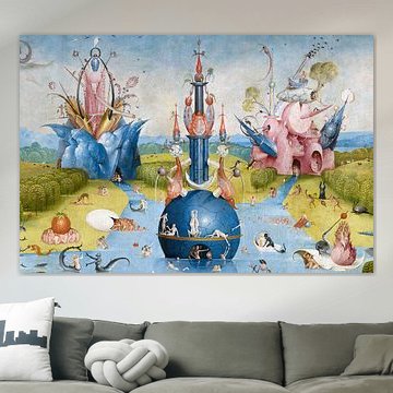
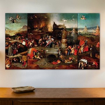
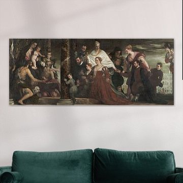
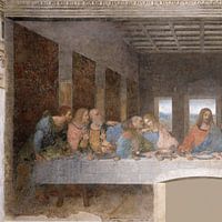
Placement tip: create depth with architectural details
Grand architectural compositions work beautifully in spaces where perspective matters. Position them on walls you view from a distance - across a hallway or facing a seating area - so the layered details remain visible. The dimensional setting in The School of Athens, Raffaello Sanzio da Urbino creates natural depth that draws the eye inward.
LianneStylist & Customer service Questions? Check out our FAQ
 -
More artworks below this tip
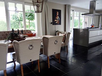
Color combination: warm neutrals with subtle accents
Brown and taupe form a grounded palette that pairs well with natural materials like wood, linen, or terracotta. Add warmth by layering in bronze or beige through cushions or ceramics. The earthy tones in Italian Renaissance Patterns, Owen Jones blend seamlessly with sage green accents for a balanced, organic look.
EileenStylist & Customer service Questions? Check out our FAQ
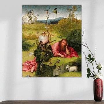
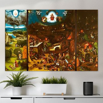
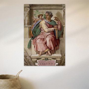
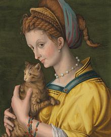
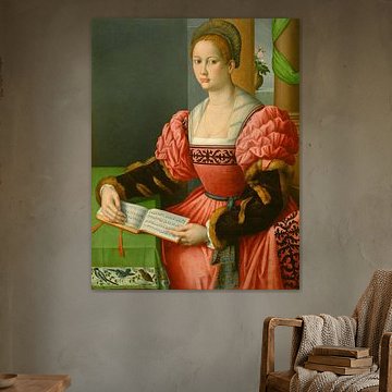
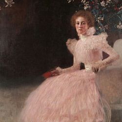
Renaissance
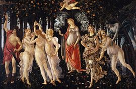
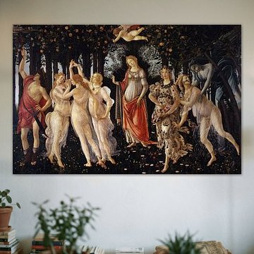
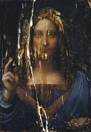
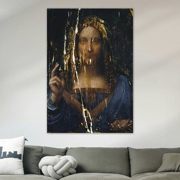
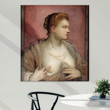
Renaissance art speaks to those who value harmony, depth, and timeless beauty. The warm earth tones and balanced compositions create a sense of calm sophistication that never goes out of style. These artworks bring classical elegance into modern interiors, whether you're drawn to the serene mystery of Mona Lisa by Leonardo da Vinci or the dreamlike detail of Sandro Botticelli - La Primavera. Each piece tells a story that unfolds slowly, rewarding closer attention with hidden symbolism and masterful technique.
At Art Heroes, we print every Renaissance artwork to order. Choose Canvas, ArtFrame™, Poster and more to match your space perfectly.


Be sure to check out the creative new masters
Our artists have created artworks inspired by the old masters.

Trusted and loved
Customers rate us 4.8!
High-quality materials
Sustainable and long-lasting beauty
Different sizes
From small to large, anything is possible.
Made for you
Made the moment you order.
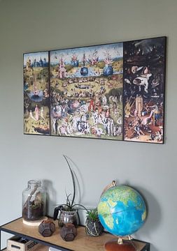
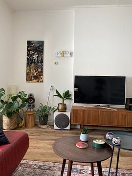
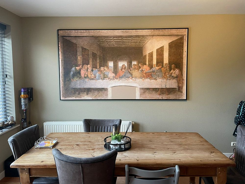
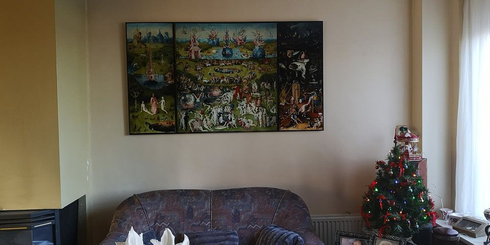
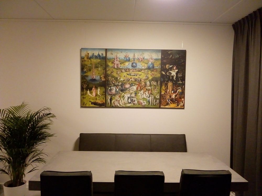
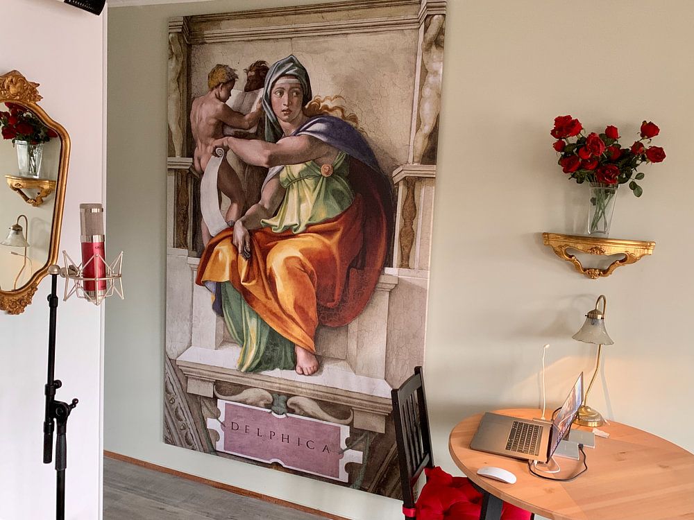
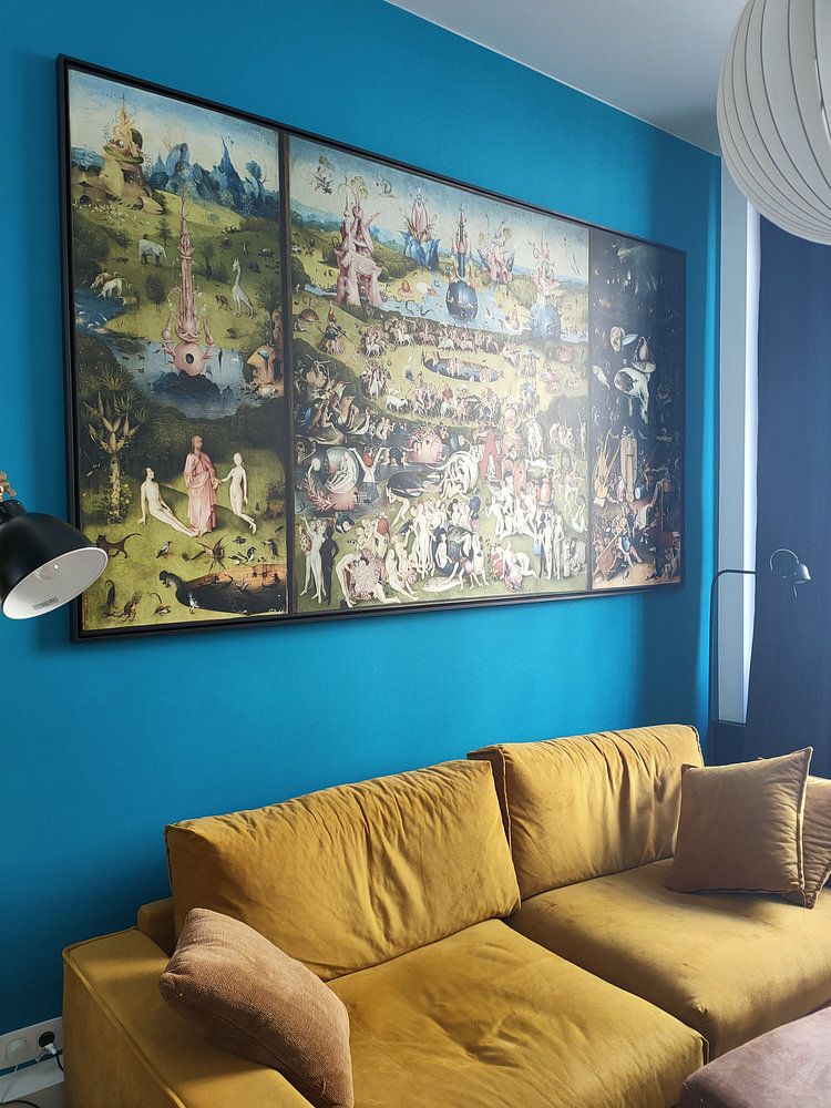
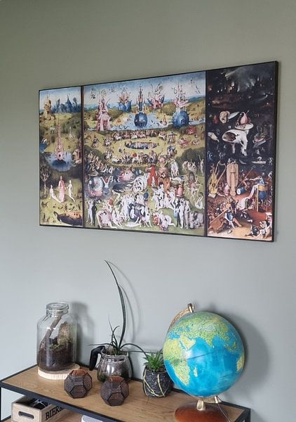
How they hang in other homes
Get inspired by beautiful artworks on other people's walls and see how they truly enhance an interior.


More like this


Choosing the right material for Renaissance art

Renaissance artworks come to life on each of our premium materials. Whether you choose Poster, Canvas, or ArtFrame™, each enhances the unique details and colors characteristic of this historic period.
Choose Poster and you benefit from prints that capture every nuance of Renaissance painting. The thick, durable satin photo paper weighing 260 grams gives depth to the rich browns, warm beiges, and olive greens typical of this era. The substantial weight creates a luxurious feel that does justice to the calm and mysterious moods these artworks convey. UV-resistant inks ensure the bronze tones and taupe shades retain their warmth year after year, keeping the dreamy atmosphere of Renaissance art intact. This makes posters particularly good for preserving the subtle color transitions and shadows that define this collection's painted works.
Still doubting which material suits your interior and chosen Renaissance artwork? Use our material comparator to find the perfect match for your space.
Where Renaissance art works well in your home

A home office is a good spot for Renaissance artworks. The calm and mysterious atmosphere creates a focused environment that encourages concentration without feeling sterile. Both portrait and landscape formats work well above a desk or on a feature wall. The earthy color palette blends naturally with wooden furniture and leather accessories often found in work spaces, creating a thoughtful backdrop for your daily tasks.
Styling Renaissance art with the right colors
Renaissance artworks pair beautifully with classic and rustic interior styles. The warm browns and bronze tones complement wooden furniture and traditional decor pieces, while the olive green and beige shades create harmony with neutral walls and natural textiles. In a classic setting, combine Renaissance pieces with cream or ivory accents to let the artwork stand out. For a country or rustic style, embrace the taupe and brown palette alongside woven baskets and warm lighting to enhance the collection's grounded, timeless character.
