






























Studio BB
Digital artist
Serenity Pantone 2016 captures the gentle power of soft blue. This delicate shade soothes the senses, inviting calm into busy lives. It's a color that whispers rather than shouts, creating space to breathe.
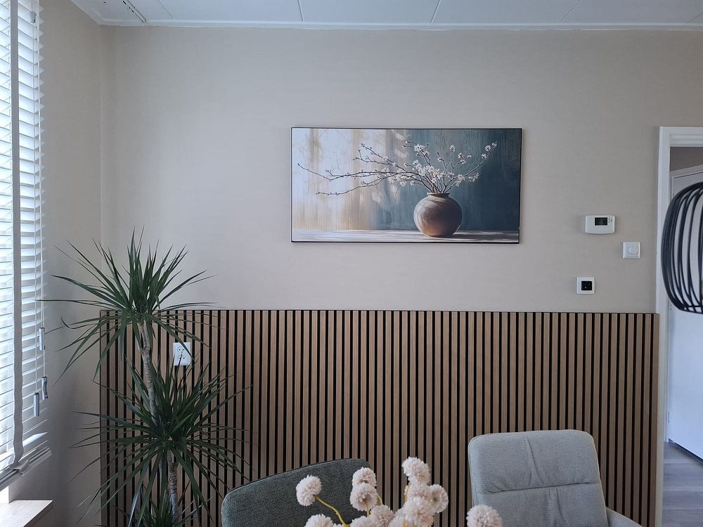
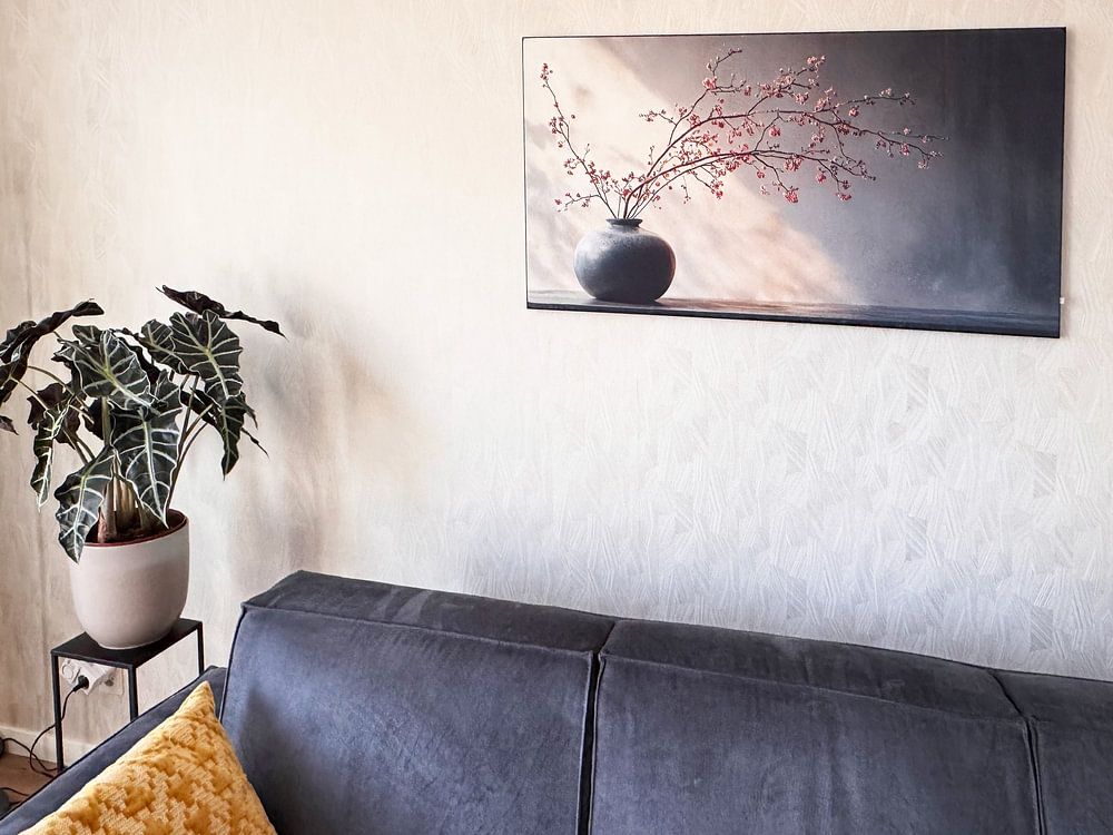
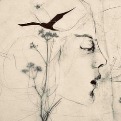
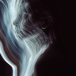
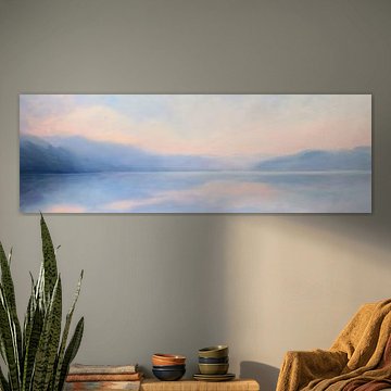
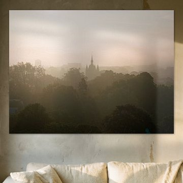
These artworks blend dreamy atmospheres with subtle elegance - from abstract portraits to misty seascapes and delicate nature studies. The palette ranges from pale turquoise to deeper teal, often paired with warm beige, taupe, or soft mauve. Perfect for minimalist, Scandinavian, or contemporary interiors that value tranquility. Into the mist no.7 shows how serene pastels can transform a room.
Available as Canvas, ArtFrame™, Poster and more - choose what suits your space.
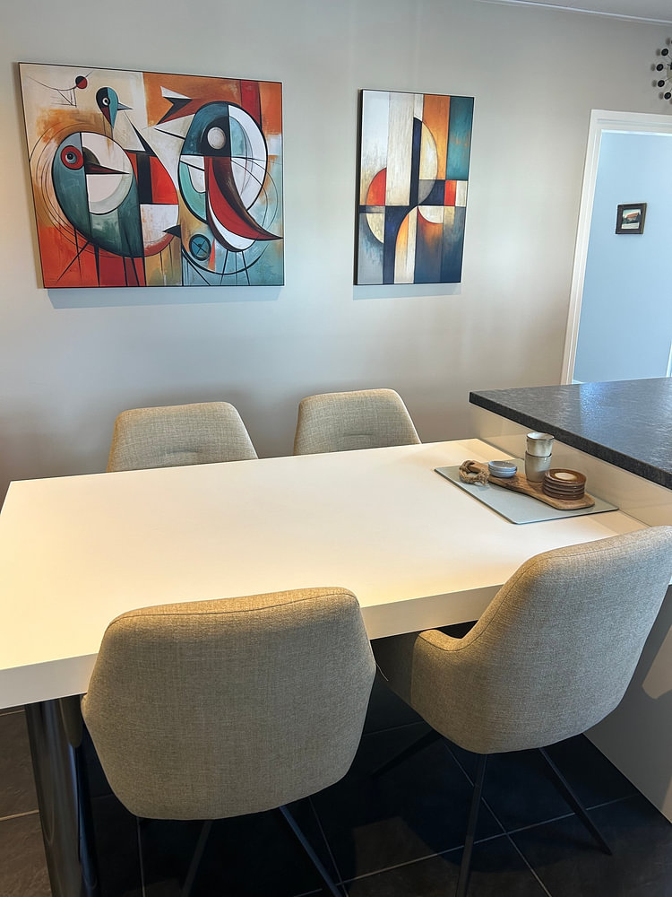
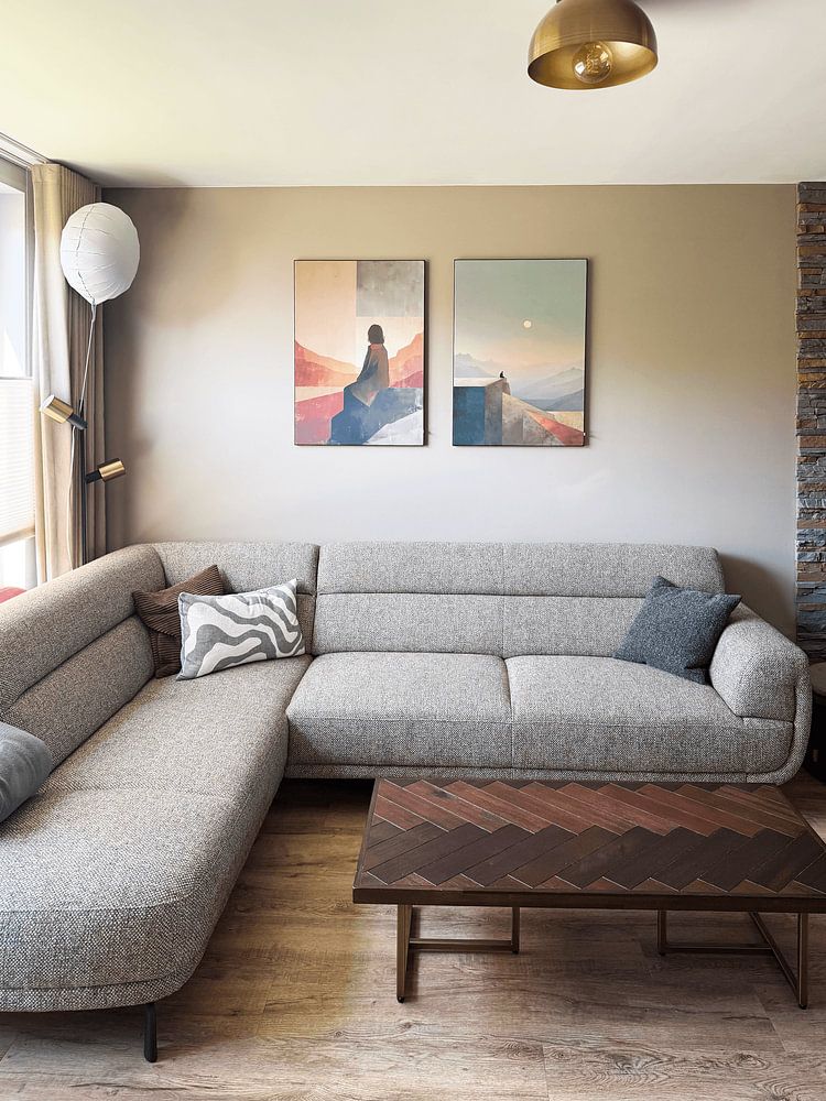
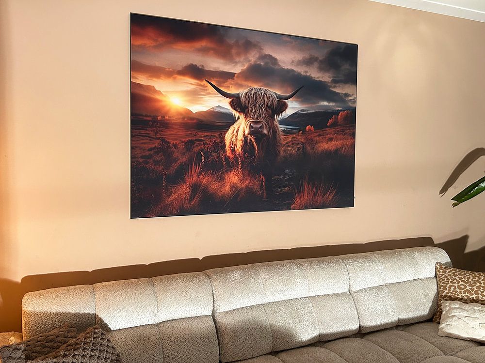
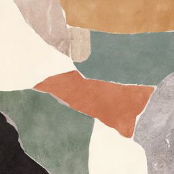
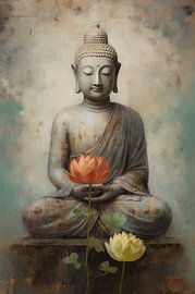
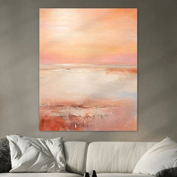
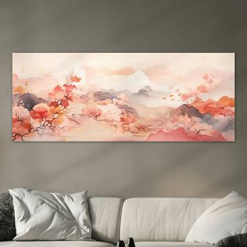
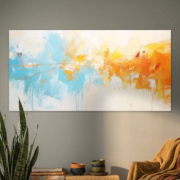
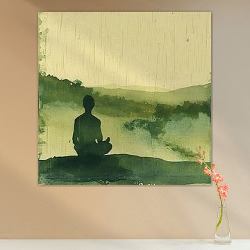
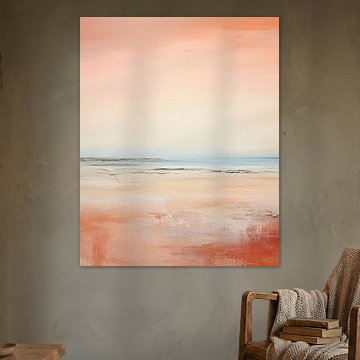
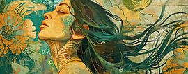
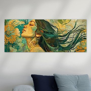
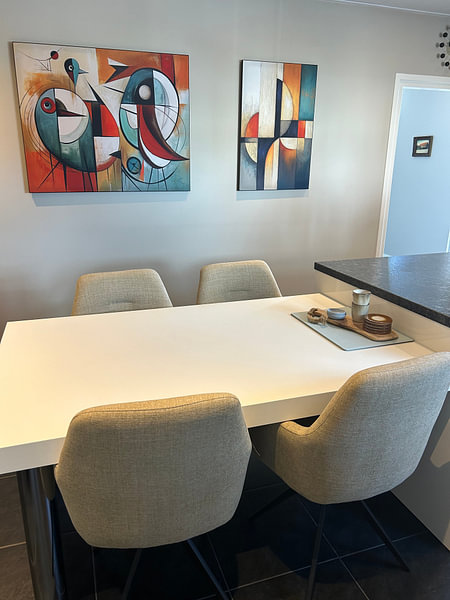
When your artwork features vivid accents - like warm oranges or deep reds - let the rest of your room stay simple. Use beige, taupe, or soft grey on walls and furniture to give the artwork breathing room. The striking orange tones in Mountain Blossom Meditation stand out best against understated backdrops.

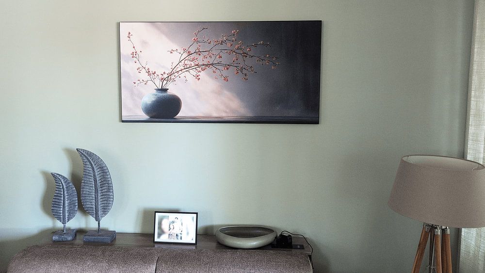
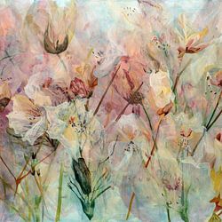
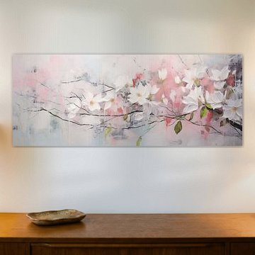
Soft pinks, mauves, and teal tones harmonize effortlessly with linen, wood, and woven materials. Layer these gentle hues with cream or taupe textiles to build warmth without overwhelming your room. The pastel palette in Into the mist no.7 complements neutral fabrics and natural finishes beautifully.

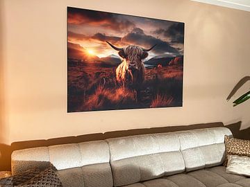
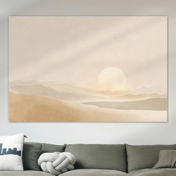
Serene scenes work beautifully in spaces where you want to slow down and breathe. Position artwork near your reading corner, bedroom, or meditation area to create a sense of calm. The peaceful mountain landscape in Maori lake New Zealand suits quiet, reflective spaces perfectly.

Customers rate us 4.8!
Sustainable and long-lasting beauty
From small to large, anything is possible.
Made the moment you order.
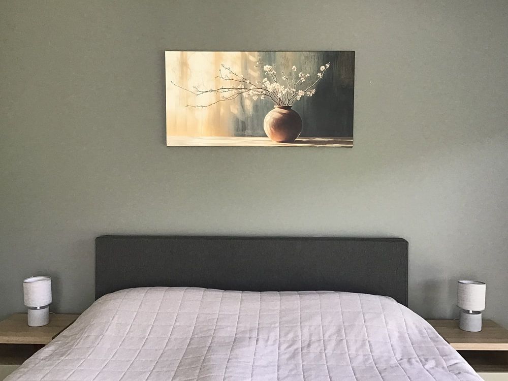
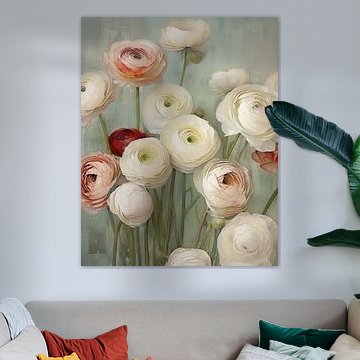
Serenity Pantone 2016 art creates a calm retreat in your bedroom, where the soft blue and grey tones promote rest and relaxation. The delicate, dreamy mood of this collection helps wind down busy thoughts at the end of the day. These gentle hues work particularly well above your bed or on the wall opposite, where they're visible as you settle in for sleep. The taupe and beige accents add warmth without disrupting the peaceful atmosphere you need in a space designed for rest.
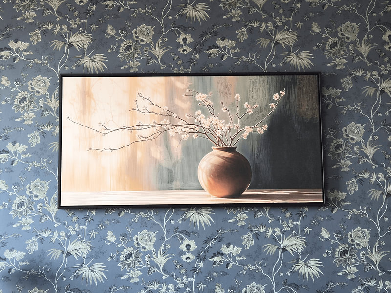
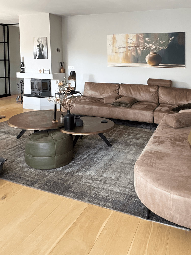
Serenity Pantone 2016 pairs beautifully with Scandinavian interiors, where the collection's soft blue and grey tones complement natural wood and clean lines. The beige and taupe shades in these artworks bridge the gap between cool walls and warm wooden furniture, creating visual harmony. Try combining the blue pieces with light oak surfaces and white textiles for a fresh, Nordic feel. For a slightly warmer take, let the brown tones lead and pair them with linen throws and ceramic accessories in grey.
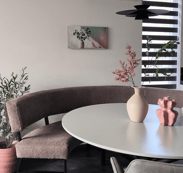
Serenity Pantone 2016 art creates a cohesive gallery wall when you group several pieces that share the same delicate mood and gentle color palette. Mix different techniques from the collection - digital art, photography, and painting - to add visual interest while maintaining the calm atmosphere. The soft blues and greys sit comfortably together, so you can arrange multiple artworks without creating visual noise. Add small planters with eucalyptus or trailing pothos nearby to echo the organic, dreamy quality of the collection and bring the calming effect into your physical space.