
Apeldoorn
There's something captivating about Apeldoorn's landscapes. The misty forest paths, autumn canals lined with ancient oaks, and soft morning light over the Veluwe create a sense of calm that stays with you. These artworks reflect that quiet beauty through warm bronze tones, golden light filtering through trees, and serene paths that seem to stretch endlessly. Works like Autumn in Apeldoorn and It's raining sunshine bring those atmospheric autumn scenes to life with rich oranges and gentle fog. Perfect for interiors that value natural warmth and understated elegance.
Available as Poster, Canvas, ArtFrame™ and more - choose the format that fits your space.
-
More artworks below this tip
Pair earthy tones with natural textures
Rich browns and bronzes sit beautifully alongside linen, jute, or wooden furniture. The warm, grounded palette in Crown Estates, Veluwe, William Temple complements natural materials without competing for attention - letting both the artwork and your interior breathe.
KatharinaStylist & Customer service Questions? Check out our FAQ
 -
More artworks below this tip
Let the mood guide your room choice
Dreamy, mysterious atmospheres create intimacy and focus. Artworks with mist, shadow, and filtered light - like Het Loo Royal Estate - work beautifully in private spaces: studies, dressing rooms, or cosy sitting areas where contemplation feels natural.
RosanneStylist & Customer service Questions? Check out our FAQ


Trusted and loved
Customers rate us 4.8!
High-quality materials
Sustainable and long-lasting beauty
Different sizes
From small to large, anything is possible.
Made for you
Made the moment you order.


More like this


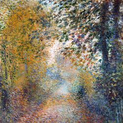
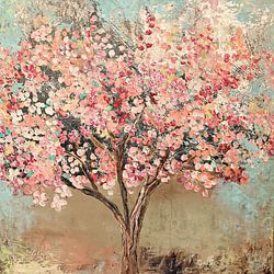
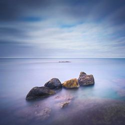


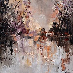

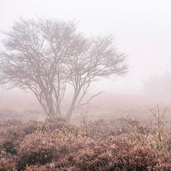
Which colors from Apeldoorn suit a Scandinavian interior
Apeldoorn brings together brown, olive green, blue, mauve, and grey - a naturally balanced palette that works beautifully in Scandinavian interiors. Pair the soft grey and blue tones with light wood furniture and white walls to create an airy, calm foundation. Add olive green or mauve accents through textiles like cushions or throws to introduce warmth without disrupting the minimalist feel. Brown tones ground the look and connect well with natural materials like linen or rattan.
Where Apeldoorn art works well in your home
Apeldoorn is a good spot for the bedroom, where the calm and mysterious moods help create a restful atmosphere that supports relaxation. The muted tones - especially grey, mauve, and blue - don't compete for attention, making them ideal for a space meant for unwinding. Hang the artwork above your bed or on the wall opposite to set a gentle, elegant tone. The understated color palette blends quietly into the room while still adding visual interest.
How to style Apeldoorn with other decor elements
Apeldoorn pairs well with natural decor that echoes its calm and elegant character. Style the artworks alongside soft textiles in neutral tones, wooden accessories, or ceramic vases in earthy shades to reinforce the collection's grounded feel. For a layered gallery wall, combine different formats and mix photography with illustration or drawing to add subtle variety. Introduce greenery like eucalyptus or ferns to complement the olive and grey tones. Choose your size and material to make it personal.