
De Cocksdorp
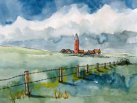
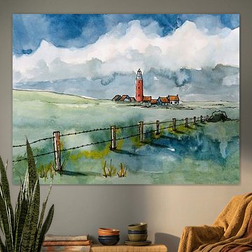
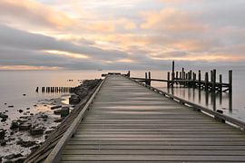
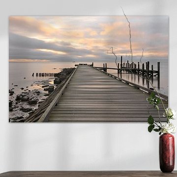
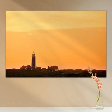
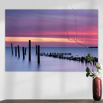
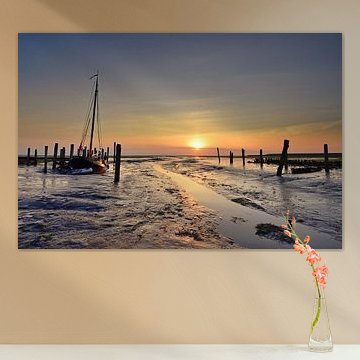
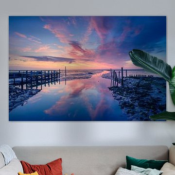
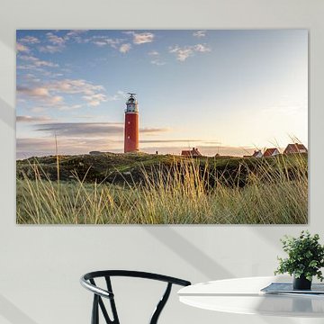
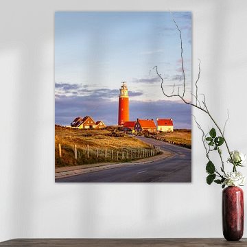
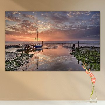
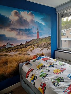
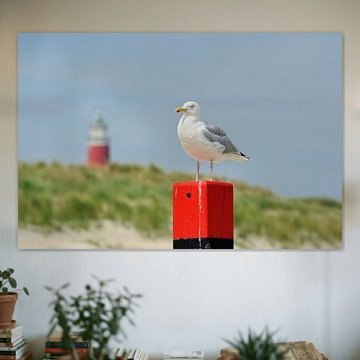
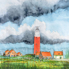
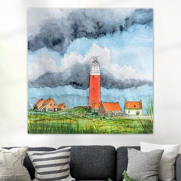
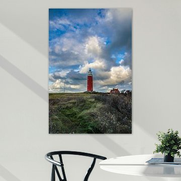
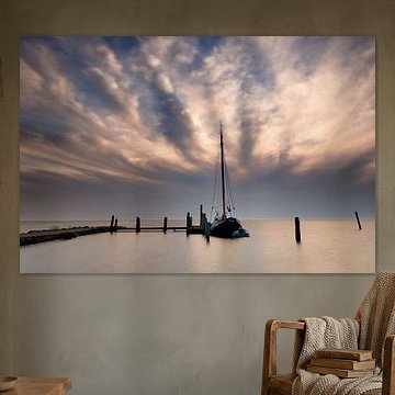
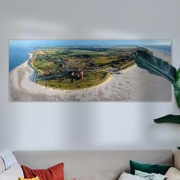
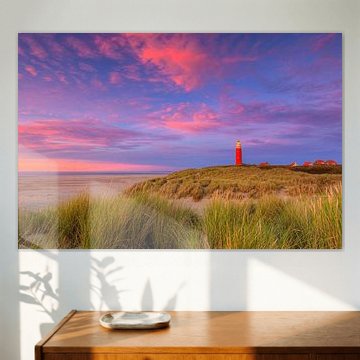
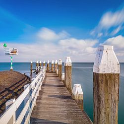
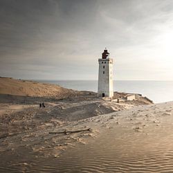
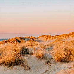
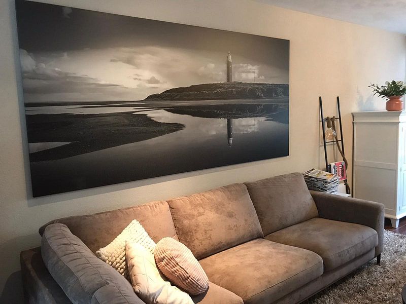
De Cocksdorp sits at Texel's northern tip, where dunes meet sea and the iconic lighthouse stands watch. These artworks capture that windswept beauty - striped red-and-white towers, rolling sands, and skies that shift from stormy grey to soft sunset pastels. The calm, nostalgic mood works beautifully in coastal, Scandinavian, or minimalist interiors, where natural tones and spacious compositions breathe. Texel 3 mirrors the lighthouse in still water, while Eierland Lighthouse (Texel) frames it against a pastel dusk - each view reveals something different.
Choose what suits your space: ArtFrame™ for a modern floating finish, Canvas for warmth, Poster for versatility, and more. Explore the full collection and find your coastal horizon.
-
More artworks below this tip
Let the dunes lead your eye
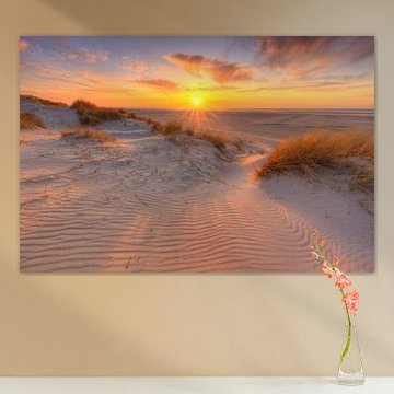
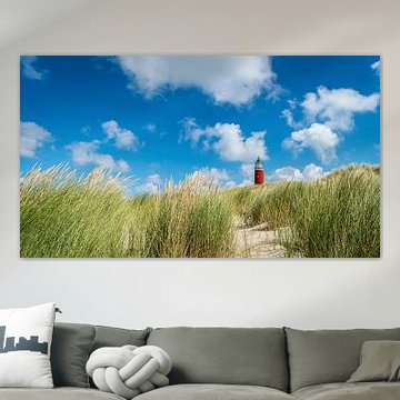
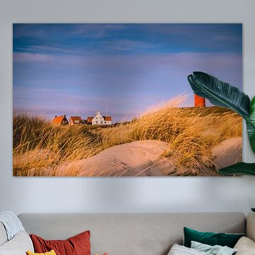
Horizontal compositions guide the gaze naturally across your wall, making narrow spaces feel wider. This works particularly well in hallways or above sofas where you want visual flow rather than height. The expansive dune scene in Houses on Vuurtorenweg in Texel | De Cocksdorp | Hand-painted watercolour painting shows how landscape-oriented artworks open up a room without overwhelming it.
RosanneStylist & Customer service Questions? Check out our FAQ
 -
More artworks below this tip
Create a tranquil corner with coastal hues
Soft morning tones bring a sense of calm to bedrooms and reading nooks. The warm yellows and pinks paired with cool greys work beautifully beside natural wood furniture or linen textiles. A good example is Eierland Lighthouse at Sunrise | Texel | Hand-painted Watercolour Painting, where sunrise colours create a peaceful focal point above a low sideboard or headboard.
KatharinaStylist & Customer service Questions? Check out our FAQ
 -
More artworks below this tip
Pair coastal scenes with earthy accents
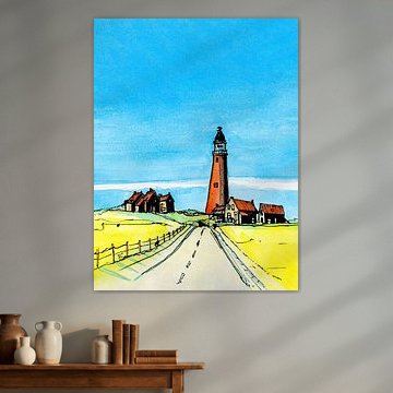
Watercolour skies and dune grass blend effortlessly with terracotta pots, wicker baskets, or olive-toned cushions. These natural materials echo the organic feel of the painted landscape. The sage greens and sandy browns in Eierland Lighthouse and the dunes of Texel | Hand-painted watercolour | Portrait orientation harmonise beautifully with botanical prints or wooden frames elsewhere in the room.
GinaStylist & Customer service Questions? Check out our FAQ



































Trusted and loved
Customers rate us 4.8!
High-quality materials
Sustainable and long-lasting beauty
Different sizes
From small to large, anything is possible.
Made for you
Made the moment you order.


More like this




Which room works well with De Cocksdorp art

De Cocksdorp artworks suit a bedroom where calm and introspection matter most. The blue and grey tones create a restful backdrop that helps you unwind at the end of the day, while the mysterious and melancholic moods add quiet depth without overwhelming the space. These pieces work well above a headboard or on the wall opposite your bed, where they can set a tranquil tone.
Colors from De Cocksdorp that suit Scandinavian interiors
De Cocksdorp brings together blue, grey, and taupe - a palette that pairs naturally with Scandinavian style. Combine the soft grey and taupe hues with light wood furniture and neutral textiles to keep the space airy and uncluttered. The blue tones add a gentle contrast that complements white walls and simple lines, creating a balanced look that feels both serene and grounded.
How to choose the right format for De Cocksdorp
De Cocksdorp artworks look good in horizontal formats, which suit walls above sideboards, sofas, or beds where you want the eye to move gently across the composition. A horizontal piece above a dining table or console table balances the width of the furniture and fills the wall without crowding it. If you have a narrow hallway or a tall, slim wall section, a vertical format works better to match the proportions.