
Gustaaf De Smet
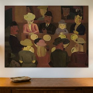
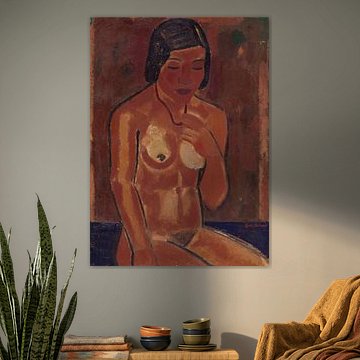
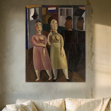
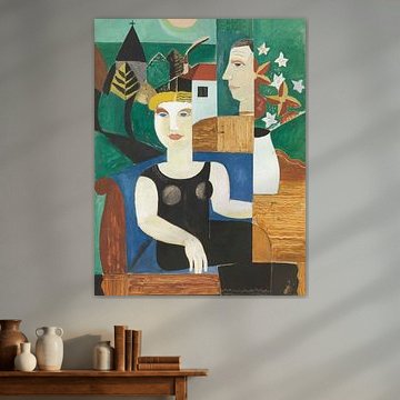
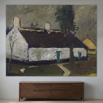
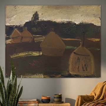
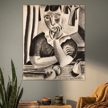
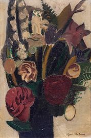
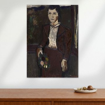
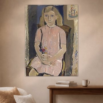
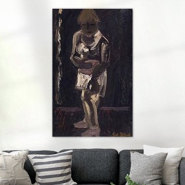
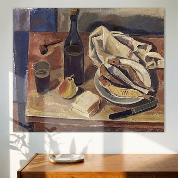
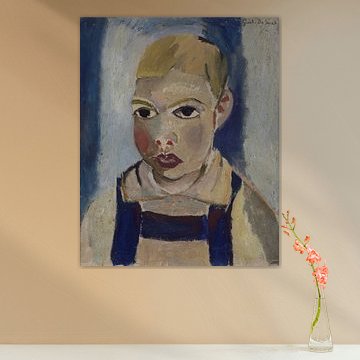
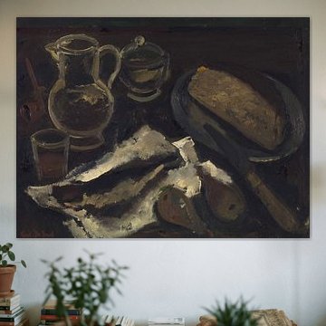
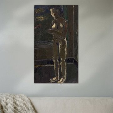
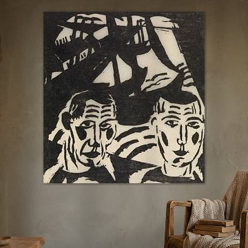
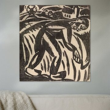
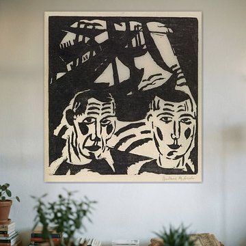
Gustaaf De Smet shaped Flemish expressionism with bold simplicity and emotional restraint. His scenes feel quiet yet alive. Earthy tones - browns, mauves, terracottas - create warmth without drama.
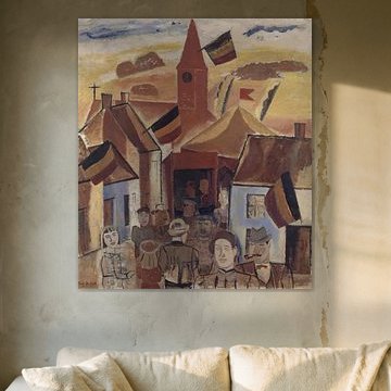
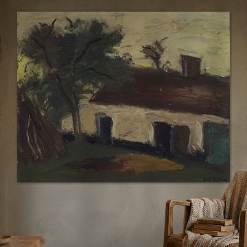
His village landscapes and candid interiors suit spaces that value understated character. Village scene, Gustave De Smet, 1936 shows his signature style: geometric forms, soft horizons, a peaceful rhythm. These artworks bring calm to living rooms, studies, or bedrooms where contemplation matters.
Available as Canvas, ArtFrame™, Poster and more - choose what suits your space.
-
More artworks below this tip
Pair earthy tones with natural textures
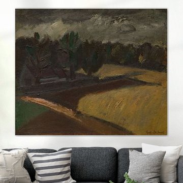
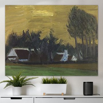
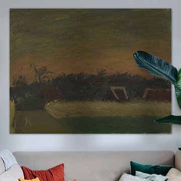
The muted browns, sage greens, and beige tones in Clouds, Gustave De Smet work beautifully alongside natural materials. Think linen cushions, wooden furniture, or woven baskets. These combinations bring warmth without overwhelming your space, creating a calm, grounded feel that suits living rooms and bedrooms alike.
AnthiStylist & Customer service Questions? Check out our FAQ





































Trusted and loved
Customers rate us 4.8!
High-quality materials
Sustainable and long-lasting beauty
Different sizes
From small to large, anything is possible.
Made for you
Made the moment you order.


More like this








Where Gustaaf De Smet artworks suit your bedroom best
Gustaaf De Smet artworks work well in a bedroom thanks to their calm and nostalgic moods. The earthy palette of brown, beige, and olive green creates a restful atmosphere that helps you unwind at the end of the day. These muted tones don't compete for attention, making them a good spot for a space meant for relaxation. The mysterious quality in the artworks adds depth without feeling heavy or overstimulating before sleep.
Colors in Gustaaf De Smet that match Scandinavian interiors
Gustaaf De Smet artworks pair naturally with Scandinavian interiors through their palette of beige, grey, and taupe. These neutral earth tones complement the light wood furniture and minimal aesthetic typical of Scandinavian design. Try combining the olive green accents with white walls and natural textiles for a grounded, cohesive look. The brown tones bring warmth to otherwise cool-toned spaces, creating balance without cluttering the clean lines that define this style.
Which format works for Gustaaf De Smet on your walls
Gustaaf De Smet artworks suit various wall placements depending on your chosen format. Horizontal formats work well above a bed or sideboard, filling wider wall spaces without overwhelming the room. Square formats offer flexibility for gallery-style groupings or standalone placement near doorways and hallways. If you're working with a narrow wall section or the space beside a wardrobe, vertical formats create visual height and draw the eye upward, making rooms feel more spacious.