-
More artworks below this tip
Where to hang statement abstract artworks
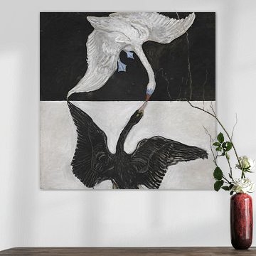
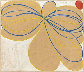
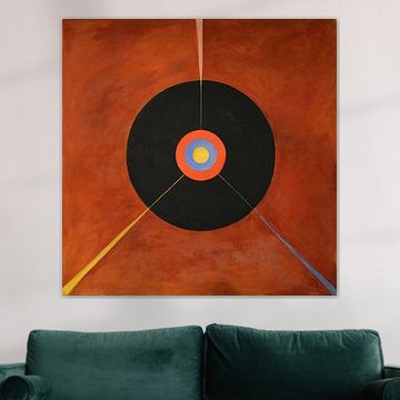
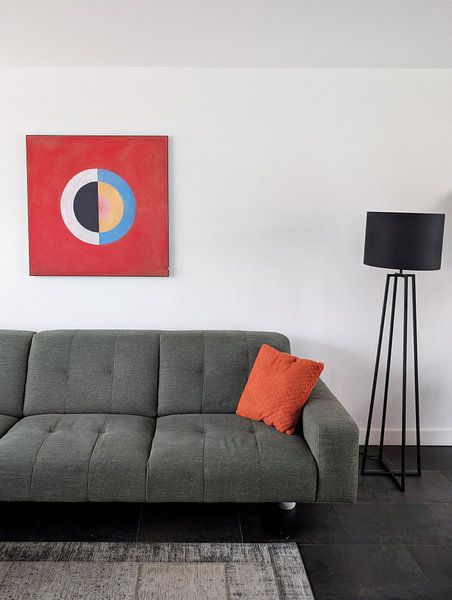
Abstract pieces with strong contrasts draw the eye and work best as focal points in your room. The black-and-white composition in The Swan, No. 1 (Group IX-SUW), Hilma af Klint creates impact above a sofa or sideboard. Give it breathing room - avoid cluttering the wall with other frames nearby to preserve its visual strength.
EileenStylist & Customer service Questions? Check out our FAQ
 -
More artworks below this tip
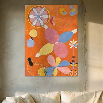
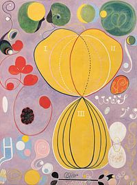
Choosing rooms for spiritual abstract art
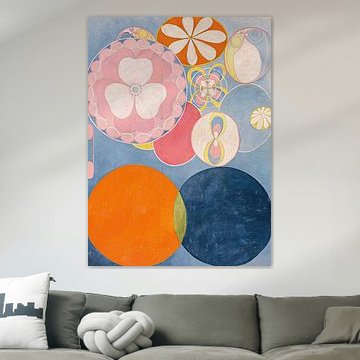
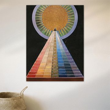
Artworks rooted in spiritual symbolism bring calm and contemplation to personal spaces. The geometric forms and soft color transitions in The Ten Largest, No. 4, Youth, Hilma af Klint suit bedrooms, reading corners, or home studios where you want a thoughtful, creative atmosphere. These pieces encourage quiet reflection rather than energetic conversation.
KatharinaStylist & Customer service Questions? Check out our FAQ
Hilma af Klint
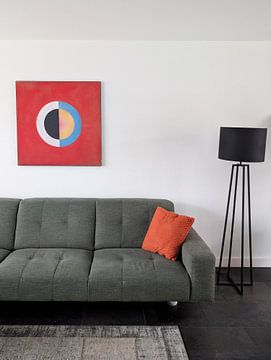
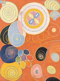
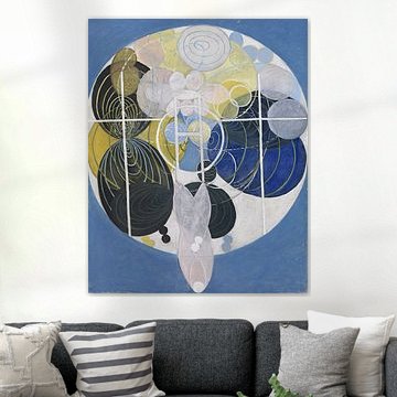
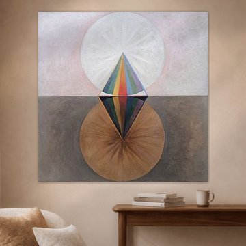
Hilma af Klint created abstract art before abstraction had a name. Her visionary paintings merge spiritual geometry with vibrant colour, turning complex Theosophical ideas into captivating visual language. Works like The Ten Largest, No. 2, Childhood, Hilma af Klint radiate playful energy through bold circles and organic forms, while Group IX,SUW, No. 17. The Swan, No. 17, Hilma af Klint balances concentric colour with meditative simplicity.
These artworks bring a sense of discovery to contemporary interiors, where their geometric rhythms and soft palettes complement modern and eclectic spaces alike. At Art Heroes, we print each piece to order, ensuring your chosen Hilma af Klint artwork arrives exactly as you imagine it. Explore Canvas, Poster, Wallpaper and more - all with free shipping included.


Trusted and loved
Customers rate us 4.8!
High-quality materials
Sustainable and long-lasting beauty
Different sizes
From small to large, anything is possible.
Made for you
Made the moment you order.


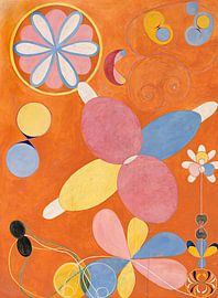
How do pink and terracotta shades from Hilma af Klint enhance Scandinavian interiors?
The warm palette of Hilma af Klint artworks brings a soft, organic touch to Scandinavian homes. Pink and mauve tones pair beautifully with light wood furniture and neutral walls, while terracotta and brown add grounding warmth to white or grey spaces. Combine these earthy shades with natural textiles and simple lines to create a calm, balanced atmosphere that feels both modern and inviting.
Choosing the right material
Hilma af Klint comes to life on each of our premium materials. Whether you choose ArtFrame™, Poster, or Canvas, each enhances the unique details and colors.
Choose ArtFrame™ and you benefit from flexibility that matches the dreamy, mysterious mood of this collection. The vibrant pinks and terracottas shift beautifully throughout the day as natural light changes, and you can swap prints whenever you want to explore different artworks from the collection. The acoustic panels work especially well in quiet spaces where you want to preserve the contemplative atmosphere these abstract compositions inspire, reducing echo without compromising the visual impact of the intricate patterns and layered colors.
Still doubting which material suits your interior and chosen Hilma af Klint artwork? Use our material comparator to find the perfect match.
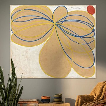
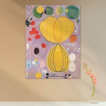
Which wall placement works best for square Hilma af Klint formats?
Square formats dominate this collection and create striking focal points above sideboards, desks, or centered on feature walls. The balanced proportions suit rooms where you want symmetry and calm, making them ideal for bedrooms or home offices. If you have a narrow hallway or space beside a window, a vertical format offers a better fit and draws the eye upward without overwhelming the area.
