



































Anton de Zeeuw
Photographer
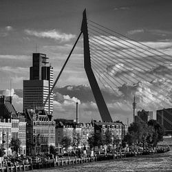
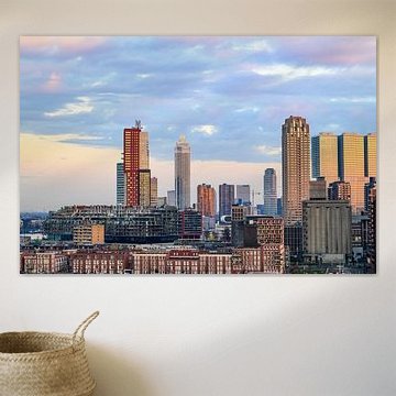
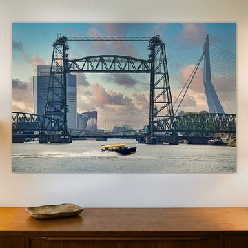
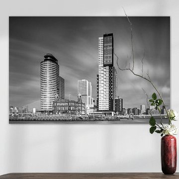
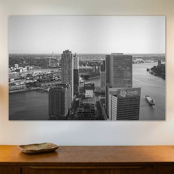
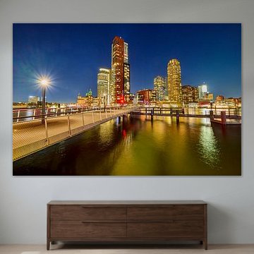
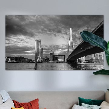
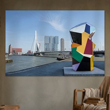
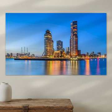
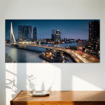
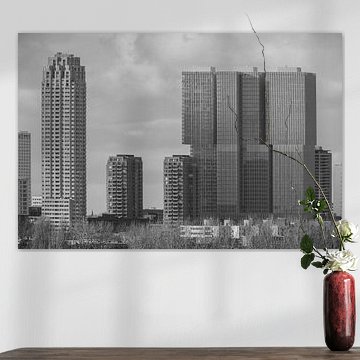
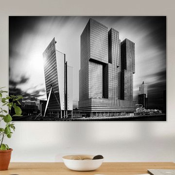
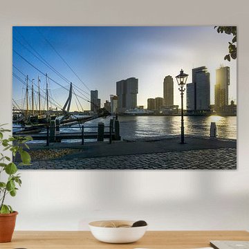
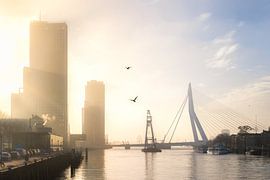
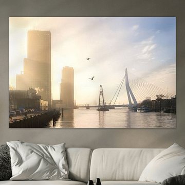
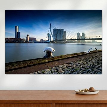
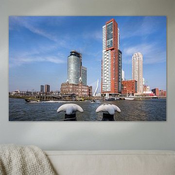
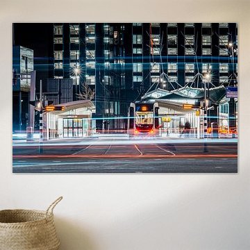
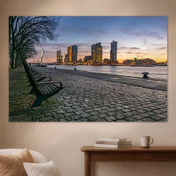
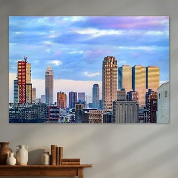
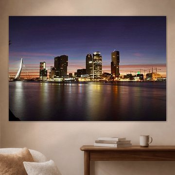
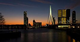
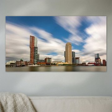
Rotterdam's Kop van Zuid captures the soul of modern waterfront architecture. Skylines glow at dusk, fog rolls across steel towers, and the Erasmus Bridge arches over calm water - these scenes blend urban power with quiet beauty. Whether you're drawn to the architectural clarity of Aerial view Wilhelminapier Rotterdam or the dreamy atmosphere of Rotterdam in the fog, these artworks bring contemporary elegance into minimalist and industrial interiors alike.
At Art Heroes, we print every piece to order. Choose from Canvas, ArtFrame™, Poster and more - each format tailored to your space and style.
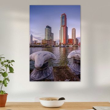
Rotterdam's mix of historic and modern buildings translates beautifully into contemporary interiors. The architectural contrast in Rotterdam's Maastoren and Noordereiland. suits spaces with clean lines and minimalist furniture, where the layered cityscape adds visual interest without competing for attention.

Soft mauve and grey create a sophisticated, understated palette that pairs well with natural materials like wood and linen. The muted color balance in Rotterdam at dawn works particularly well alongside warm metallics such as brass or copper fixtures in your room.

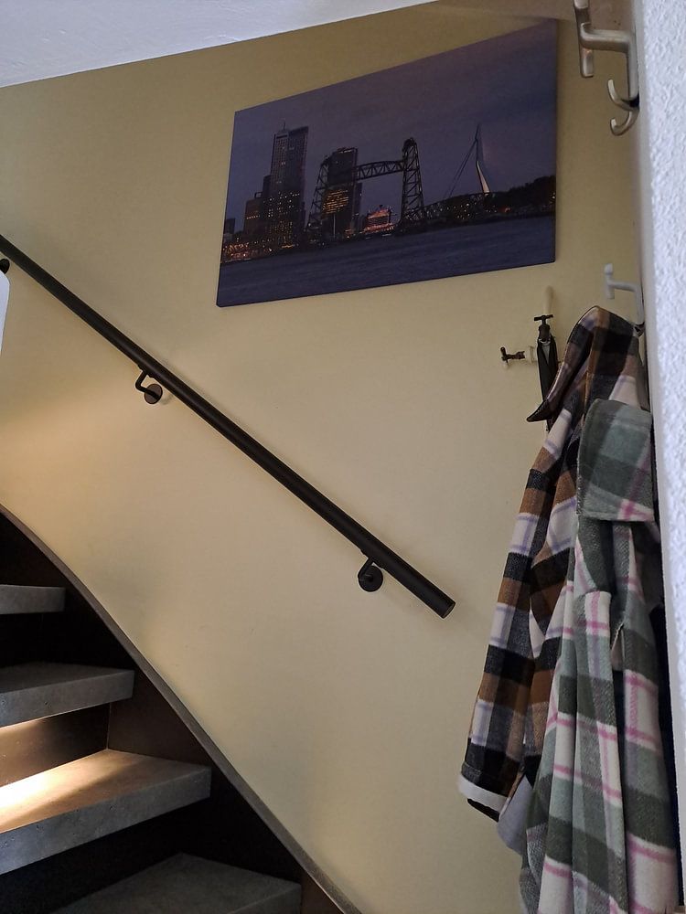
Urban waterfront scenes work beautifully in spaces where you want to create a calm, contemplative atmosphere. Consider placing Rotterdam: Kop van Zuid in the mist in a hallway or living room where the misty tones and reflective water can add depth without overwhelming the space.

Customers rate us 4.8!
Sustainable and long-lasting beauty
From small to large, anything is possible.
Made the moment you order.
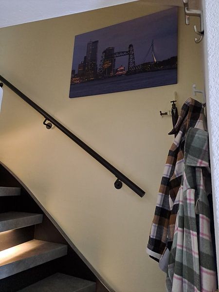
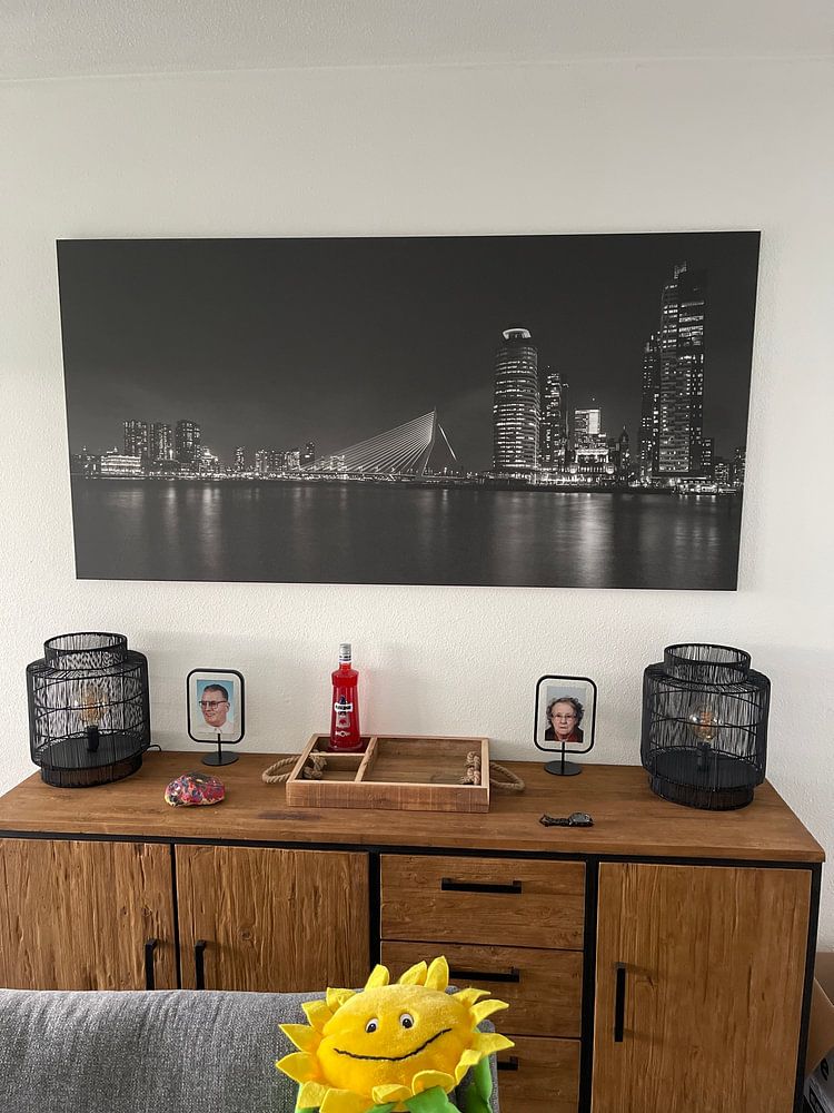
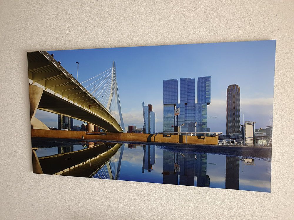
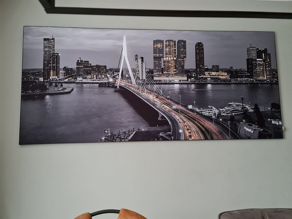
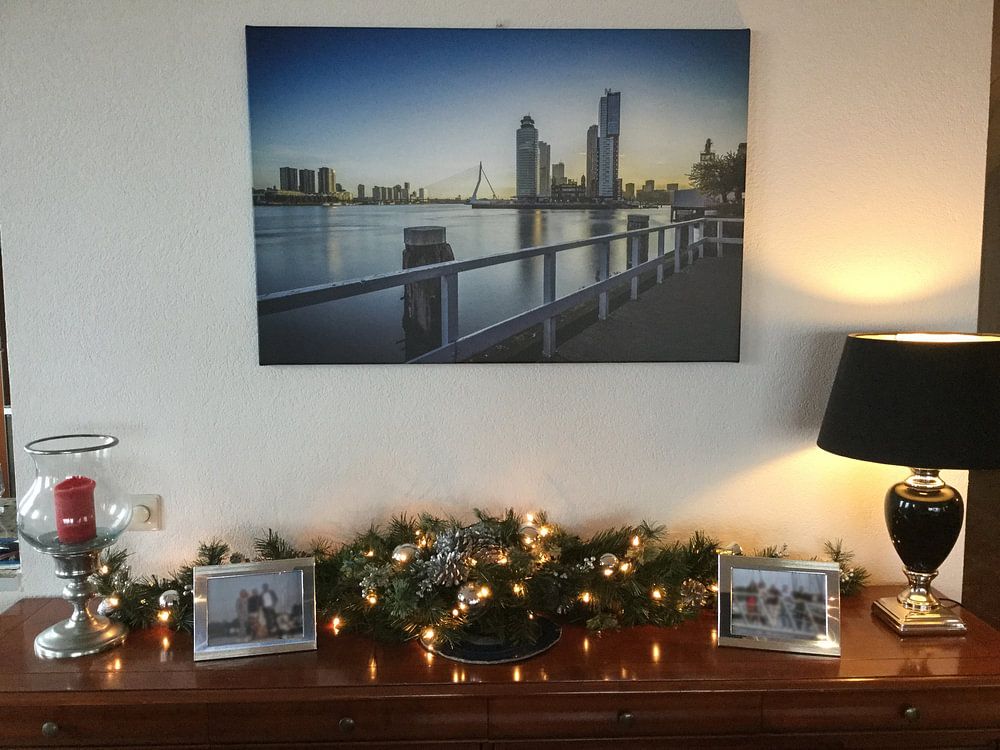
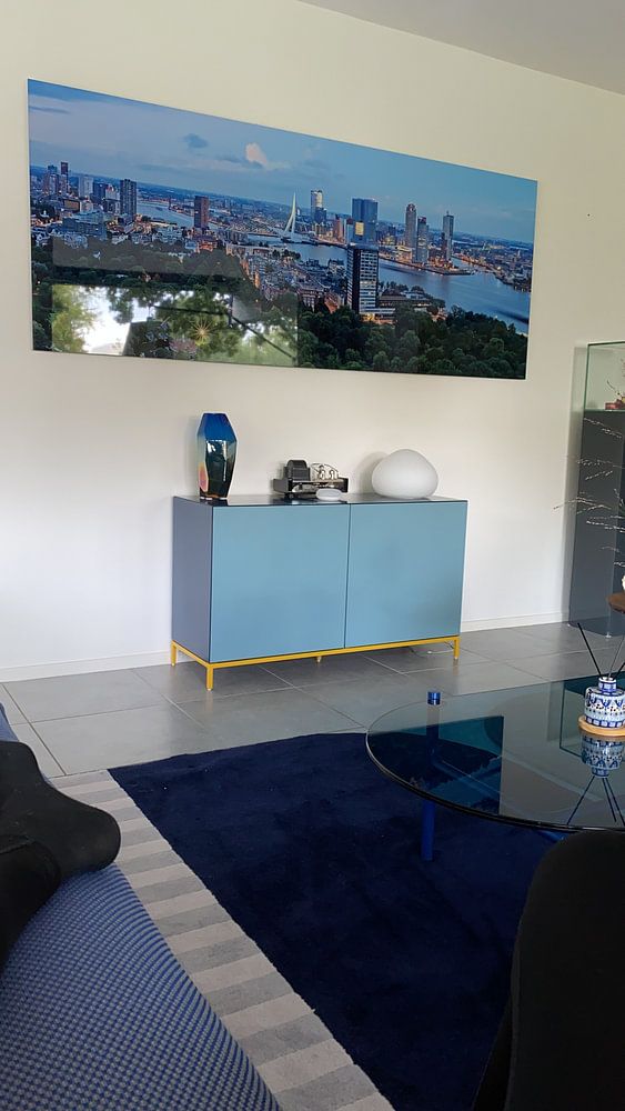
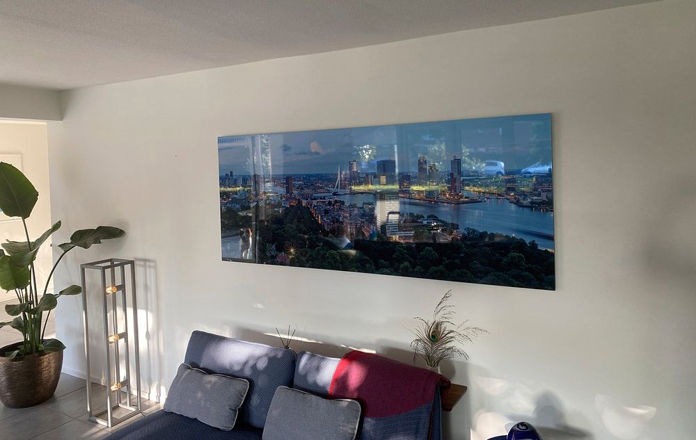
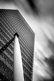
Kop van Zuid artworks work beautifully in horizontal formats, making them ideal for placement above a sofa or sideboard where they can stretch across the wall. The wide composition draws the eye along the skyline and waterfront, creating a sense of space and openness. A horizontal print suits living rooms and hallways particularly well, where the format complements the natural flow of the room. If you're working with a narrower wall or want to emphasize height, a vertical format can highlight architectural details and create a striking focal point.
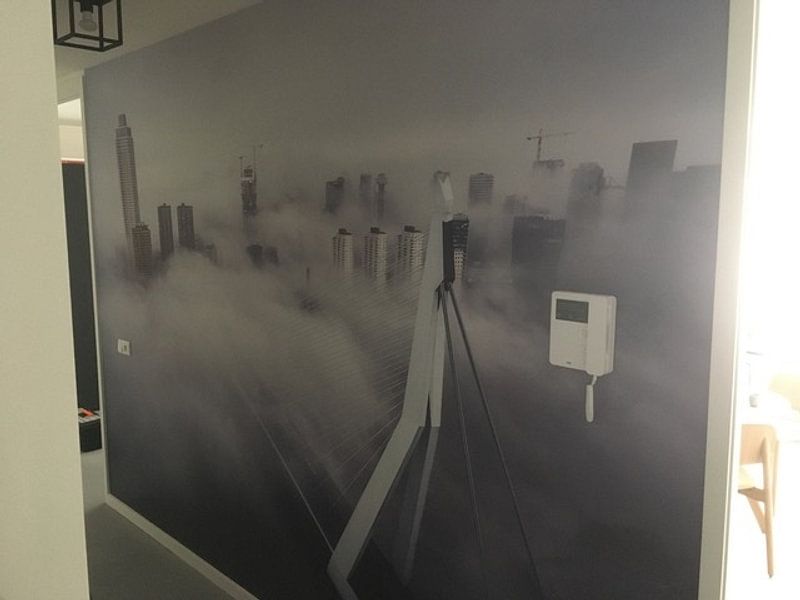
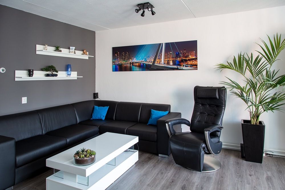
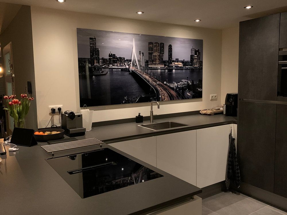
Kop van Zuid prints feature blue, grey, and black-and-white tones that align perfectly with Scandinavian interiors. Pair soft grey artworks with light oak furniture and white walls to maintain that airy, minimalist feel typical of Nordic design. Blue tones add a calming accent without overwhelming the space, while black-and-white prints bring graphic clarity that complements clean lines and natural textures. Mauve and brown variations offer warmth if you want to soften the cool palette with subtle earthy touches alongside linen textiles.
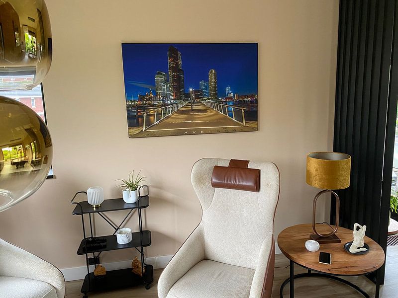
Kop van Zuid artworks balance calm and vibrant moods, making them versatile for layered styling. Use a calm blue or grey print as your anchor piece, then introduce vibrant accents through cushions, throws, or a second smaller artwork in warmer tones. This approach works well in gallery walls where you mix mysterious black-and-white photography with more colorful pieces. Add greenery like ferns or succulents to echo the waterfront atmosphere, and consider pairing your artwork with metal or glass accessories that reflect the urban character of the collection. Choose your format and bring Rotterdam's iconic skyline into your space.