-
More artworks below this tip
Finding the right room
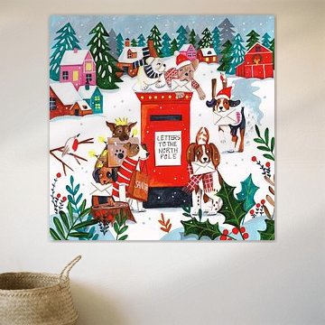
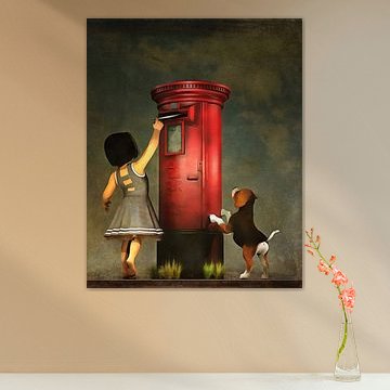
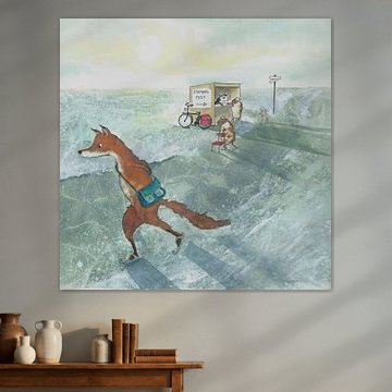
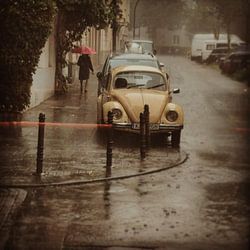
Narrative scenes add personality to transitional spaces where movement happens. The winter forest setting in Postman Fox works in quiet reading corners or bedrooms where you want a calming, story-driven focal point. Consider lighting that won't create glare on the surface.
RosanneStylist & Customer service Questions? Check out our FAQ
 -
More artworks below this tip
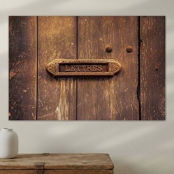
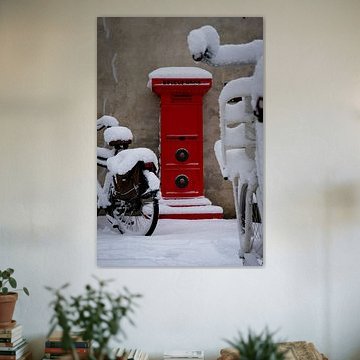
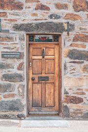
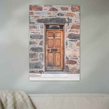
Placing weathered character pieces
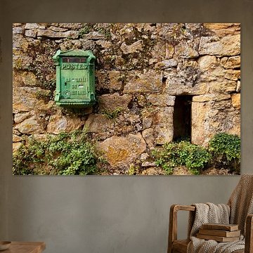
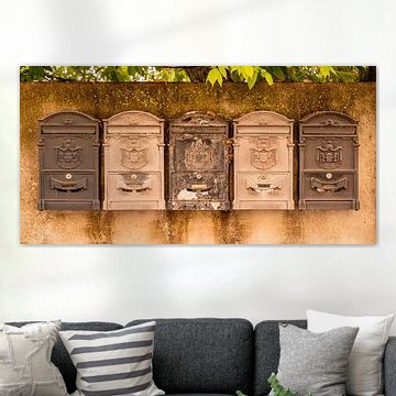
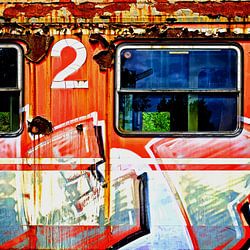
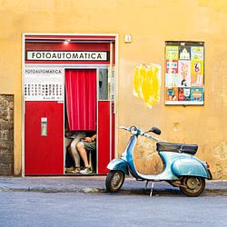
Textured surfaces and visible age marks work beautifully in entrance halls or covered outdoor areas where they echo natural wear. The aged patina and peeling paint in Green door with 2 letter boxes suits spaces where authenticity matters more than perfection - think hallways, mudrooms, or garden room corners.
LianneStylist & Customer service Questions? Check out our FAQ
 -
More artworks below this tip
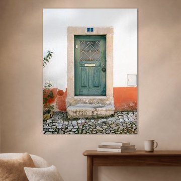
Choosing between portrait and landscape
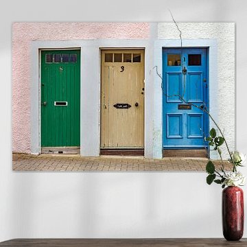
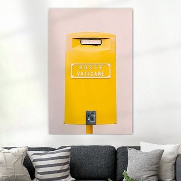
Both portrait and landscape formats are popular for this collection. Portrait works well on narrow wall sections beside doorways or between windows, while landscape suits wider spaces above console tables or benches. Choose the format that fits your available wall space.
AnthiStylist & Customer service Questions? Check out our FAQ
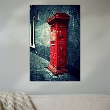
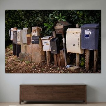
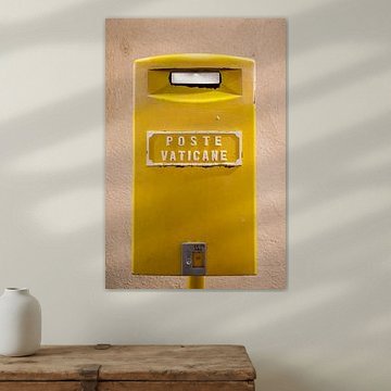
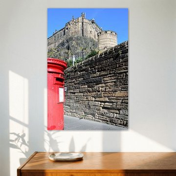
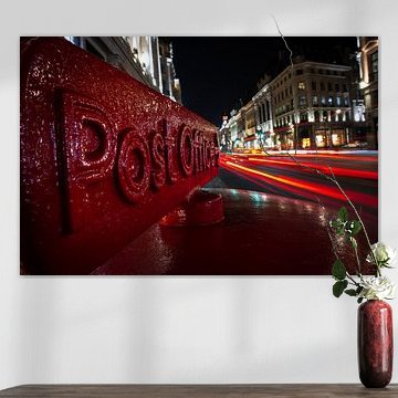
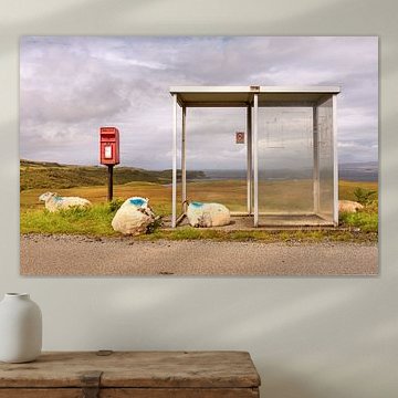
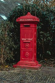
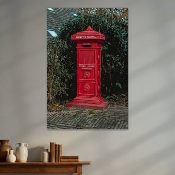
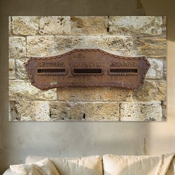
Post boxes
Post boxes carry stories - of letters sent, connections made, moments preserved. These charming fixtures blend nostalgia with everyday beauty, which makes them captivating wall art subjects. From weathered French doors to vibrant Italian streets, our collection captures the character of post boxes across Europe. Soft tones and rich textures bring warmth to modern and classic interiors alike, while playful interpretations like Image manipulation Pigeons as Postmen: Humorous and Warm Wall Decoration add unexpected humor.
At Art Heroes, we work with talented European artists to bring you custom-made artwork. Choose your size and material - from Canvas to ArtFrame™ and more - and enjoy free shipping on every order.


Trusted and loved
Customers rate us 4.8!
High-quality materials
Sustainable and long-lasting beauty
Different sizes
From small to large, anything is possible.
Made for you
Made the moment you order.


More like this


Where do portrait-format post boxes work best in your space?
Post boxes work beautifully in portrait format, making them ideal for narrow wall spaces beside doorways, between windows, or in hallways where vertical artworks naturally draw the eye upward. A portrait post box creates visual height above a console table or sideboard, while square formats work well when you need to fill a compact wall area above furniture. Consider the wall dimensions before choosing your format to ensure the artwork complements rather than overwhelms the space.
How to combine post boxes with nostalgic interior elements
Post boxes pair naturally with vintage-inspired decor that echoes their nostalgic character. Combine these artworks with antique brass accessories, weathered wood furniture, or woven baskets to create a cohesive look that celebrates heritage charm. The brown, taupe, and beige tones in post box artworks work particularly well alongside terracotta pots, linen textiles, and warm lighting that enhances the calm, collected mood. Group a post box artwork with botanical prints or travel photography to build a gallery wall that tells a story of connection and communication.
Let these artworks anchor a display shelf styled with vintage postcards, old books, and ceramic vessels in complementary earth tones.
A good spot for post boxes in your hallway
Your hallway provides an ideal setting for post box artworks, where themes of communication and connection feel naturally at home in a transitional space. These pieces work well in entrance areas where they greet visitors and set a welcoming tone, particularly when hung at eye level along corridor walls or above a narrow hall table. The nostalgic mood and warm color palette create an inviting atmosphere in spaces that often lack personality. Choose Canvas or Poster for hallway walls, and consider how the vibrant or calm variations suit your lighting conditions and existing decor palette.
