


































Rietje Bulthuis
Photographer
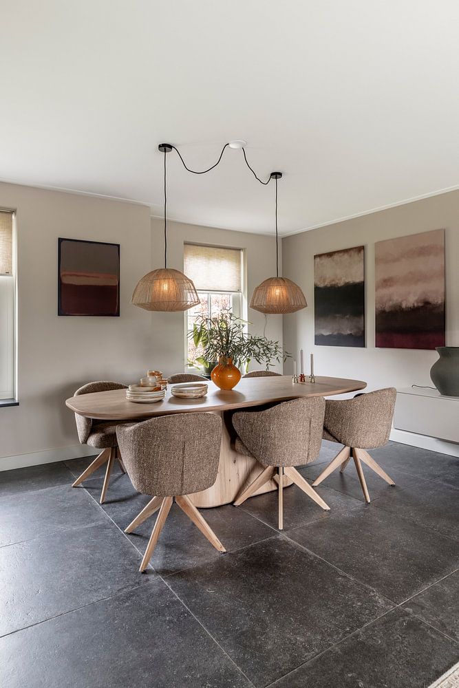
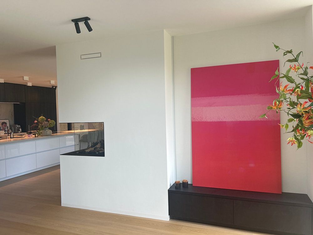
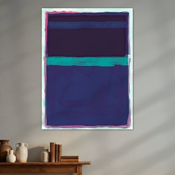
Mark Rothko's color field paintings invite contemplation through bold, luminous rectangles. His signature style brings calm and depth to any space, which is why these abstract compositions remain so powerful today.
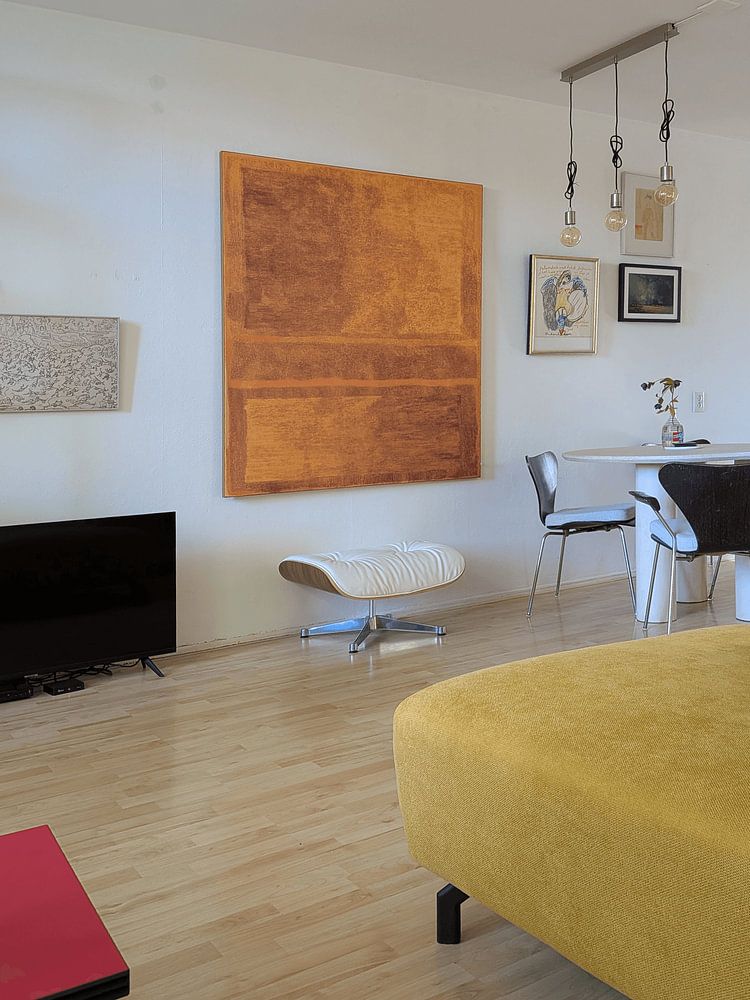
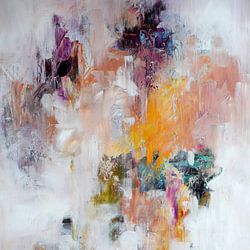
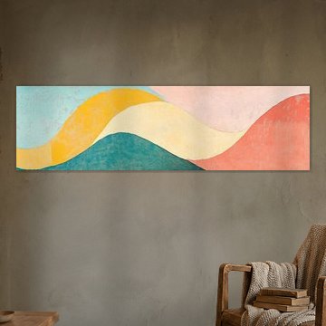
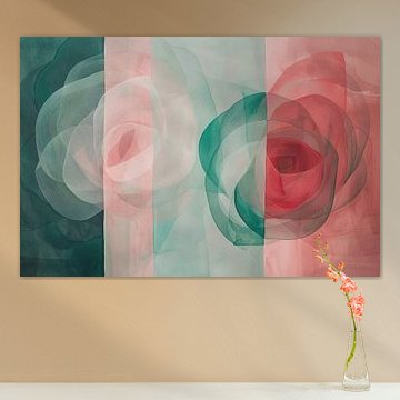
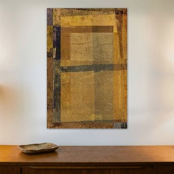
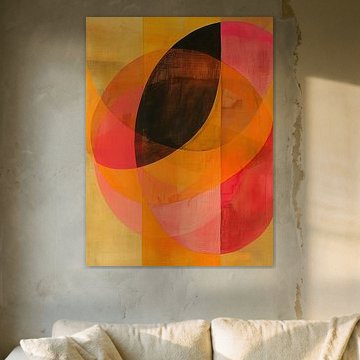
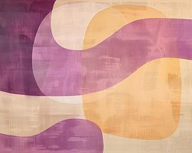
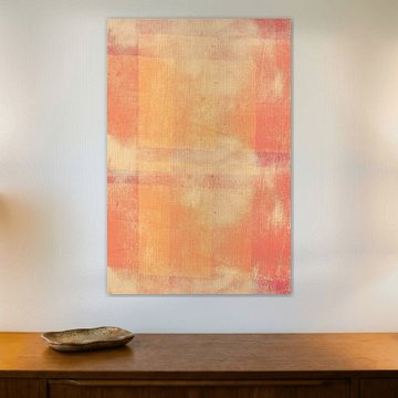
Our collection features soft pinks meeting warm terracotta, deep burgundy layering over muted yellows, and serene greens blending into earthy tones. Modern abstract expressionism. Pink and yellow on orange. shows how irregular rectangles in pink and mustard create delicate textural contrast. These abstract expressionist artworks complement modern, minimalist, and Scandinavian interiors beautifully because their horizontal bands of color add visual balance without overwhelming.
At Art Heroes, we print each artwork to order as Poster, Canvas, Wallpaper, and more. Explore the collection to find what suits your space.
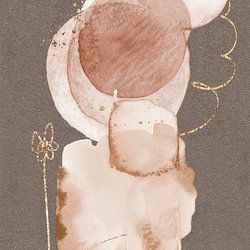
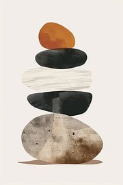
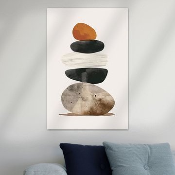
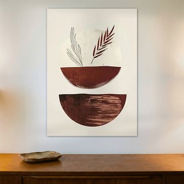
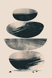
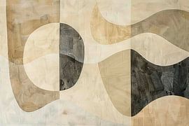
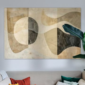
Taupe and beige create a calm foundation in any room. Layer these soft neutrals with warm terracotta or bronze accents - think cushions, throws, or ceramic pieces - to add depth without overwhelming the space. The muted palette in Scandinavian painting works beautifully alongside natural materials like oak or linen.

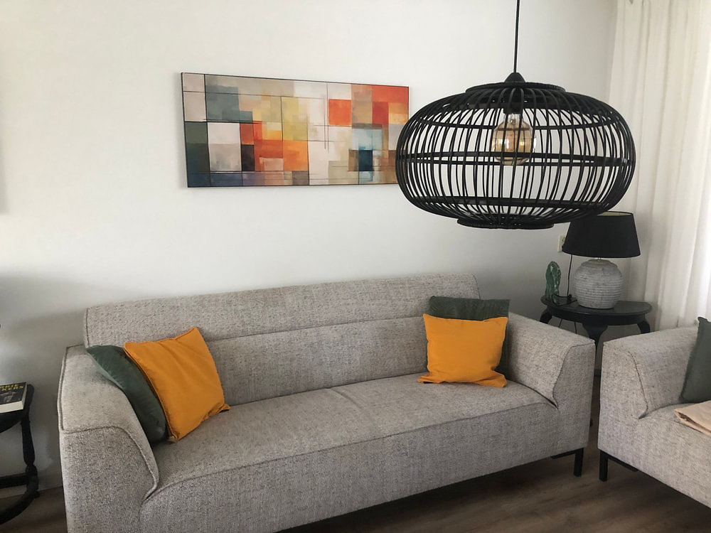
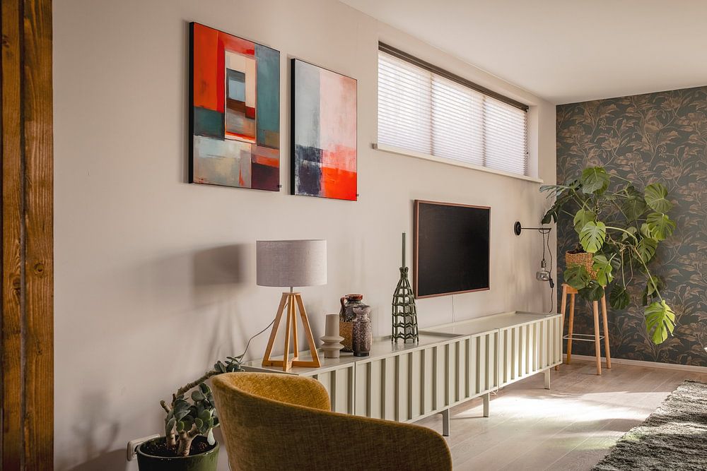
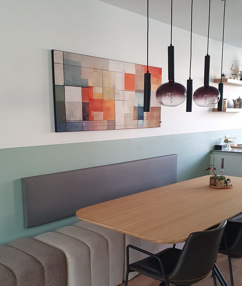
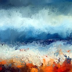
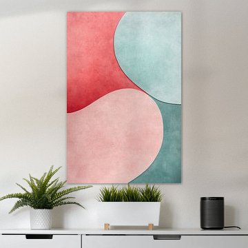
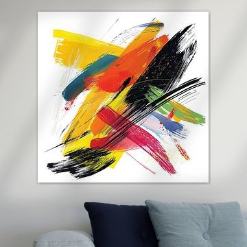
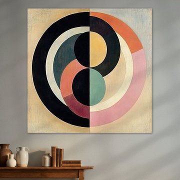
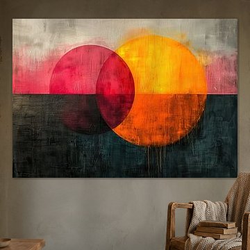
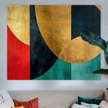
Geometric abstraction suits spaces where you want visual interest without distraction. Living rooms, dining areas, and home offices benefit from structured shapes and contrasting colours. The teal, orange, and red composition in Painting anchors a room while leaving space for conversation and movement.

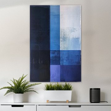
Abstract colour-field compositions invite quiet reflection, so placement matters. Hang them in spaces where you pause naturally - above a reading chair, facing your desk, or in a hallway where you transition between rooms. The layered rectangles in Scandinavian painting reward a slower, closer look.

Customers rate us 4.8!
Sustainable and long-lasting beauty
From small to large, anything is possible.
Made the moment you order.
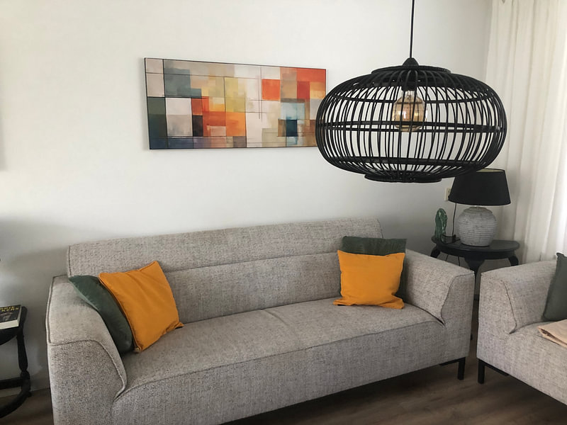
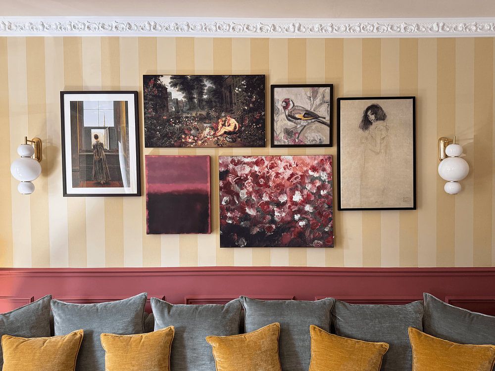
Ode to Mark Rothko artworks carry a calm yet vibrant energy that pairs beautifully with natural textures and understated decor. Combine these warm earthy tones - taupe, beige, terracotta - with linen textiles, ceramic vases, or wooden furniture to let the mysterious depth of each piece breathe. A single statement artwork above a sideboard creates focus, while a curated gallery wall adds layered visual interest. Soften the space with greenery or ambient lighting to complement the collection's serene character.
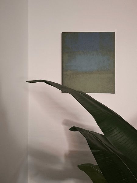
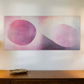
Horizontal formats suit Ode to Mark Rothko artworks especially well, echoing the balanced compositions that define this aesthetic. Hang a wide piece above your sofa or bed to anchor the room and draw the eye across its layered color fields. For narrow walls or hallways, a vertical format offers an elegant alternative that guides attention upward. Match the format to your furniture width - your artwork should feel connected to the space, not floating above it.
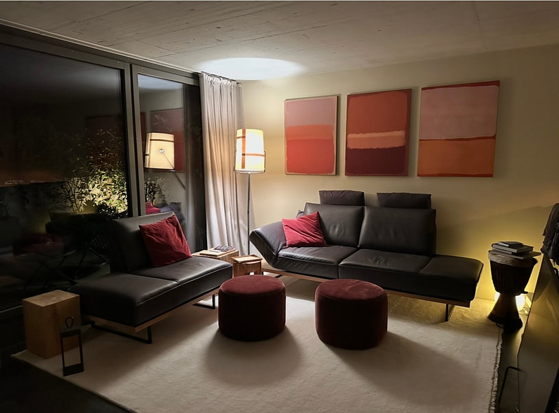
ArtFrame™ brings out the warm, layered tones in Ode to Mark Rothko artworks, while Canvas and Poster offer accessible alternatives. Choose ArtFrame™ - then you benefit from easily interchangeable prints that let you refresh your interior in just five minutes, perfect when you want to shift between the collection's calm and vibrant moods. The optional acoustic panels reduce echo without affecting the artwork's appearance, ideal for living rooms or home offices where these mysterious color compositions deserve to shine in peace. Still doubting which material suits your interior and chosen Ode to Mark Rothko artwork? Use our Material Advisor to find the perfect match.