


Rietje Bulthuis
Photographer
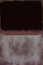
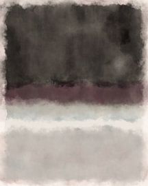
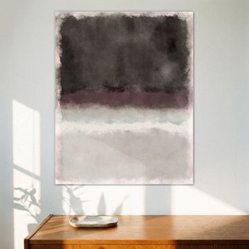
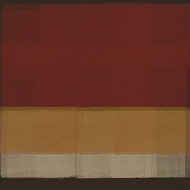
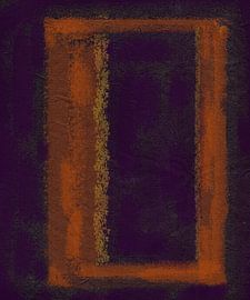
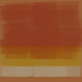
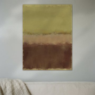
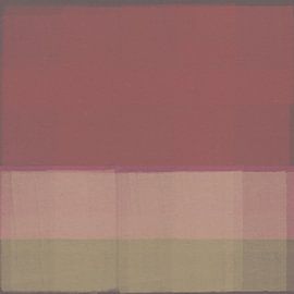
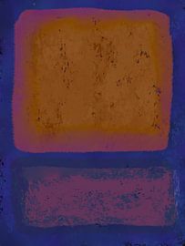
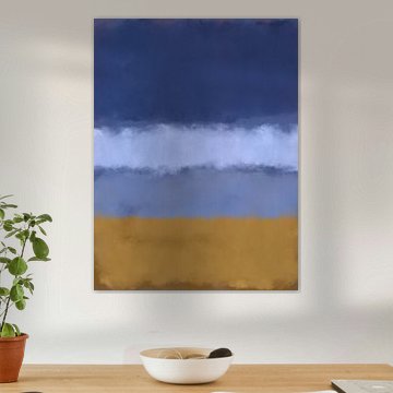
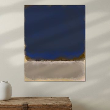
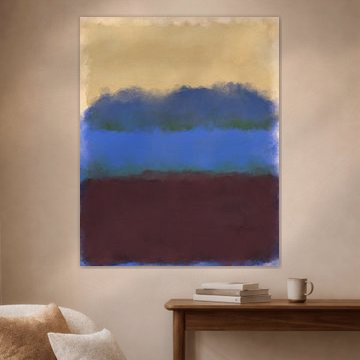
Mark Rothko's color field paintings invite contemplation through bold, luminous rectangles. His signature style brings calm and depth to any space, which is why these abstract compositions remain so powerful today.
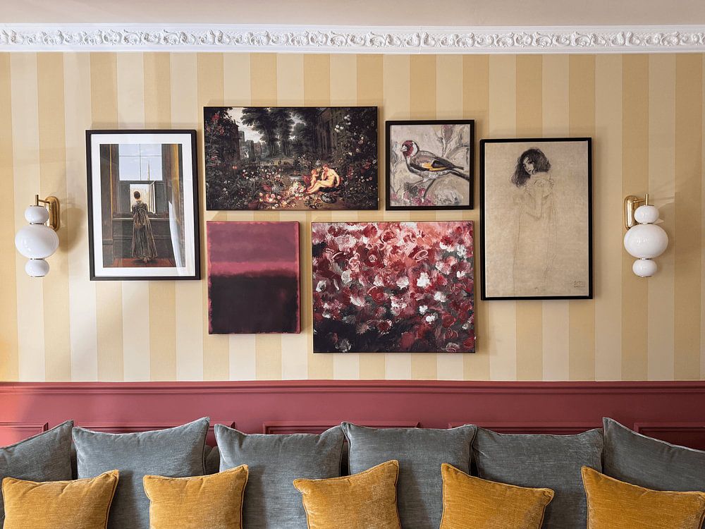
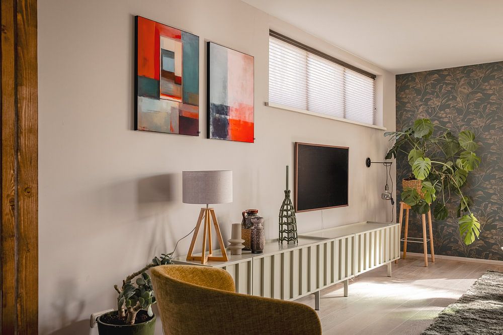
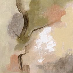
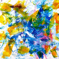
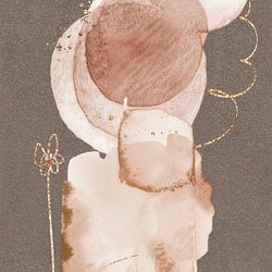
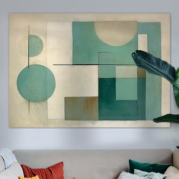
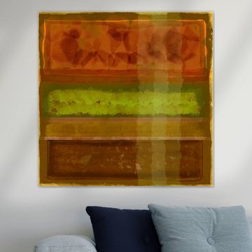
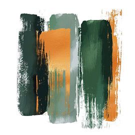
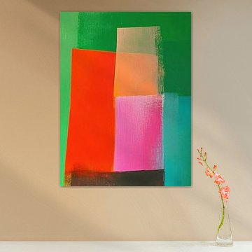
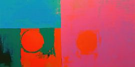
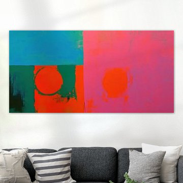
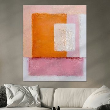
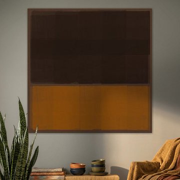
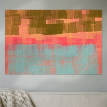
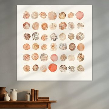
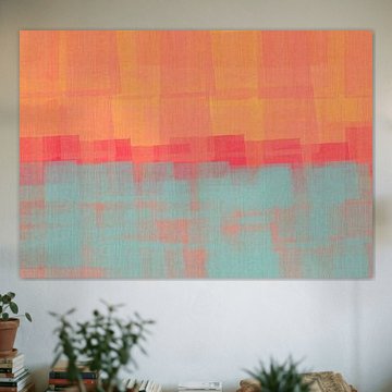
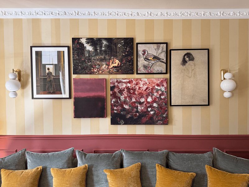
Our collection features soft pinks meeting warm terracotta, deep burgundy layering over muted yellows, and serene greens blending into earthy tones. Modern abstract expressionism. Pink and yellow on orange. shows how irregular rectangles in pink and mustard create delicate textural contrast. These abstract expressionist artworks complement modern, minimalist, and Scandinavian interiors beautifully because their horizontal bands of color add visual balance without overwhelming.
At Art Heroes, we print each artwork to order as Poster, Canvas, Wallpaper, and more. Explore the collection to find what suits your space.
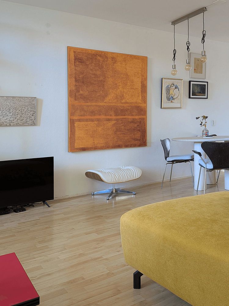
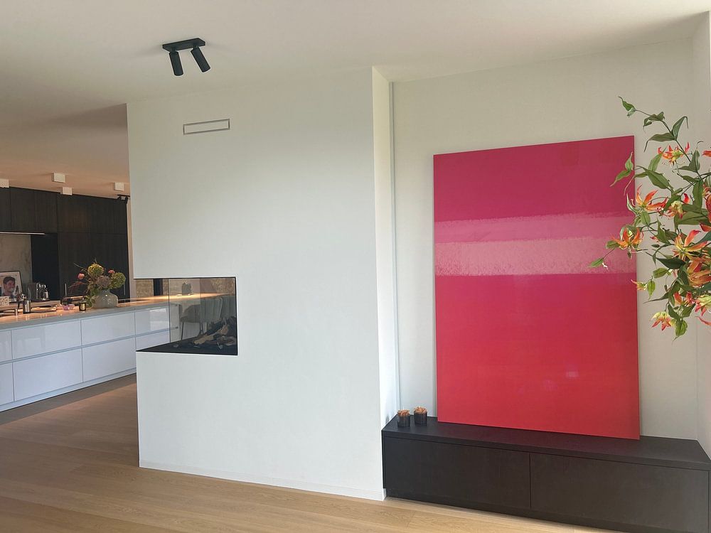
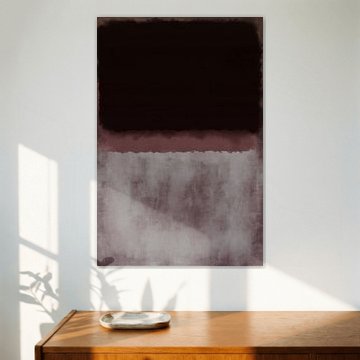
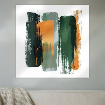
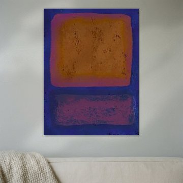
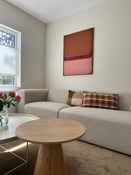
Color field compositions need space to breathe. Hang them on a wall with minimal distraction - away from busy shelving or patterned wallpaper - so the blocks of color can create their contemplative effect. A spot above a sofa or sideboard works well, giving you room to step back and take in the full composition.

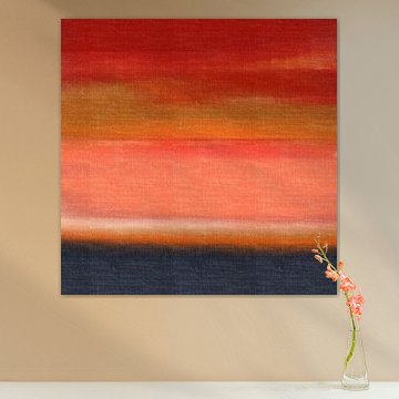
These abstract compositions bring calm energy to spaces where you want to encourage quiet focus or relaxation. Bedrooms, reading corners, and home offices are natural fits. The gentle pink and orange tones in Abstract JG#21 also work beautifully in a hallway, creating a soft, welcoming transition between rooms.

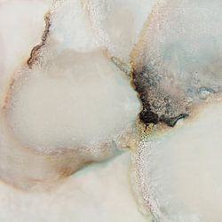
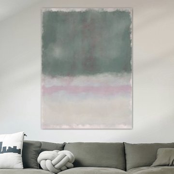
Beige and taupe backgrounds - dominant across this collection - offer a versatile neutral base that allows brighter accent colors to shine without overwhelming your space. Try pairing the warm beige tones in Painting with terracotta cushions or burnt orange throws to echo the artwork's palette and tie your room together.

Customers rate us 4.8!
Sustainable and long-lasting beauty
From small to large, anything is possible.
Made the moment you order.
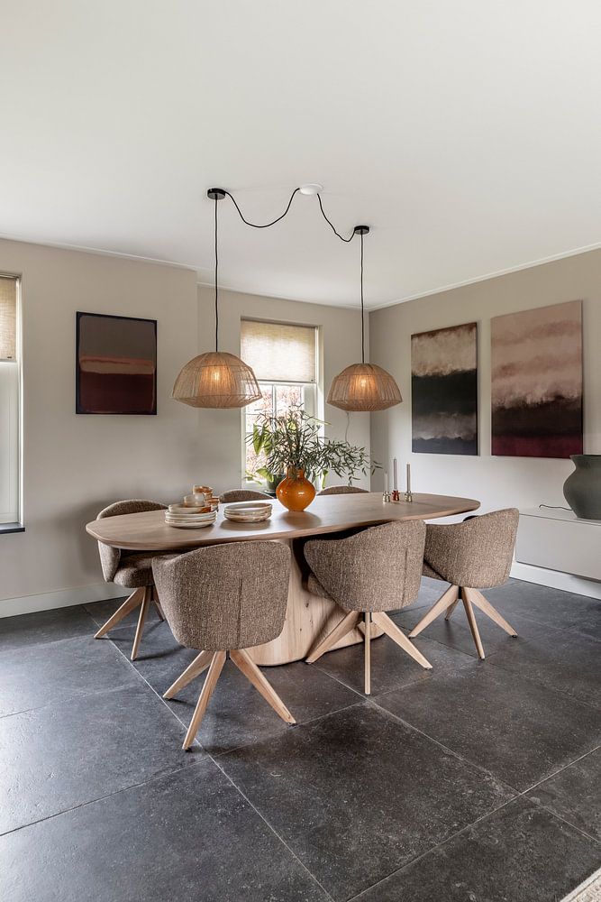
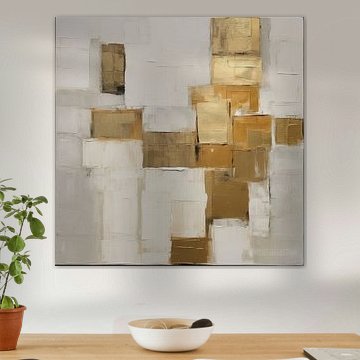
Artworks inspired by Mark Rothko bring warmth through taupe, beige, brown, orange, and terracotta tones that work beautifully in minimalist spaces. These earthy hues create calm focal points without overwhelming clean lines and neutral palettes. Pair taupe and beige pieces with light wood furniture and white walls for a serene look, or combine terracotta and orange artworks with concrete surfaces and black accents for contrast. The subtle color fields complement minimalist interiors by adding depth while maintaining the uncluttered aesthetic that defines the style.
The living room is a good spot for art inspired by Mark Rothko, where large color fields can anchor a seating area and set the mood for the entire space. These abstract artworks work well above a sofa or sideboard, creating a contemplative atmosphere that invites conversation and reflection. The calm yet vibrant compositions suit spaces where you gather and unwind, offering visual interest without demanding attention. Consider placing them where natural light can interact with the layered tones throughout the day, enhancing the subtle shifts in color and mood.
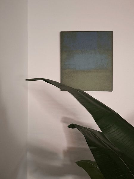
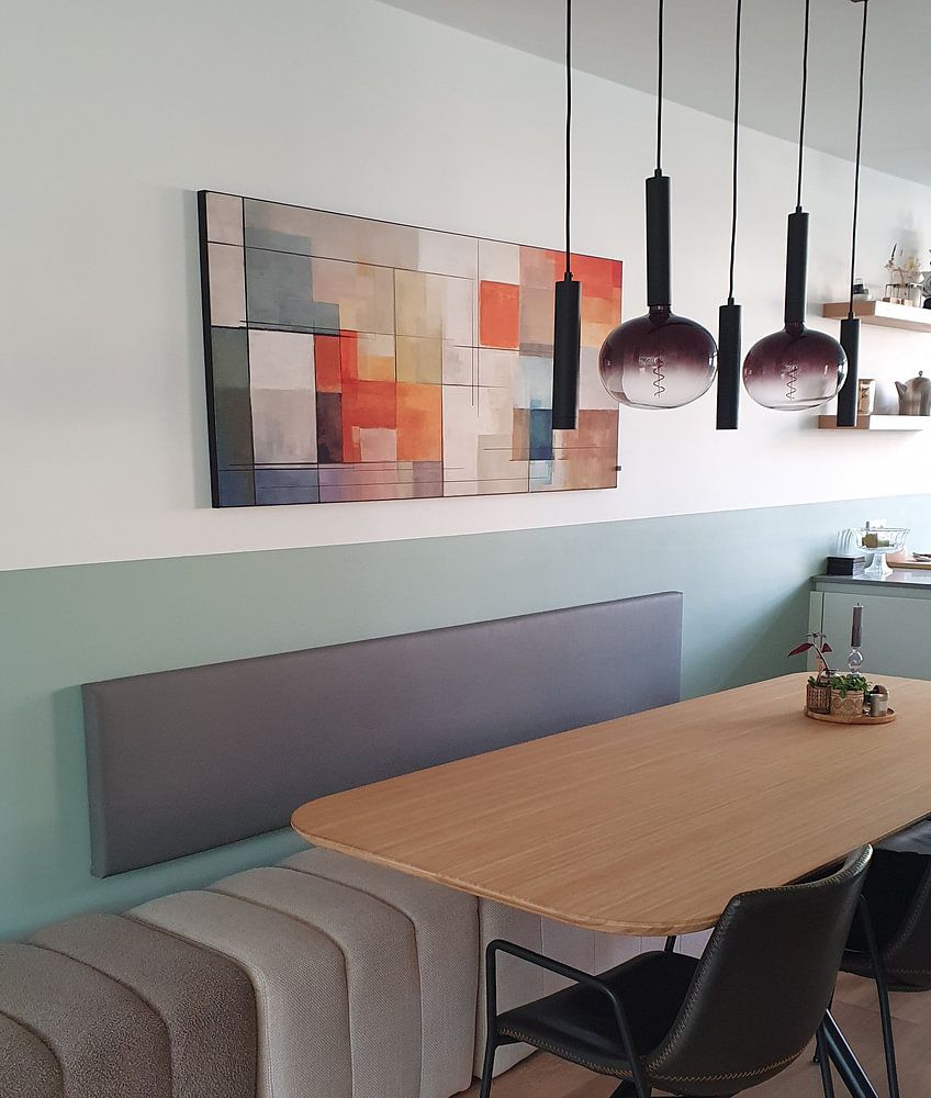
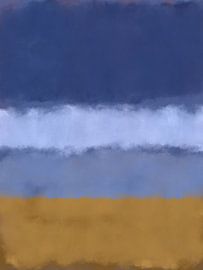
Horizontal formats dominate artworks inspired by Mark Rothko and suit wide wall spaces above sofas, beds, or sideboards particularly well. The landscape orientation echoes the classic composition style and creates a grounding presence in your room. Place horizontal pieces at eye level on feature walls where they can breathe without competing with other elements. Square formats work better for smaller walls or when you want to create a gallery wall arrangement, offering flexibility while maintaining the contemplative quality these abstract compositions bring to your space.