-
More artworks below this tip
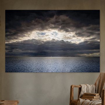
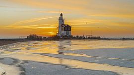
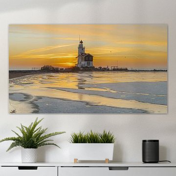
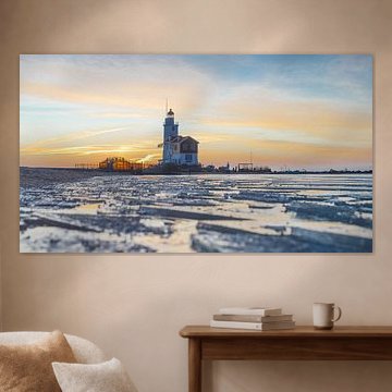
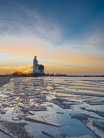
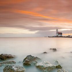
Bring maritime calm to bedrooms
Serene waterside scenes help create restful spaces where you unwind. The calm mood and soft evening light in Sunset at the lighthouse of Marken! make it a good choice for bedroom walls. Hang it where you'll see it from your bed to set a peaceful tone.
EileenStylist & Customer service Questions? Check out our FAQ
 -
More artworks below this tip
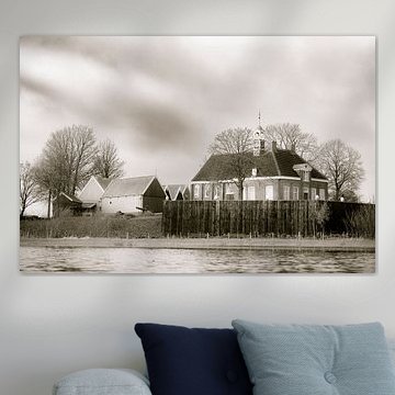
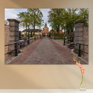
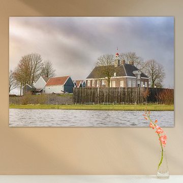
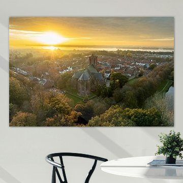
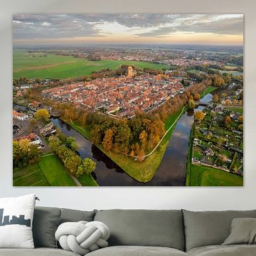
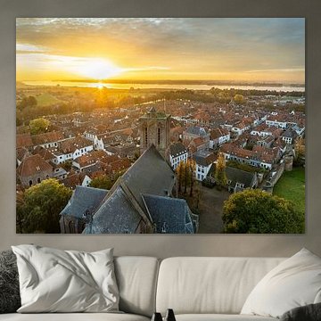
Hang historical scenes in social spaces
Artworks with nostalgic character invite conversation and curiosity. Hoorn: past, present and future! captures architectural detail and historical elements that give guests something to notice and talk about. Consider placing it in your dining room, hallway, or entryway where people naturally gather and pause.
KatharinaStylist & Customer service Questions? Check out our FAQ
 -
More artworks below this tip
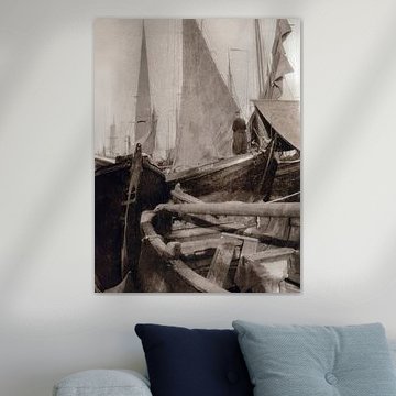
Pair soft pastels with natural textures
Coastal scenes often feature gentle color palettes that work beautifully with organic materials. The purple and mauve tones in Breathe again! pair well with linen curtains, jute rugs, or light wooden furniture. These combinations create a calm, natural atmosphere in living rooms or bedrooms.
AnouschkaArt Stylist Questions? Check out our FAQ
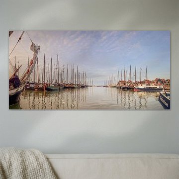
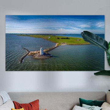
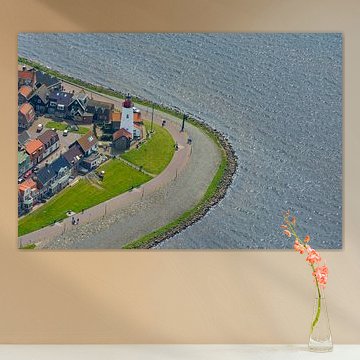
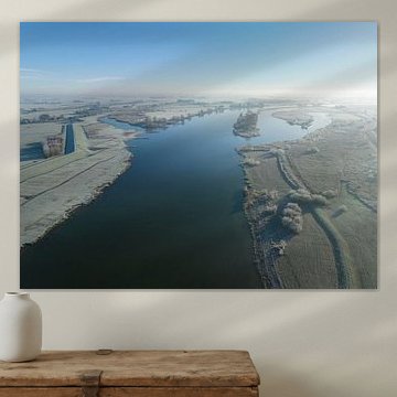
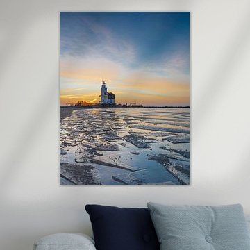
Markermeer
Markermeer artworks capture the quiet beauty of Dutch coastal life. The iconic lighthouse, calm waters, and changing skies create a soothing visual rhythm that works beautifully in Scandinavian and modern interiors. From the golden-hour glow in Lighthouse Marken The Netherlands square format to the stormy drama in Marken, these pieces bring peaceful maritime character to your walls.
We print each piece to order on your preferred material - Canvas, ArtFrame™, Poster and more. Choose what suits your space and discover your coastal style.


Trusted and loved
Customers rate us 4.8!
High-quality materials
Sustainable and long-lasting beauty
Different sizes
From small to large, anything is possible.
Made for you
Made the moment you order.


More like this


Which colors from the Markermeer collection suit a Scandinavian interior?
The Markermeer collection brings together soft blues, greys, and taupe tones that work beautifully in a Scandinavian interior. Combine the blue and grey artworks with light wooden furniture and white walls for that characteristic Nordic calm. The mauve and brown shades add warmth when paired with natural textiles like linen or wool, creating a balanced look that feels both fresh and inviting.
Where does Markermeer art work well in your home?
A bedroom is a good spot for Markermeer artworks, where the calm and mysterious moods help create a restful atmosphere. The soft color palette won't overwhelm the space, making it easier to unwind at the end of the day. Hang a landscape-format piece above your bed or place a square artwork on a dresser to bring the tranquil character of the Markermeer into your personal space.
Which format works best for Markermeer artworks?
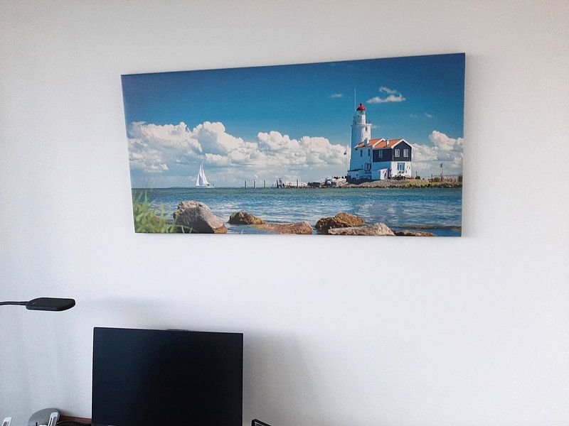
Landscape formats are popular in the Markermeer collection and suit wider walls particularly well. A horizontal piece works above a sideboard in your hallway or along an empty wall in your living room, drawing the eye across the space. If you're working with a narrow wall or want to add height to a room, a portrait format can be a better choice to balance the proportions.
Ready to bring the Markermeer into your space? Choose your favorite artwork as a Poster and select the size and optional frame that works for you. We print each piece with care on thick 260-gram satin photo paper using UV-resistant inks, so your colors stay vibrant year after year.
