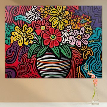
-
More artworks below this tip
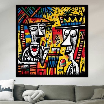
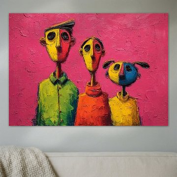
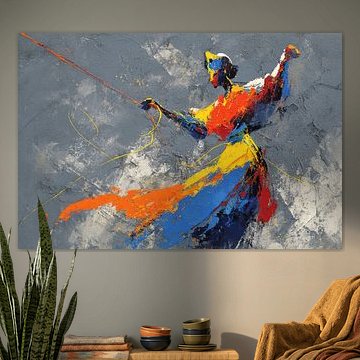
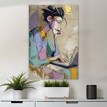
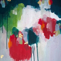
Create Energy in Social Spaces
Playful, expressive artworks bring energy to rooms where people gather. The dynamic composition and vivid palette in Crazy 9 make it well-suited for living rooms, dining areas, or creative workspaces where a lively atmosphere feels right.
AnthiStylist & Customer service Questions? Check out our FAQ
 -
More artworks below this tip
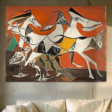
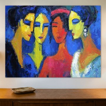
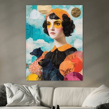
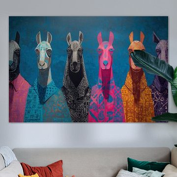
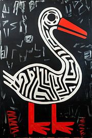
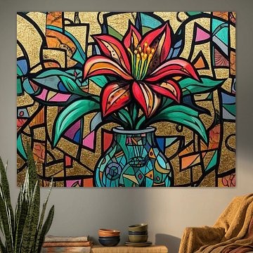
Choose Portrait or Landscape to Match Your Wall
Both portrait and landscape formats are equally popular for this collection. Consider your available wall space: portrait works well on narrow walls or between windows, while landscape suits wider spaces above sofas or sideboards. Choose what fits your interior best.
LianneStylist & Customer service Questions? Check out our FAQ
 -
More artworks below this tip
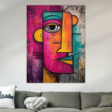
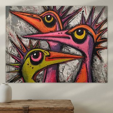
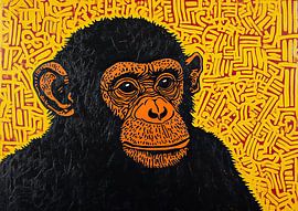
Position at Eye Level for Maximum Impact
Bold, graphic artworks command attention when hung at eye level - typically 145 - 150 cm from the floor to the center of the artwork. This placement lets you appreciate the expressive details and vibrant color combinations without straining your view.
RosanneStylist & Customer service Questions? Check out our FAQ
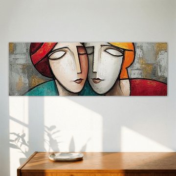
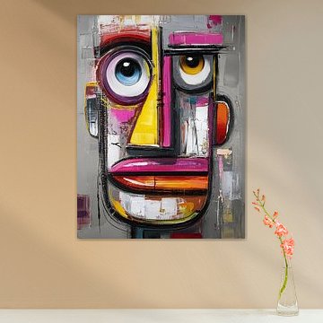
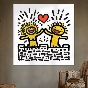
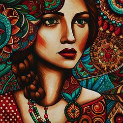
Ode to Keith Haring
Looking for bold color and graphic energy? Ode to Keith Haring captures the playful spirit and social awareness that made Haring's visual language unforgettable. Vibrant reds, striking blacks, and dynamic shapes fill these artworks, which work beautifully in modern and eclectic interiors where you want to make a statement. Inspired by Keith Haring brings that iconic street-art feel into your space with two stylized figures forming heart shapes - a joyful tribute to connection and movement.
At Art Heroes, every piece is custom-made and ships free, so you can explore ArtFrame™, canvas, poster and more to find what fits your space.


Trusted and loved
Customers rate us 4.8!
High-quality materials
Sustainable and long-lasting beauty
Different sizes
From small to large, anything is possible.
Made for you
Made the moment you order.


More like this


Which room format works best for Ode to Keith Haring?
The square format dominates this collection and suits modern interiors beautifully. Hang a square artwork above your sideboard or console table to create visual balance. This format also works well in hallways where wall space is limited. If you're decorating a wider wall above your sofa, choose a landscape format instead for better proportions.
How to match Ode to Keith Haring with modern interiors
The bold combination of blue, yellow, and mauve makes Ode to Keith Haring a natural fit for modern and minimalist interiors. Pair the vibrant yellow tones with neutral furniture in beige or white to let the artwork stand out. The playful energy of these colors works especially well in living rooms and creative workspaces where you want an energizing atmosphere.
Choosing the right material
Ode to Keith Haring comes to life on each of our premium materials. Whether you choose Poster, Canvas, or ArtFrame™, each enhances the unique details and colors.
Choose Poster and you benefit from museum-grade prints on thick satin photo paper weighing 260 grams. The UV-resistant inks are particularly valuable for this collection, as they preserve the joyful blue and yellow hues year after year without fading. The vibrant, playful character of Ode to Keith Haring demands colors that stay true over time, especially if you display your artwork in bright rooms. The substantial 260-gram paper gives each piece a luxurious feel that matches the bold, graphic nature of the collection. You can frame your poster yourself or select one of our optional frames in black, white, natural, dark brown, or aluminum.
Still doubting which material suits your interior and chosen Ode to Keith Haring artwork? Use our material comparator to find the perfect match for your space.
