





































db Waterman
Painter
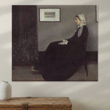
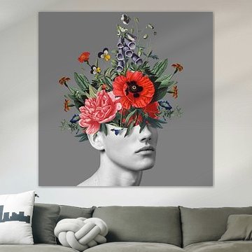
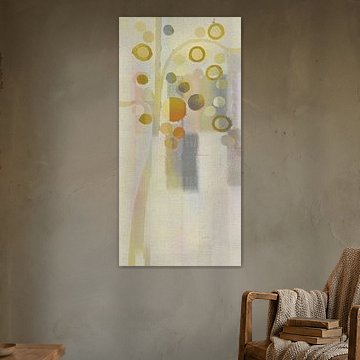
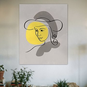
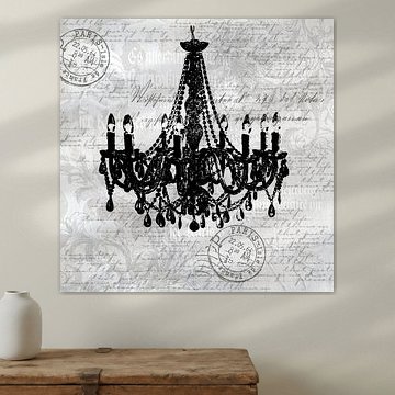
Pantone 2021 brought us two colors: optimistic yellow and grounding gray. Together, they speak of hope balanced with quiet strength. A palette that feels both energizing and calm.
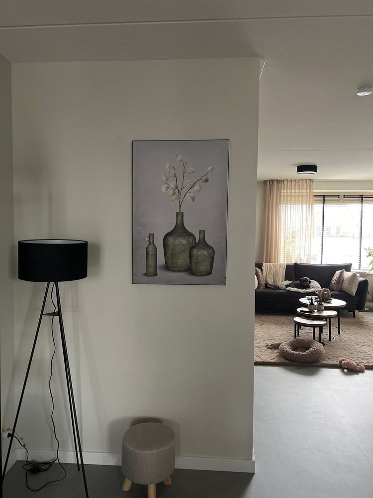
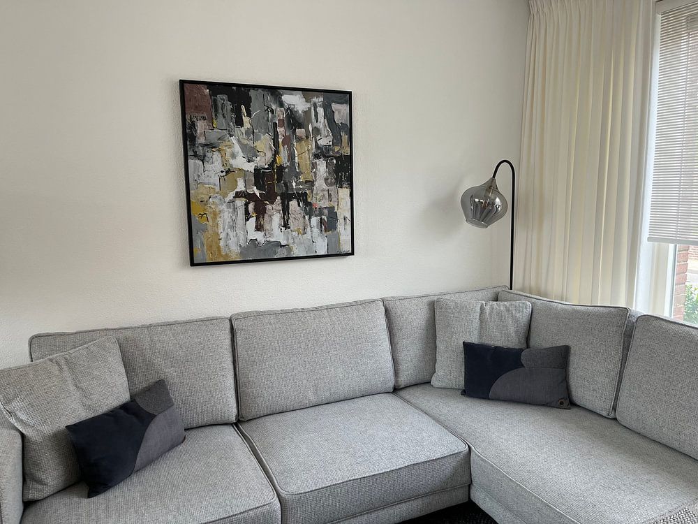
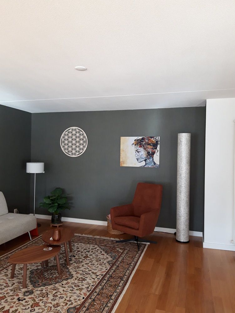
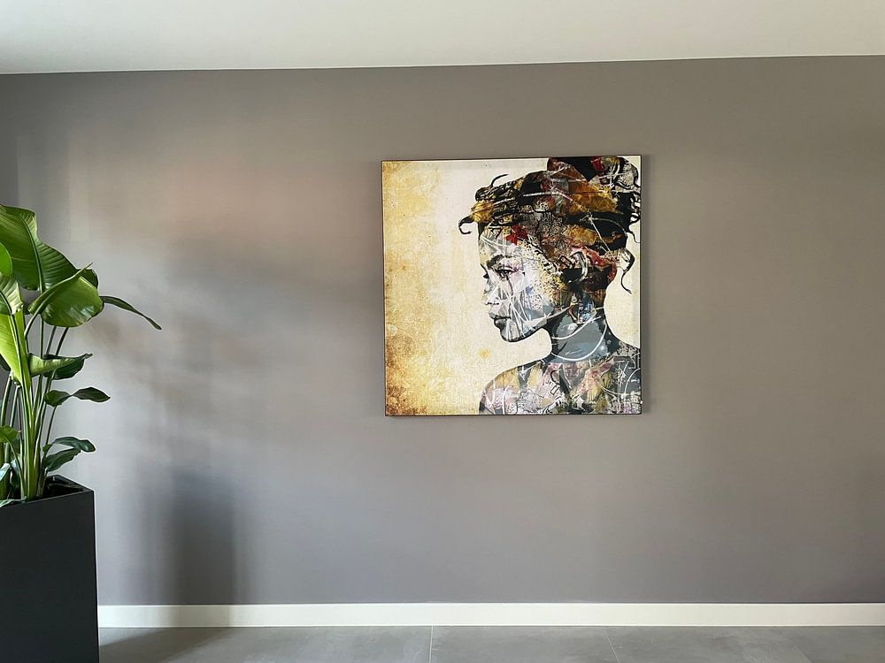
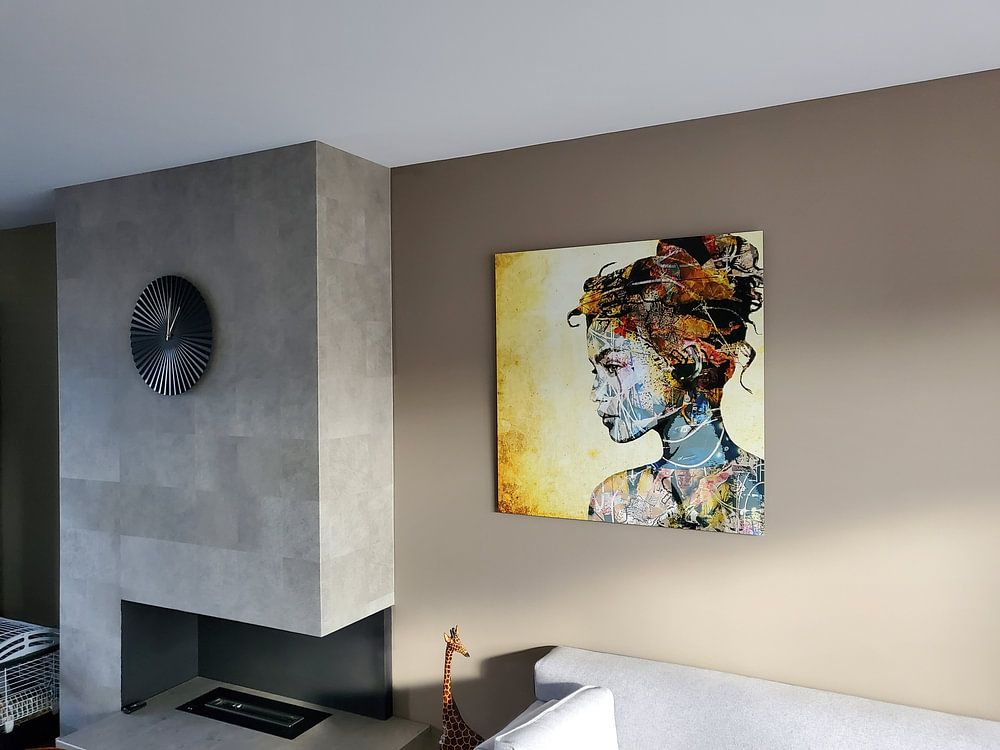
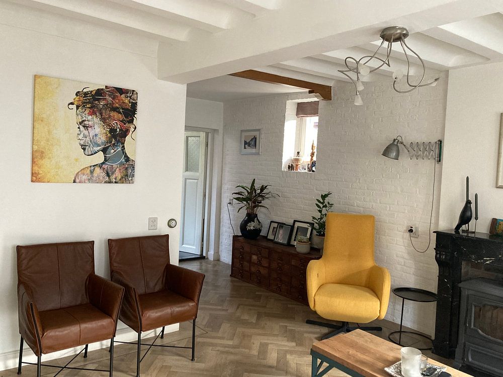
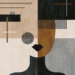
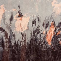
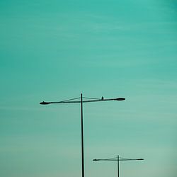
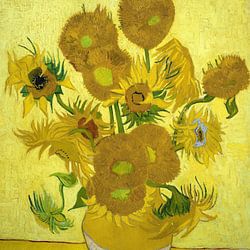
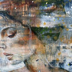
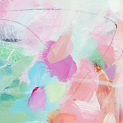
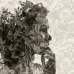
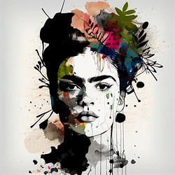
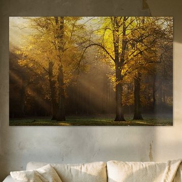
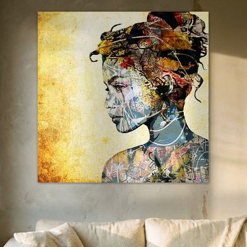
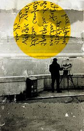
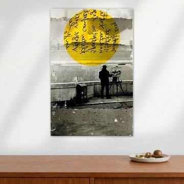
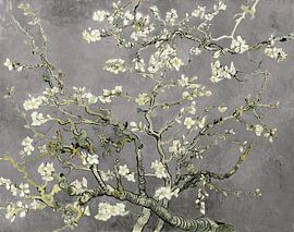
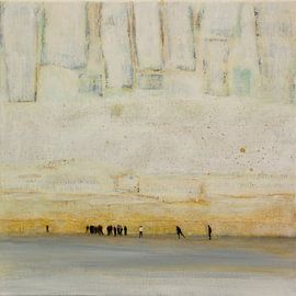
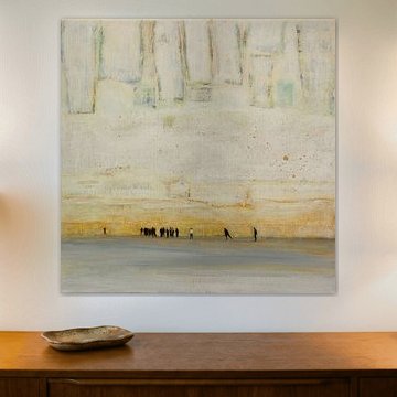
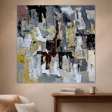
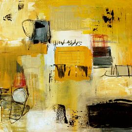
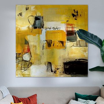
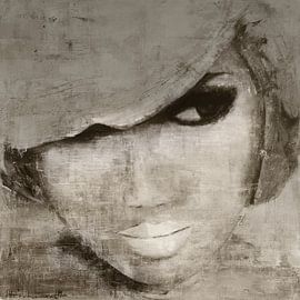
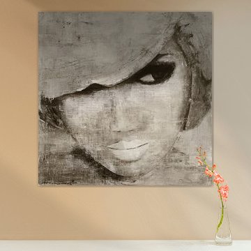
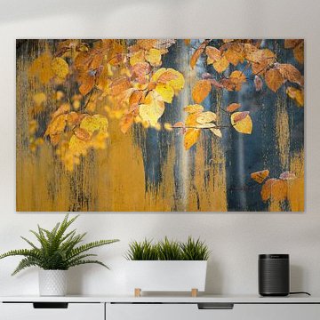
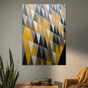
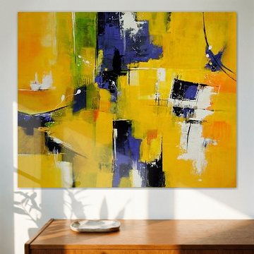
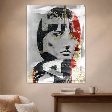
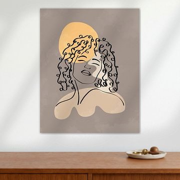
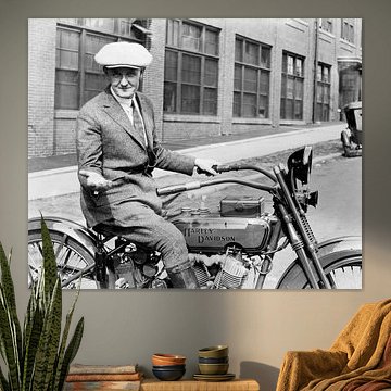
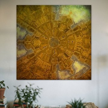
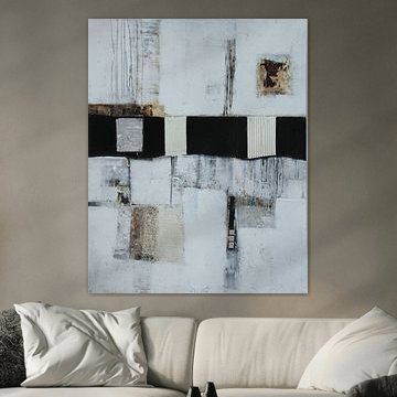
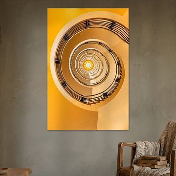
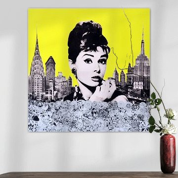
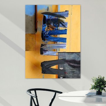
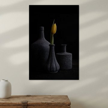
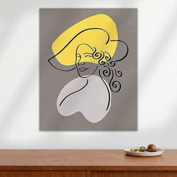
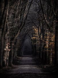
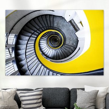
These artworks reflect that duality. From golden autumn light filtering through forest trees to abstract compositions layering soft grays and warm golds, each piece captures Illuminating Yellow and Ultimate Gray in its own way. In yellow glows with natural warmth, while Silence explores understated elegance. The collection fits modern, Scandinavian, or minimalist interiors where color tells a story without shouting.
Choose what suits your space. Available as ArtFrame™, Canvas, Poster and more.
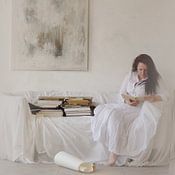
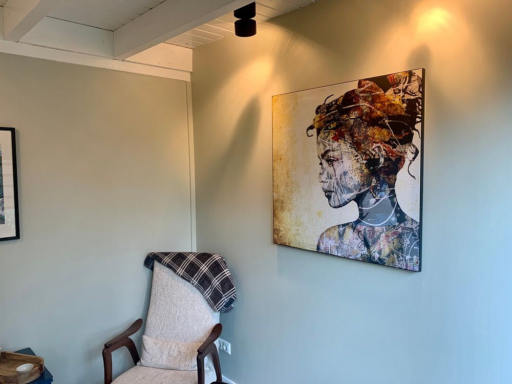
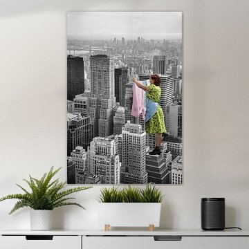
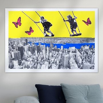
Artworks with collage-style layering benefit from focused viewing at eye level. Position them where you naturally pause - hallways, reading corners, or near seating areas - so the intricate details reveal themselves gradually. The textured surface and woven lines in THE GIFTED GIRL reward closer inspection in intimate spaces.

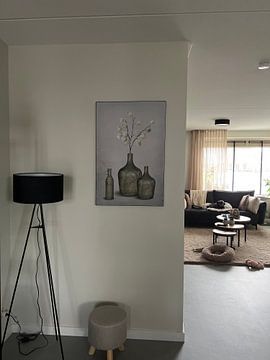
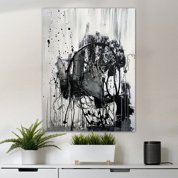
Match the atmosphere of your artwork to the room's purpose and light. Spaces with soft, diffused natural light suit contemplative pieces that invite quiet reflection. The muted tones and calm mood of NO FINISH LINE work well in bedrooms, reading nooks, or minimalist living areas where you want a peaceful backdrop.

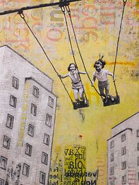
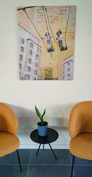
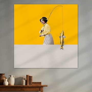
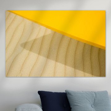
Yellow and beige create a welcoming foundation that works beautifully alongside natural materials. Combine these warm hues with wooden furniture, woven textiles, or terracotta accents to enhance their grounded, sunlit quality. The yellow and beige palette in SUNDAY SWING pairs effortlessly with light oak or rattan pieces.

Customers rate us 4.8!
Sustainable and long-lasting beauty
From small to large, anything is possible.
Made the moment you order.
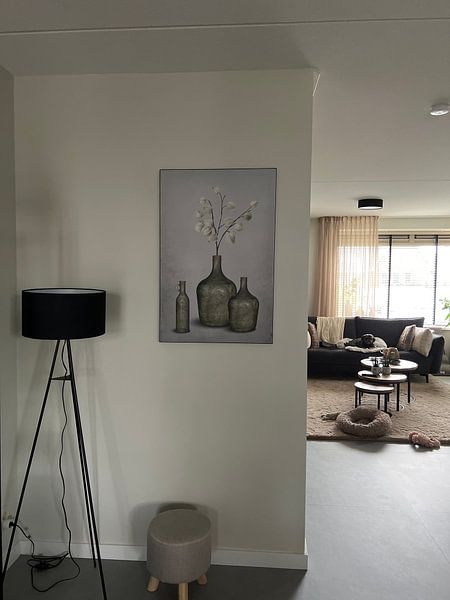
Pantone 2021 is a good spot for a home office where calm focus meets vibrant energy. The combination of grey and white creates a neutral backdrop that supports concentration, while gold and yellow accents inject warmth without distraction. These tones help maintain a productive atmosphere while preventing the space from feeling too sterile or clinical, making long working hours more pleasant.
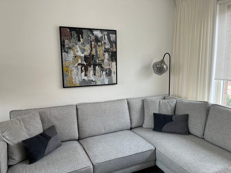
ArtFrame™ suits this collection's balanced palette, offering clean edges that complement the grey and white tones. Poster and Canvas work as accessible alternatives when you want flexible styling options.
Choose ArtFrame™ and you benefit from easily interchangeable prints that let you refresh your workspace as often as your projects change - simply swap the artwork without replacing the frame. The grey and white pieces gain extra definition through the modern aluminum frame, available in colors that either blend seamlessly or add contrast through gold or black finishes. You also gain an acoustic function: optional sound-dampening panels reduce echo in your workspace while remaining invisible behind the print, creating a quieter environment that supports better focus during calls and deep work.
Still doubting which material suits your interior and chosen Pantone 2021 artwork? Use our Material Advisor to find the perfect match.
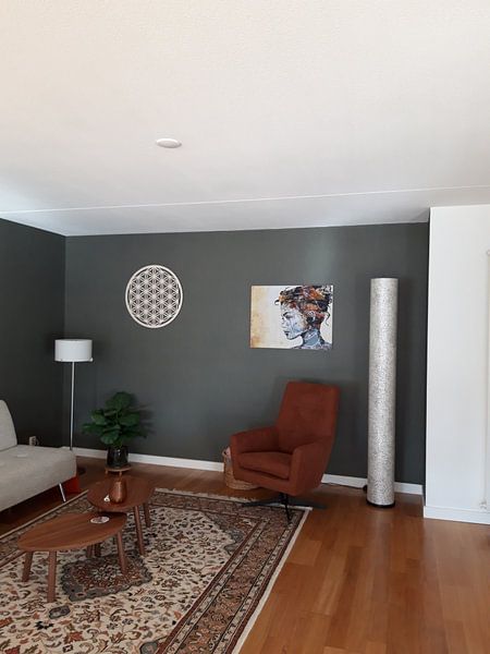
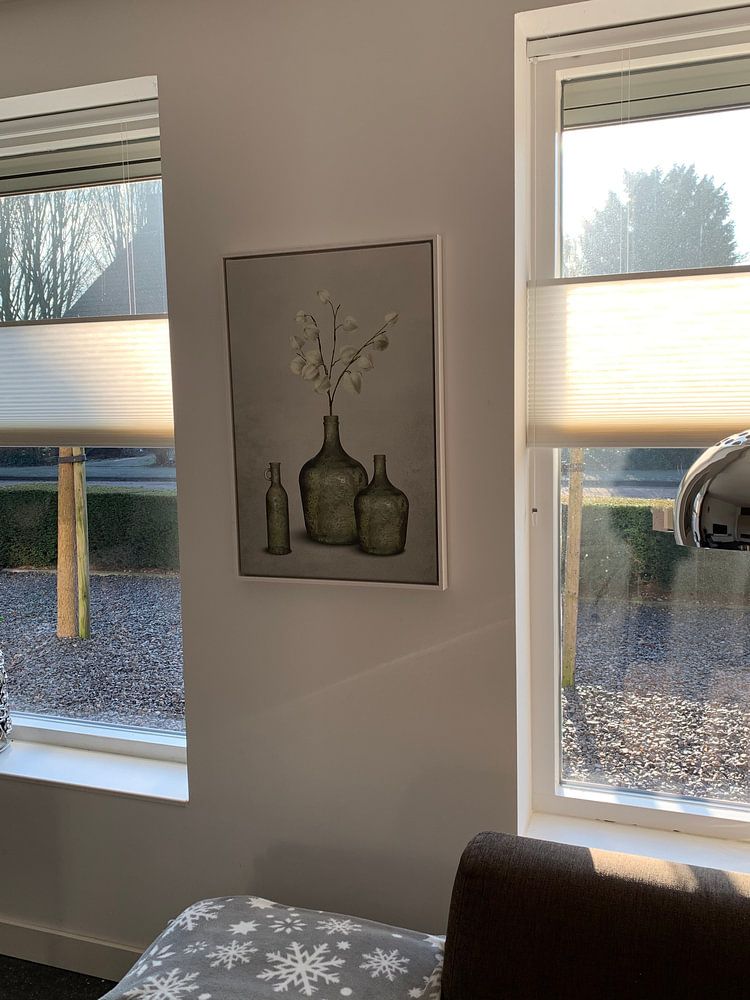
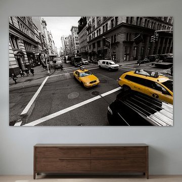
Pantone 2021 looks strong in horizontal formats, which work particularly well above a desk or credenza where the width emphasizes the calm, grounded mood of the collection. A horizontal piece fills the wall space without overwhelming it, creating visual balance in your workspace. If you're working with a narrow wall between windows or beside a bookshelf, a vertical format offers better proportion and makes the most of limited width.