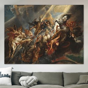
-
More artworks below this tip
Consider height when hanging portraits
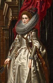
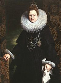
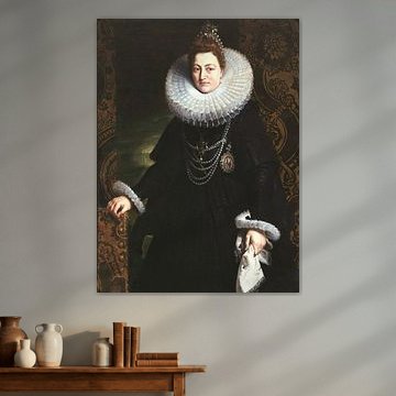
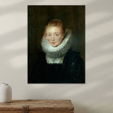
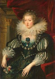
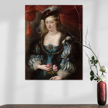
Baroque portraits were often designed to be viewed from below, creating a sense of grandeur. If you're working with high ceilings or a stairwell, placing Marchesa Brigida Spinola Doria, Peter Paul Rubens. above eye level brings out the architectural perspective the artist intended. The upward gaze feels natural in these spaces.
AnouschkaArt Stylist Questions? Check out our FAQ
 -
More artworks below this tip
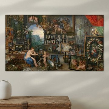
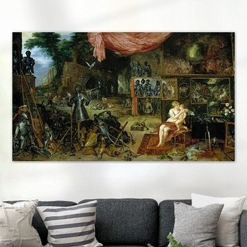
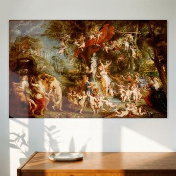
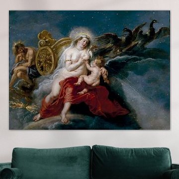
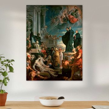
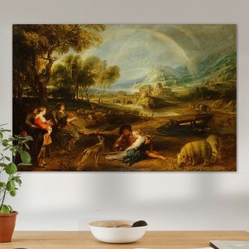
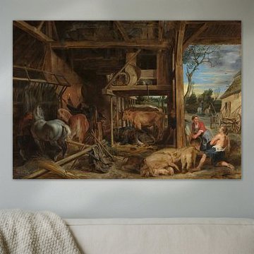
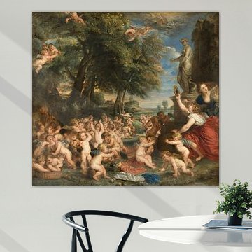
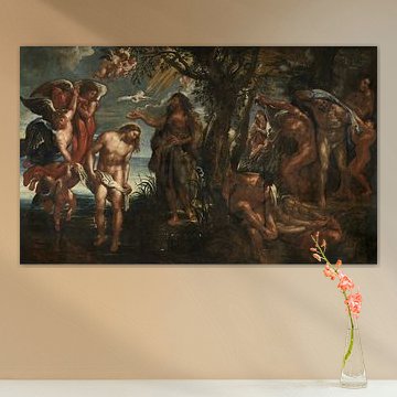
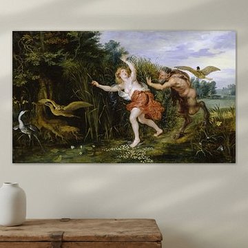
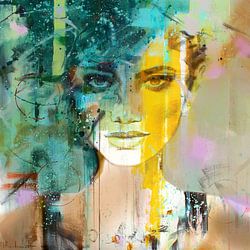
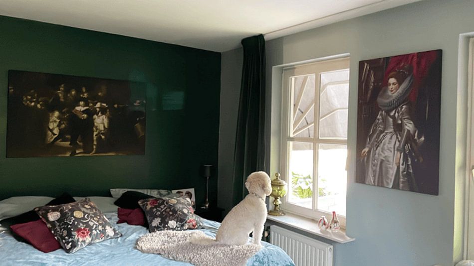
Portrait and landscape formats offer flexibility
Both portrait and landscape orientations are popular choices in this collection. Portrait format suits narrower wall spaces like hallways or beside doorways, while landscape works well above sofas or sideboards. Choose the format that fits your available wall space.
RosanneStylist & Customer service Questions? Check out our FAQ
 -
More artworks below this tip
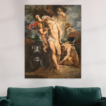
Pair rich earth tones with textured fabrics
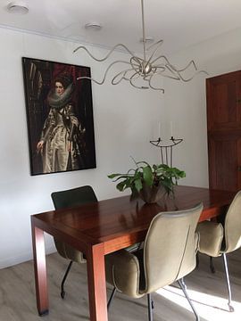
Deep browns and burgundy work beautifully alongside velvet, leather, or woven materials. The warm terracotta and mauve tones in Marchesa Brigida Spinola Doria, Peter Paul Rubens. complement natural wood furniture and brass accents. This combination adds depth without overwhelming your room with competing colors.
EileenStylist & Customer service Questions? Check out our FAQ
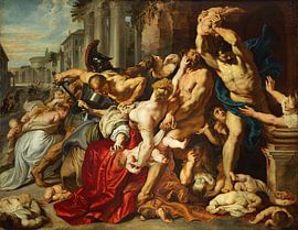
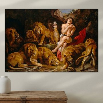
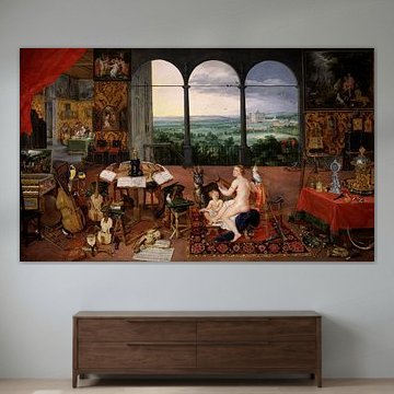
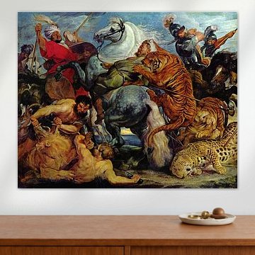
Peter Paul Rubens
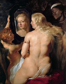
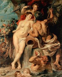
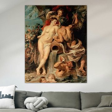
Rubens brings drama and warmth into your space. His rich color palettes - deep bronzes, earthy olives, soft taupes - create depth without overwhelming. Whether you're drawn to the romantic elegance of classical portraits or the vibrant energy of mythological scenes, his compositions feel both grand and intimate. Works like Peter Paul Rubens . Venus in front of the mirror, 1612 showcase his mastery of light and texture, which translates beautifully across different interior styles.
At Art Heroes, we print each piece to order with care. Choose your size and material - from Canvas to ArtFrame™ and more - to match your space perfectly.


Trusted and loved
Customers rate us 4.8!
High-quality materials
Sustainable and long-lasting beauty
Different sizes
From small to large, anything is possible.
Made for you
Made the moment you order.
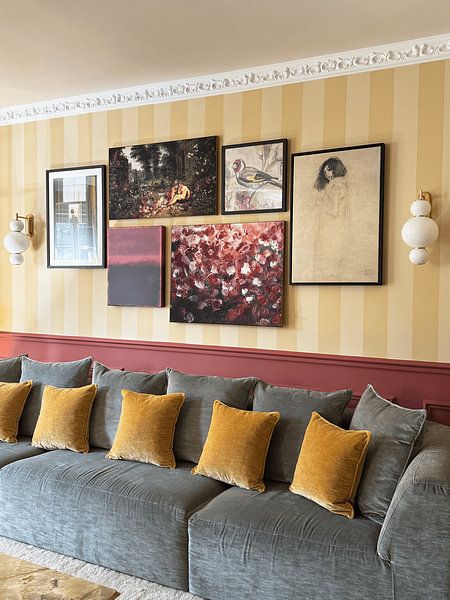
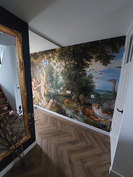
How they hang in other homes
Get inspired by beautiful artworks on other people's walls and see how they truly enhance an interior.


More like this


Choosing the right material for Peter Paul Rubens artworks
Peter Paul Rubens comes to life on each of our premium materials. Whether you choose Poster, Canvas, or ArtFrame™, each enhances the unique details and colors that define this collection.
Choose Poster and you benefit from museum-grade quality that does justice to the rich brown, taupe, and bronze tones found throughout Peter Paul Rubens artworks. The heavy 260-gram satin photo paper delivers prints with depth and substance, while UV-resistant inks ensure the warm olive green and beige hues maintain their intensity year after year. This matters especially for Peter Paul Rubens reproductions, where subtle color transitions and powerful compositions rely on accurate, fade-resistant printing. The thick, durable paper gives each piece a luxurious appearance that matches the calm yet powerful moods these artworks convey, while flexible framing options let you choose black, natural, or white frames to complement your interior.
Still doubting which material suits your interior and chosen Peter Paul Rubens artwork? Use our material comparator to find the perfect match for your space.
Where to display Peter Paul Rubens in your home
Portrait formats dominate this collection, making Peter Paul Rubens artworks ideal for narrower wall spaces where you need vertical impact. Hang them above a sideboard in your hallway, between windows in your living room, or on the wall beside your bed. The vertical composition naturally draws the eye upward, adding height to rooms with standard ceilings. When you have a wider wall above your sofa or dining table, consider square formats instead - they create balance without overwhelming the space.
Which interior styles suit Peter Paul Rubens artworks
The warm brown, taupe, and bronze palette in Peter Paul Rubens artworks pairs naturally with classic and rustic interiors. In classic spaces, combine these earthy tones with dark wood furniture, cream walls, and brass or gold accents to create a refined, cohesive look. For country or rustic styles, the olive green and beige shades work beautifully alongside natural materials like linen, weathered wood, and stone. These colors bring depth without adding visual noise, letting the romantic and calm moods shine through in any room you choose.
