










Marja van den Hurk
Mixed-media artist
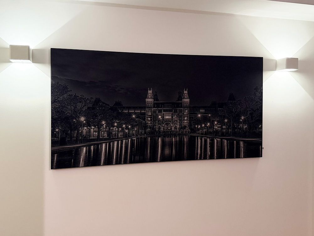
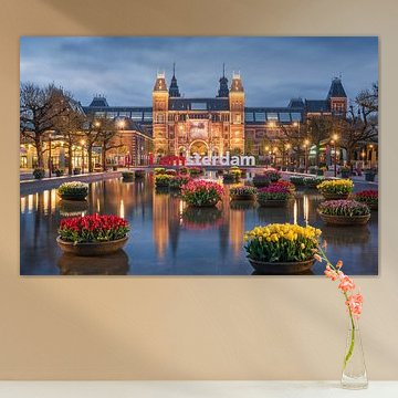
Looking for art that captures Dutch heritage with a contemporary twist? The Rijksmuseum Amsterdam collection blends historic charm with modern energy, from classic portraits to reimagined masterpieces. Rich earth tones meet bold splashes of color, while nostalgic scenes pair with vibrant pop art interpretations - perfect for interiors that honor tradition without feeling dated. Rijksmuseum and tulips showcases the museum's iconic facade bathed in twilight, surrounded by tulips in full bloom.
Available as Canvas, Poster, ArtFrame™ and more, so you can choose what suits your space. Explore timeless Dutch artistry, refreshed for today.
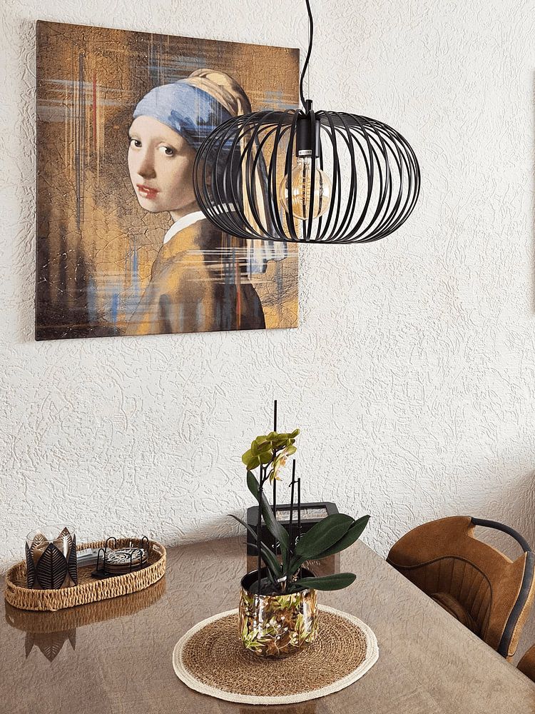
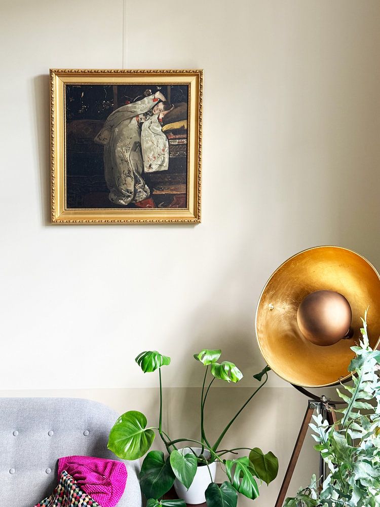
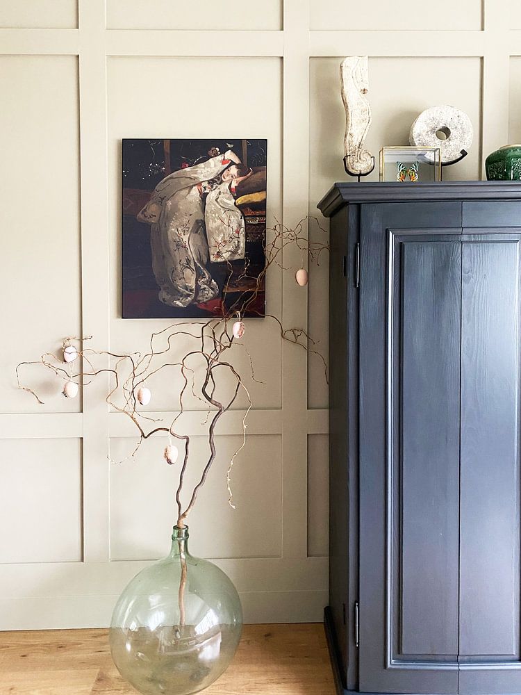
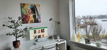
Dark backgrounds draw the eye and add depth without overwhelming your wall. They work well in rooms with plenty of natural light or alongside lighter furniture. The gradient backdrop in Meisje met de Parel – The almost Black & White Edition demonstrates how shadowy tones can frame a focal point effectively.

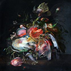
If your walls and furniture lean neutral, a vibrant arrangement adds energy without requiring a full room redesign. Burgundy, violet, and emerald green bring warmth and character to pale or grey surroundings. The rich tones in Floral still life - Floral Majesty show how color can stand out beautifully.

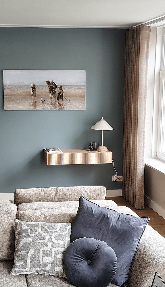
Earthy brown and taupe shades pair naturally with cooler blues and greys, creating balance without clashing. These combinations suit both modern and traditional interiors. You'll find this color harmony throughout the Rijksmuseum Amsterdam collection, making it easy to match your existing décor.

Customers rate us 4.8!
Sustainable and long-lasting beauty
From small to large, anything is possible.
Made the moment you order.
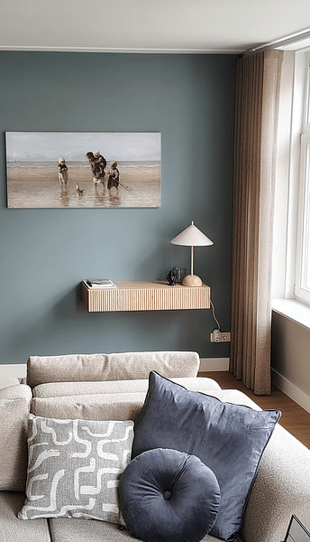
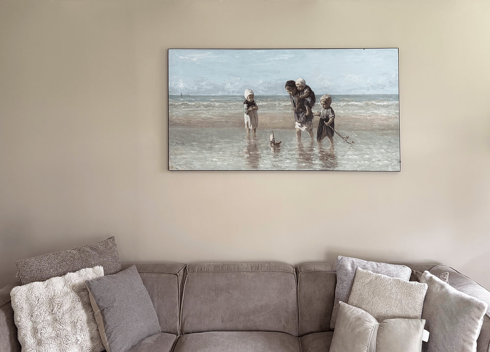
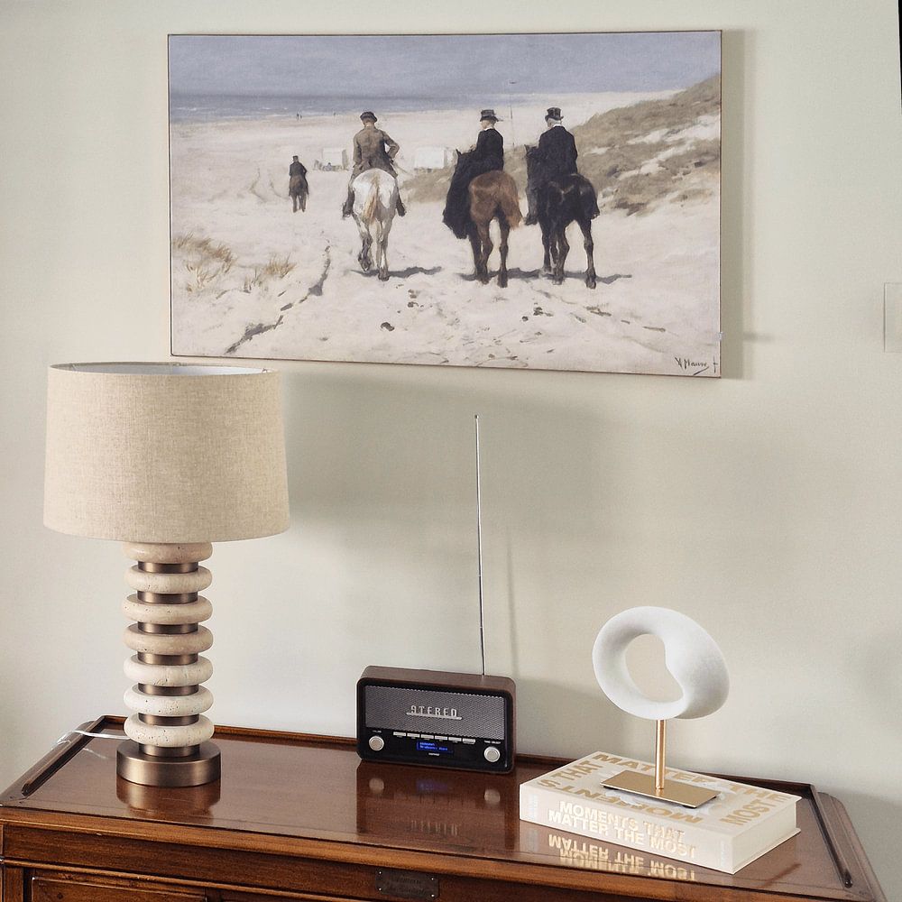
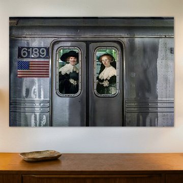
The rich brown and beige tones found in Rijksmuseum Amsterdam artworks pair beautifully with classic interiors. These warm, earthy hues create depth when combined with wooden furniture and brass accents. Add touches of blue through textiles or decorative objects to balance the warmth, while taupe walls provide a sophisticated backdrop that lets the artwork take center stage without competing for attention.
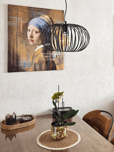
A living room is a good spot for Rijksmuseum Amsterdam artworks, especially when you want to introduce a calm, nostalgic atmosphere. The brown and beige color palette creates a grounding effect above a sofa or sideboard, inviting quiet reflection during evening hours. These tones naturally complement neutral upholstery and wooden surfaces, helping the space feel collected and thoughtful rather than staged or impersonal.
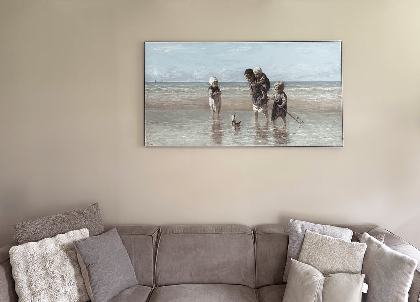
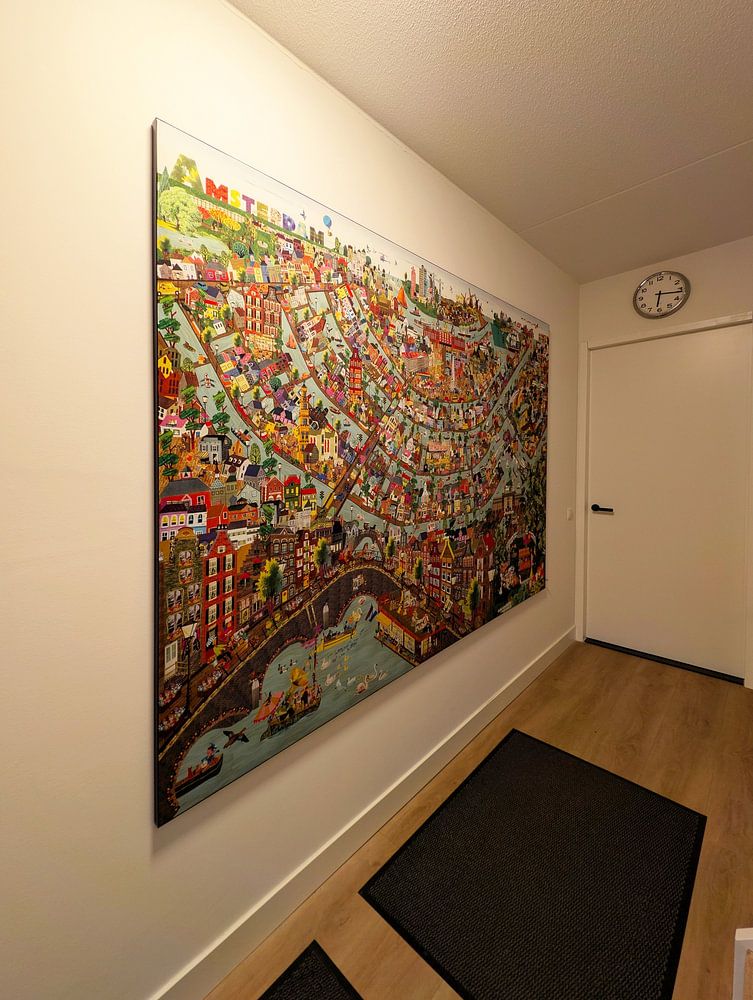
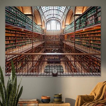
Rijksmuseum Amsterdam artworks respond well to layered styling that honors their calm, mysterious character. Place vintage books, ceramic vases in muted glazes, or dried botanicals nearby to echo the nostalgic mood without overwhelming it. Consider pairing a large Wallpaper with smaller framed pieces in similar tones to create visual rhythm along a hallway or behind a dining table. Choose what suits your space and let the collection's quiet presence guide your choices.