Anton de Zeeuw
Photographer
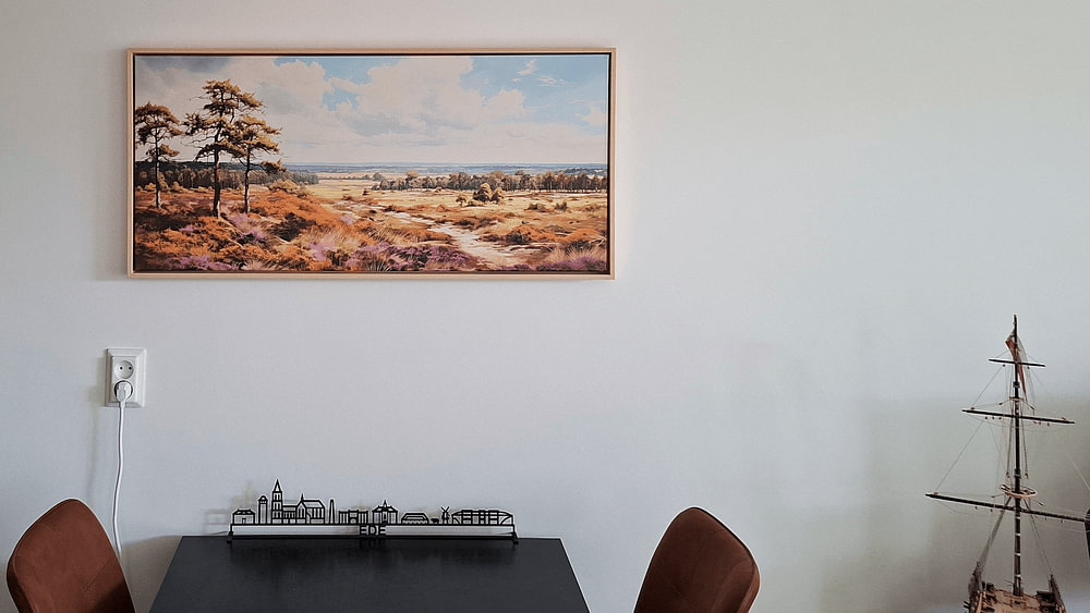
Looking for artwork that captures the essence of Dutch landscapes? The Netherlands offers endless inspiration, from historic windmills to tranquil polders bathed in golden light. These scenes evoke calm and nostalgia, perfect for creating a grounded, peaceful atmosphere.
Wide horizons, serene waterways and dramatic skies define this collection. Soft earth tones and muted blues suit modern and classic interiors alike, while Polder landscape in the Alblasserwaard shows how evening light transforms a simple polder into something special. Whether you're drawn to stormy coastlines or quiet countryside, each piece reflects the character of the Dutch landscape.
Choose your size and material - Canvas, ArtFrame™, Poster and more - to fit your space perfectly.
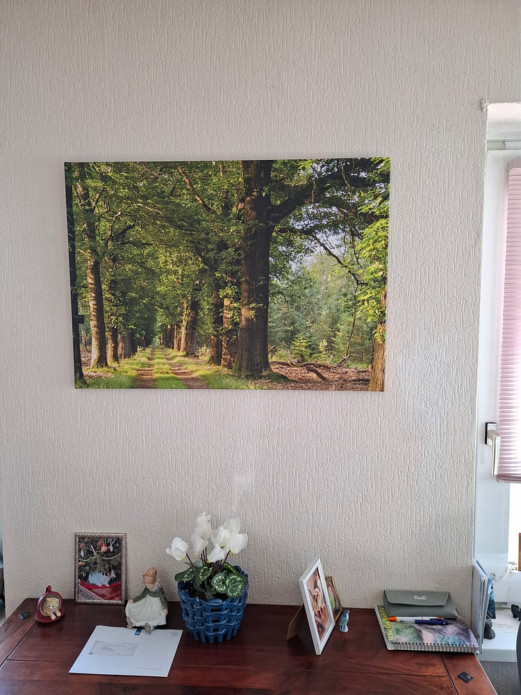
Hallways benefit from artworks that draw the eye forward. A pathway or vista creates visual depth, making compact spaces feel more open. The tree-lined avenue in Acacia's the Mist guides your gaze naturally down the corridor, adding dimension and a welcoming sense of discovery as you move through your home.

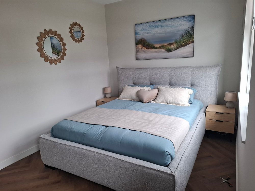
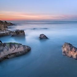
Natural color palettes create calm interiors. Pair warm bronze and terracotta tones with cooler teal accents to bring balance to your room. The earthy palette in A walk on the beach: peace and reflection combines beautifully with soft neutrals like cream or linen textiles, grounding the space while keeping it light and airy.

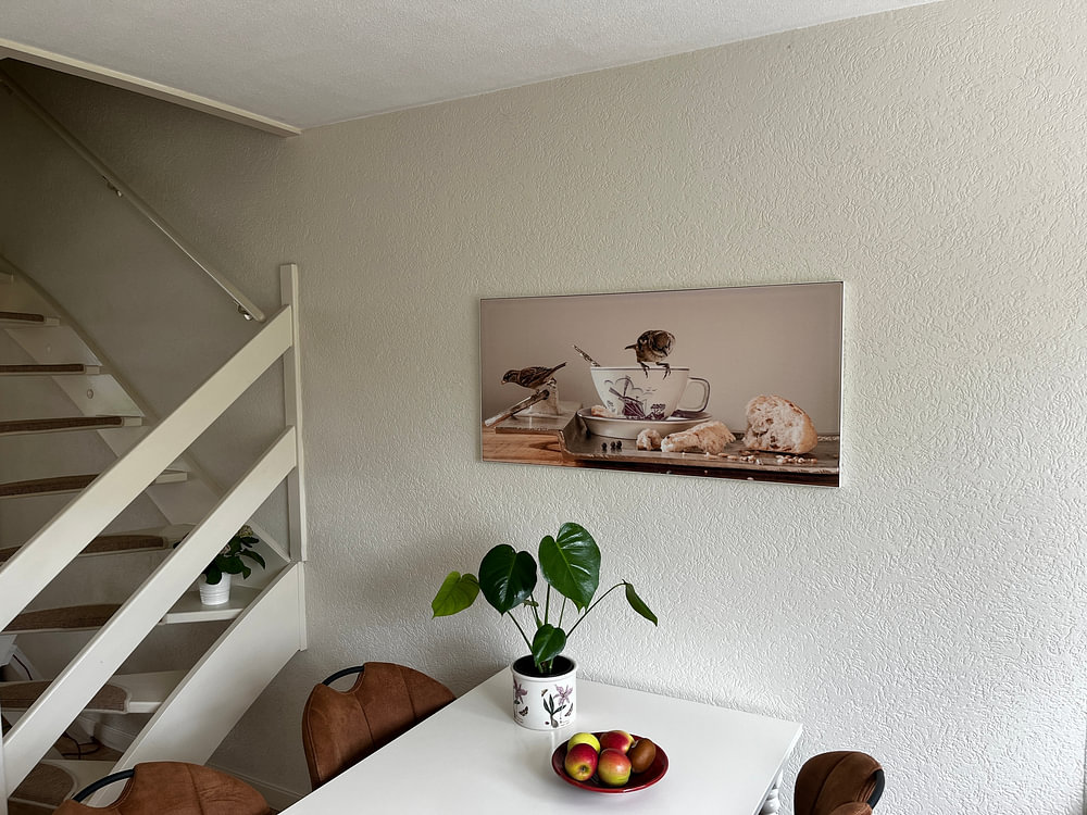
In rooms where you spend time sitting - dining rooms, reading corners, or bedrooms - hang your artwork slightly lower than standard height. Position the center around 140 - 150 cm from the floor so you enjoy the view comfortably from your chair or sofa, rather than craning your neck upward.

Customers rate us 4.8!
Sustainable and long-lasting beauty
From small to large, anything is possible.
Made the moment you order.
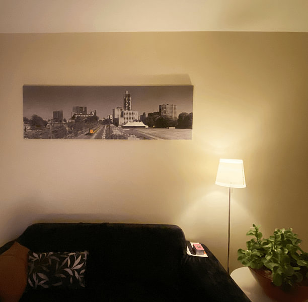
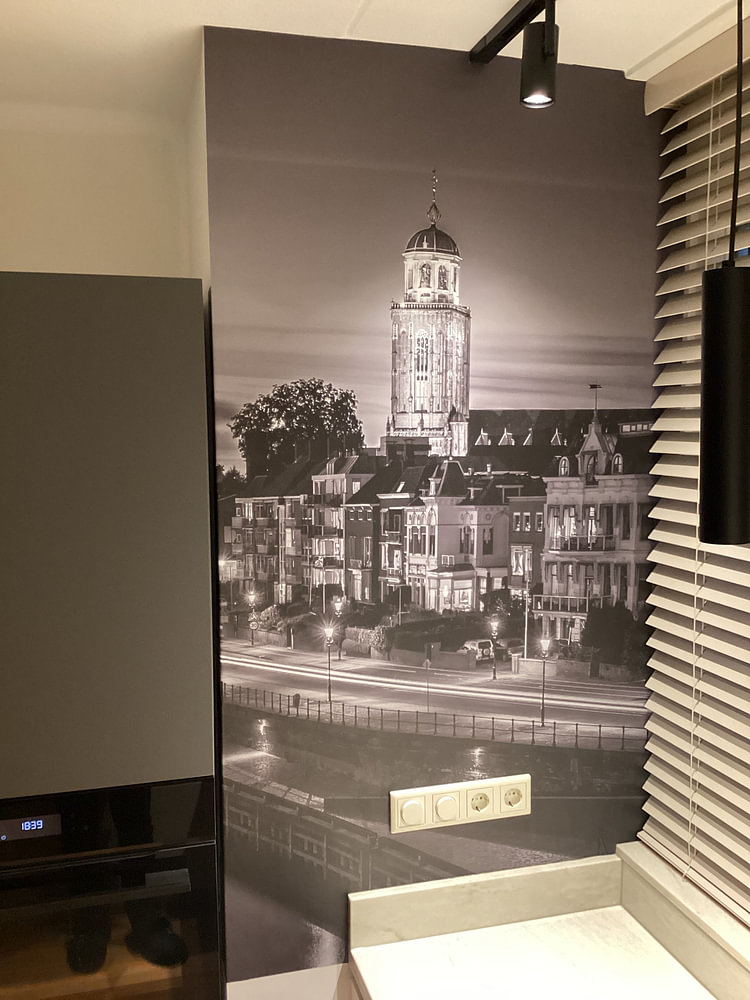
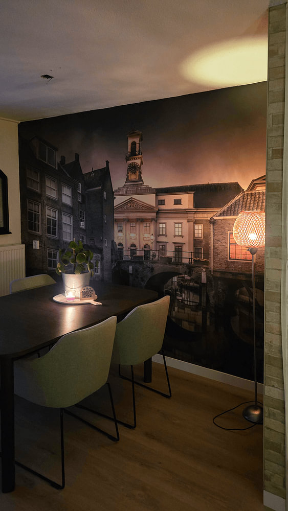
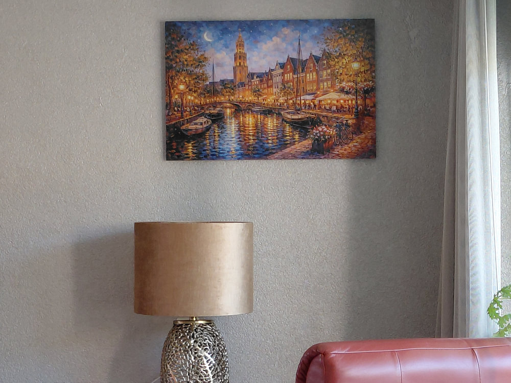
Art from The Netherlands works beautifully in a gallery wall with imagery from Amsterdam, Rotterdam, and Utrecht, creating a visual story of Dutch cities and landscapes. The calm and nostalgic moods invite you to pair these artworks with natural textures like linen cushions or wooden side tables. For a cohesive look, combine photography and painting styles together - the mysterious tones create depth when arranged with breathing space between frames, while warmer brown and taupe pieces anchor the composition.
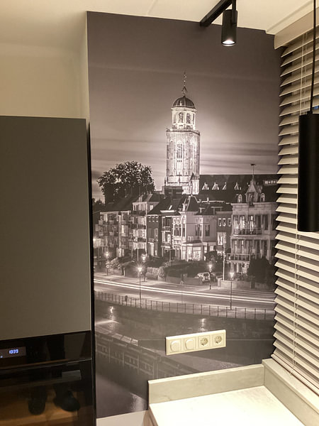
Canvas brings out the layered brushstrokes and atmospheric depth that define Dutch landscapes, making it a strong match for this collection's calm character. Poster and Wallpaper offer lighter alternatives for flexible styling. Choose Canvas and you benefit from two key advantages. First, the fine-art print quality on bright white poly-cotton canvas fabric makes the blue waterways and olive green polders truly stand out - the mauve skies and taupe architecture gain subtle texture that feels authentic to the Dutch painting tradition. Second, the option to personalize your finish with edge wrap choices (smooth, mirrored, or continuous) and thickness options lets you adapt each artwork to its setting, whether you want the brown canal houses to wrap around the sides or prefer clean, contained edges. Still doubting which material suits your interior and chosen The Netherlands artwork? Use our Material Advisor to find the perfect match.
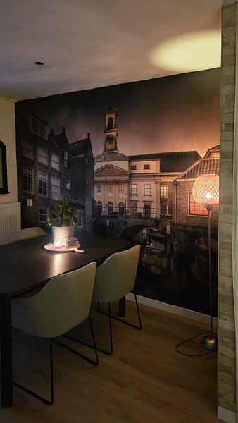
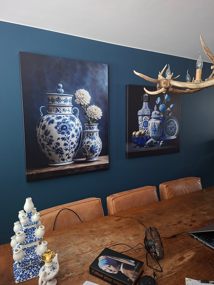
The Netherlands collection offers brown, blue, and taupe tones that align naturally with Scandinavian interiors - pair the soft blue and mauve shades with white walls and light wood furniture for a fresh, airy feel. In modern spaces, the olive green and deeper brown artworks create contrast against concrete or dark accent walls, while taupe pieces bridge neutral palettes without feeling cold. Mix these earthy tones with natural materials like wool throws or ceramic vases to bring warmth into minimalist rooms.