-
More artworks below this tip
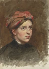
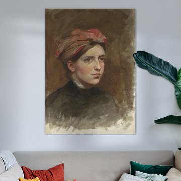
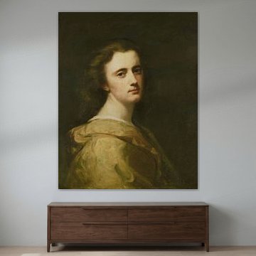
Pairing warm tones with wood
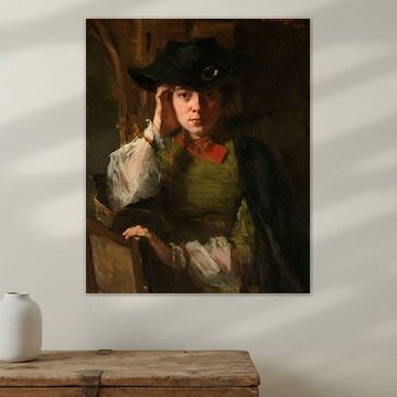
Rich browns and bronze tones create harmony when placed near natural wood furniture or flooring. The warm palette bridges historical art with contemporary interiors. The earthy colours in Portrait of Thérèse Ansingh, Thérèse Schwartze complement wooden desks, bookshelves, or dining tables particularly well, bringing cohesion to your reading nook or study.
EileenStylist & Customer service Questions? Check out our FAQ
 -
More artworks below this tip
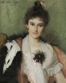
Balancing light and dark
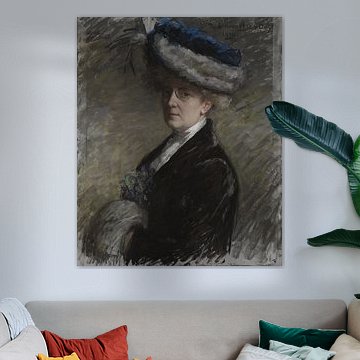
Artworks with strong light-dark contrasts add depth without overwhelming a room. They work well on lighter walls where the dark elements create visual weight. The interplay of shadow and brightness in Portrait of Lizzy Ansingh, Thérèse Schwartze draws the eye naturally, making it an effective focal point above a console table or sofa.
KatharinaStylist & Customer service Questions? Check out our FAQ
 -
More artworks below this tip
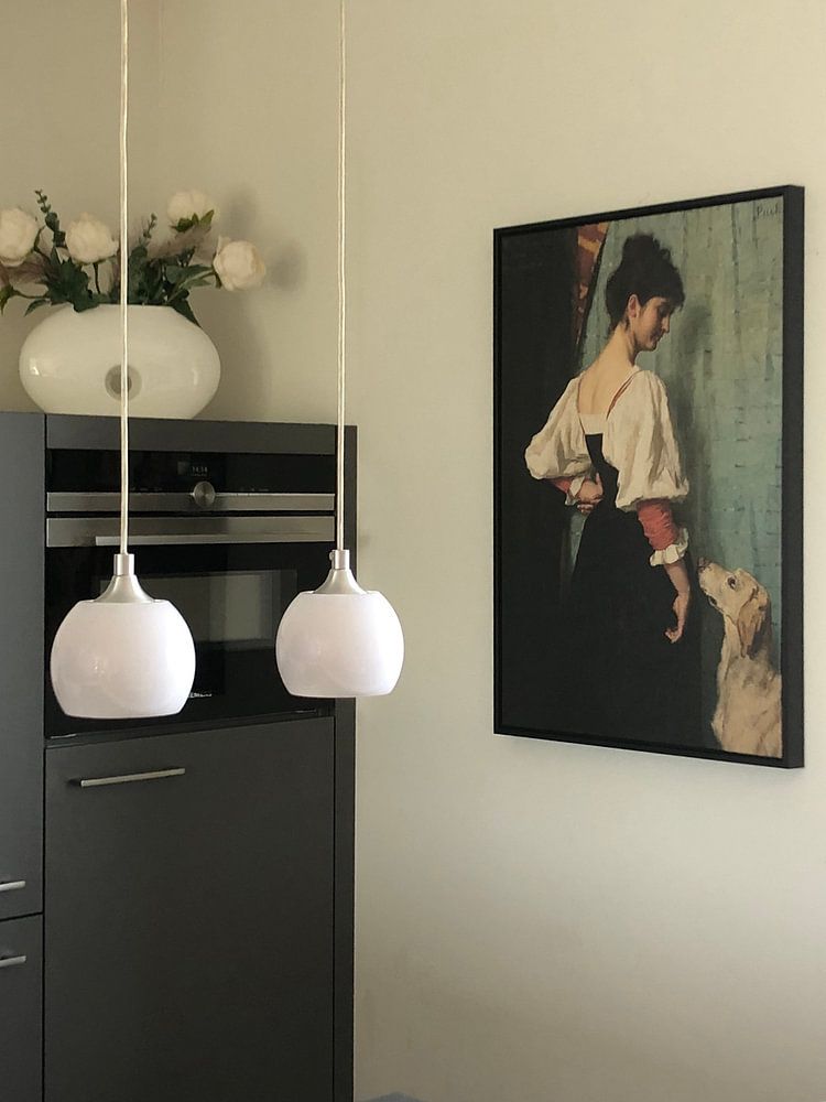
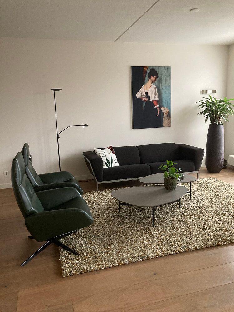
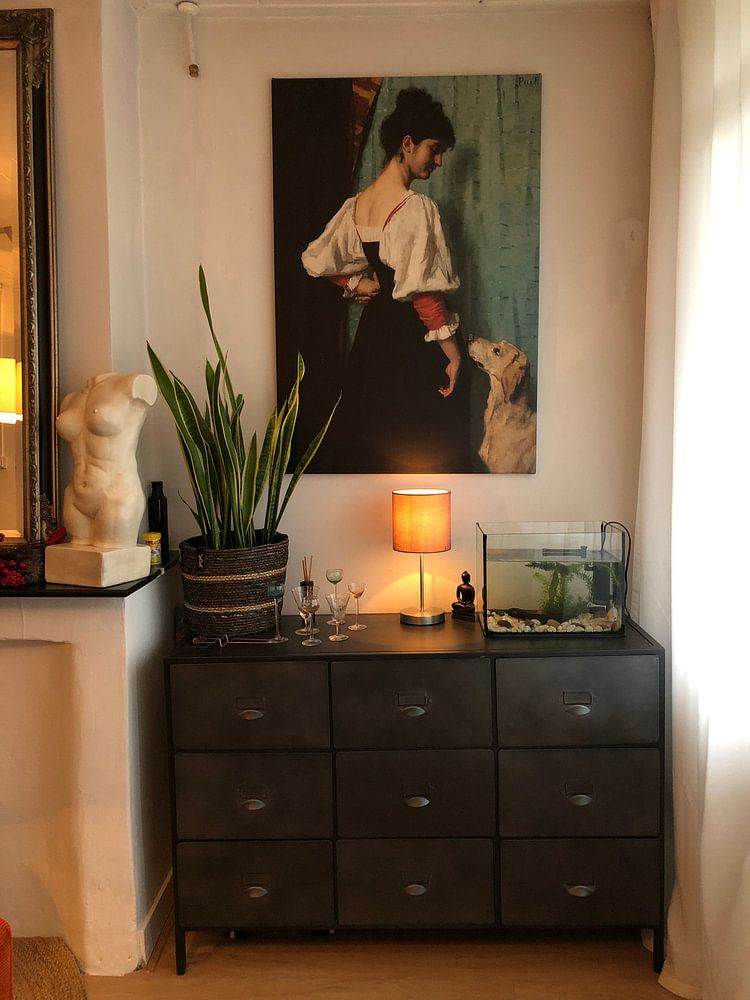
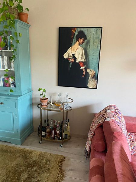
Creating calm in busy spaces
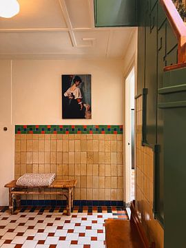
Calming compositions help quiet visually active rooms - think kitchens with open shelving or living rooms with patterned textiles. The gentle, contemplative mood in Portrait of a young woman with the dog Puck - Thérèse Schwartze offers a visual pause. Place it where you want to soften the energy, such as opposite a busy gallery wall or near a window.
RosanneStylist & Customer service Questions? Check out our FAQ
Thérèse Schwartze
Looking for timeless Dutch portraiture that brings quiet elegance to your walls? Thérèse Schwartze captured 19th-century society with remarkable sensitivity, painting aristocrats, orphans, and families with equal grace. Her palette - soft olives, warm taupes, and muted greys - creates a calming, nostalgic mood that complements both classic and contemporary interiors.
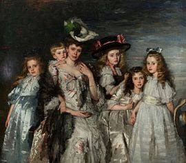
Works like Portrait of Mrs. A.G.M. van Ogtrop-Hanlo (1871-1944) and her five children, Thérèse Schwartze showcase her skill in rendering fabric, light, and character, while pieces such as Three girls from the Amsterdam orphanage, Thérèse Schwartze reveal her compassionate eye for everyday life. At Art Heroes, we print each piece to order, ensuring your chosen artwork fits your space perfectly. Explore the full collection as a Canvas, Poster, Wallpaper, and more.


Trusted and loved
Customers rate us 4.8!
High-quality materials
Sustainable and long-lasting beauty
Different sizes
From small to large, anything is possible.
Made for you
Made the moment you order.
How they hang in other homes
Get inspired by beautiful artworks on other people's walls and see how they truly enhance an interior.


Which format works best for Thérèse Schwartze paintings?
The artworks of Thérèse Schwartze often work well in vertical formats, which suit the portrait tradition she was known for. A vertical piece fits naturally above a console table in your hallway or alongside a tall bookshelf in your study. If you're working with a wider wall space above your sofa or sideboard, a horizontal format can create a calming balance that draws the eye across the room instead.
Where to display Thérèse Schwartze art in your living room

The living room is a good spot for Thérèse Schwartze artworks, where the calm and elegant character of her painting style adds a refined touch without overwhelming the space. Hang a piece above your seating area to create a thoughtful focal point, or place it on a feature wall near your reading corner. The nostalgic mood of her work pairs well with comfortable furniture and soft textiles, inviting quiet reflection in a room where you spend time with family or guests.
Styling Thérèse Schwartze with classic and Scandinavian interiors

The warm brown and beige tones in Thérèse Schwartze artworks complement classic interiors beautifully, especially when combined with wooden furniture and soft fabrics in taupe or grey. For a Scandinavian approach, pair the muted olive green and beige hues with light wood, linen textures, and simple lines to keep the look fresh and uncluttered. Both styles benefit from the understated elegance of her palette, which works as a grounding element whether your space leans traditional or clean and minimal.
