


































PI Creative Art
Illustrator
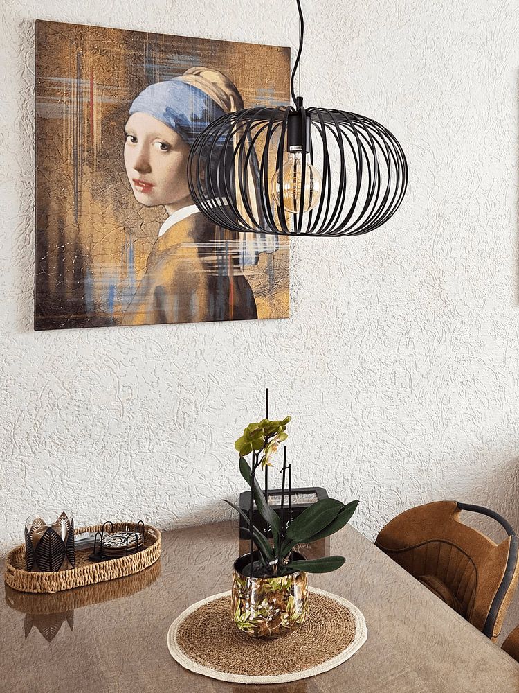
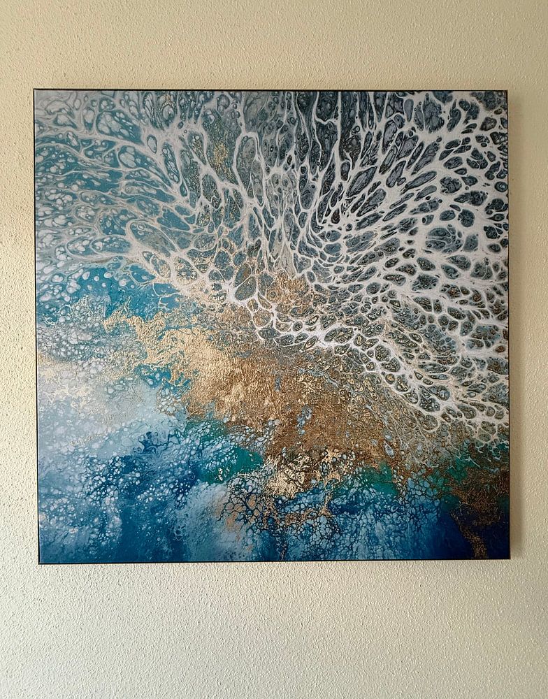
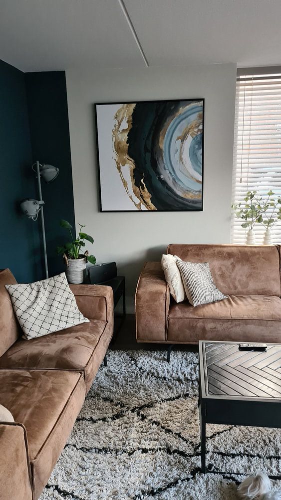
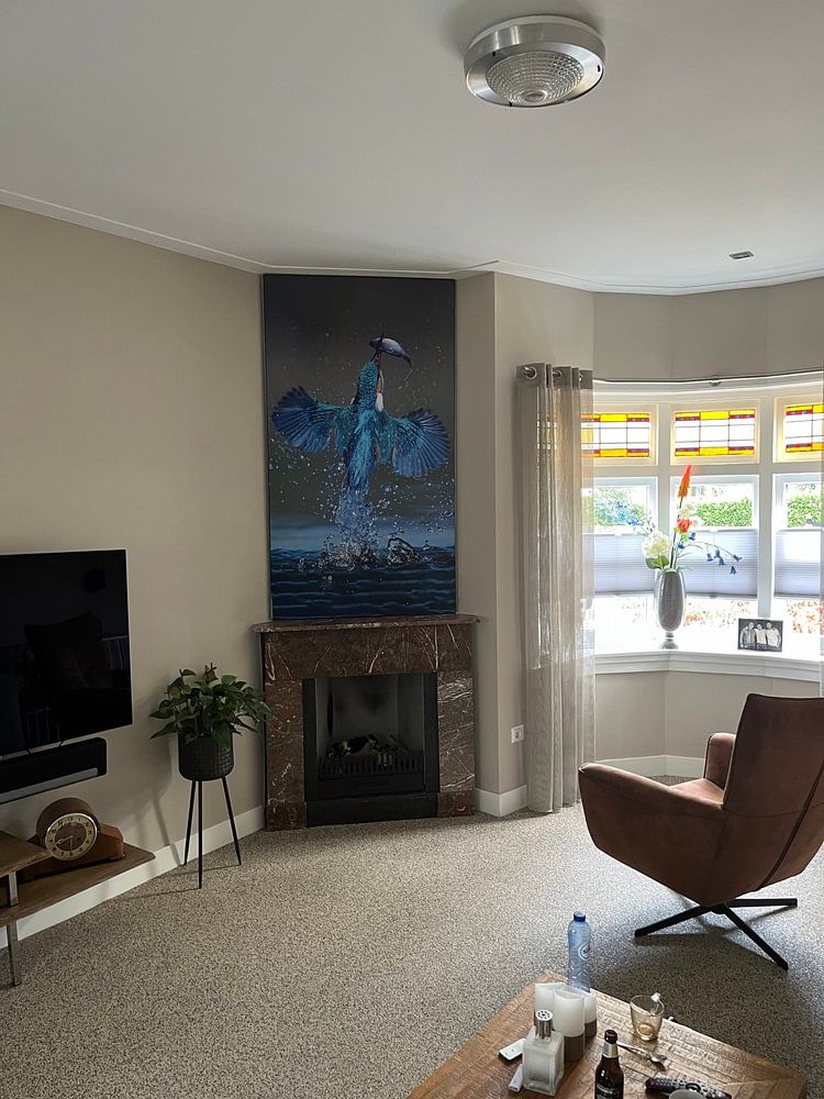
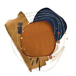
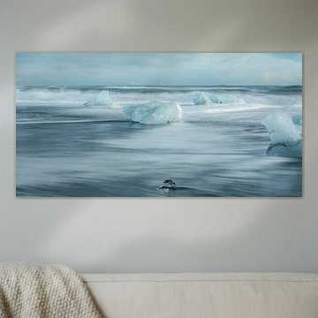
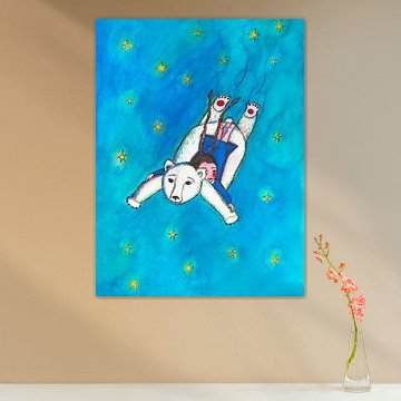
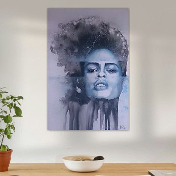
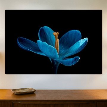
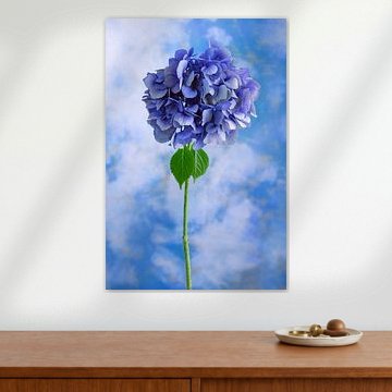
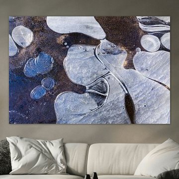
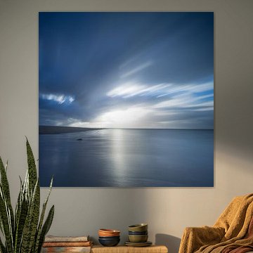
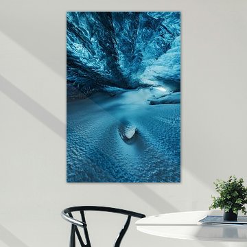
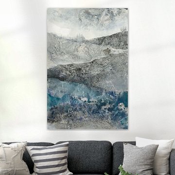
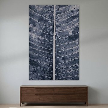
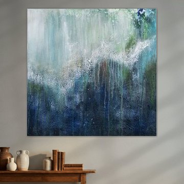
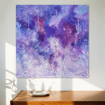
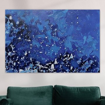
Blue has a way of grounding a space. It invites calm without feeling cold, offers depth without overwhelming. The Touch of Blue collection brings together abstract seascapes, delicate still lifes, and textured compositions - each one centered around soothing shades of indigo, teal, and turquoise. Works like Fortuna , Shaylen Broughton layer organic forms with metallic warmth, while Let the ocean in | Watercolour painting captures the sea's quiet power through watercolor washes. These artworks suit minimalist and coastal interiors alike, adding subtle movement to living rooms or bedrooms.
Available as ArtFrame™, canvas, poster and more - printed to the size that fits your wall.
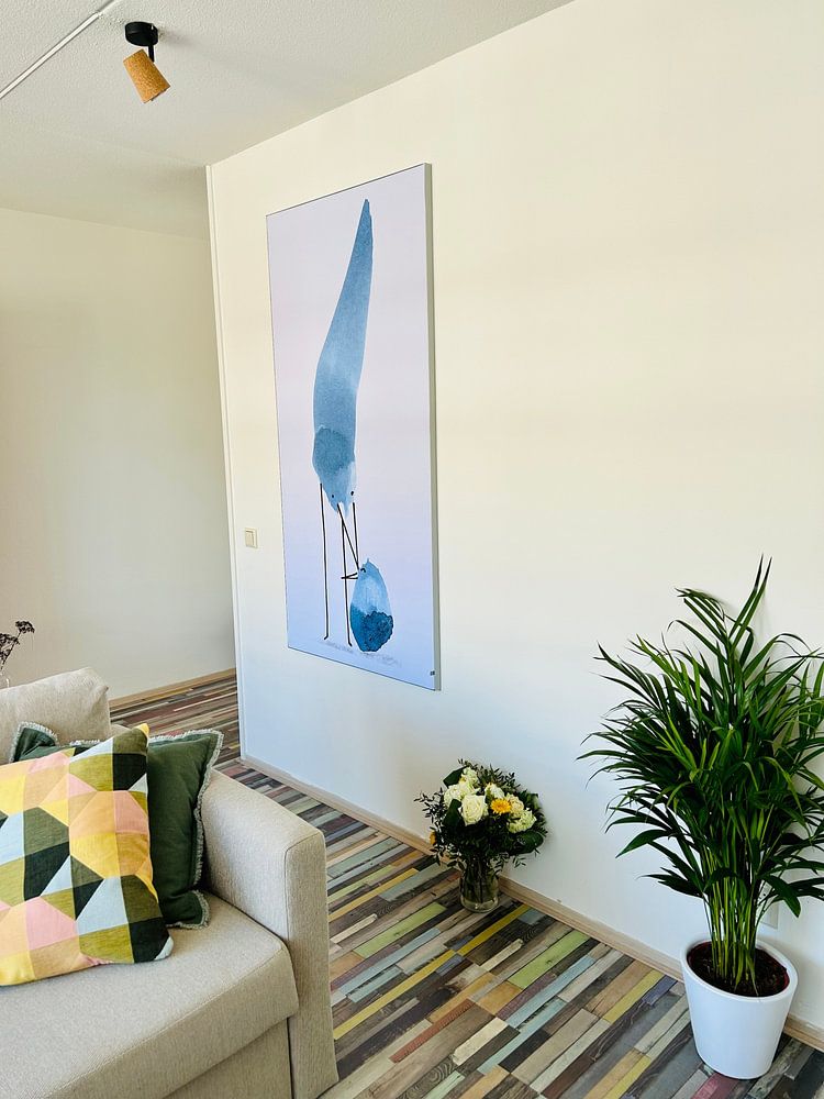
Cooler tones gain warmth when placed against beige, taupe, or cream backgrounds. The palette creates breathing room without feeling cold or clinical. The blue and beige combination in Tender blue shows how these colors balance each other, making the artwork feel both calming and grounded in your space.

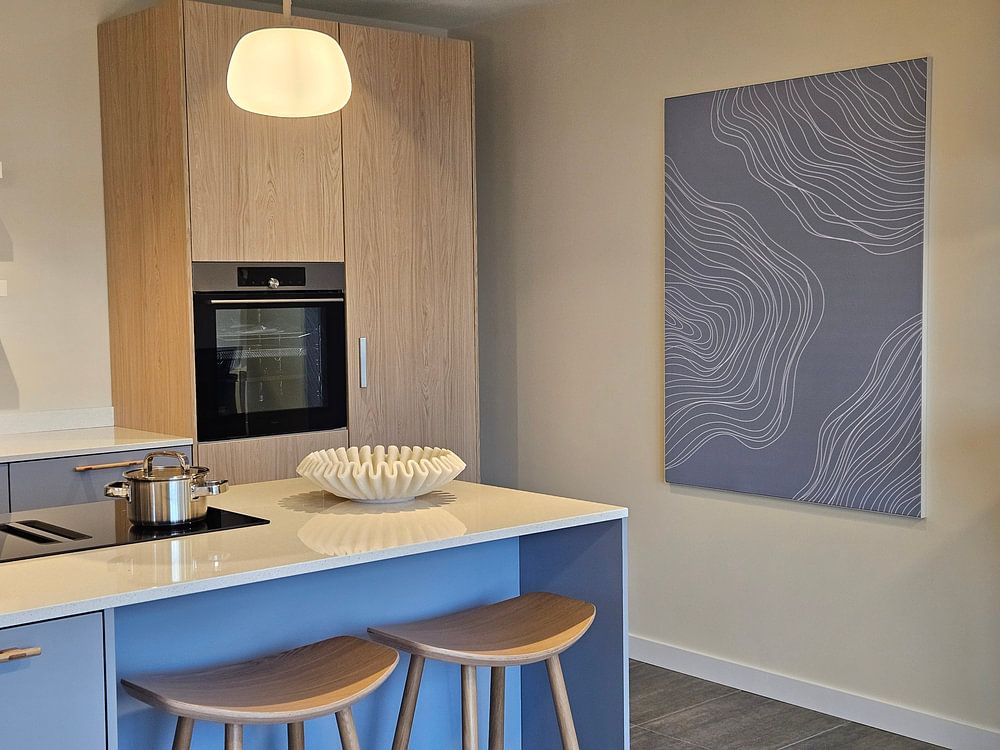
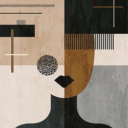
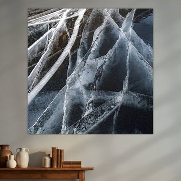
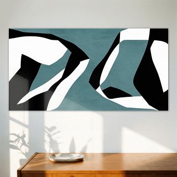
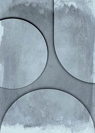
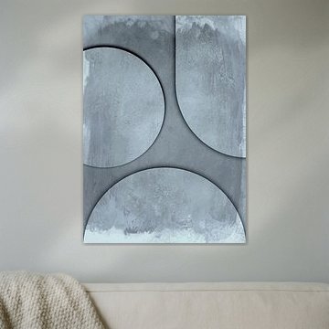
Abstract geometric artwork often needs visual space to make its full impact. Avoid clustering these pieces with other wall décor - give them a clear wall where the eye can follow the shapes without distraction. The layered depth in The Foot of the Great becomes a focal point when it has room to breathe.

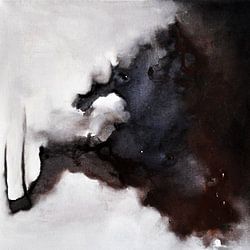
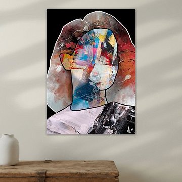
Artwork with calm, introspective moods fits naturally in bedrooms, reading corners, or private spaces where you want a sense of stillness. These aren't pieces for high-energy areas - they reward quiet moments. Consider placing do not cry, Alice in a bedroom or study where its reflective quality enhances the room's peaceful atmosphere.

Customers rate us 4.8!
Sustainable and long-lasting beauty
From small to large, anything is possible.
Made the moment you order.
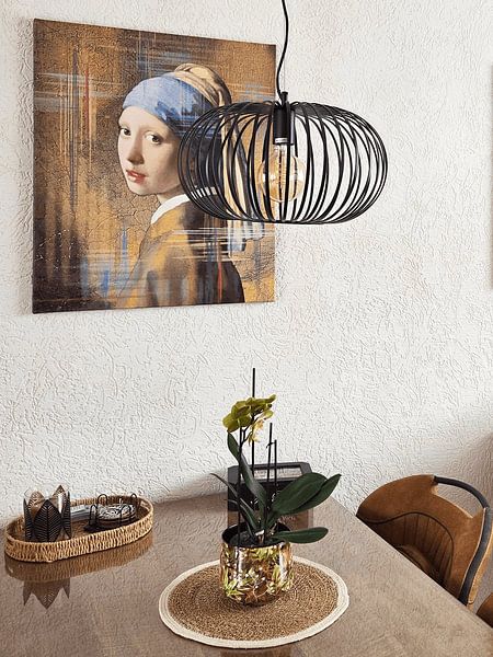
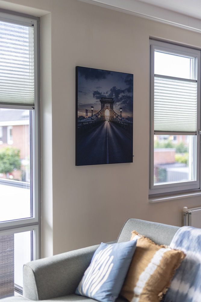
Touch of Blue brings together blue, grey, and teal hues that work beautifully in minimalist and Scandinavian interiors. Pair soft grey artworks with white walls and natural wood furniture for a calming, uncluttered look. Deeper teal pieces add quiet character above a light sofa or bed without overwhelming the space. Use mauve or violet accents sparingly to introduce warmth while keeping the serene, pared-back feel intact.
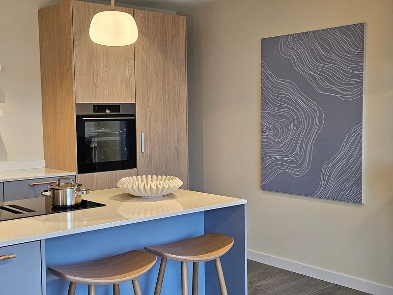
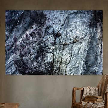
Touch of Blue artworks layer effortlessly on a gallery wall when you mix calm and mysterious moods together. Combine softer blue pieces with deeper violet tones to create depth, and add texture through linen cushions or a wool throw in complementary grey. Position a teal artwork near greenery - ferns or eucalyptus branches work well - to enhance the dreamy, otherworldly atmosphere. This approach keeps your space cohesive while inviting quiet intrigue into every corner.
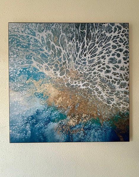
ArtFrame™ highlights the tranquil blue and grey tones beautifully, especially when framed in silver or white for a fresh finish. Alternatively, Canvas adds subtle texture, while Poster offers an accessible way to try the collection. Choose ArtFrame™ and you benefit from easy interchangeability - swap your print whenever you crave a new mood, shifting from calm teal to mysterious mauve in moments without replacing the entire frame. The optional acoustic panels absorb sound while sitting invisibly behind your artwork, perfect when you want a dreamy, peaceful room that looks as serene as it feels. Still doubting which material suits your interior and chosen Touch of Blue artwork? Use our Material Advisor to find the perfect match.