


PI Creative Art
Illustrator
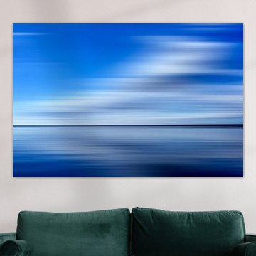
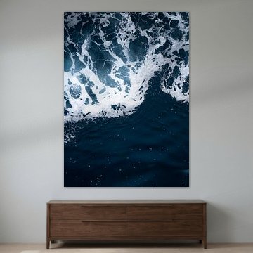
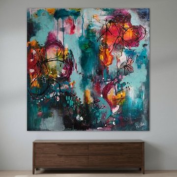
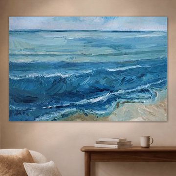
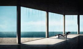
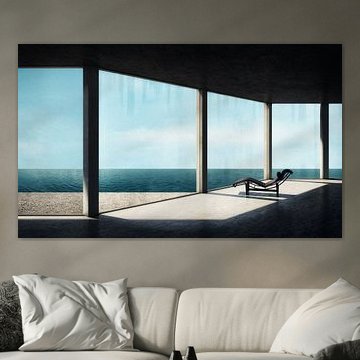
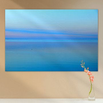
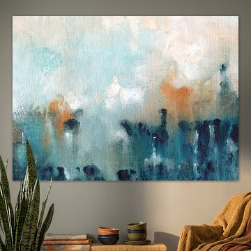
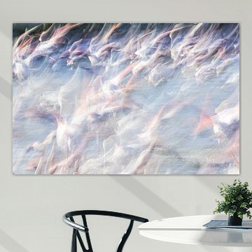
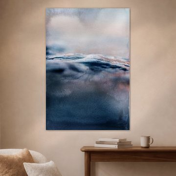
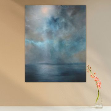
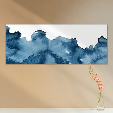
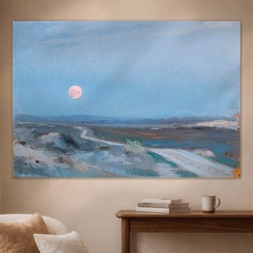
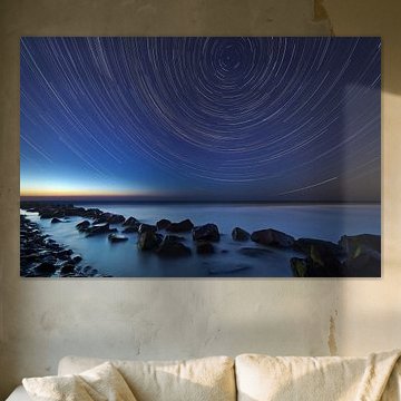
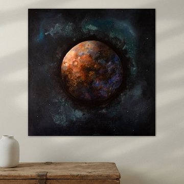
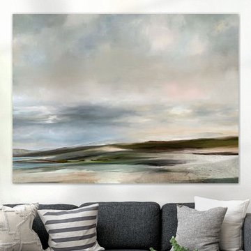
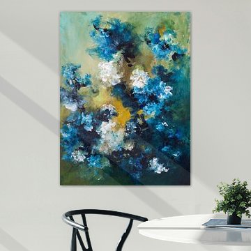
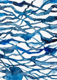
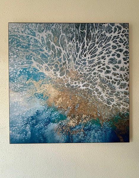
Blue brings calm and depth to any space. It's a colour that soothes without losing character, which makes it versatile for modern and classic interiors alike. Within the Touch of Blue collection, you'll find everything from serene ocean scenes like Seascape (beach North-Holland) to abstract compositions that balance organic forms with vibrant energy.
Whether you lean towards minimalist coastal views or dynamic textures with gold accents, these artworks work beautifully in living rooms, bedrooms, or quiet corners. At Art Heroes, we print every piece to order. Choose your size and material - Canvas, Poster, Wallpaper, and more - to suit your interior.
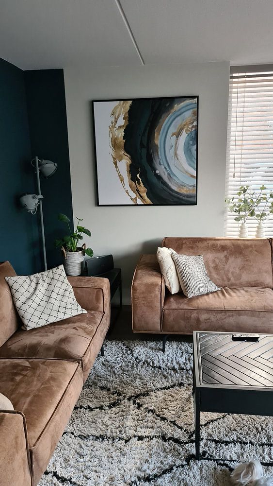
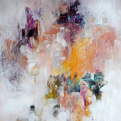
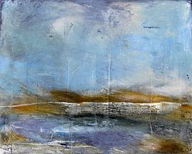
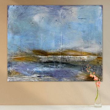
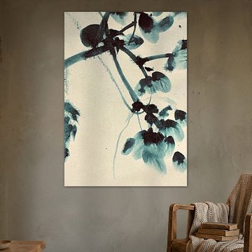
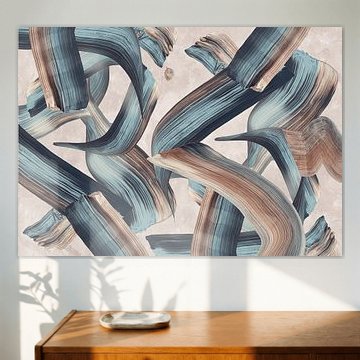
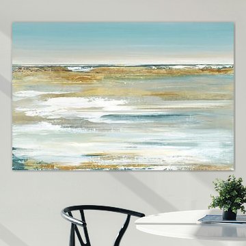
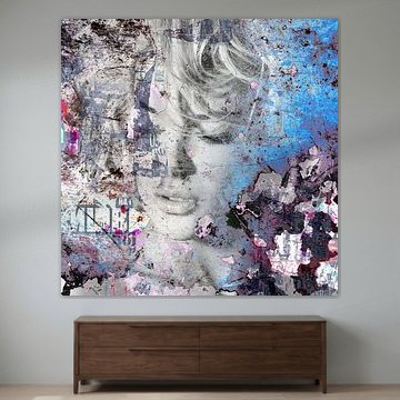
Blues and greys create a serene, layered look when combined thoughtfully. Try pairing cooler tones with warm neutrals like beige or taupe to add depth without losing the calming effect. The gentle palette in Tender blue shows how these shades work together naturally.

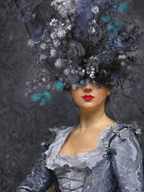
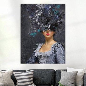
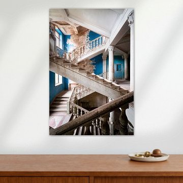
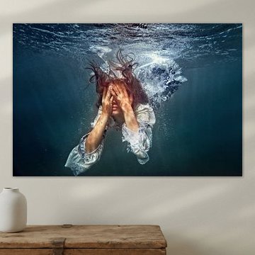
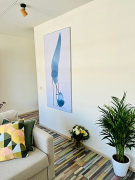
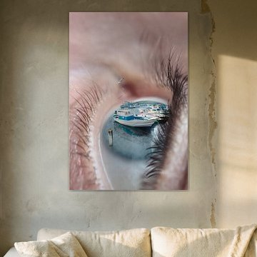
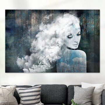
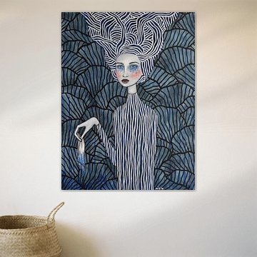
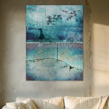
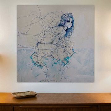
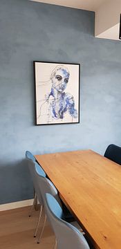
Thoughtful, introspective imagery works best in quieter corners of your home. Consider spaces where you pause naturally - a reading nook, bedroom wall, or hallway landing. The reflective mood in do not cry, Alice suits rooms where you want a moment of calm.

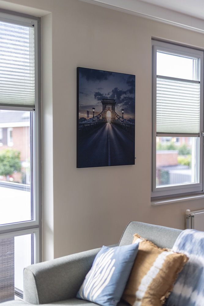
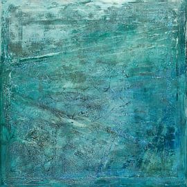
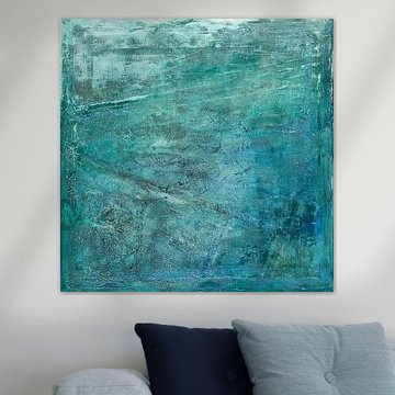
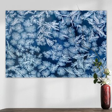
Blue, grey, and teal are the most popular colours in Touch of Blue, offering flexibility across different rooms. These cooler shades ground a space without overwhelming it, working equally well in bright or subdued lighting. Pick the tone that matches your existing palette.

Customers rate us 4.8!
Sustainable and long-lasting beauty
From small to large, anything is possible.
Made the moment you order.
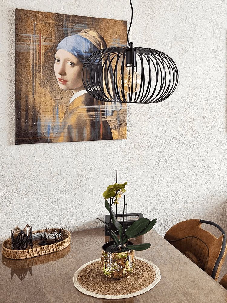
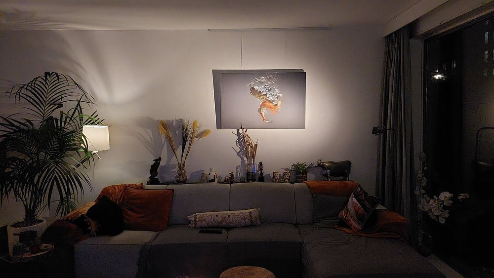
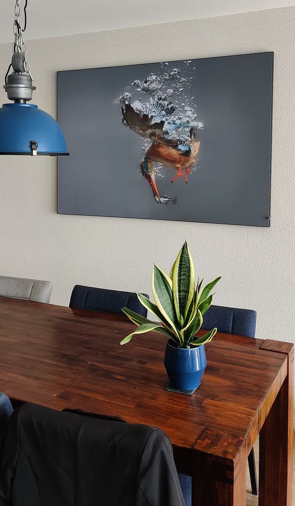
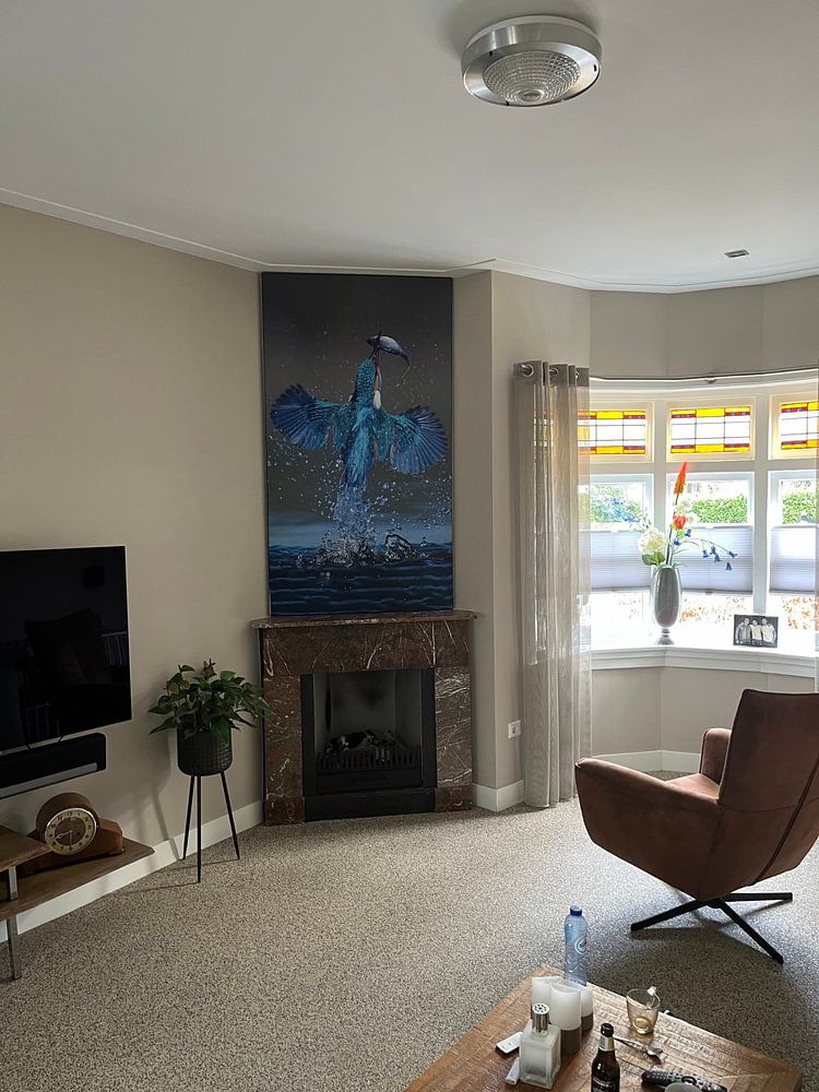
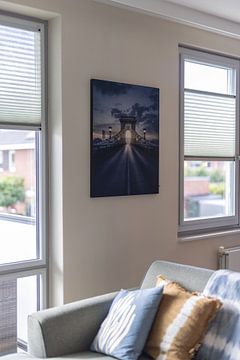
The collection leans toward horizontal formats, making it well-suited for placement above sofas, sideboards, or beds where you want to create visual balance. A horizontal print naturally draws the eye across the wall and complements wider furniture pieces without overwhelming the space. If you're working with a narrow wall or hallway, a vertical format works better to emphasize height and create an elegant focal point that guides the eye upward.

The soft palette of blue, grey, and teal in Touch of Blue pairs beautifully with Scandinavian and minimalist interiors. Combine the cooler blue tones with natural wood furniture and pale walls for a calm, Nordic-inspired look, or let the mauve and violet accents add subtle warmth to an otherwise neutral space. The dreamy, mysterious moods captured through photography, painting, and digital art bring depth without clutter - ideal for interiors that value simplicity and breathing room.
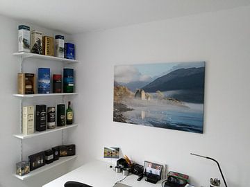
Touch of Blue is a good spot for the bedroom, where its calm and dreamy character helps create a restful atmosphere. The gentle color transitions and mysterious undertones encourage relaxation without demanding too much visual attention before sleep. Hang a larger piece above the headboard to anchor the room, or choose a smaller format for the wall opposite your bed. Pair it with soft textiles in complementary grey or teal to tie the artwork into your overall bedroom styling.