-
More artworks below this tip
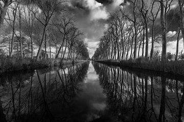
Matching bold textures with your interior
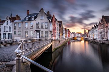
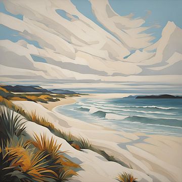
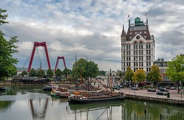
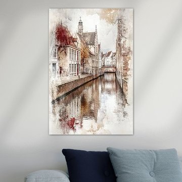
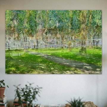
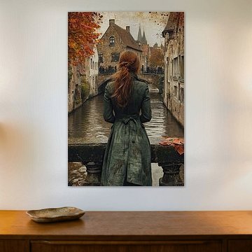
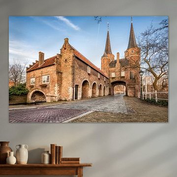
Industrial textures with strong contrast suit modern, minimalist interiors where they can stand out as a statement piece. The dark tones and geometric patterns in feeling tired work well in spaces with concrete, metal, or exposed brick, adding visual weight and character.
LianneStylist & Customer service Questions? Check out our FAQ
 -
More artworks below this tip
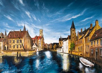
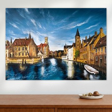
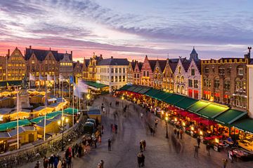
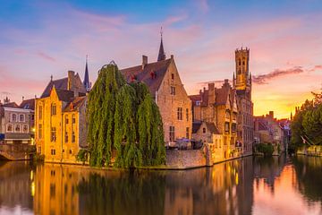
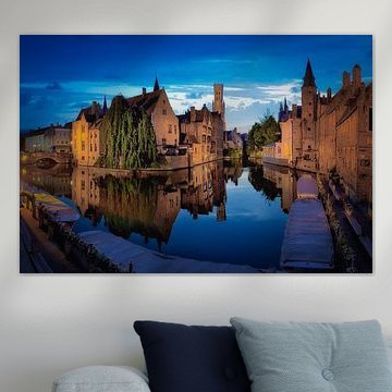
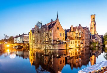
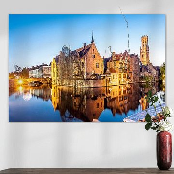
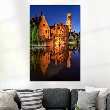
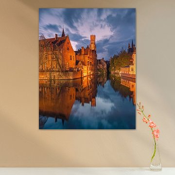
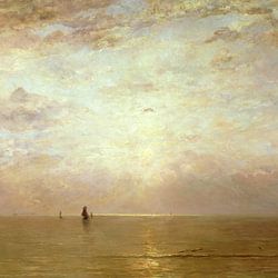
Pairing warm tones with cooler accents
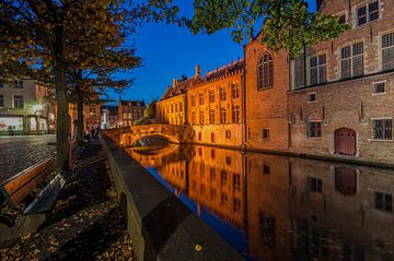
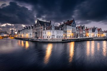
The warm mauve and pink tones in Sunset over Rozenhoedkaai, Brugge work beautifully alongside cooler grey or teal accessories. Try pairing sunset-inspired hues with soft blue cushions or grey textiles to create balance. This combination adds depth without overwhelming your space.
AnouschkaArt Stylist Questions? Check out our FAQ
 -
More artworks below this tip
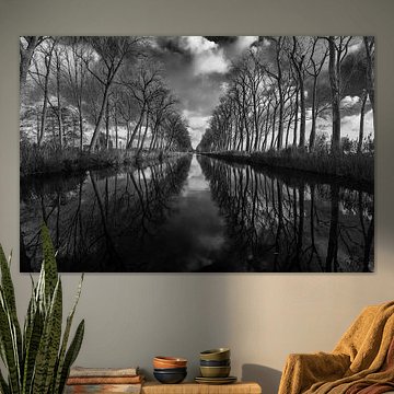
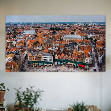
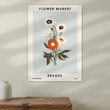
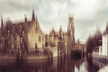
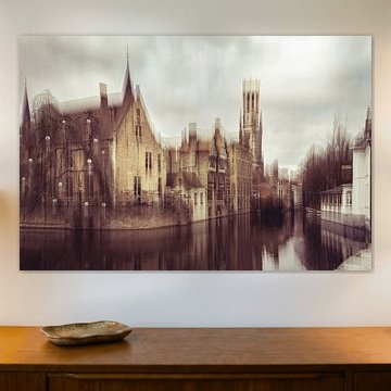
Choosing between portrait and landscape
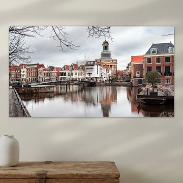
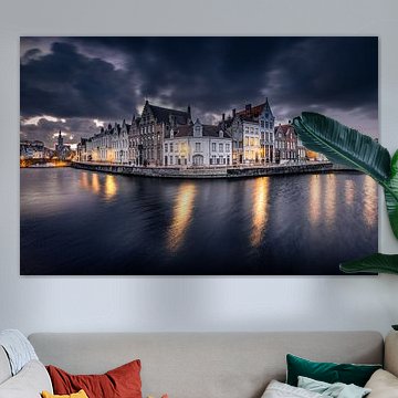
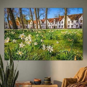
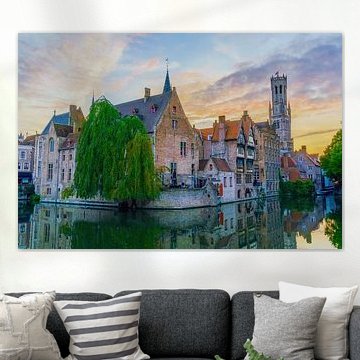
Portrait format suits narrow wall spaces like hallways or beside doorways, while landscape format fills wider areas above sofas or sideboards. Both formats are popular in the Bruges collection, so choose what fits your available wall space and the furniture below it.
EileenStylist & Customer service Questions? Check out our FAQ
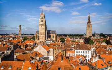
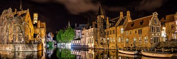
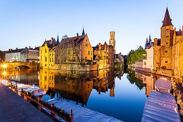
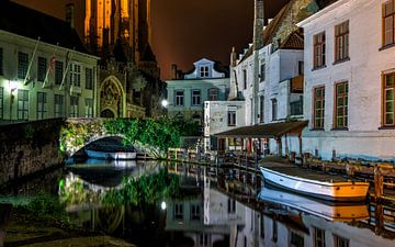
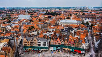
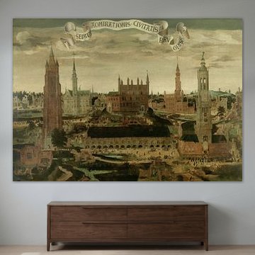
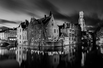
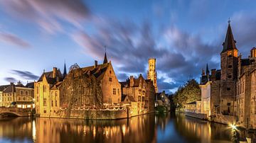
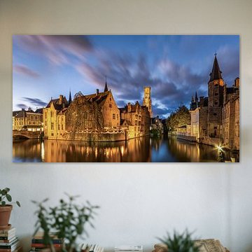
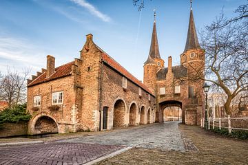
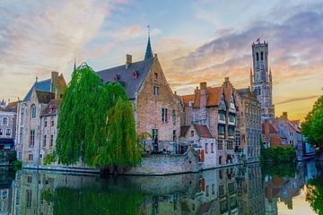
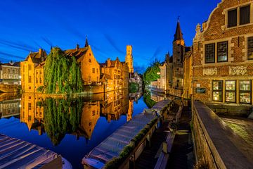
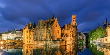
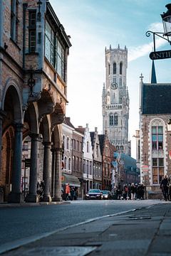
Bruges
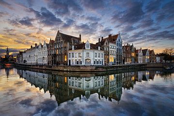
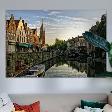
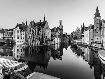
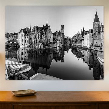
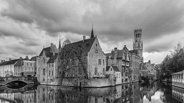
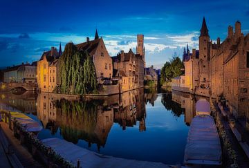
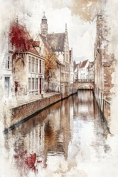
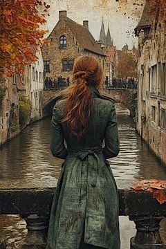
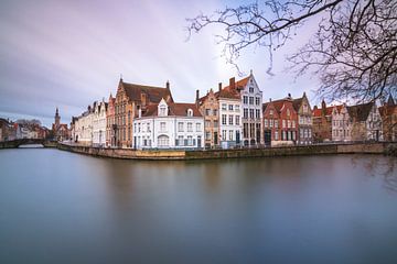
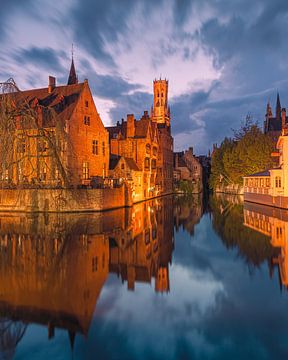
Bruges captivates with its timeless canals and medieval charm. The city's cobbled streets and Gothic spires inspire a sense of calm nostalgia, which translates beautifully into wall art. Our collection features reflective waterways, golden-hour light, and historic architecture that complements both classic and contemporary interiors - artworks like Rozenkaai Brugge België capture the serene atmosphere of the Rozenhoedkaai at dusk, while Sunset in Bruges, Belgium adds romantic warmth with its mirrored sunset glow.
At Art Heroes, every piece is made to order by talented European artists. Explore the collection as Canvas, Poster, ArtFrame™ and more - each option designed to fit your space perfectly.


Trusted and loved
Customers rate us 4.8!
High-quality materials
Sustainable and long-lasting beauty
Different sizes
From small to large, anything is possible.
Made for you
Made the moment you order.


More like this


How do Bruges artworks fit into different interior styles?
The Bruges collection brings a rich palette that adapts beautifully to your interior. The warm brown and taupe tones work wonderfully in country or rustic spaces, especially when paired with natural wood and linen textures. For a modern approach, combine the blue and black-and-white pieces with clean lines and metal accents. The mauve hues add a romantic touch to classic interiors when styled alongside soft furnishings and elegant furniture.
Styling Bruges artworks in your home
Create a calm, nostalgic atmosphere by combining Bruges artworks in a gallery wall arrangement. Mix portrait and landscape formats to add visual interest, and consider pairing them with vintage-inspired decor elements. The romantic mood of this collection works particularly well when styled with soft textiles, gentle lighting, and natural materials like wicker or aged brass. These pieces also complement spaces where you want to create a sense of history and character. Let the serene tones guide your room into a peaceful retreat that feels both grounded and inviting.
Choosing the right material
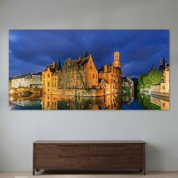
Bruges comes to life on each of our premium materials. Whether you choose Canvas, Poster, or ArtFrame™, each enhances the unique details and colors.
Choose ArtFrame™ and you benefit from exceptional flexibility and acoustic comfort. The interchangeable print system lets you refresh your space whenever the mood strikes - simply swap the artwork in minutes without replacing the entire frame. This matters especially with a collection like Bruges, where the nostalgic and romantic character may inspire you to rotate pieces seasonally or match them to changing light throughout the year. Additionally, the optional sound-dampening panels make ArtFrame™ ideal for creating calm spaces where the serene mood of Bruges can truly shine, reducing echo while the brown and blue tones bring warmth and tranquility to your walls.
Still doubting which material suits your interior and chosen Bruges artwork? Use our material comparator to find the perfect match for your space and style.
