


Roman Robroek - Photos of Abandoned Buildings
Photographer
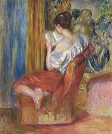
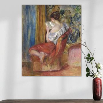
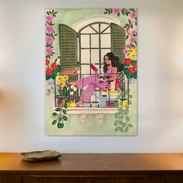
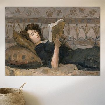
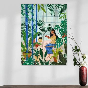
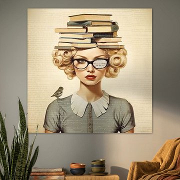
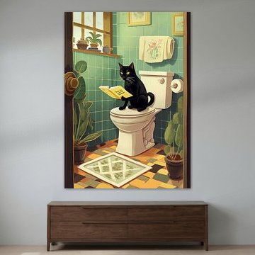
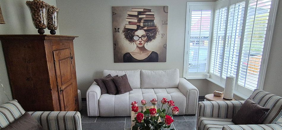
There's something quietly powerful about a person lost in a book. Reading art captures that sense of calm and concentration, bringing a thoughtful atmosphere to your space. From impressionist readers to whimsical literary scenes, these artworks blend beautifully with cozy, creative interiors where calm meets curiosity.
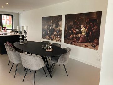
At Art Heroes, we print your chosen piece to order. Explore Canvas, Poster, ArtFrame™ and more - choose what suits your space and make it personal.
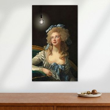
When placing artwork in a reading corner or study, consider where you'll spend most of your time. If you read seated, hang the center of your artwork slightly lower than standing eye level - around 125 - 135 cm from the floor - so it's comfortable to view from your chair or sofa.

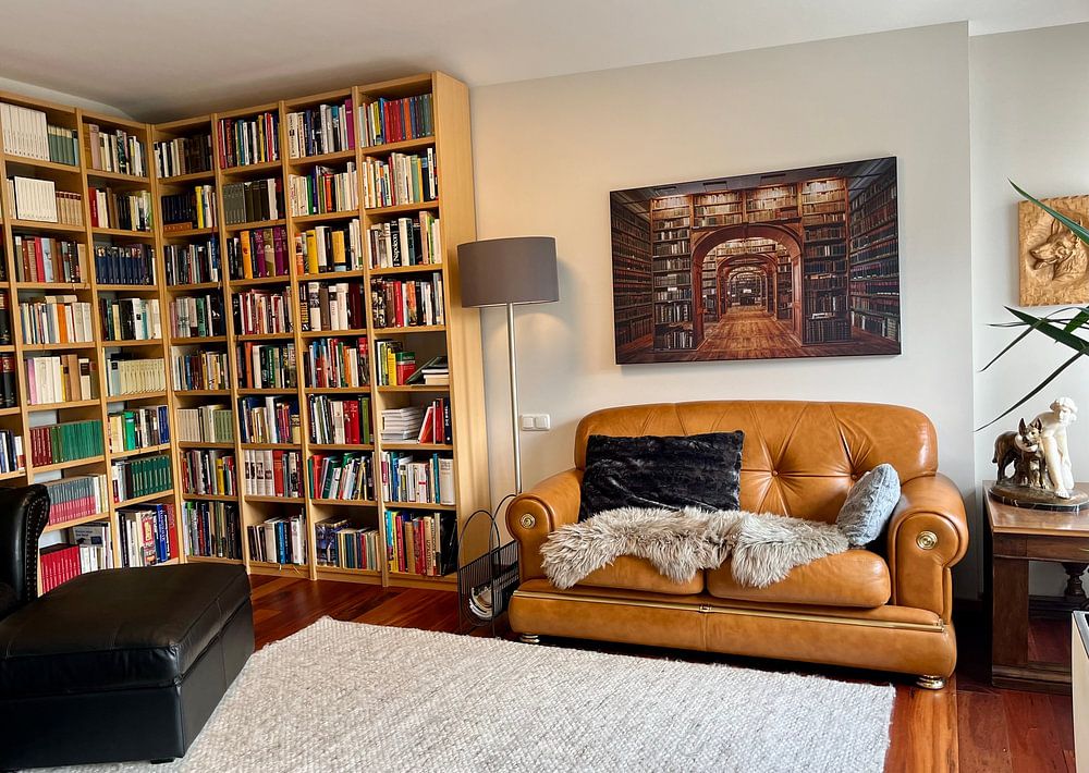
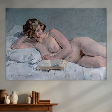
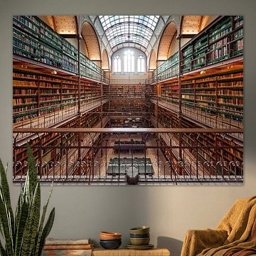
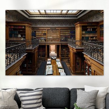
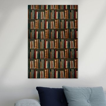
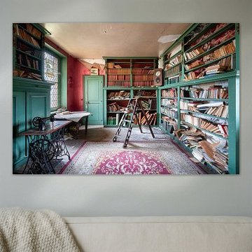
Book-themed artwork brings character to home libraries, reading nooks, and quiet study areas. These spaces benefit from artwork that reflects their purpose and creates a calm atmosphere. A good example is Interior of the Fürstenberg Gallery, Carl Larsson, which suits traditional interiors with wooden furniture and classic styling.

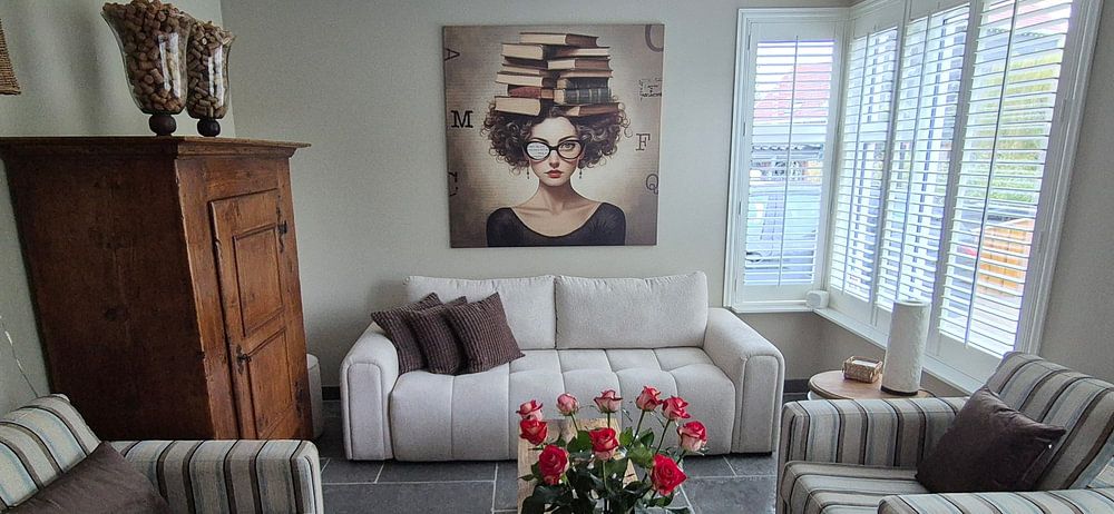
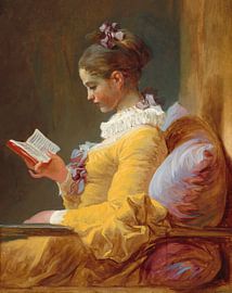
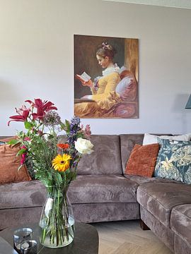
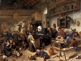
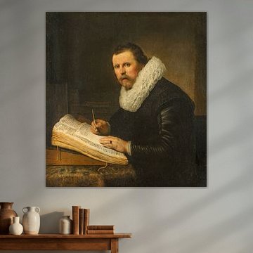
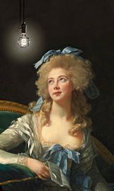
Brown and taupe create a grounded, natural feel in reading spaces. These earthy tones work beautifully alongside wooden furniture, woven textiles, and warm lighting. The golden and bronze hues in The Exam pair well with oak shelving or rattan seating to build a cohesive look.


Customers rate us 4.8!
Sustainable and long-lasting beauty
From small to large, anything is possible.
Made the moment you order.
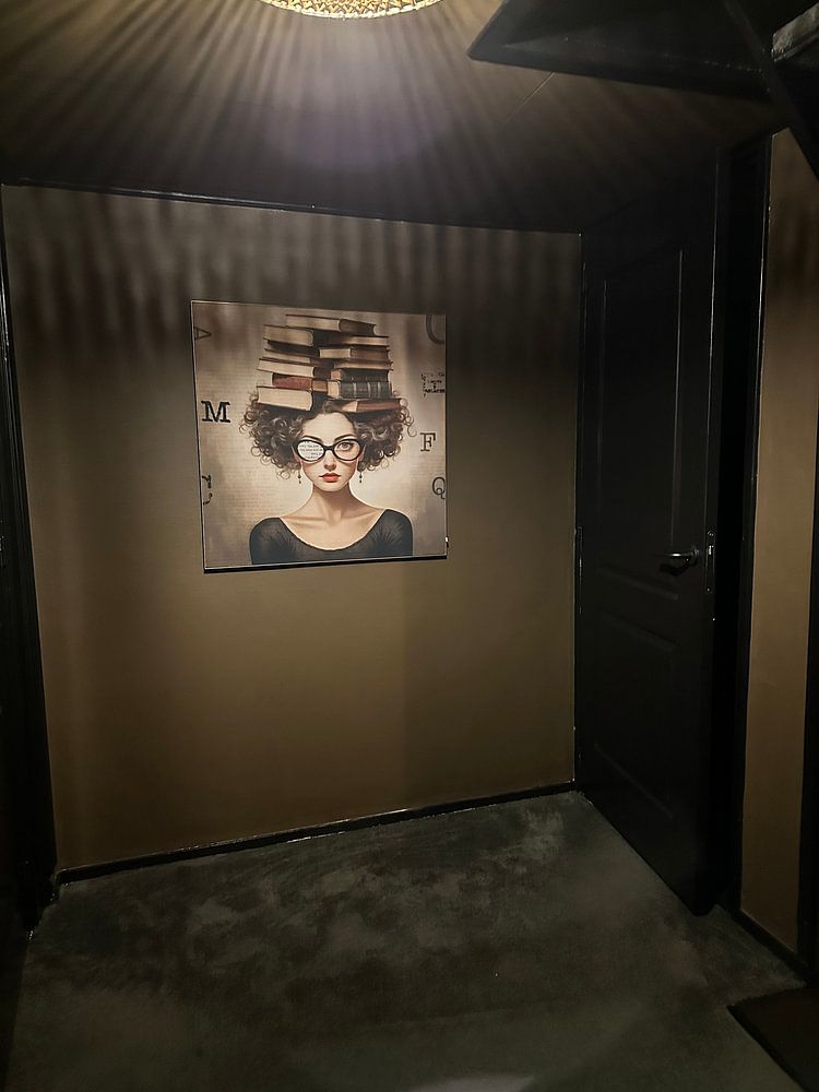
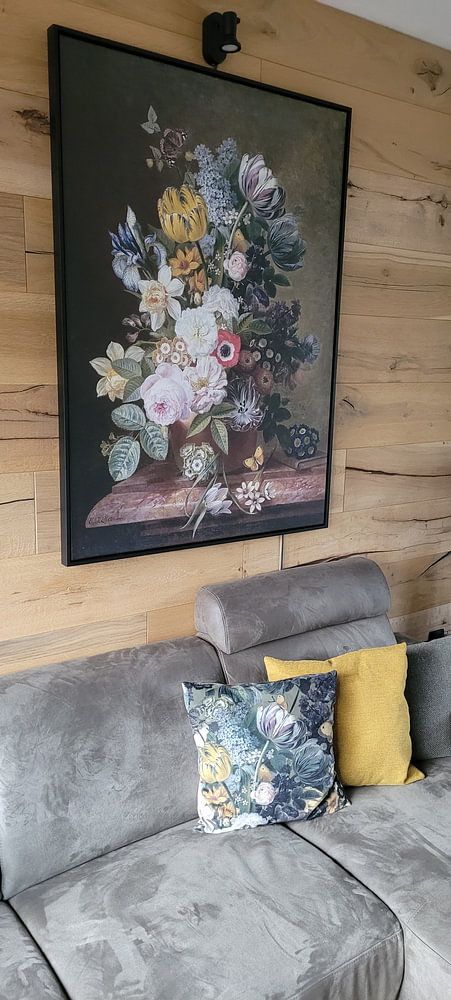
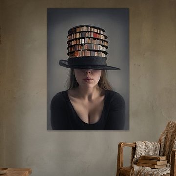
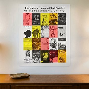
Portrait format works particularly well for reading and books artwork, especially when you want to emphasize vertical compositions featuring bookshelves or reading nooks. Hang this format beside a bookcase or in narrow wall spaces like hallways where width is limited. A portrait piece creates a strong visual anchor above a reading chair or desk. If you have a wide feature wall in your study, a landscape format can work better to balance the space horizontally.
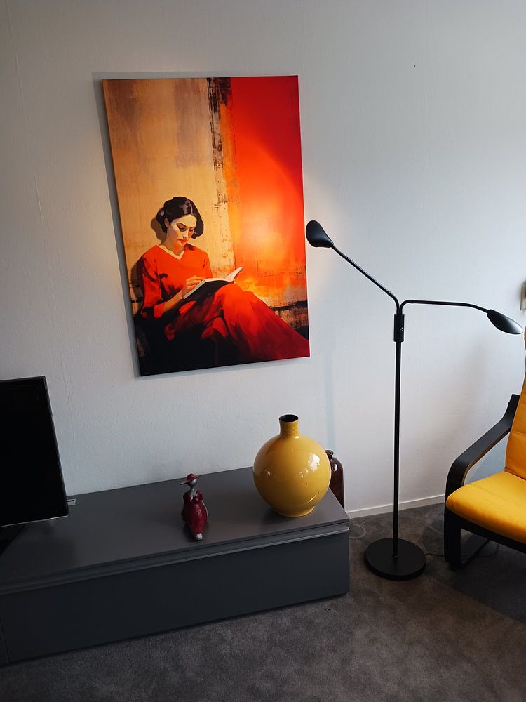
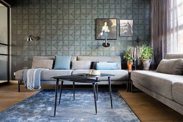
Reading and books artwork naturally complements a home office where you spend time working and studying. The familiar imagery of books and literary scenes creates a focused, intellectual atmosphere that works well in this setting. Position your chosen piece above your desk or on the wall opposite your workspace so you can glance at it during breaks. Pair reading and books art with warm task lighting and wooden furniture to build a comfortable environment that encourages concentration and creativity throughout your workday.
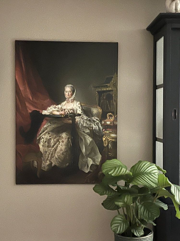
Reading and books artwork in brown, taupe, and beige tones fits beautifully within classic interior styles. These warm, earthy colors echo traditional library aesthetics and pair naturally with dark wood furniture and leather accents. Bronze details in the artwork connect well with brass hardware and warm metallics found in classic spaces. If your room leans more Scandinavian, lighter beige and soft blue tones from reading and books pieces will complement pale woods and neutral textiles. Mix these calmer shades with white walls and natural materials for a balanced, understated look.