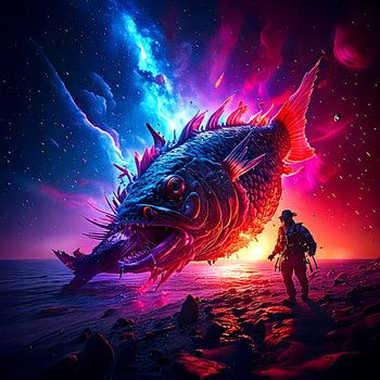


Colour contrasts are fun, especially when there are very few colours involved. Blue / red combinations, cold / warmth, it is exciting to create pictures limited to 2 colour ranges.
Colour contrasts are fun, especially when there are very few colours involved. Blue / red combinations, cold / warmth, it is exciting to create pictures limited to 2 colour ranges.
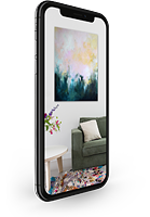
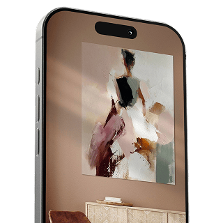
Your chosen art on a textile print, stretched in an aluminum or wooden frame. Quick and easy to change for a fresh look and exactly as you want it.


It all began at the end of the 1970s with technical illustrations for the world's largest science fiction series PERRY RHODAN. Later, I ended up in the digital world in the early 2000s using various techniques and have stuck with it, especially since the possibilities of expression here are becoming more and more diverse. Colors, technology and futurism are predominantly themes of my work. In many cases, I use a repetitive color spectrum – especially in picture series.…
Visit shop