





























Melanie Viola
Photographer
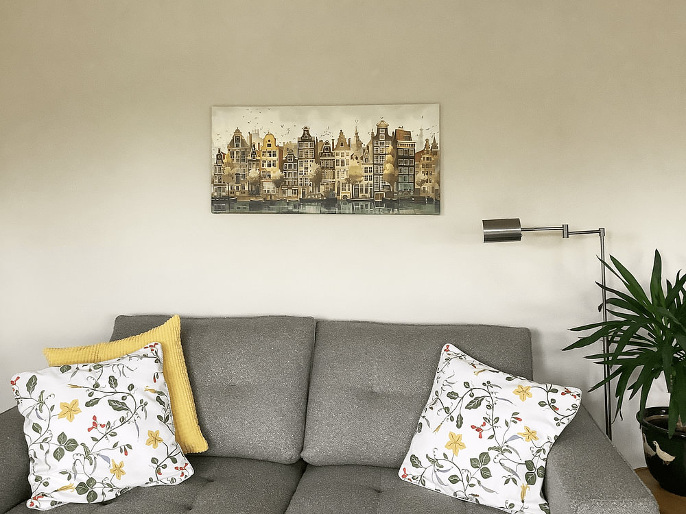
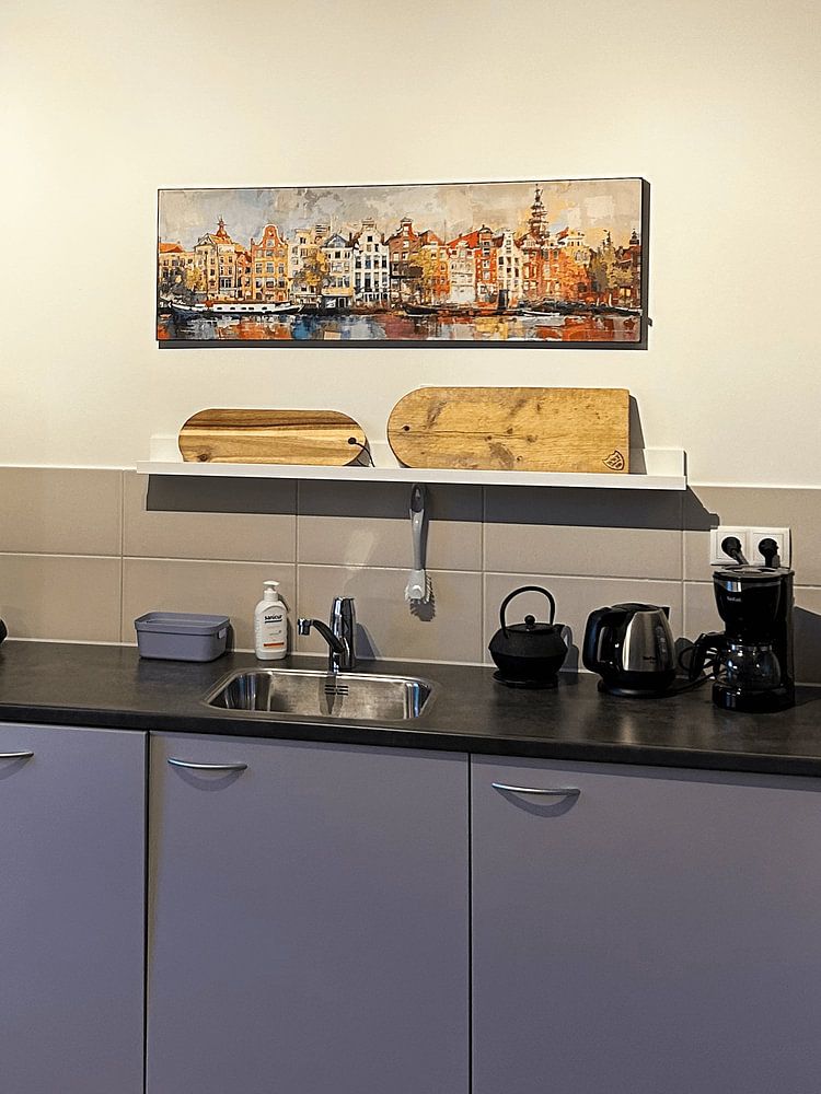
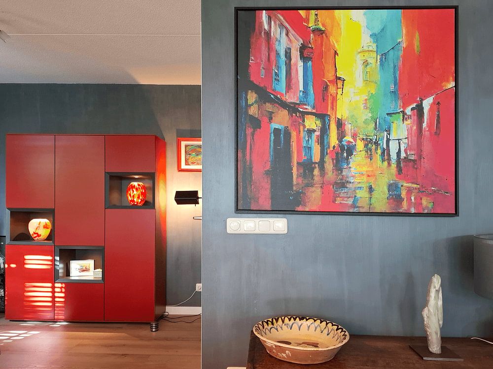
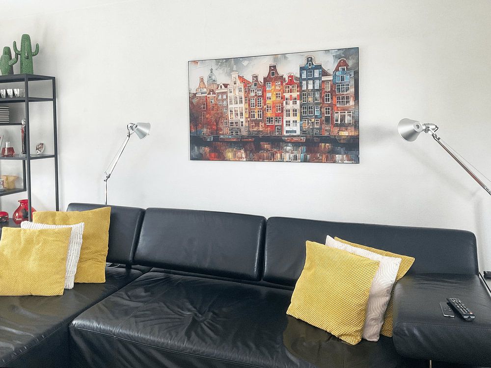
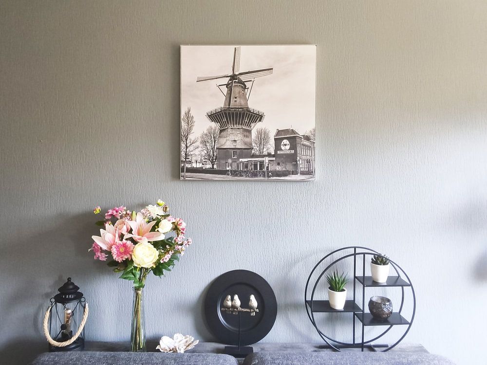
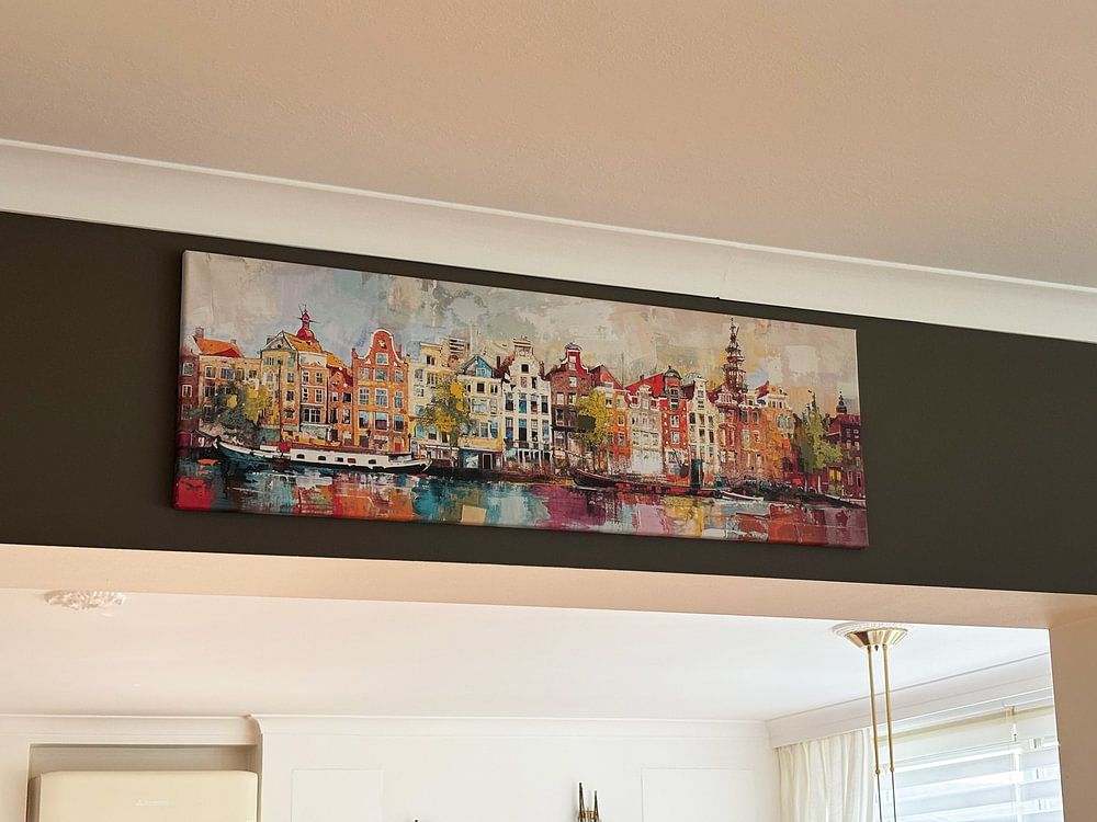
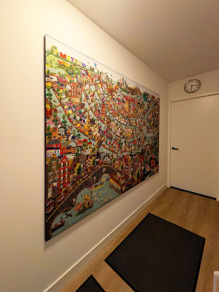
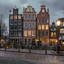
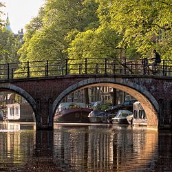
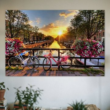
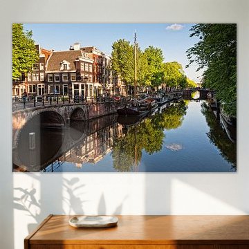
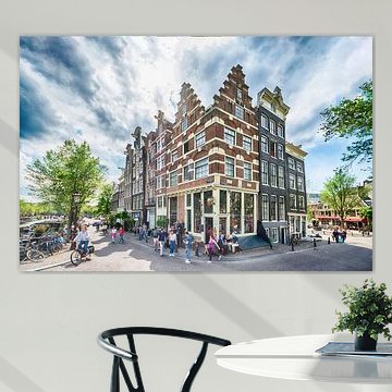
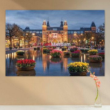
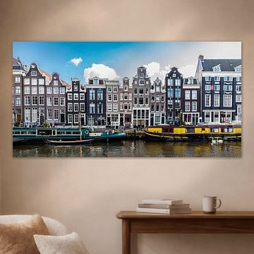
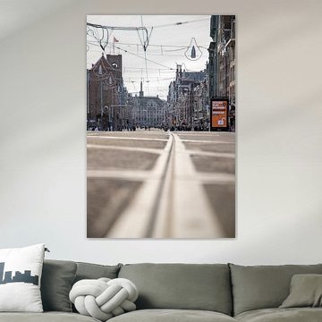
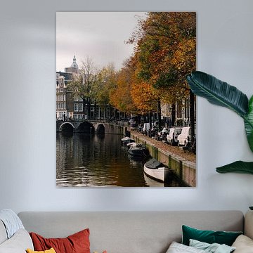
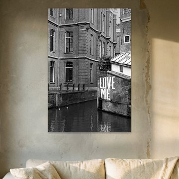
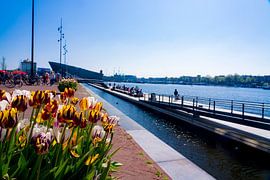
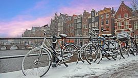
Amsterdam captures hearts with its iconic canals, colorful facades, and timeless charm. These artworks reflect that energy - from impressionistic waterside views to playful illustrations and nostalgic autumn scenes. Warm ochres, teal blues, and vibrant oranges bring the city's character into contemporary and classic interiors alike. Amsterdam Damrak offers a lively take on the Damrak, while The famous canals in Amsterdam in the autumn. celebrates the canals in autumn light.
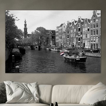
Whether you prefer the calm of a monochrome tunnel or the warmth of golden-hour reflections, you'll find a piece that fits your space. Available as ArtFrame™, canvas, poster and more - choose what works for you.
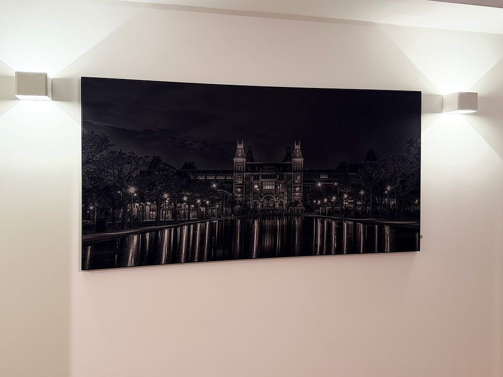
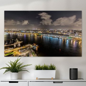
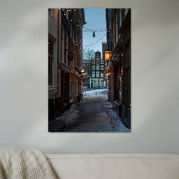
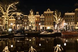
Artworks with rich purples, deep blues, and warm reflections add character to bedrooms or reading corners without creating visual noise. The softly lit evening palette offers colour depth while maintaining a calm mood. Consider Amsterdam by night for spaces where you want gentle interest and a touch of storytelling after dark.

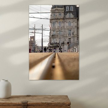
Urban photography with strong vertical lines works well in hallways, stairwells, or narrow wall spaces where the composition mirrors the architecture of your home. Position the artwork at eye level to invite viewers into the scene. Amsterdam | Dancing Trees on Lomanstraat suits entryways or corridors where its structured rhythm complements the flow of movement through your space.

Muted greens and beiges create a restful atmosphere when placed alongside soft whites or warm greys. These natural colour combinations help anchor a room without overwhelming it. The gentle palette in Flowing Harmony in Natural Colour Gradations pairs beautifully with linen textures, light wood furniture, or stone surfaces to bring organic warmth into your space.

Customers rate us 4.8!
Sustainable and long-lasting beauty
From small to large, anything is possible.
Made the moment you order.
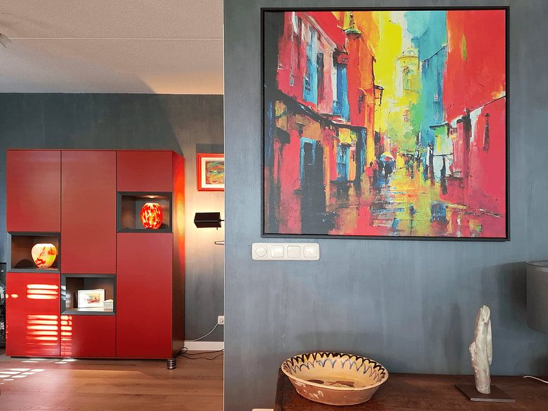
Amsterdam art works well in your living room when you're drawn to nostalgic moods with hints of calm. The brown and blue tones found throughout this collection create a grounded atmosphere that helps a busy space feel more settled. Photography and painting techniques capture the city's character without overwhelming the room, while mauve accents add softness to seating areas. These colors pair naturally with wooden furniture and textile upholstery, making it a good spot for art that feels both lived-in and thoughtful.
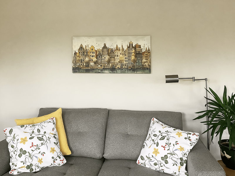
Amsterdam art becomes more layered when you combine pieces from the Amstel, Amsterdam East, and Amsterdam forest subcollections. Try pairing a vibrant canal scene with a calmer forest view to balance energy across a gallery wall. The nostalgic mood in many of these artworks sits comfortably alongside natural materials like rattan, linen throws, or ceramic vases in earthy tones. Plants with soft green foliage echo the forest subcollection, while brass or copper accents pick up the warm brown palette. Mix formats and moods to reflect different sides of the city in one cohesive display.
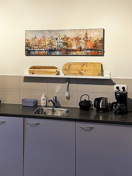
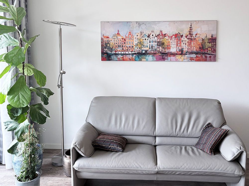
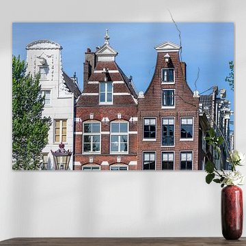
Amsterdam art looks strong in horizontal formats, especially above a sofa or sideboard where the width mirrors the furniture beneath it. Horizontal prints guide the eye across canal scenes and street views, letting the architecture unfold naturally. Place these wider pieces on feature walls where they can anchor the room without competing for attention. A vertical format works better in narrower spaces like hallways or beside doorways, where a horizontal print might feel cramped. Choose the format that matches your wall dimensions rather than forcing a shape that fights the architecture.