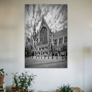
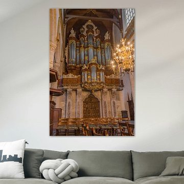
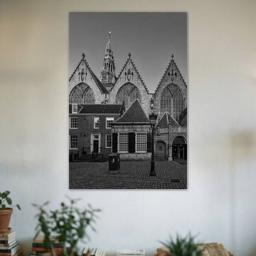
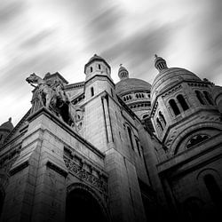
Old church
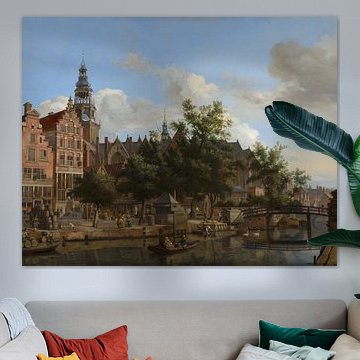
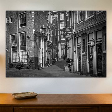
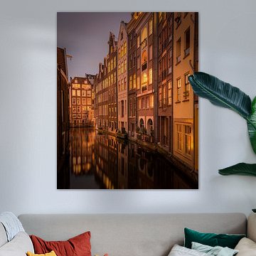
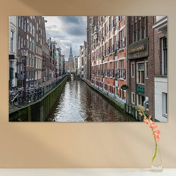
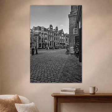
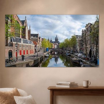
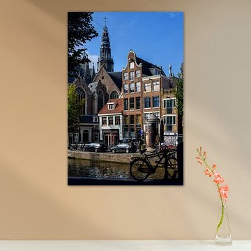
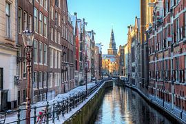
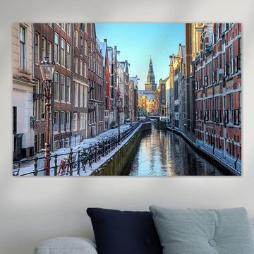
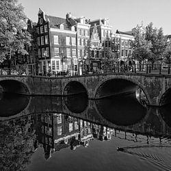
Old church architecture carries quiet power. Stone arches, dramatic skies, and worn cobblestones bring timeless beauty to your walls. These artworks fit interiors that celebrate history and calm - from monochrome cityscapes to warm Amsterdam canal views. AMSTERDAM Oude Kerk | Monochrome captures Gothic detail in striking black and white, while Painting: Amsterdam, Oudezijds Kolk blends nostalgic color with serene atmosphere.
At Art Heroes, we print your chosen piece to order - on Canvas, Poster, or ArtFrame™, and more. Choose what suits your space.
-
More artworks below this tip
Where to hang canal and tower scenes
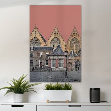
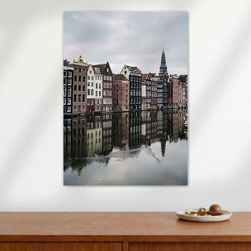
Canal views and architectural towers bring calm, nostalgic character to quiet spaces. Consider placing them in hallways, reading corners, or home offices where you want a reflective atmosphere. The serene water and muted sky in Oudezijds Kolk in Amsterdam. suits spaces where you pause rather than rush through.
LianneStylist & Customer service Questions? Check out our FAQ
 -
More artworks below this tip
Choosing between portrait and landscape formats
Both portrait and landscape formats are popular for this collection. Portrait suits narrow wall spaces like hallways or beside doorways, drawing the eye upward. Landscape works well above sofas or sideboards, creating width. Choose the format that fits your available wall space and the proportions of your room.
EileenStylist & Customer service Questions? Check out our FAQ
 -
More artworks below this tip
Working with blue skies and grey tones together
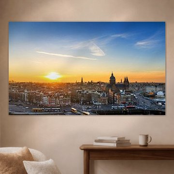
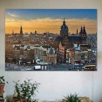
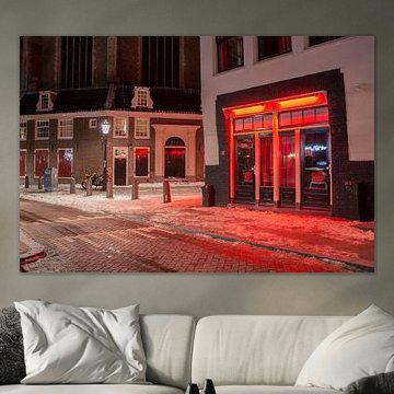
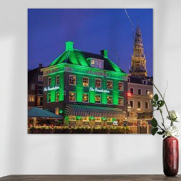
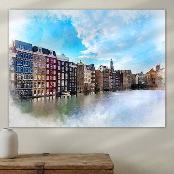
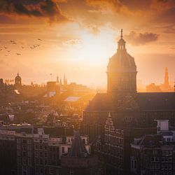
Some pieces feature bright blue skies, while others show overcast grey - both reflect Amsterdam's changing weather. If your room has cool-toned furniture or blue accents, the vibrant sky in Old Church Amsterdam adds energy. For softer, neutral interiors, grey and taupe tones create a gentler backdrop.
AnouschkaArt Stylist Questions? Check out our FAQ


Trusted and loved
Customers rate us 4.8!
High-quality materials
Sustainable and long-lasting beauty
Different sizes
From small to large, anything is possible.
Made for you
Made the moment you order.


More like this


Where does an old church collection work well in your home?
The living room is a good spot for old church artworks. These atmospheric pieces bring depth and character to the space where you spend most of your time. Place a landscape-format photograph above your sofa to create a focal point, or combine multiple square formats on a feature wall. The nostalgic mood and architectural details invite conversation and contemplation, making your living room feel both welcoming and distinctive.
Which colors from old church suit your interior style?
Old church artworks pair naturally with Scandinavian and rustic interiors. The brown and taupe tones work well in country-style rooms with wooden furniture and natural textures, while the black-and-white pieces complement Scandinavian spaces with clean lines and neutral palettes. Try combining the warmer browns with cream or beige accessories for a cohesive rustic look, or use the blue-toned artworks to add subtle color in an otherwise minimal setting.
Choosing the right material
Old church comes to life on each of our premium materials. Whether you choose Canvas, Poster, or Wallpaper, each enhances the unique details and colors.
Choose Wallpaper and you benefit from two key advantages. First, make a statement by turning your entire wall into art. Instead of limiting these atmospheric architectural scenes to a frame, wallpaper transforms the old church imagery into an immersive backdrop. The nostalgic mood and calm tones create direct character in your hallway or bedroom, letting the brown and taupe hues set the atmosphere for the entire room. Second, razor-sharp prints deliver vivid colors even in large formats. Every architectural detail - from weathered stone to delicate light play - becomes an eye-catching focal point that commands attention, perfectly suited to the romantic and contemplative mood of old church photography.
Still doubting which material suits your interior and chosen old church artwork? Use our material comparator to find the perfect match for your space.
