

-
More artworks below this tip
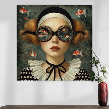
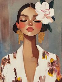
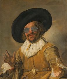
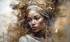
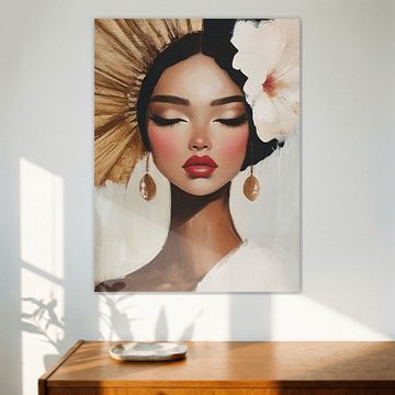
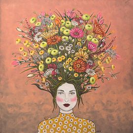
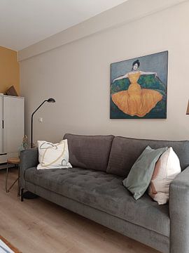
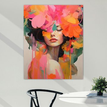
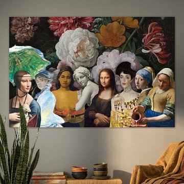
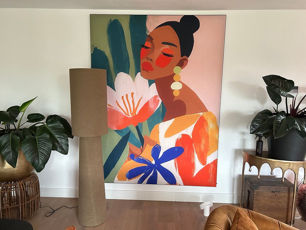
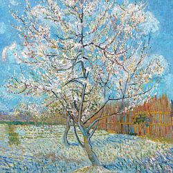
Color combination: warm earthy tones meet rich accents
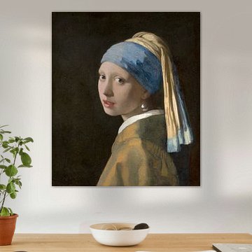
Brown and taupe form a versatile base that works well with both neutral interiors and accent colors like blue or bronze. Pair these earthy tones with natural materials - wood, linen, or terracotta - to create a cohesive look. The warm palette in Meisje met de Parel – The Orange Autumn Edition complements autumn-inspired spaces beautifully.
EileenStylist & Customer service Questions? Check out our FAQ
 -
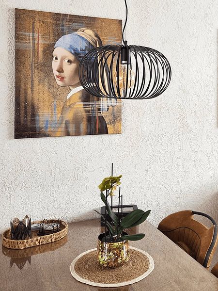
More artworks below this tip
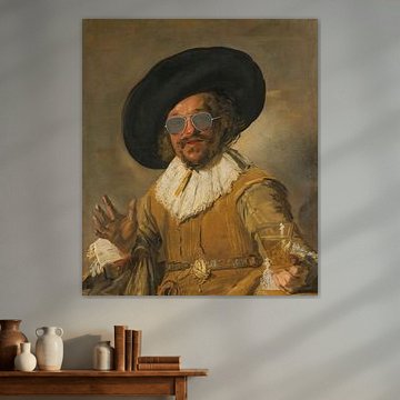
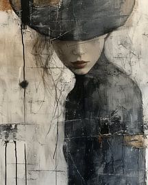
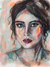
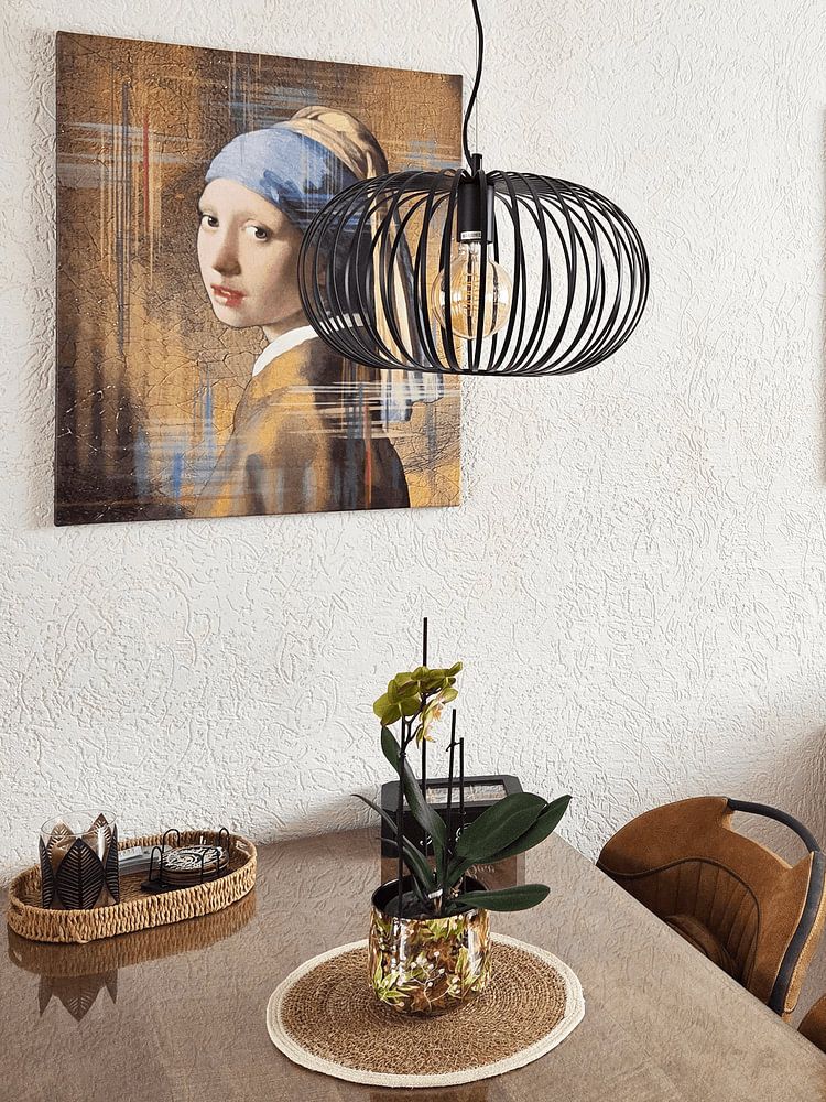
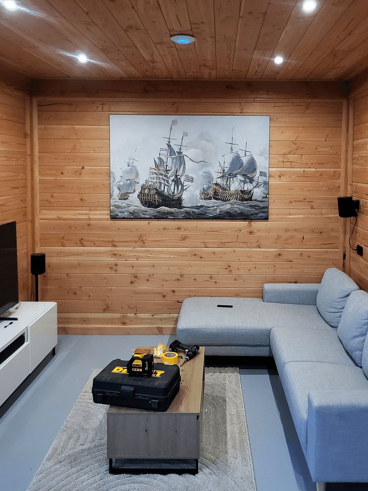
Room pairing: versatile enough for public and private spaces
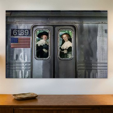
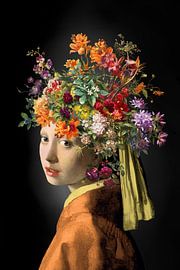
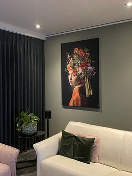
Artworks that reimagine historic subjects work across many settings - from living rooms and bedrooms to offices, restaurants, and hotels. The playful reinterpretation in Vermeer Upside Down Girl with a Pearl Earring - pop art black adds personality to both residential and commercial interiors, making it a flexible choice for different environments.
RosanneStylist & Customer service Questions? Check out our FAQ
 -
More artworks below this tip
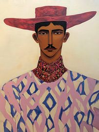
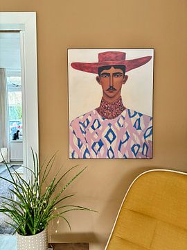
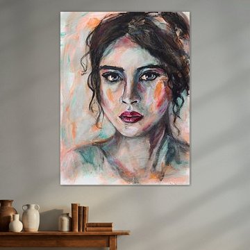
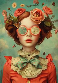
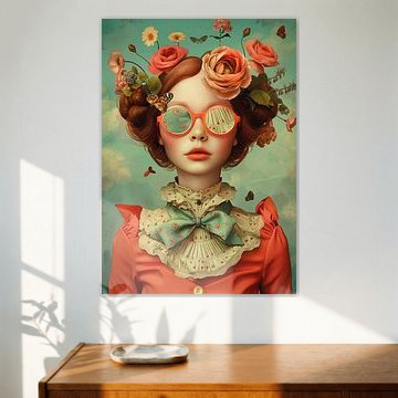
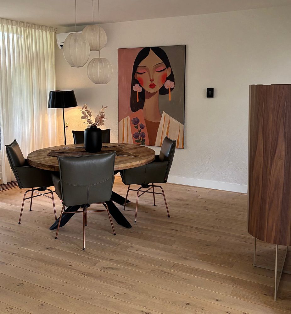
Format selection: portrait and square are equally popular
Both portrait and square formats are top choices for this collection. Portrait works well for narrow walls, above console tables, or in hallways. Square formats suit flexible spaces and create balance in symmetrical arrangements. Choose the format that fits your wall dimensions and layout.
AnthiStylist & Customer service Questions? Check out our FAQ
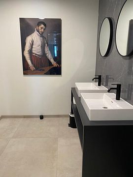
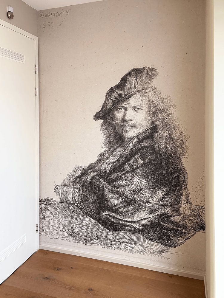
Topics of old masters
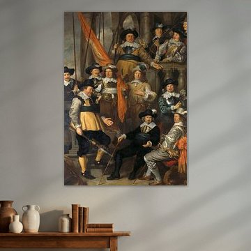
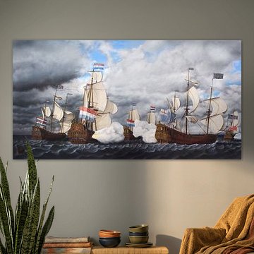
Topics of old masters bring history and storytelling into your home. From dramatic sea battles to serene portraits, these artworks capture the narrative richness that defines classical painting. Rich golden tones meet deep blues and earthy browns, creating scenes that feel both grand and intimate - qualities that work beautifully in traditional and eclectic interiors alike. Works like Cornelis Claesz. Van Wieringen, Battle of Gibraltar - 1622 showcase the sweeping scale and detail characteristic of this timeless genre.
At Art Heroes, we print each piece to order. Choose your size and material - Canvas, Poster, ArtFrame™ and more - to suit your space perfectly.


Looking for the orignal Old Masters?
In this collection you will find both the edited and original Old Masters.


Trusted and loved
Customers rate us 4.8!
High-quality materials
Sustainable and long-lasting beauty
Different sizes
From small to large, anything is possible.
Made for you
Made the moment you order.
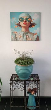
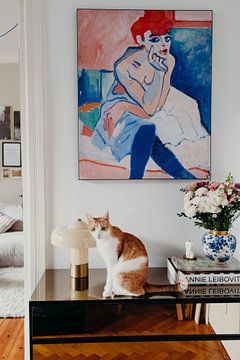
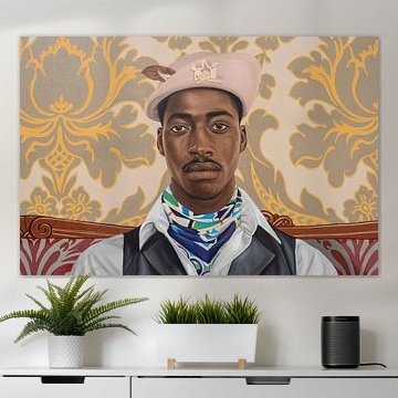
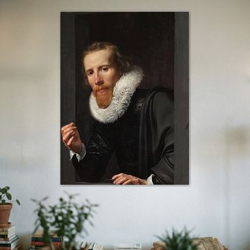
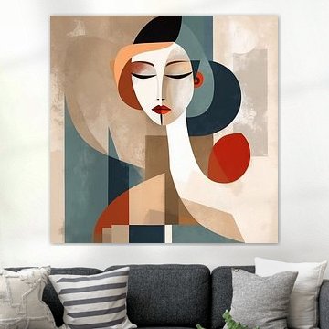
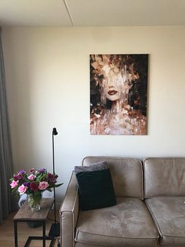
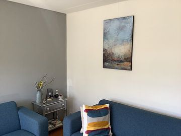
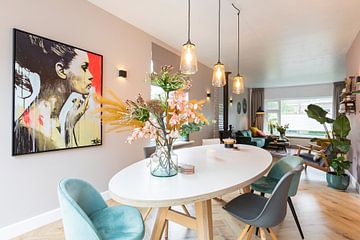
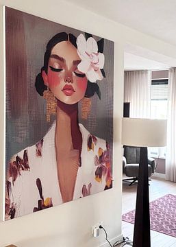
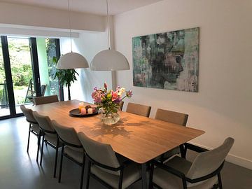
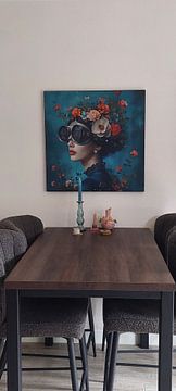
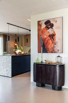
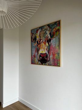
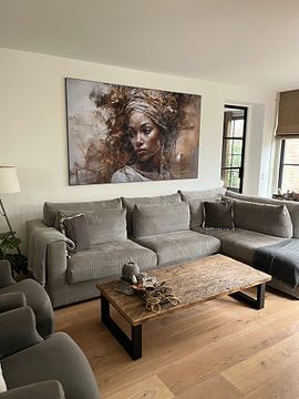
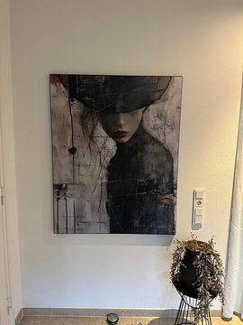
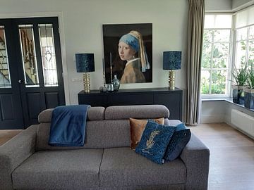
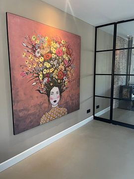
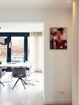
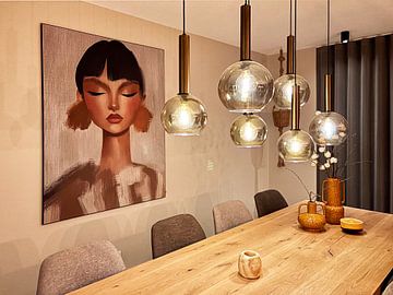
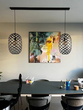
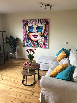
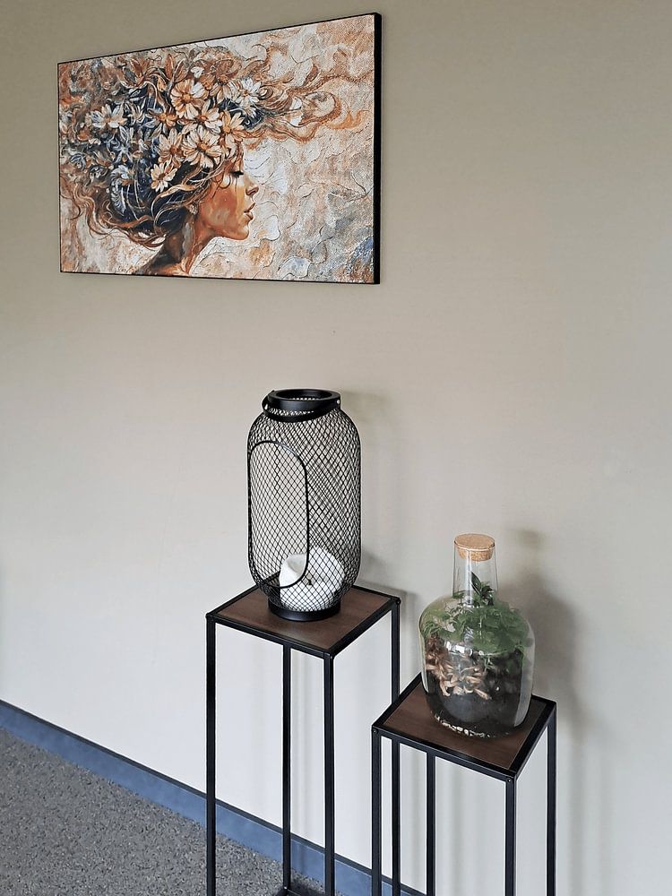
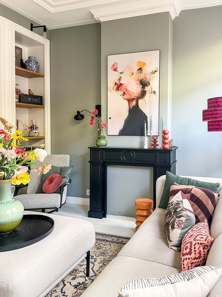
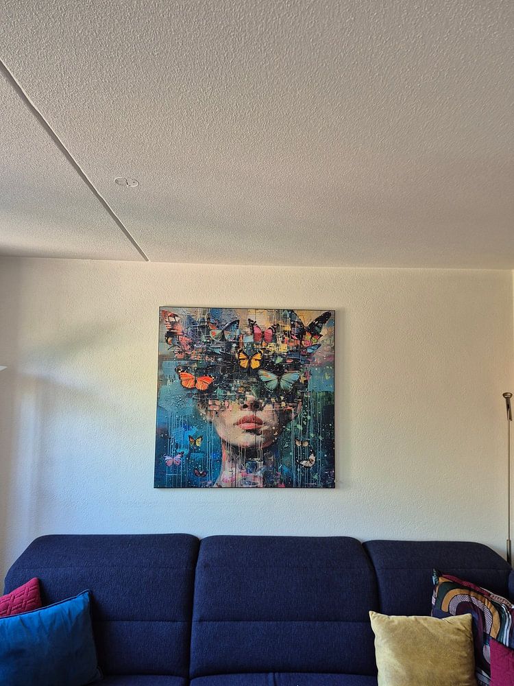
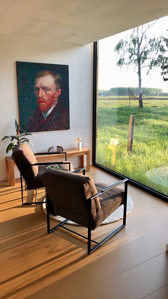
How they hang in other homes
Get inspired by beautiful artworks on other people's walls and see how they truly enhance an interior.


More like this


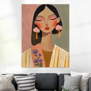
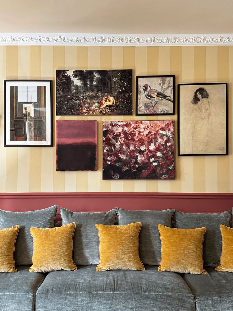
Brown and grey tones for classic and modern interiors
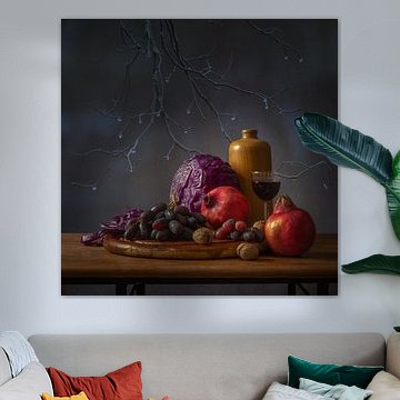
Topics of old masters brings rich brown, beige, and grey tones that blend beautifully into both classic and modern interiors. In a classic setting, combine deeper browns with warm beige for a traditional look. For modern spaces, pair cool grey with taupe to create calm, sophisticated rooms. These earthy colors work particularly well in living rooms and studies, where they add depth without overwhelming your walls.
Choosing the right material
Topics of old masters comes to life on each of our premium materials. Whether you choose Canvas, Poster, or Wallpaper, each enhances the unique details and colors.
Choose Poster and you benefit from museum-grade prints on heavy 260-gram satin photo paper. The calm, nostalgic moods of historical portraits and civic guard paintings shine through the fine-art quality printing, capturing every brushstroke and subtle shade of brown, beige, and blue with precision. UV-resistant inks ensure the mysterious depth and rich tones of these classical subjects don't fade over time. This matters especially for Topics of old masters artworks, where the interplay of shadow and light defines the atmosphere. Your print maintains its color year after year, preserving the authentic character that makes these scenes so captivating.
Still doubting which material suits your interior and chosen Topics of old masters artwork? Use our material comparator to find the perfect match for your space.
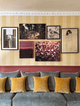
Creating a gallery wall with Topics of old masters

Combine Topics of old masters with complementary artworks to build a thoughtful gallery wall. Mix historical portraits with seas and seascapes for visual variety, or group civic guard paintings together for dramatic impact. The nostalgic and mysterious moods work well alongside vintage books, candlesticks, or dark wood furniture. Try pairing portrait and landscape formats on the same wall for balanced composition.
Let the calm, classical atmosphere of Topics of old masters guide your interior choices and create spaces that feel both grounded and inspiring.
