-
More artworks below this tip
Pairing with Your Room
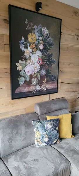
Spring florals bring warmth to cooler rooms with limited natural light. The bright yellow blooms and fresh green stems in Spring can help brighten a north-facing bedroom or hallway. Place your print where you'd welcome a touch of seasonal colour and energy throughout the year.
EileenStylist & Customer service Questions? Check out our FAQ
 -
More artworks below this tip
Hanging Near Natural Elements
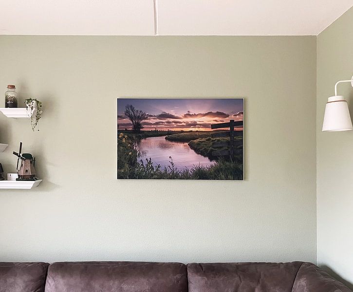
Landscape scenes with foreground detail benefit from thoughtful placement. Position Alblasserwaard where viewers can appreciate both the meadow flowers in the foreground and the sunset backdrop - ideally at eye level in a living room or dining area. Avoid hanging too high, which can lose the layered depth of the scene.
AnouschkaArt Stylist Questions? Check out our FAQ
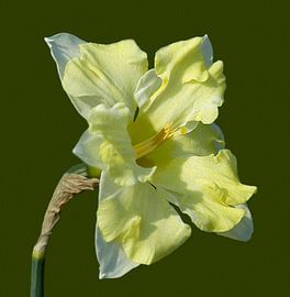
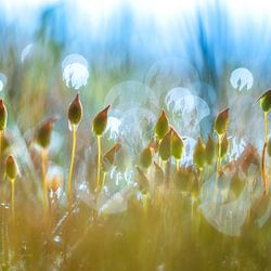
Daffodil
Daffodil artworks bring warmth and light into your home. Their bright yellows and soft greens create an inviting atmosphere that lifts your mood every day. Whether you prefer bold, painterly blooms like Yellow Narcissus or gentle abstract compositions, daffodil art fits beautifully into Scandinavian, modern, and country-style interiors. The natural elegance works particularly well in spaces where you want to feel refreshed and inspired.
At Art Heroes, we work with talented European artists to offer you custom-made pieces. Choose from Canvas, Poster, ArtFrame™ and more - all with free shipping to your door.


Trusted and loved
Customers rate us 4.8!
High-quality materials
Sustainable and long-lasting beauty
Different sizes
From small to large, anything is possible.
Made for you
Made the moment you order.
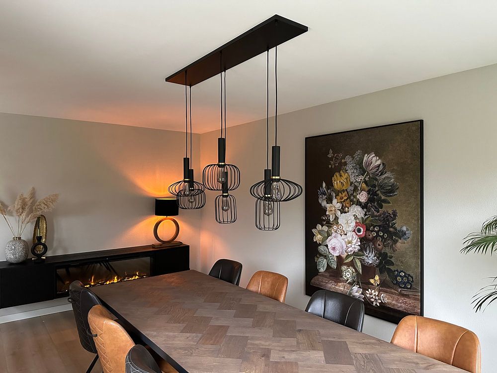
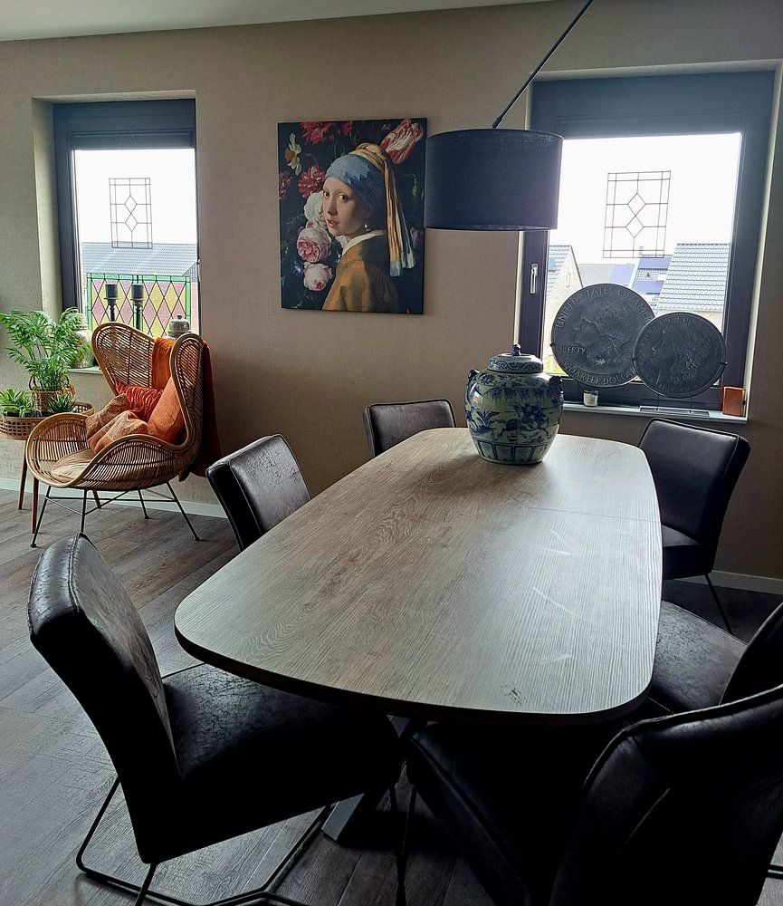
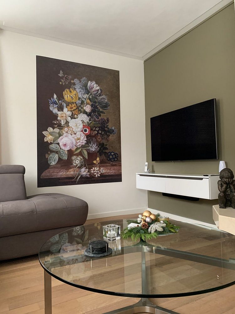
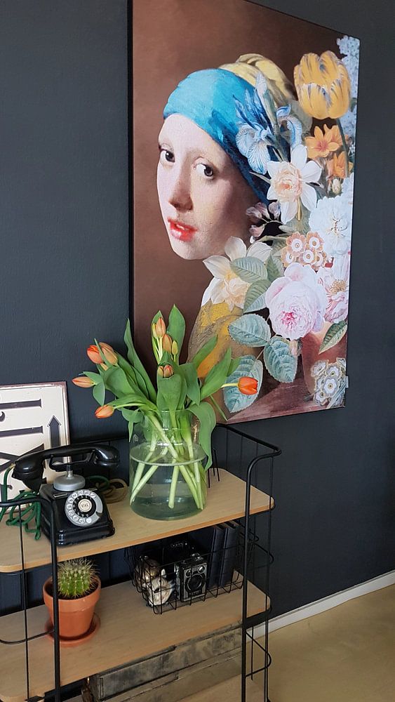
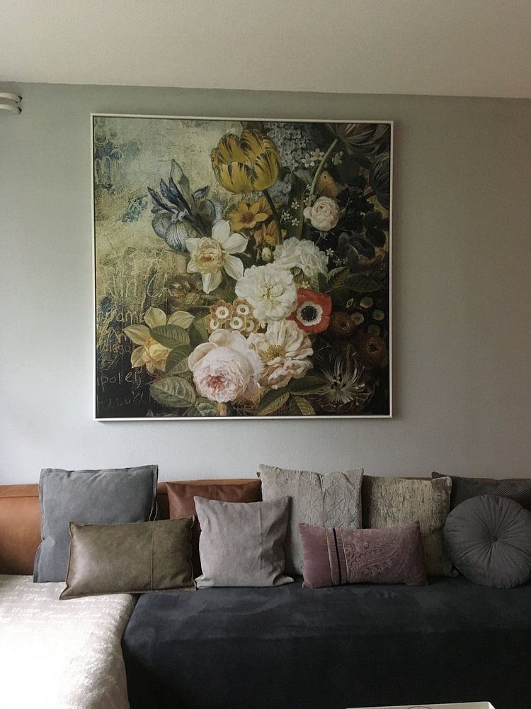
How they hang in other homes
Get inspired by beautiful artworks on other people's walls and see how they truly enhance an interior.


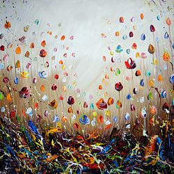
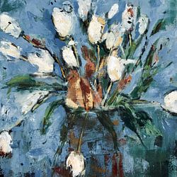
More like this


Choosing the right material for daffodil art
Daffodil comes to life on each of our premium materials. Whether you choose Poster, Canvas, or ArtFrame™, each enhances the unique details and colors of these cheerful spring blooms.
Choose Poster and you benefit from prints that truly honor the vibrant yellows and golds in daffodil artworks. The fine-art quality satin photo paper weighing 260 grams ensures every petal and stem appears sharp and lifelike, making calm and joyful moods shine through. The UV-resistant inks are particularly valuable for daffodil prints, as they keep the sunny yellow and gold tones bright year after year without fading. This matters when you want to preserve the warm, vibrant character that makes these artworks so appealing, whether rendered through photography, painting, or digital art.
Still doubting which material suits your interior and chosen daffodil artwork? Use our material comparator to find the perfect match for your space.
Where does daffodil art work well in your home
A kitchen is a good spot for daffodil artworks, where the yellow and gold tones complement natural light and create a welcoming atmosphere during morning routines. These pieces work particularly well above a sideboard or dining table, where the calm yet joyful mood enhances the heart of your home. Portrait and square formats fit neatly on smaller walls, while landscape pieces suit the space above kitchen counters or breakfast nooks beautifully.
Which colors pair well with daffodil prints

Daffodil artworks featuring yellow, gold, and olive green tones blend naturally into Scandinavian and country interiors. In Scandinavian spaces, pair the soft yellows with white walls and light wood furniture to maintain an airy, calm feel. For country or rustic styles, combine the warmer gold and brown shades with natural textures like woven baskets and wooden frames. The green elements in these artworks bridge the gap between both styles, making them adaptable to your existing décor.
