
Jacob van Ruisdael
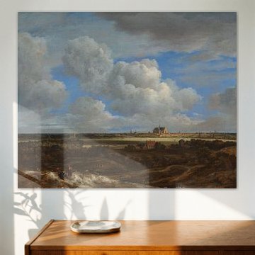
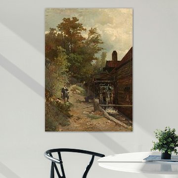
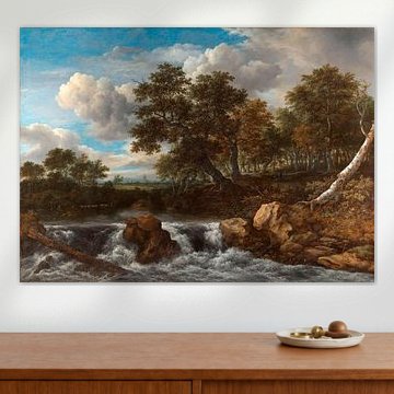
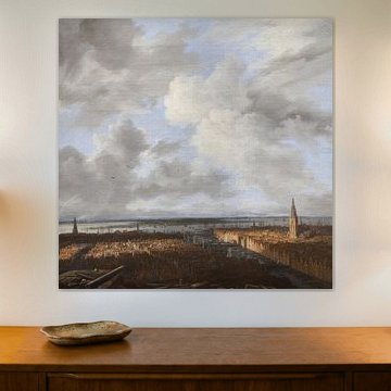
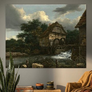
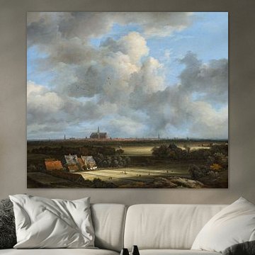
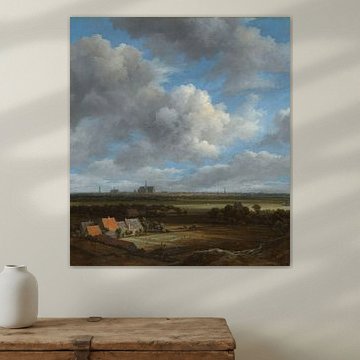
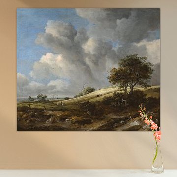
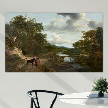
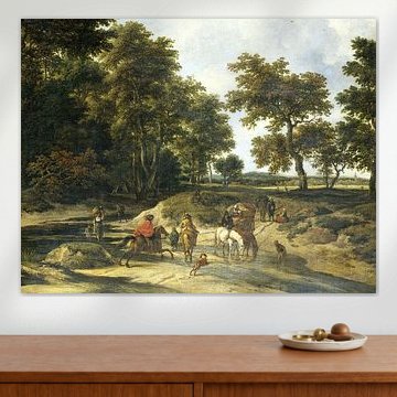
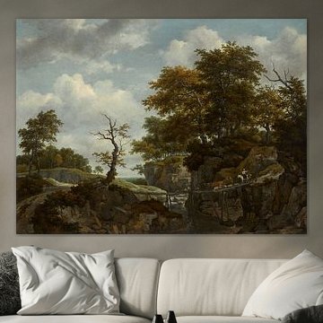
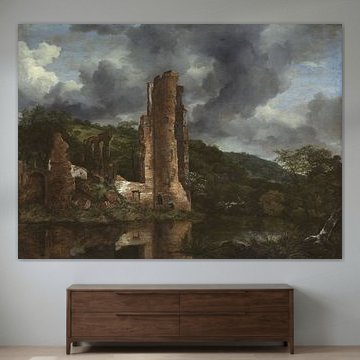
Choosing Jacob van Ruisdael means embracing the quiet drama of the Dutch Golden Age. His landscapes capture rolling dunes, windswept skies, and peaceful waterways with remarkable depth. These artworks suit interiors that value natural tones and timeless composition.
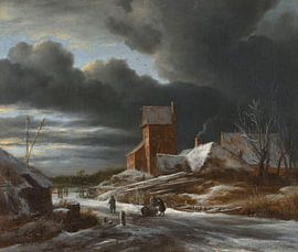
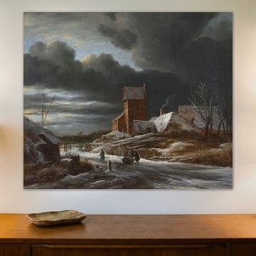
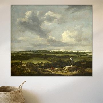
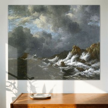
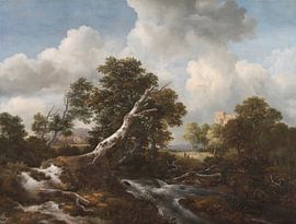
Ruisdael painted with a painter's eye for light and weather - notice how clouds dominate in Winter landscape, Jacob Isaacksz. van Ruisdael, creating atmosphere that feels both calm and mysterious. His palette of sage greens, warm grays, and earthy browns blends beautifully with Scandinavian, rustic, or classic interiors.
Available as Canvas, ArtFrame™, Poster and more - choose what suits your space.
-
More artworks below this tip
Create depth in hallways and living rooms
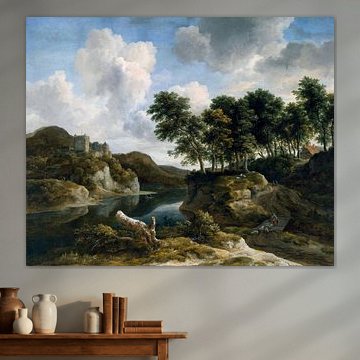
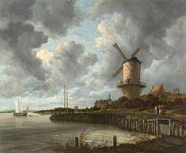
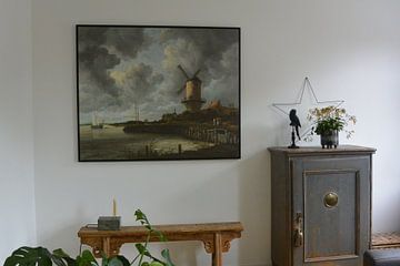
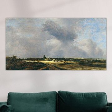
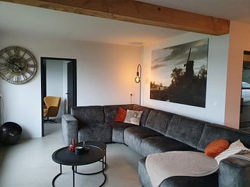
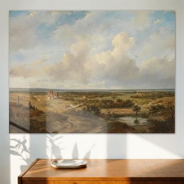
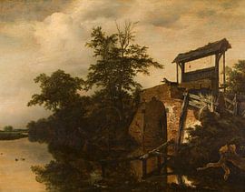
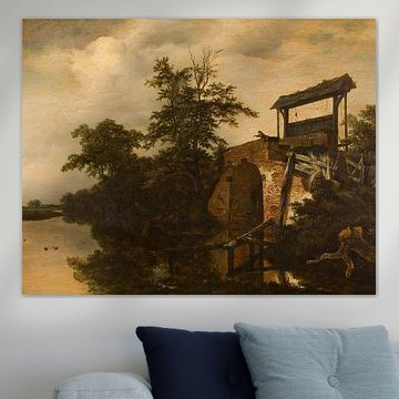
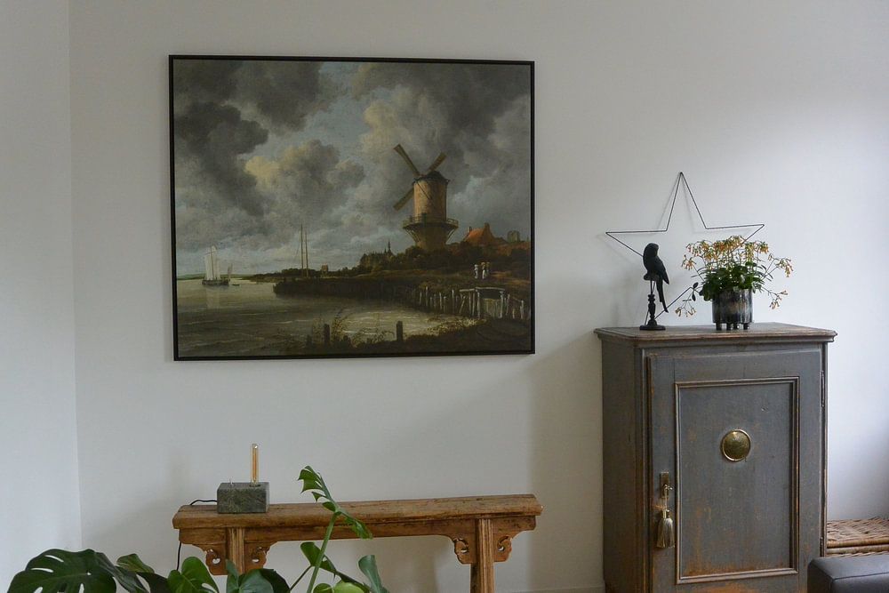
Landscapes with layered scenery work well in spaces where you want to add visual depth. The sweeping vista in The mill at Wijk bij Duurstede, Jacob Isaacksz. van Ruisdael draws the eye from foreground to horizon, making it ideal for narrow hallways or above sofas where you'd like to create a sense of openness.
GinaStylist & Customer service Questions? Check out our FAQ






















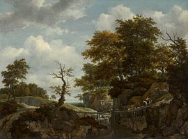


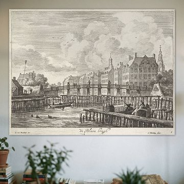


Be sure to check out the creative new masters
Our artists have created artworks inspired by the old masters.



Trusted and loved
Customers rate us 4.8!
High-quality materials
Sustainable and long-lasting beauty
Different sizes
From small to large, anything is possible.
Made for you
Made the moment you order.
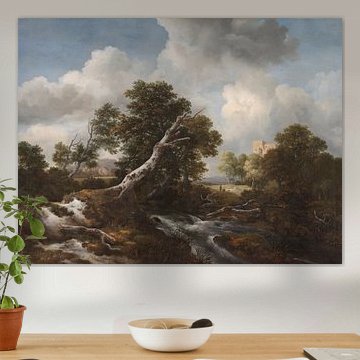
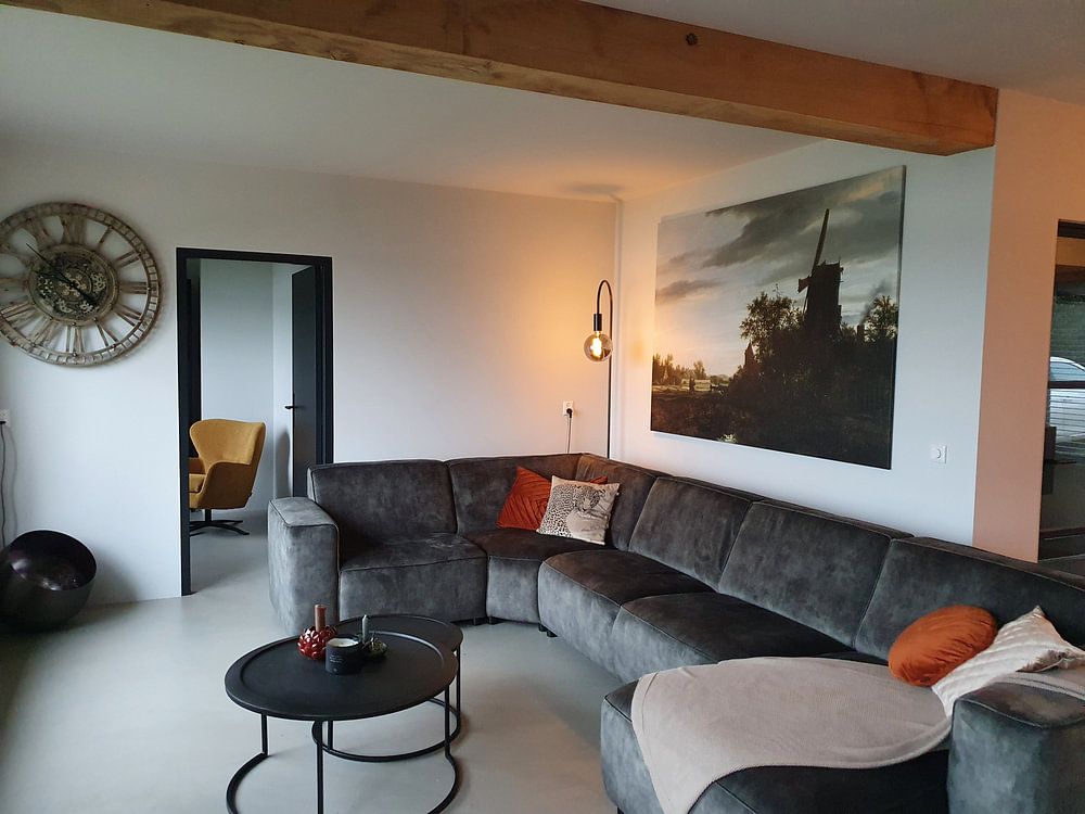
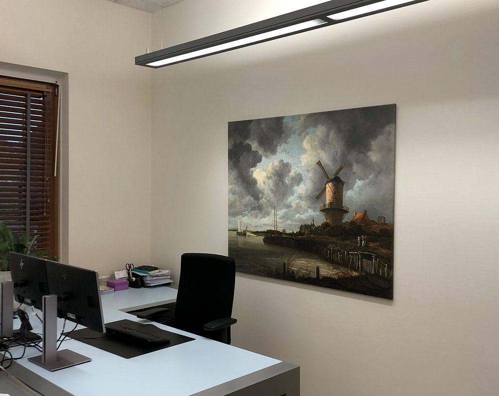
How they hang in other homes
Get inspired by beautiful artworks on other people's walls and see how they truly enhance an interior.


More like this




Which colors in Jacob van Ruisdael artworks suit a Scandinavian interior
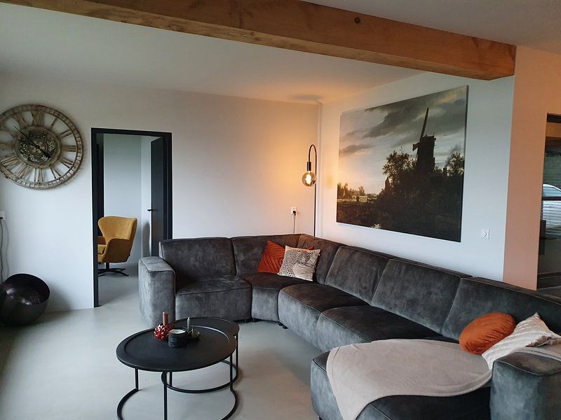
Jacob van Ruisdael's palette of grey, brown, and beige creates a natural foundation for Scandinavian interiors, where muted tones and organic textures meet. The soft grey skies and earthy browns echo the light wood and neutral linens typical of Nordic design, while touches of blue and olive green add gentle contrast without overwhelming the space. Pair beige-toned artworks with white walls and pale oak furniture for a cohesive look, or introduce deeper grey pieces to anchor a minimalist room with subtle depth.
Where Jacob van Ruisdael artworks work well in your living room
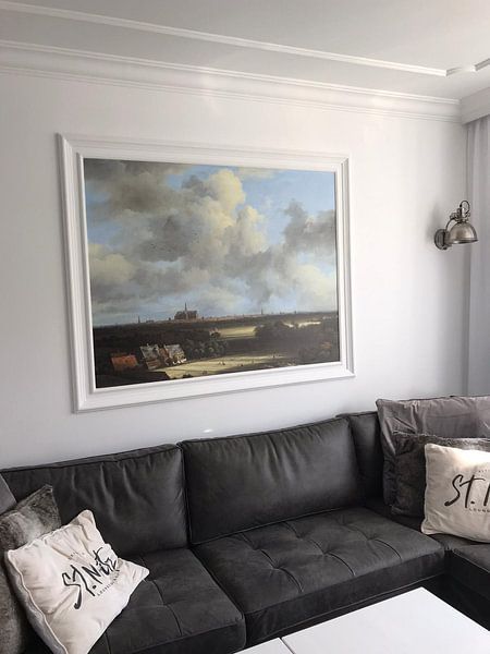
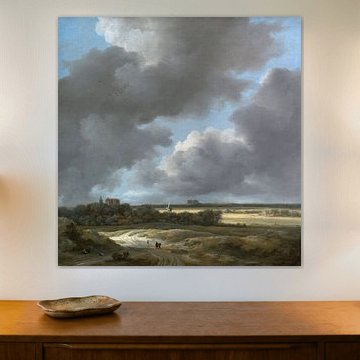
A living room is a good spot for Jacob van Ruisdael artworks, especially if you want to cultivate a calm and nostalgic atmosphere. The collection's grey and brown tones bring a sense of quiet contemplation that works beautifully above a sofa or sideboard, inviting slower moments in a space often used for gathering. The mysterious quality of these landscapes adds visual interest without demanding attention, making them easy companions for relaxed evenings and conversation.
Styling Jacob van Ruisdael with complementary decor elements
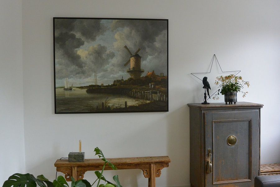
Jacob van Ruisdael artworks pair naturally with decor that echoes their calm and nostalgic moods - think weathered wood objects, linen cushions in beige or grey, and ceramic vases in earthy glazes. Add greenery like ferns or olive branches to reflect the olive green tones in the collection, or place a simple table lamp nearby to warm the mysterious shadows. For a cohesive gallery wall, combine different sizes from the collection and frame them with natural wood borders to enhance the organic, grounded feel. Choose your preferred format and Canvas finish to bring these landscapes into your home.