-
More artworks below this tip
Placing Dutch Golden Age landscapes in your home
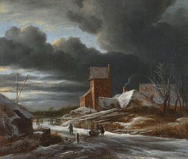
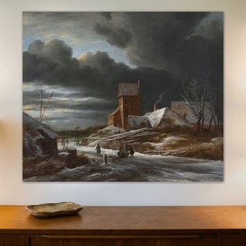
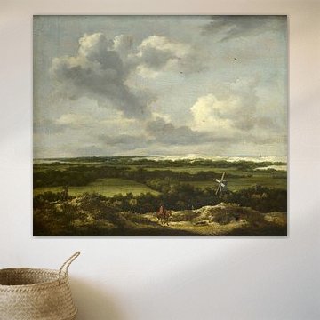
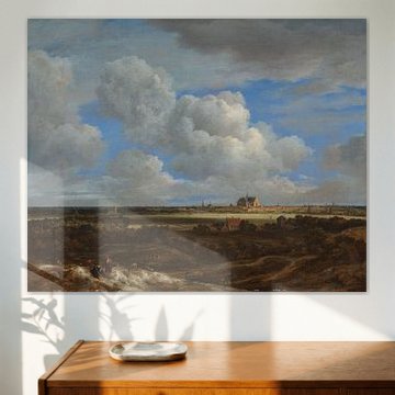
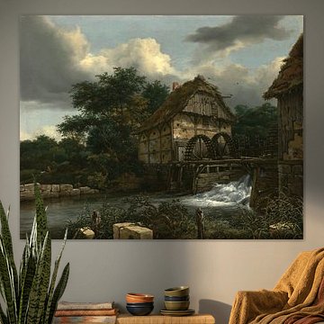
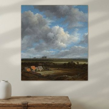
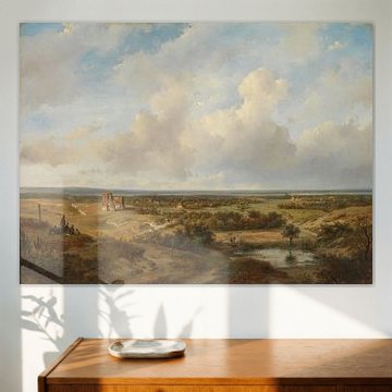
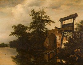
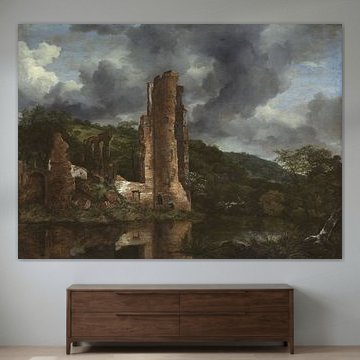
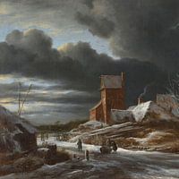
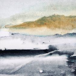
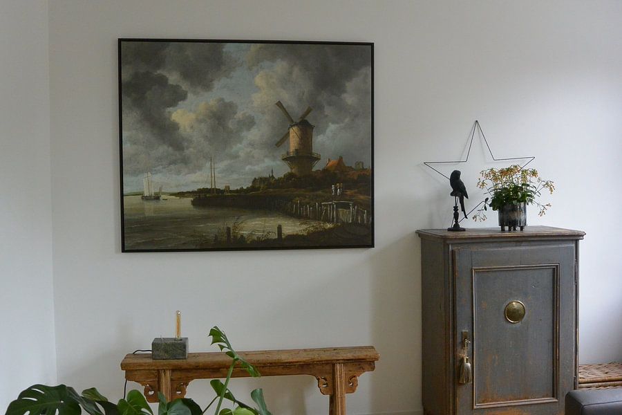
Dutch landscape paintings often work best where natural light echoes their atmospheric skies. Consider positioning The mill at Wijk bij Duurstede, Jacob Isaacksz. van Ruisdael in a room with large windows or soft daylight. The dramatic cloudscape and reflective water gain depth when viewed in changing light throughout the day.
AnthiStylist & Customer service Questions? Check out our FAQ
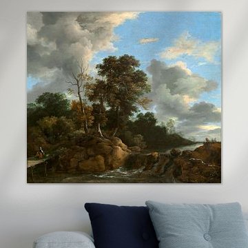
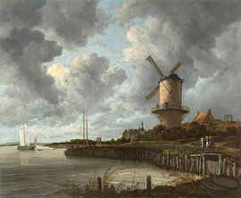
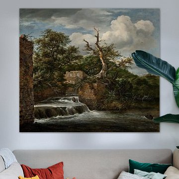
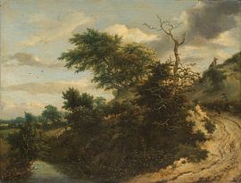
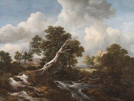
Jacob van Ruisdael
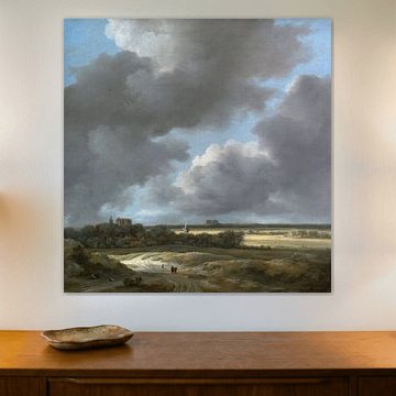
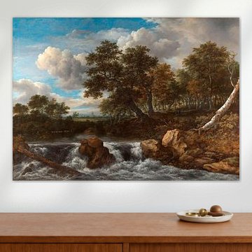
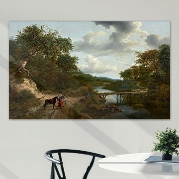
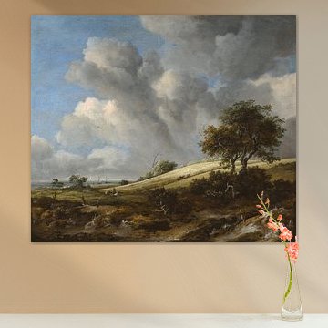
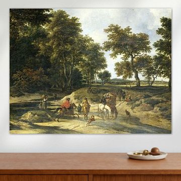
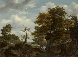
Jacob van Ruisdael captures the soul of the Dutch Golden Age through sweeping skies and tranquil countryside. His landscapes evoke calm and mystery in equal measure.
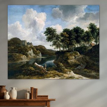
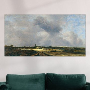
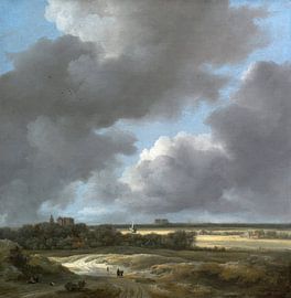
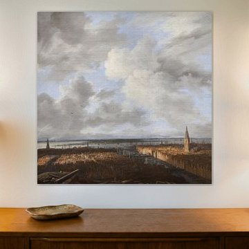
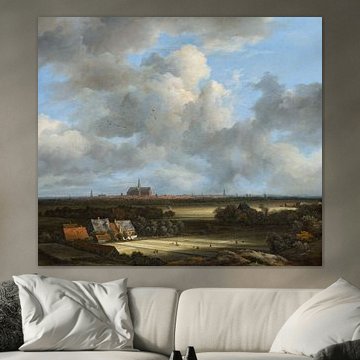
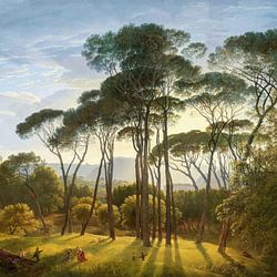
Dramatic cloud formations meet earthy greens and soft greys, while works like A Panoramic View of Haarlem, Jacob van Ruisdael showcase his signature panoramic views. These timeless scenes bring depth to minimalist and classic interiors alike, anchoring your space with quiet drama.
At Art Heroes, we print each artwork to order. Choose Canvas, ArtFrame™, Poster and more to suit your style.


Be sure to check out the creative new masters
Our artists have created artworks inspired by the old masters.


Trusted and loved
Customers rate us 4.8!
High-quality materials
Sustainable and long-lasting beauty
Different sizes
From small to large, anything is possible.
Made for you
Made the moment you order.
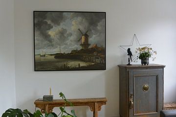
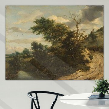
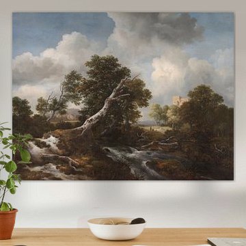
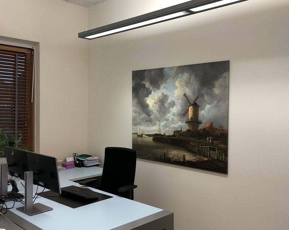
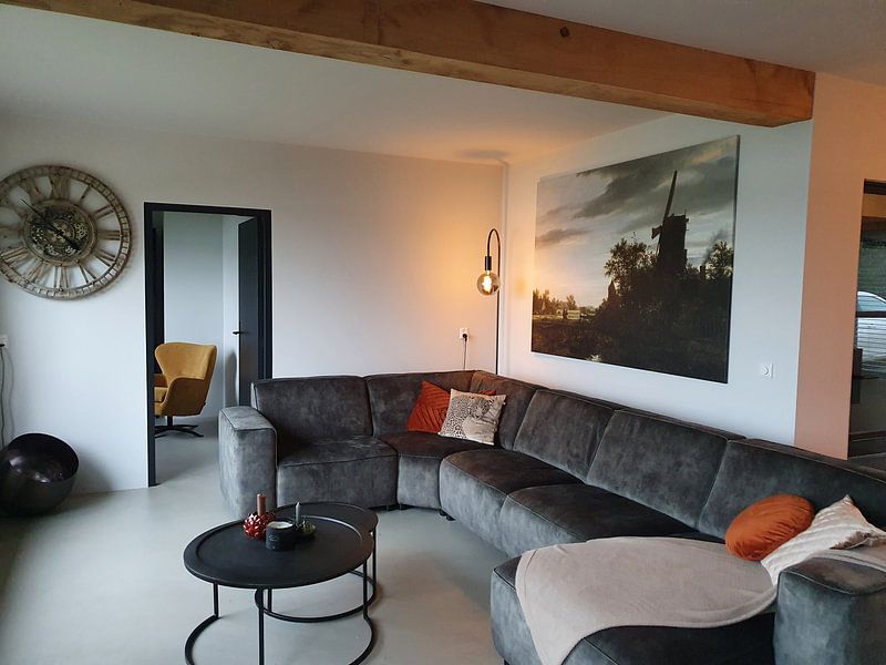
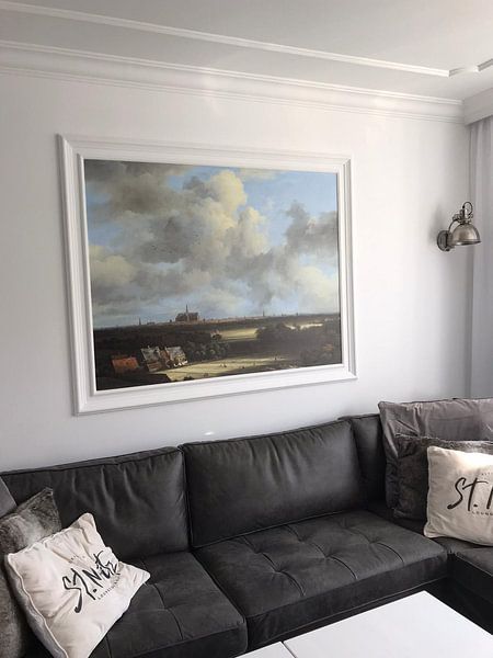
How they hang in other homes
Get inspired by beautiful artworks on other people's walls and see how they truly enhance an interior.


More like this


Which colors from Jacob van Ruisdael suit a Scandinavian interior?
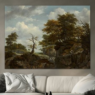
The muted grey, beige, and soft blue tones found in Jacob van Ruisdael landscapes blend beautifully with Scandinavian interiors. Combine these earthy shades with light wood furniture and natural textiles for a cohesive look. The olive green and brown hues add warmth without overwhelming minimalist spaces, creating balance between calm and character in your home.
Choosing the right material
Jacob van Ruisdael comes to life on each of our premium materials. Whether you choose Canvas, Poster, or ArtFrame™, each enhances the unique details and colors.
Choose ArtFrame™ and you benefit from two standout features. First, the easy interchangeability means you can refresh your space in minutes - swap between different Jacob van Ruisdael landscapes whenever the mood strikes, without replacing the entire frame. This flexibility suits collectors who appreciate the calm, nostalgic atmosphere these artworks bring but enjoy variety. Second, the acoustic function makes ArtFrame™ practical for spaces where sound matters. The optional sound-dampening panels reduce echo while staying hidden behind your chosen Jacob van Ruisdael print, combining visual beauty with functional comfort in home offices or living areas.
Still doubting which material suits your interior and chosen Jacob van Ruisdael artwork? Use our material comparator to find the perfect match for your space.
Where does art by Jacob van Ruisdael work well in your home?
A home office is a good spot for Jacob van Ruisdael landscapes. The calm and mysterious moods these artworks evoke help create focus without distraction during work hours. Hang a larger format above your desk or on the wall opposite your workspace to bring natural depth into the room. Pair with neutral furniture and plants to echo the organic palette.
