
Michiel de Ruyter
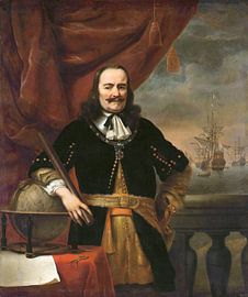
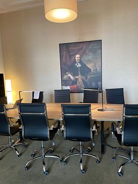
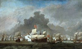
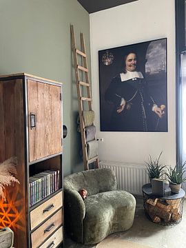
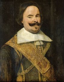
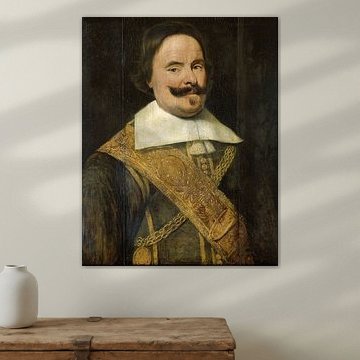
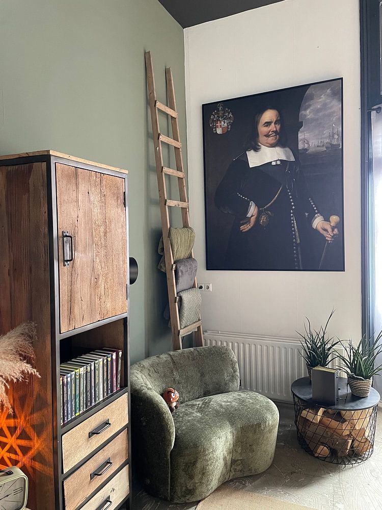
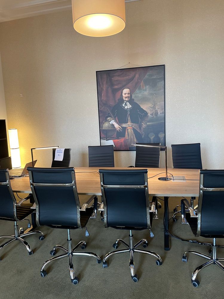
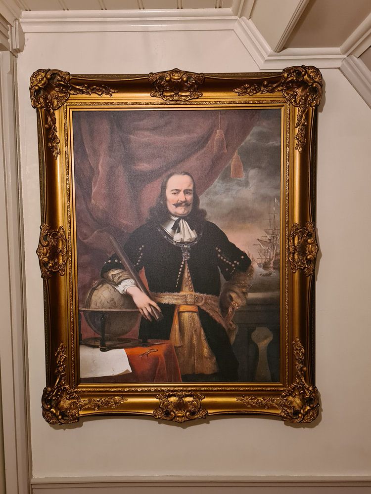
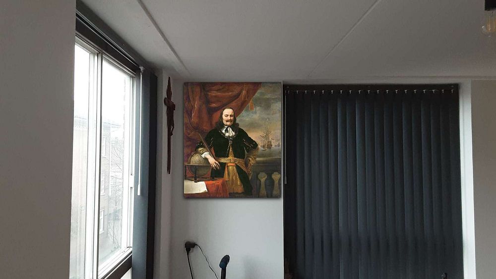
Golden Age maritime power meets modern craftsmanship. Michiel de Ruyter's legacy lives through dramatic sea battles and dignified portraits that capture Dutch naval strength. Rich earth tones and sage greens dominate these commanding compositions, which suit classic and contemporary interiors alike. Portrait painting: Michiel de Ruyter as lieutenant admiral, Ferdinand Bol, 1667 shows the admiral in full regalia, embodying authority and elegance.
At Art Heroes, we bring this historical grandeur to your space. Choose from ArtFrame™, Canvas, Poster and more - all custom-made and shipped free to your door.
-
More artworks below this tip
Working with grey and blue accents
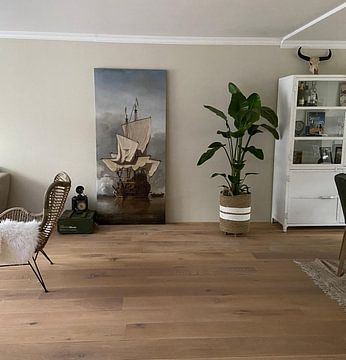
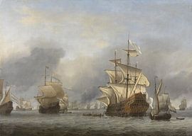
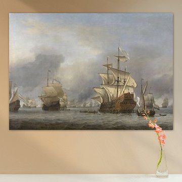
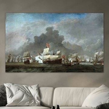
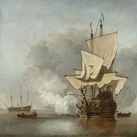
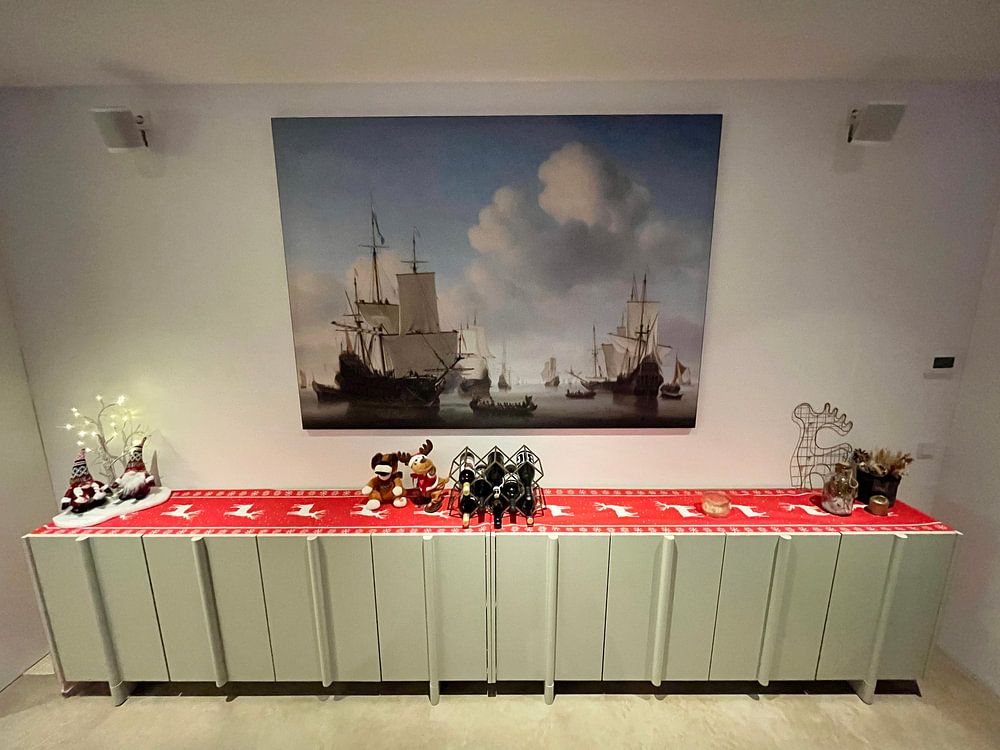
Stormy skies and turbulent waters bring grey and blue into your interior naturally. These cooler tones pair well with steel, concrete, or dark wood finishes. The grey clouds in VOC Naval battle painting: The capture of the Royal Prince complement modern industrial spaces while adding a layer of historic depth.
AnouschkaArt Stylist Questions? Check out our FAQ
 -
More artworks below this tip
Where maritime drama works best
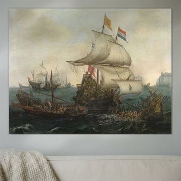
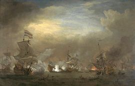
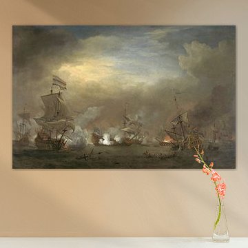
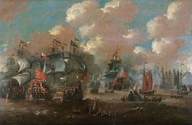
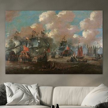
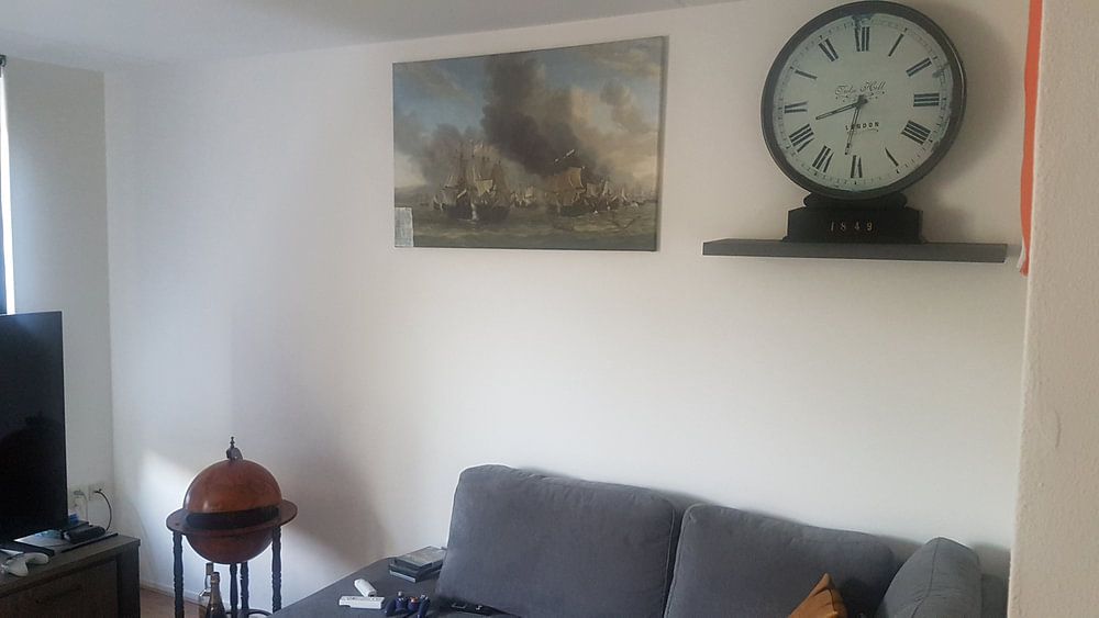
Naval battle scenes carry natural intensity that commands attention in your space. They work beautifully in studies, hallways, or dining rooms where you want to spark conversation. The smoke and movement in Michiel Adriaensz de Ruyter's fight against the Duke of York on the 'Royal Prince' creates a strong focal point that draws the eye across the room.
GinaStylist & Customer service Questions? Check out our FAQ






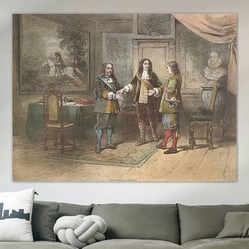
Be sure to check out the creative new masters
Our artists have created artworks inspired by the old masters.


Trusted and loved
Customers rate us 4.8!
High-quality materials
Sustainable and long-lasting beauty
Different sizes
From small to large, anything is possible.
Made for you
Made the moment you order.
How they hang in other homes
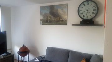
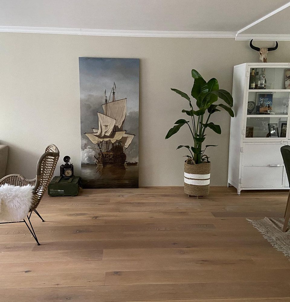
Get inspired by beautiful artworks on other people's walls and see how they truly enhance an interior.


More like this


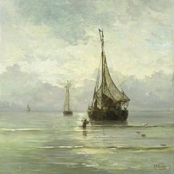




Where do portrait-format prints of Michiel de Ruyter work best?
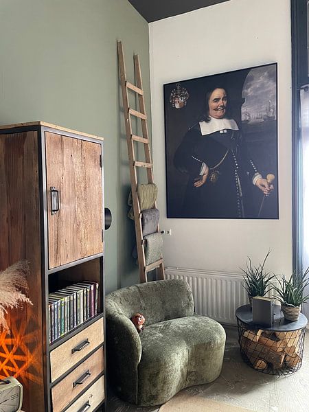
The Michiel de Ruyter collection works beautifully in portrait format, making it ideal for narrower walls or spaces between windows. Hang these artworks in hallways to create visual flow, or position them above a sideboard in your dining room. If your wall is wider, a landscape format offers better balance and draws the eye across the composition instead.
How do you combine artworks from the Michiel de Ruyter collection?
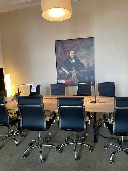
The powerful yet calm mood of the Michiel de Ruyter collection pairs naturally with understated decor. Style these artworks alongside brass or bronze objects that echo the historical character, or add sage-green textiles to soften the overall look. Wooden furniture in darker tones complements the earthy palette, while simple white ceramics prevent the space from feeling too heavy. Create a setting where strength meets tranquility, and every element supports the story.
Which interior styles suit the colors in Michiel de Ruyter prints?
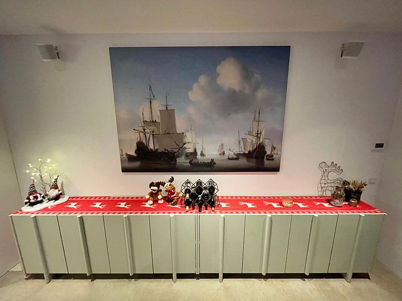
The beige, brown, grey, and sage-green tones in the Michiel de Ruyter collection suit classic and Scandinavian interiors particularly well. In a classic setting, combine the deeper browns with warm wood finishes and layered textiles for a refined, grounded atmosphere. For Scandinavian spaces, let the grey and sage-green hues take the lead, paired with pale oak and soft linen to keep the look fresh and uncluttered. Both styles allow Michiel de Ruyter artworks to anchor the room without overwhelming it.