-
More artworks below this tip
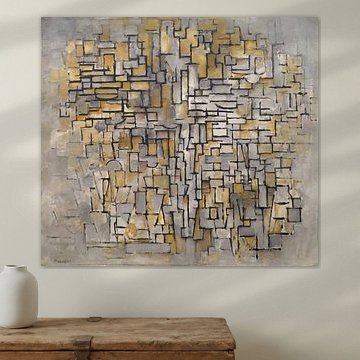
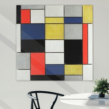
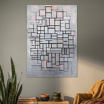
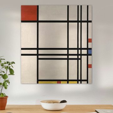
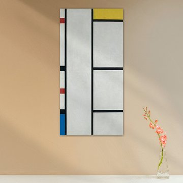
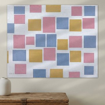
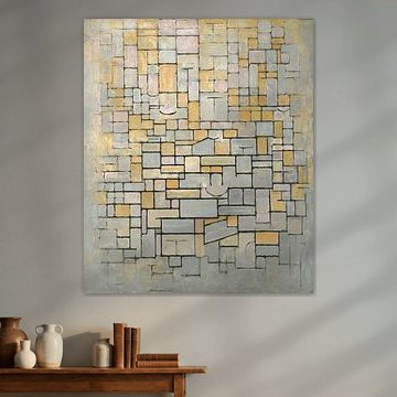
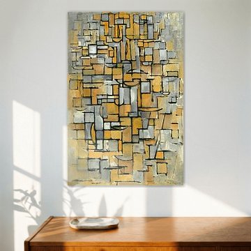
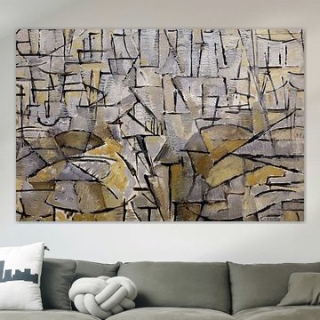
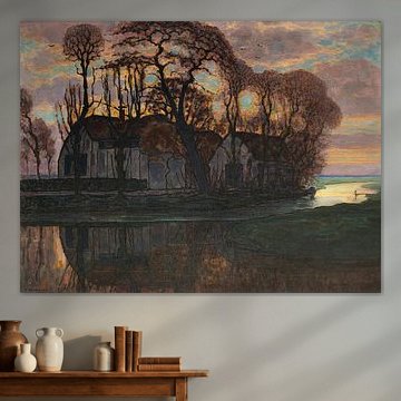
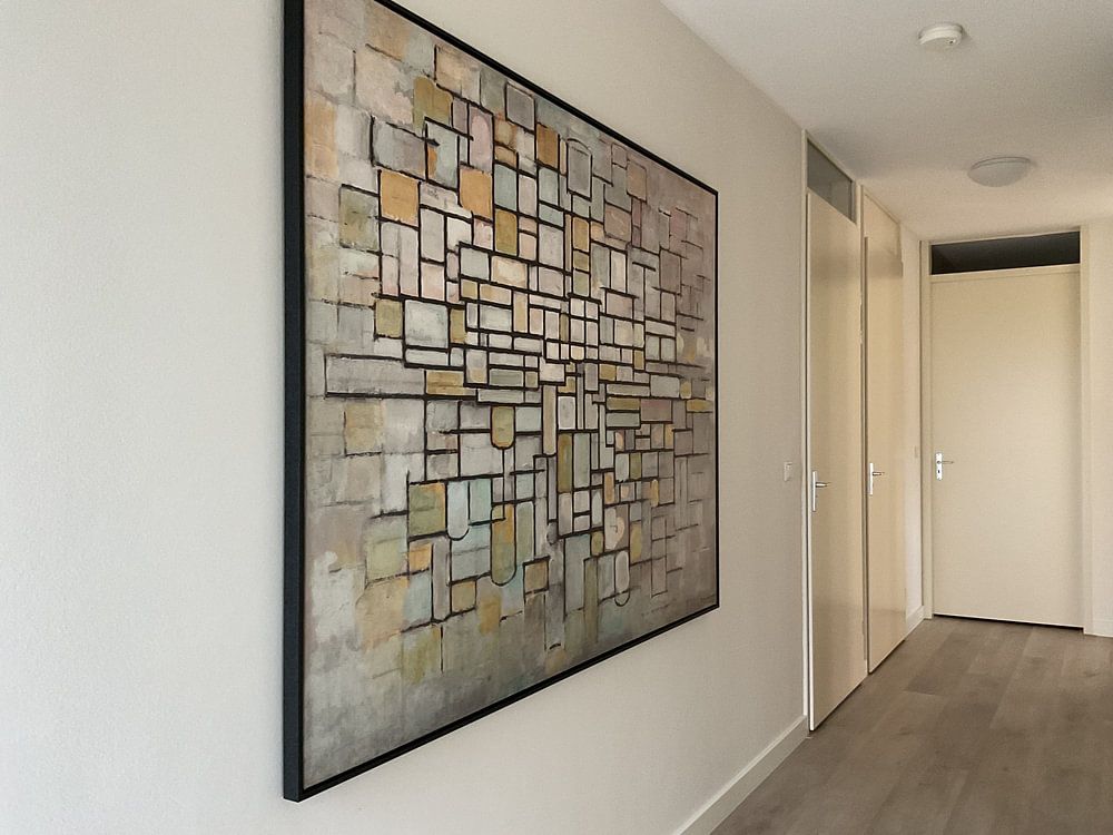
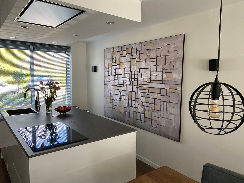
Hang geometric artworks at eye level in open spaces
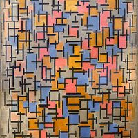
Grid-based compositions with strong vertical and horizontal lines benefit from central placement where the structure can be appreciated fully. Position the artwork at eye level on a wall with minimal distractions - avoid busy corners or crowded shelving. This allows the geometric balance to create visual order in your room without competing for attention.
EileenStylist & Customer service Questions? Check out our FAQ
 -
More artworks below this tip
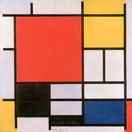
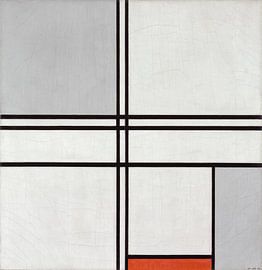
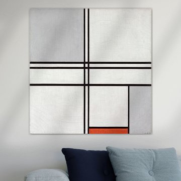
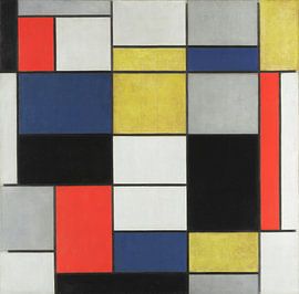
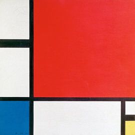
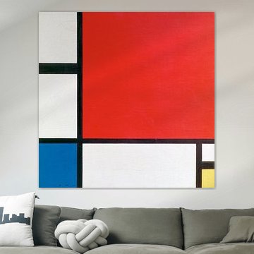
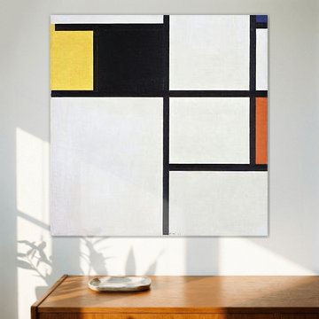
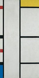
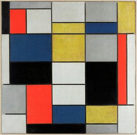
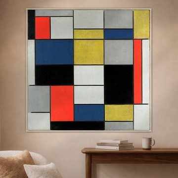
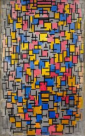
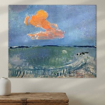
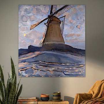
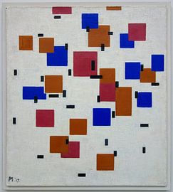
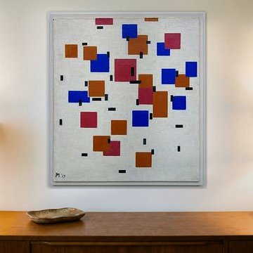
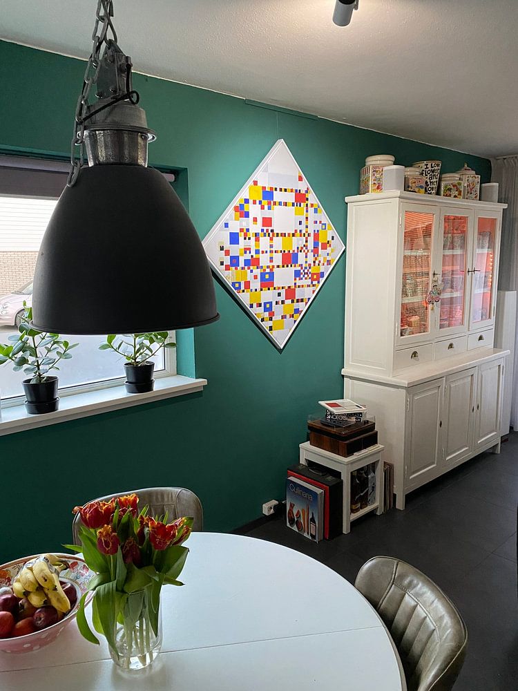
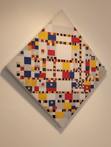
Balance bold color with neutral surroundings
Primary colors make a strong visual statement and work best when surrounded by breathing room. Pair artworks featuring red, yellow, and blue with neutral walls and furniture in white, grey, or beige to let the composition take center stage. A good example is Piet Mondriaan. Composition en rouge, jaune, bleu et noir, which stands out beautifully against calm, understated interiors.
KatharinaStylist & Customer service Questions? Check out our FAQ
 -
More artworks below this tip
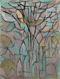
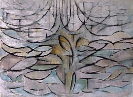
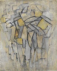
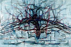
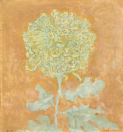
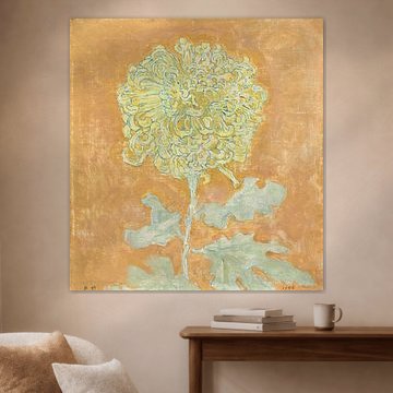
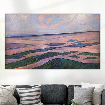
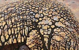
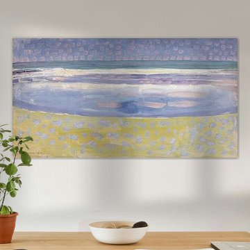
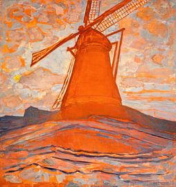
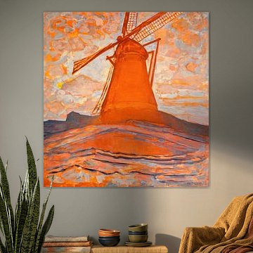
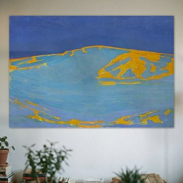
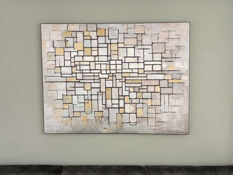
Soften modern interiors with organic forms
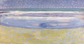
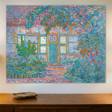
Not all abstract art follows rigid lines. Curved shapes and softer tones add warmth to contemporary spaces without breaking the modern aesthetic. If your room features clean furniture and minimalist design, consider adding gentler compositions. A good example is Trees, Piet Mondriaan, which brings a dreamy, organic quality to structured interiors.
LianneStylist & Customer service Questions? Check out our FAQ
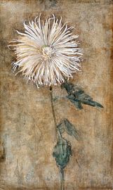
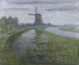
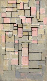
Piet Mondriaan
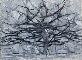
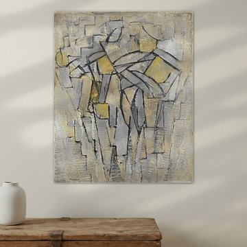
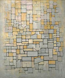
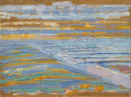
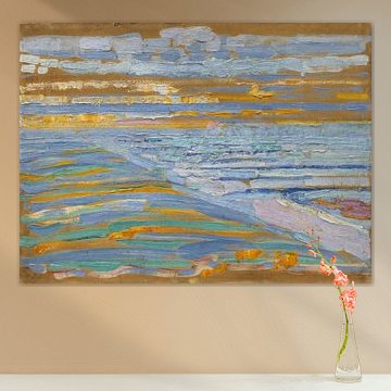
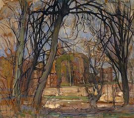
Piet Mondriaan's geometric precision brings calm and clarity to any space. His work evolved from expressive tree studies like Gray Tree (1911) Piet Mondrian to the iconic grids of primary colors that define modern abstraction. Whether you're drawn to his early nature-inspired compositions or the pure balance of his later neoplastic works, Mondriaan's art complements minimalist and contemporary interiors with timeless structure.
At Art Heroes, we create each piece to order - choose from ArtFrame™, Canvas, Poster and more. Free shipping and crafted by talented European artists.


Be sure to check out the creative new masters
Our artists have created artworks inspired by the old masters.


Trusted and loved
Customers rate us 4.8!
High-quality materials
Sustainable and long-lasting beauty
Different sizes
From small to large, anything is possible.
Made for you
Made the moment you order.
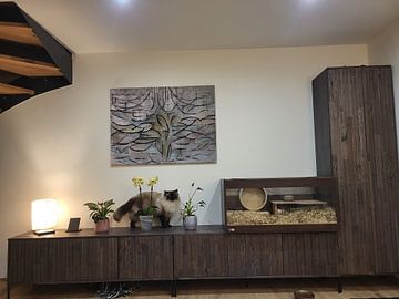
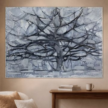
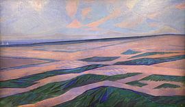
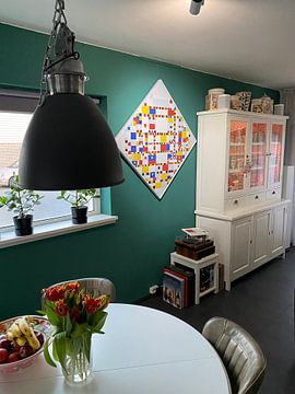
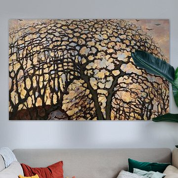
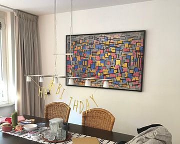
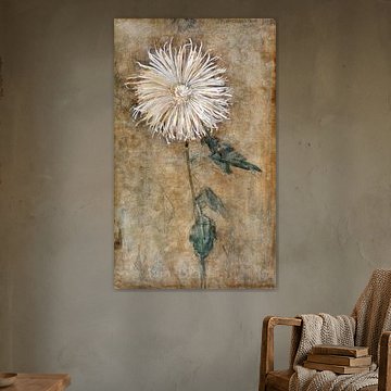
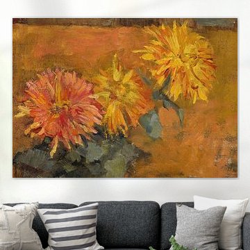
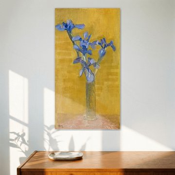
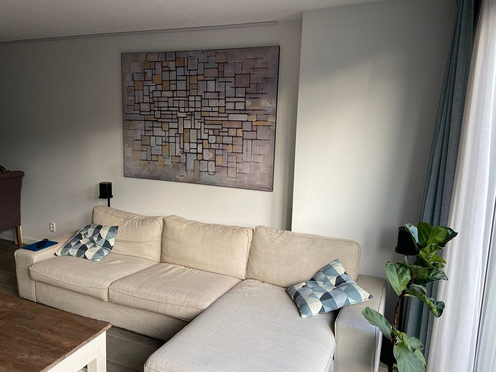
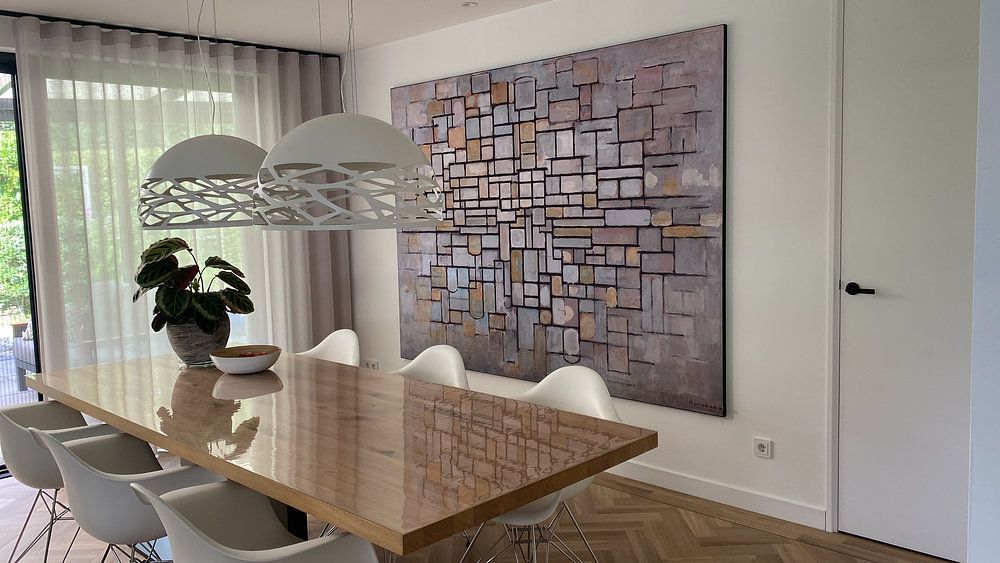
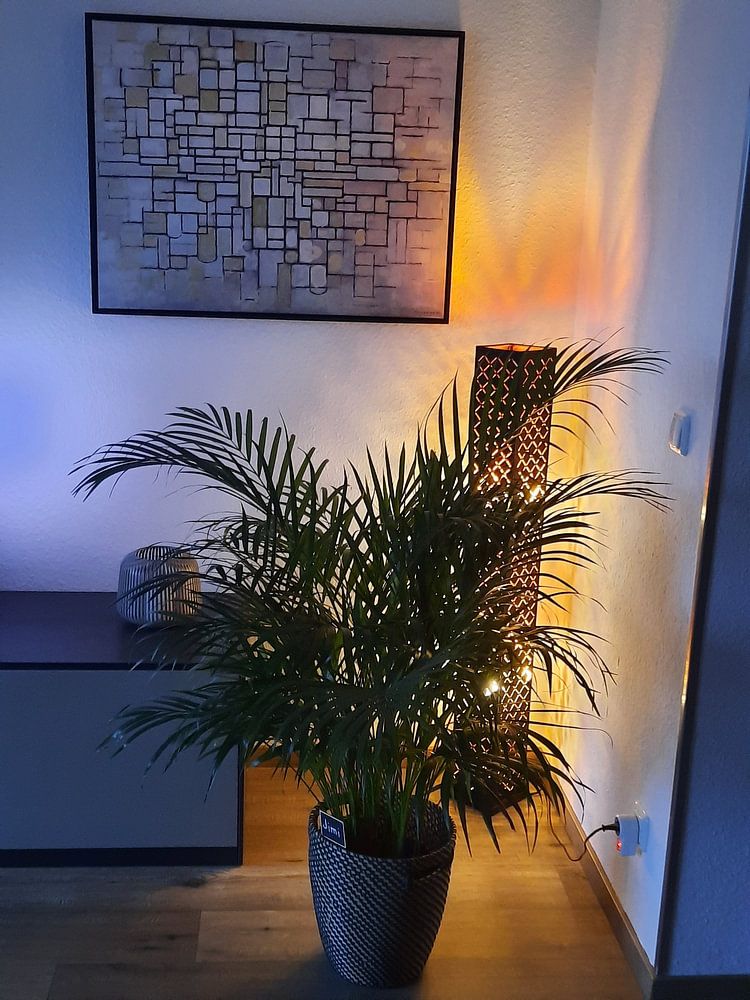
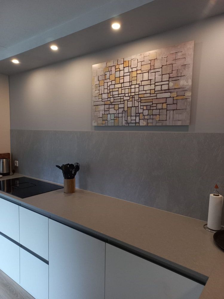
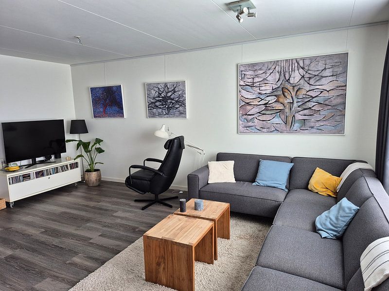
How they hang in other homes
Get inspired by beautiful artworks on other people's walls and see how they truly enhance an interior.


More like this


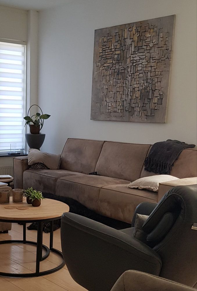
Where does art by Piet Mondriaan work well in your home?
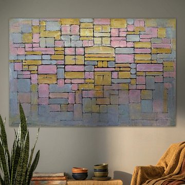
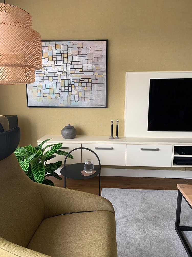
Art by Piet Mondriaan works beautifully in a living room where you want to create a calm yet vibrant atmosphere. The beige, taupe, and grey tones bring a grounded, serene quality that helps balance busier spaces, while subtle hints of mauve add a touch of warmth without overwhelming the room. These earthy colors complement natural light and neutral furnishings, making the living room a good spot to appreciate the quiet elegance and understated energy these artworks bring to your daily surroundings.
Which format suits art by Piet Mondriaan best?
Artworks by Piet Mondriaan look striking in horizontal formats, which suit the wall space above a sofa or sideboard particularly well. The wider composition draws the eye across the room and creates a sense of balance on larger walls. If you're working with a narrower wall or a hallway, a vertical format can work better - it adds height and structure without taking up too much horizontal space, giving you flexibility depending on your layout.
Which colors and styles pair well with art by Piet Mondriaan?
Art by Piet Mondriaan fits naturally into Scandinavian and minimalist interiors, where the muted palette of beige, grey, and taupe complements light wood, white walls, and simple lines. Pair these artworks with soft textiles in similar tones to create a cohesive, understated look. If you prefer a warmer feel, combine the brown and mauve shades with natural materials like linen or woven accessories - this adds depth while keeping the calm, mysterious mood intact throughout your space.
