-
More artworks below this tip
Choose a format that fits your wall
Portrait and square formats are both popular choices for Maps of Utrecht. A portrait format works well on narrow walls or between windows, while a square format suits balanced compositions above furniture. Consider your available wall space and choose what fits your interior best.
AnouschkaArt Stylist Questions? Check out our FAQ
 -
More artworks below this tip
Hang your map where you gather
A city map becomes a conversation piece when placed where people naturally spend time together. The living room or hallway are ideal spots - guests can spot familiar landmarks and share their own Utrecht stories. Position it at eye level for easy viewing and engagement.
RosanneStylist & Customer service Questions? Check out our FAQ
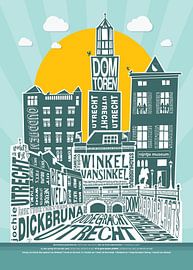
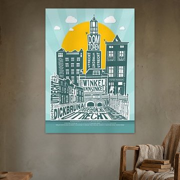
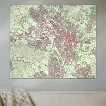
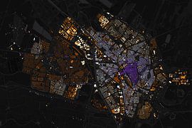
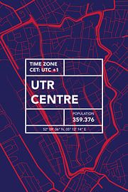
Maps of Utrecht
Looking for a map that captures Utrecht's historic character and modern energy? Maps of Utrecht turn the city's canals, streets, and neighborhoods into striking wall art. From detailed aerial views to abstract designs showing centuries of architectural growth, these artworks bring geographic beauty into your home. Whether you prefer minimalist line drawings or richly colored compositions, each piece reflects Utrecht's distinctive urban landscape.
Our collection at Art Heroes features work by talented European artists who transform cartographic data into art. Choose your favorite as an Canvas, Poster, Wallpaper, and more - all custom-made and shipped free.


Trusted and loved
Customers rate us 4.8!
High-quality materials
Sustainable and long-lasting beauty
Different sizes
From small to large, anything is possible.
Made for you
Made the moment you order.


More like this


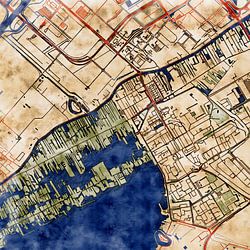


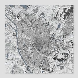
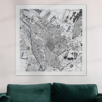
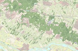
Choosing the right material for historic cartography
Maps of Utrecht comes to life on each of our premium materials. Whether you choose ArtFrame™, Poster, or Canvas, each enhances the unique cartographic details and beige, taupe, and sage green tones.
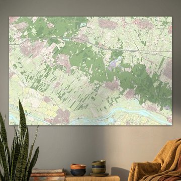
Choose ArtFrame™ and you benefit from easy interchangeability and acoustic functionality. The sturdy textile print brings out the fine linework and hand-drawn details typical of historic Maps of Utrecht, while the calm color palette - featuring early dew, sage green, and warm taupe - creates a sophisticated look in the modern aluminum frame. Available in gold, black, white, or silver, you can match the frame to the map's era or your interior style. If you work from home or need better sound quality in your living room, add optional sound-dampening panels behind your Maps of Utrecht print. They reduce echo without affecting the artwork's appearance, combining visual appeal with practical comfort.
Still doubting which material suits your interior and chosen Maps of Utrecht artwork? Use our material comparator to find the perfect match.
Where Maps of Utrecht works well in your home office
A home office is a good spot for Maps of Utrecht. These drawings and illustrations offer both visual interest and a sense of place without overwhelming a workspace. The calm and mysterious moods help maintain focus, while the vibrant accents in certain maps add character to what might otherwise be a functional room. Hang a map above your desk or on the wall opposite your screen to give your eyes a rest during long working sessions. The beige and sage green palette complements wooden furniture and neutral office setups beautifully.
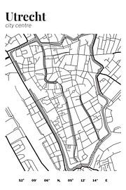
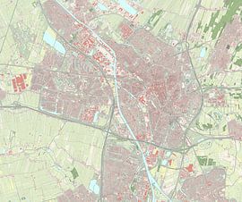
Which format suits Maps of Utrecht best
Landscape formats work particularly well for Maps of Utrecht, as many historic city maps were drawn in horizontal compositions to capture Utrecht's canal structure and urban layout. A landscape piece above a sideboard or console table in your hallway creates an immediate sense of arrival and place. That said, square formats offer a balanced alternative when wall space is limited or when you want to create a gallery wall combining multiple Maps of Utrecht with other artworks. Consider your available wall width before choosing your format.
