-
More artworks below this tip
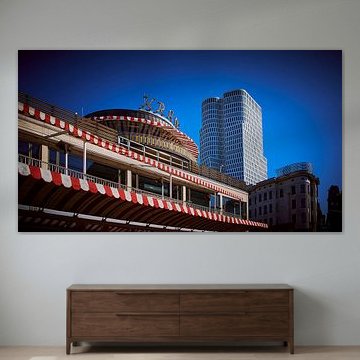
Balance warm and cool tones across your room
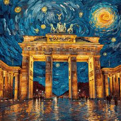
When an artwork combines warm and cool colours, echo one shade elsewhere in your space. The golden yellows and teal blues in Kreuzberg, KottbusserTor, Berlin pair well with soft furnishings in either tone - choose cushions, throws or rugs that pick up one colour family to create visual harmony.
GinaStylist & Customer service Questions? Check out our FAQ
 -
More artworks below this tip
Pair bold colours with neutral surroundings
Vibrant architectural prints stand out best when the rest of your wall stays calm. The teal and warm yellow tones in Kreuzberg, KottbusserTor, Berlin create a striking focal point against white or light grey walls. Keep surrounding décor minimal to let the artwork take centre stage.
LianneStylist & Customer service Questions? Check out our FAQ
 -
More artworks below this tip
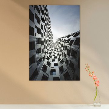
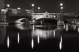
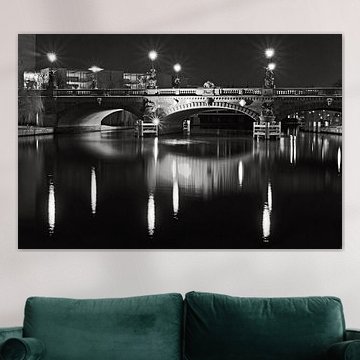
Create depth with monochrome contrasts
Black and white prints add visual interest without competing for attention. The strong vertical lines and nostalgic atmosphere in BERLIN Radio Tower | Monochrome work beautifully in spaces where you want a calm yet powerful presence. Try placing it in hallways or above seating areas where the eye naturally travels upward.
RosanneStylist & Customer service Questions? Check out our FAQ
West Berlin
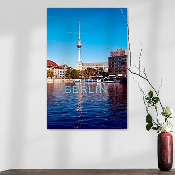
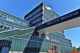
Looking for art that captures Berlin's creative energy? West Berlin artworks bring urban character and history into your space. From illuminated towers to street-art collages, these pieces reflect the city's alternative spirit and architectural landmarks, which blend seamlessly with contemporary and industrial interiors.
Think vibrant cityscapes in warm terracotta and sage green, or moody street scenes in anthracite and teal - pieces like Berlin showcase Berlin's eclectic atmosphere. Art Heroes offers each artwork custom-made, printed with care by talented European artists. Choose your size and material - Canvas, Poster, Wallpaper, and more - to match your style.


Trusted and loved
Customers rate us 4.8!
High-quality materials
Sustainable and long-lasting beauty
Different sizes
From small to large, anything is possible.
Made for you
Made the moment you order.


More like this


Where does West Berlin art work well in your home?
West Berlin art is a good spot for your living room, where its nostalgic character creates meaningful conversations. The photographic and collage styles in this collection work particularly well above a low sideboard or arranged along a gallery wall. Combine pieces with warm wood tones and neutral textiles to let the blue and mauve hues stand out. The urban, documentary feel brings calm energy to social spaces without overwhelming the room.
Which format suits West Berlin art best?
Horizontal formats dominate this collection and work well on walls above sofas or sideboards where width matters more than height. A horizontal West Berlin piece draws the eye across the composition, emphasizing the architectural lines and street scenes typical of this theme. That said, a vertical format can work better in narrower spaces like hallways or beside doorways, where you need the artwork to fit a taller, slimmer wall section.
Choosing the right material
West Berlin comes to life on each of our premium materials. Whether you choose Canvas, ArtFrame™, or Poster, each enhances the unique details and colors.
Choose Canvas? Then you benefit from fine-art print quality on bright white poly-cotton canvas that brings out the blue, mauve, and black-and-white tones beautifully. The fabric adds texture that complements the collage and photography techniques, giving depth to nostalgic urban scenes. You also get sustainable, durable craftsmanship built to last at least 10 years. The PEFC-certified wooden frame and reinforced canvas edges mean your West Berlin artwork stays vibrant and structurally sound, even in busy living spaces where it's viewed daily.
Still doubting which material suits your interior and chosen West Berlin artwork? Use our material comparator to find the perfect match for your space.
