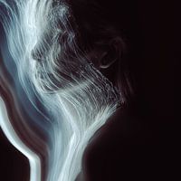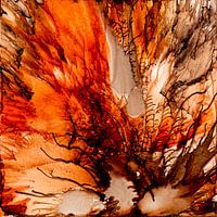


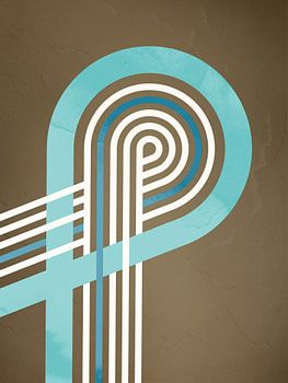
About ‘Reverse: Colour mist in water’ by Mixed media vector arts
You can see an inverted representation of coloured mist spreading in water. The bright, almost luminous structures look like rising smoke or gas unfolding in a dark, undefined space. The forms are soft, organic and at the same time graphically clear - an interplay of natural movement and digital processing.
The idea for this work…
Colors
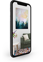
Discover our ArtFrame
The modern canvas alternative
Your chosen art on a textile print, stretched in an aluminum or wooden frame. Quick and easy to change for a fresh look and exactly as you want it.
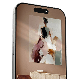
- High-quality print
- Easily replaceable
- Acoustic function
- Large formats possible

Meet the artist
Mixed media vector arts
Erfurt, Germany

Generally speaking, I'm not the type of person who has much to say about myself. What might be noticeable is that I don't like to stagnate stylistically or thematically; I want to have done everything. Anyone looking for 100 works in a series by me in the same style will hardly find them. Unfortunately, there's often not enough time in the day, or even in life, to realize everything that's ever crossed my mind. Stylistically, it's probably…
Visit shop
Discover the artworks of Mixed media vector arts


Customer reviews
4.8/5

Related collections