-
More artworks below this tip
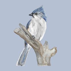
Working with blue tones
Blue dominates many Jan van Gent artworks, making them easy to pair with neutral interiors. The navy and soft blue tones in Gannet in flight work well alongside grey, taupe, or beige furnishings. Add natural wood or linen textures to warm the overall look.
RosanneStylist & Customer service Questions? Check out our FAQ
 -
More artworks below this tip
Placement ideas
Seabird photography brings the outdoors in, so consider placing it near natural light sources. The romantic interaction captured in Jan van Genten on Helgoland works particularly well in intimate spaces like reading nooks or above a bedside table, where the heart-shaped gesture between the birds can be appreciated up close.
LianneStylist & Customer service Questions? Check out our FAQ
Northern gannet
Jan van Gent artworks bring calm and elegance to your space. These majestic seabirds, captured in flight or tender moments, create serene focal points that suit modern and classic interiors alike. From the striking eye contact in Eye contact: Jan van Gent Captured on Heligoland to romantic mating rituals rendered in soft blues and greys, these pieces balance movement with tranquility. The collection features work by talented European nature photographers who capture intimate details - from sunset silhouettes to close-up portraits.
At Art Heroes, we print your chosen Jan van Gent artwork to order. Choose Canvas, Poster, ArtFrame™ and many more options to match your interior.


Trusted and loved
Customers rate us 4.8!
High-quality materials
Sustainable and long-lasting beauty
Different sizes
From small to large, anything is possible.
Made for you
Made the moment you order.


More like this


Where does Jan van Gent work well in your home?
The Jan van Gent collection works well in a bedroom, where its calm and elegant mood helps create a relaxing atmosphere. The blend of blue, grey, and taupe tones brings a sense of quiet sophistication that suits a restful space. Hang a piece in portrait or square format above your bed, or place a landscape print on the wall opposite to set a tranquil tone as soon as you enter the room.
How to style Jan van Gent with other decor
Because Jan van Gent carries a delicate and elegant character, it pairs beautifully with natural materials and soft textures. Consider combining these artworks with linen cushions, wooden furniture, or ceramic accessories in neutral tones to enhance the calm mood. A small gallery wall mixing portrait and square formats creates visual interest without overwhelming the space, while adding a simple vase or indoor plant nearby brings warmth and balance. Let the understated beauty of the collection guide your choices for a cohesive, thoughtful interior.
Which colors and styles suit Jan van Gent best?
The Jan van Gent palette of blue, grey, taupe, brown, and beige fits naturally into Scandinavian and minimalist interiors. In a Scandinavian setting, pair the cooler blue and grey tones with light wood, white walls, and simple lines for a fresh, airy feel. For a minimalist approach, lean on the taupe and beige shades to create a warm, monochrome look that feels grounded and serene. Both styles benefit from the collection's restrained color range, making it easy to build a calm, harmonious space around these artworks.
