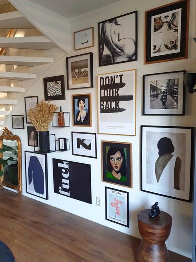
Create a gallery wall at home
Discover 15 ideas for an art wall at home!

Having an issue with a white, blank wall in your home? Discover the effect of an artwork or wallpaper with matching and well-combined colours in your interior. Whether you like vibrant colours or prefer neutral tones, the colours you choose can make or break your interior. Here you will find the expert colour advice of our stylists.


If you want to use a certain colour included in your wall decoration, it is important to consider which colours you already have in your interior. Or which colours you would like to use in your interior. If you have a Scandinavian or country style with natural colours, then choose a matching colour in, for example, earth tones. Or would you like to combine it with a colourful style? Then choose a statement piece or collage of art with different striking colours and accents such as red, purple, yellow or blue. By doing this you combine styles from two different worlds into one harmonious whole.
Make use of our color filters! Each collection contains a handy color filter, allowing you to filter the list by your favorite color.


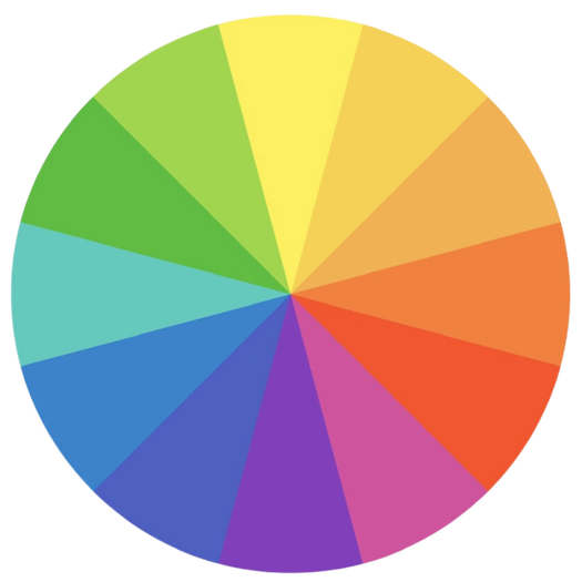
The colour wheel is a useful tool for determining which colours work well together. The Art Heroes stylists give 3 important tips on using the colour wheel for your wall decoration.

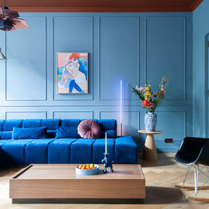
Colours that are opposite each other on the colour wheel are complementary. So, if you have yellow, orange or brown wall decor, you might want to add blue accessories to create a balanced look. Pink and green are complementary colours often used in Boho or vintage interiors. For example, combine a pink accent wall with green plants or use green wall decoration on a pink wall.

Analogues are colours that are next to each other on the colour wheel, such as the cool colours blue and green, or warmer colours orange and yellow. These colours work well together because they have similar shades and give a calmer appearance. So consider mainly what mood you want. Like warm and minimalist or industrial and cool?

Triadic colours are three colours equally spaced on the colour wheel. Using triadic colours in your interior can create a striking and vibrant look. An example of a primary triadic colour scheme would be yellow, blue, and red. Or choose the secondary colours purple, green, and orange. This colour combination can have a bold look, but can also be very harmonious if you combine the colours in the right way.


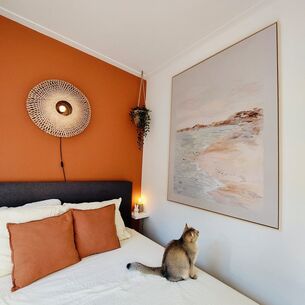
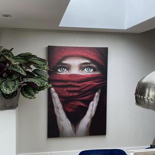
An accent wall is an original way to add colour and character to a room. It is a wall that is different from the other walls in the room, often by having a different colour or texture. For example, use different artworks together, for a true art wall in matching or contrasting colours.
An easy way to create an accent wall is to choose a bold colour that contrasts with the other walls in the room. For example, if the walls are light grey, you could consider green or deep navy blue artwork for the accent wall. If you prefer a more subtle approach, you could choose a lighter or darker shade of the same colour. For example, if the walls in the room are beige, you could choose a lighter or darker shade of beige.

Besides using colour, you can also experiment with patterns on the accent wall. You can do this, for example, by using a a large ArtFrame. This can be an impressive eye-catcher in the room.