

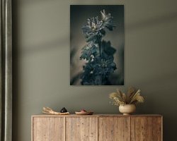



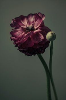
About ‘Flower #6’ by tim eshuis
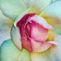
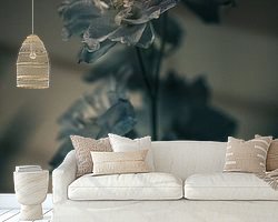
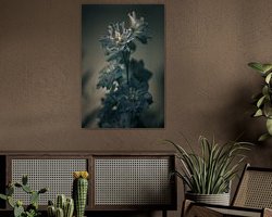
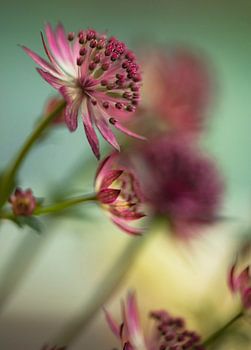
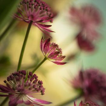
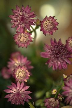
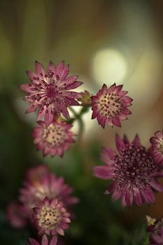
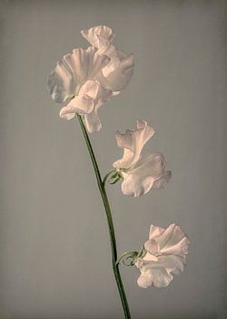
I have noticed that more and more often I take pictures that have something picturesque about them. In this case this is due to low key light, low contrast and little colour saturation. It is almost monochrome.
And in my opinion also beautiful.
Colors
Discover our ArtFrame
The modern canvas alternative
Your chosen art on a textile print, stretched in an aluminum or wooden frame. Quick and easy to change for a fresh look and exactly as you want it.
- High-quality print
- Easily replaceable
- Acoustic function
- Large formats possible

Meet the artist
tim eshuis
breda, Netherlands

Tim Eshuis, born 1972.
I started photographing at the art academy in the early 90's and have never stopped since...
Discover the artworks of tim eshuis



Customer reviews
4.8/5
Related collections