


Buy this flower art Peony Coral Charm by Mixed media vector arts on canvas, ArtFrame, poster and wallpaper, printed on demand in high quality.
About "Peony Coral Charm"
by Mixed media vector arts
About the artwork
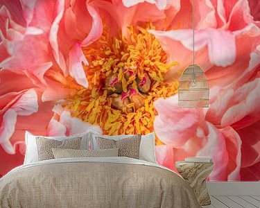
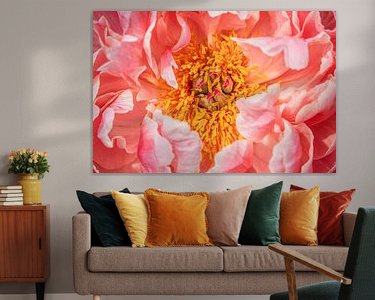
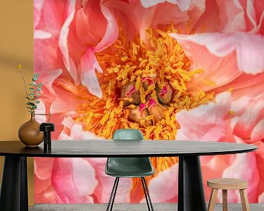
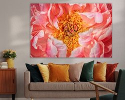
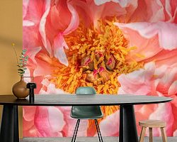
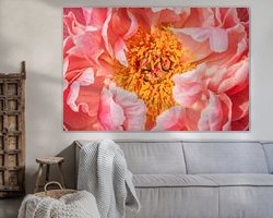
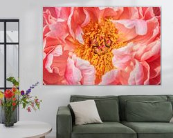
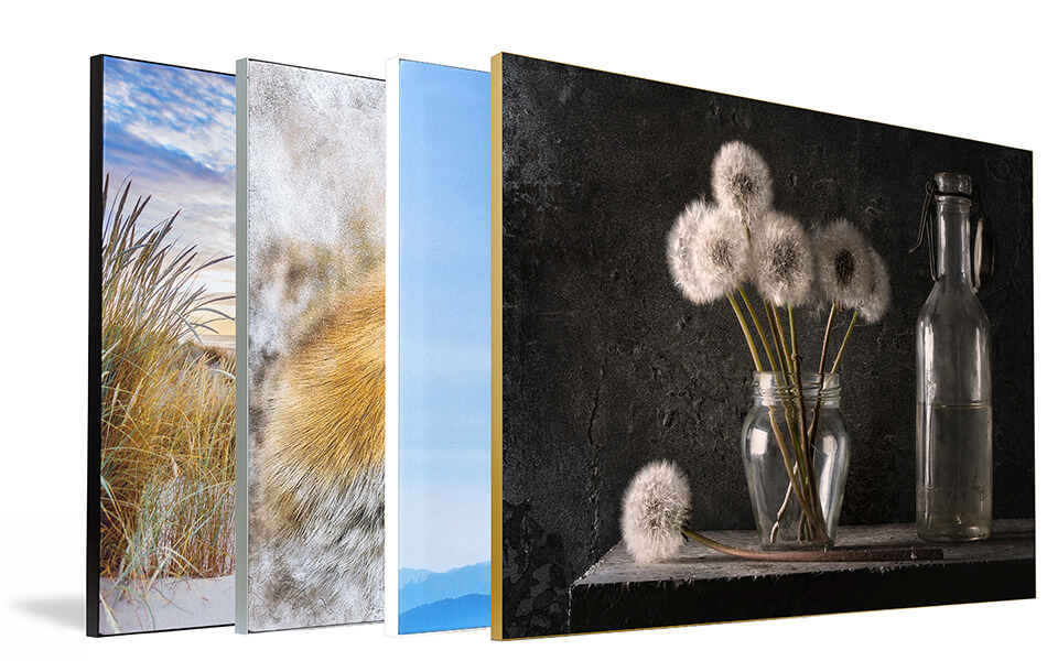
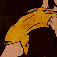
The picture shows a close-up of a peony with pale pink petals that fade into darker shades of pink in places. Yellow-orange stamens glow in the centre, forming a vivid contrast to the soft colours of the outer petals. The composition focuses on the natural shape and colour structure of the flower, while the background remains deliberately blurred to emphasise the floral presence.
The idea for this work arose from the desire to show the peony not as a symbol, but as a structure - as an organic structure that gains expression through light, colour and perspective. I was particularly interested in how the different layers of colour overlap in the flower and develop their own dynamic.
The atmosphere I want to create with this picture is calm, but not static. It is about conscious seeing - an invitation to engage with details that are often overlooked in everyday life. The message is a quiet one: beauty is often a question of attention.
In interior design, this image acts as a natural accent that conveys warmth and structure. It is particularly effective in bright, clearly designed rooms - as a calm eye-catcher with depth.

About Mixed media vector arts
I'm generally not the type of person who has a lot to say about herself. Not even about my work in graphics and illustrations. It should be obvious, that I don't like to stand still in terms of style and content, but want to explore everything. If you.. Read more…
 Flowers
 Gentle Whispers
 Macrophotography
 Nature and weather
 Photo wallpaper
 Photography
 Plants
 Roses
Roses Vibrant Colors
 Germany
 Ordered in April 2019
 Netherlands
 Ordered in October 2017
Germany
Ordered in May 2021
Netherlands
Ordered in April 2017
Netherlands
Ordered in May 2020
Netherlands
Ordered in June 2019
Germany
Ordered in September 2019
Netherlands
Ordered in November 2018
Netherlands
Ordered in December 2019
Netherlands
Ordered in October 2017
Germany
Ordered in May 2021
Netherlands
Ordered in April 2017
Netherlands
Ordered in May 2020
Netherlands
Ordered in June 2019
Germany
Ordered in September 2019
Netherlands
Ordered in November 2018
Netherlands
Ordered in December 2019
Netherlands Ordered in April 2024
Germany
Ordered in November 2020
Germany
Ordered in August 2025
Ordered in April 2024
Germany
Ordered in November 2020
Germany
Ordered in August 2025
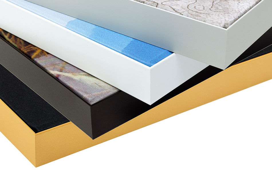
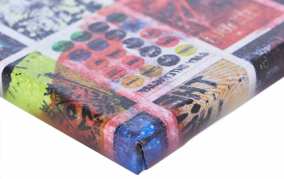
About the material
ArtFrame™
Interchangeable Art Prints
- High-quality print
- Easily interchangeable
- Acoustic function
- Large sizes available
Discover the artworks of Mixed media vector arts
 DanseMixed media vector arts
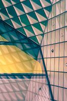 Architectural Detail - Berlin FuturiumMixed media vector arts
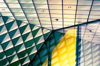 Detail of abstract glass patterns from postmodern architecture in BerlinMixed media vector arts
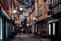 Erfurt Krämerbrücke at ChristmasMixed media vector arts
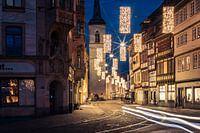 Erfurt Marktstraße at ChristmasMixed media vector arts
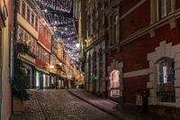 Erfurt Krämerbrücke at ChristmasMixed media vector arts
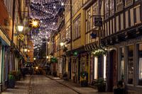 Erfurt Krämerbrücke at ChristmasMixed media vector arts
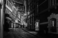 Erfurt Krämerbrücke at Christmas black and whiteMixed media vector arts
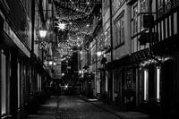 Erfurt Krämerbrücke at Christmas black and whiteMixed media vector arts
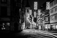 Erfurt Marktstraße at Christmas black and whiteMixed media vector arts
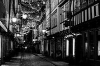 Erfurt Krämerbrücke at Christmas black and whiteMixed media vector arts
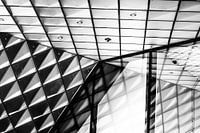 Glass façade at Futurium Berlin black and whiteMixed media vector arts
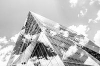 3XN Cube Berlin black and whiteMixed media vector arts
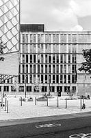 Federal Ministry of Education and Research BerlinMixed media vector arts
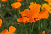 Golden poppy - California poppyMixed media vector arts
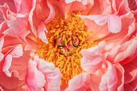 Peony Coral CharmMixed media vector arts
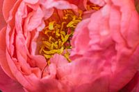 Perennial peony - Paeonia officinalisMixed media vector arts
 Green architecture in ErfurtMixed media vector arts
 Interwoven lightness - layers in light blueMixed media vector arts
 Interwoven silence - light and fabric in dialogueMixed media vector arts


