


Nanouk el Gamal - Wijchers (Photonook)
Photographer
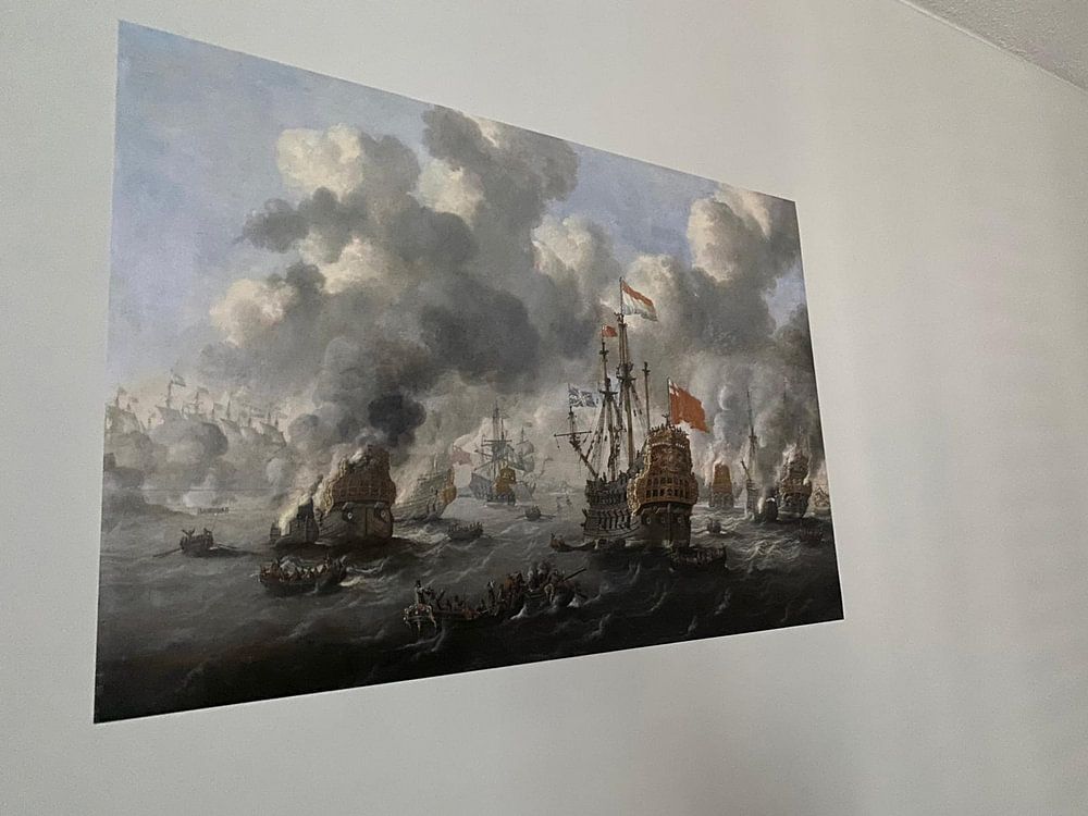
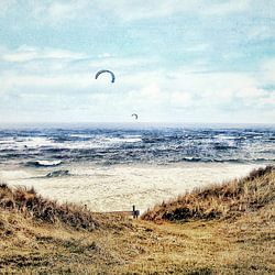
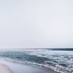
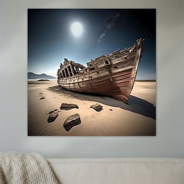
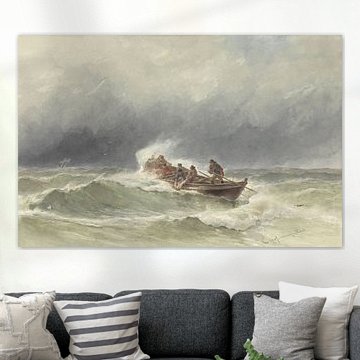
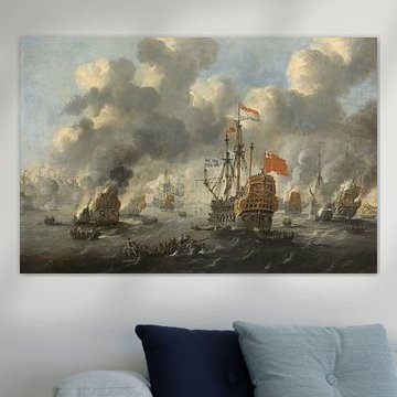
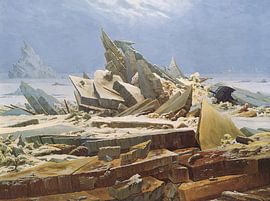
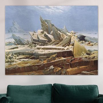
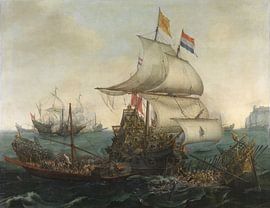
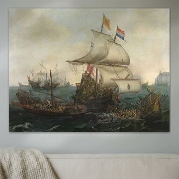
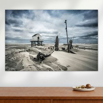
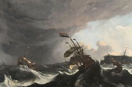
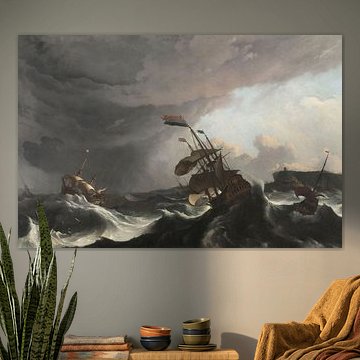
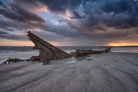
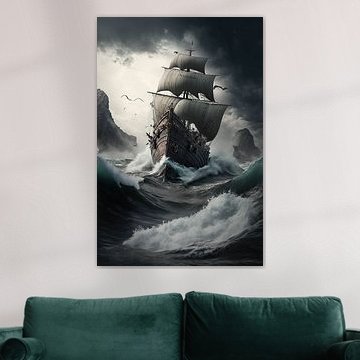
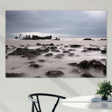
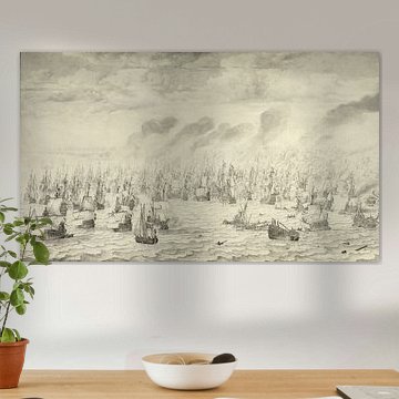
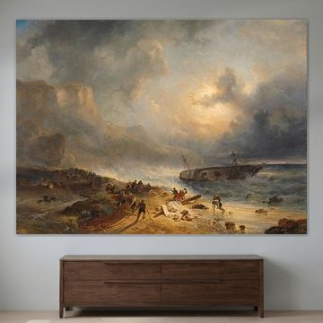
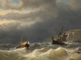
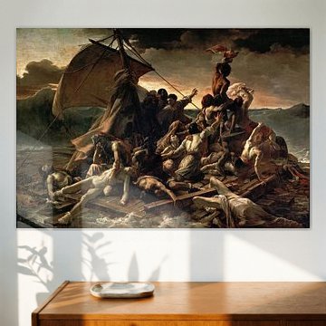
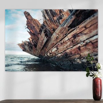
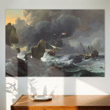
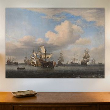
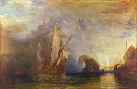
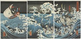
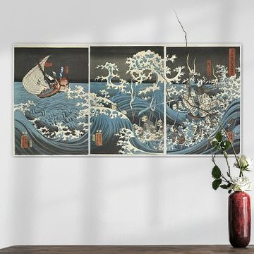
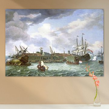
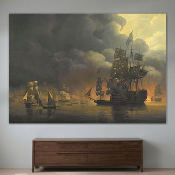
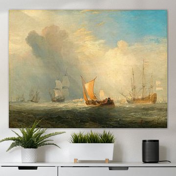
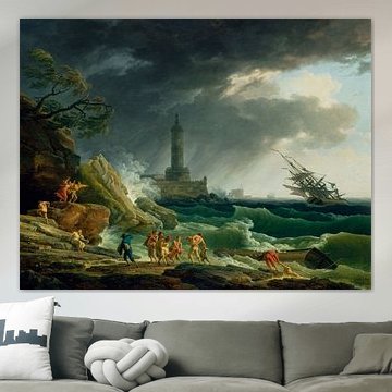
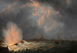
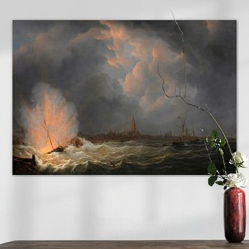
Shipwreck imagery captures the raw beauty of maritime decay. These artworks blend melancholy with mystery, drawing you into scenes of weathered vessels and forgotten shores. From rusted hulls floating in misty waters to dramatic Arctic landscapes, each piece tells a silent story of time and nature's power.
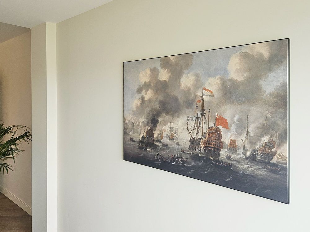
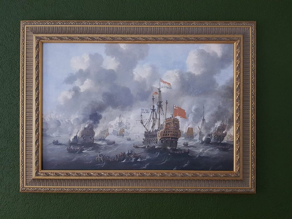
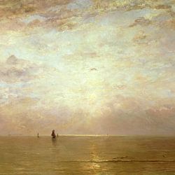
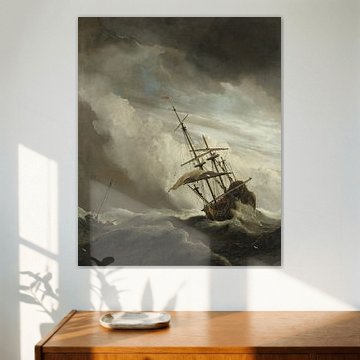
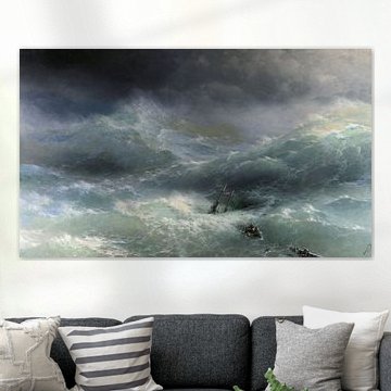
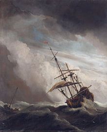
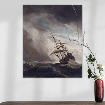
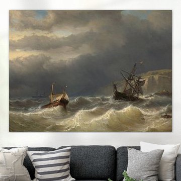
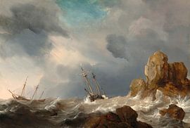
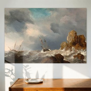
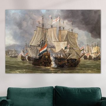
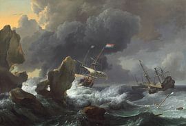
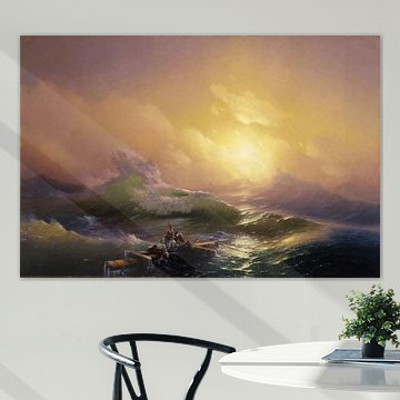
The calm, nostalgic tones work beautifully in minimalist and industrial interiors, while dramatic seascapes like Hovhannes Aivazovsky, The Ninth Wave - 1850 add depth to traditional spaces. Soft blues, greys and earth tones create atmosphere without overwhelming your room.
At Art Heroes, we print each piece to order. Choose from Canvas, ArtFrame™, Poster and more to match your space perfectly.
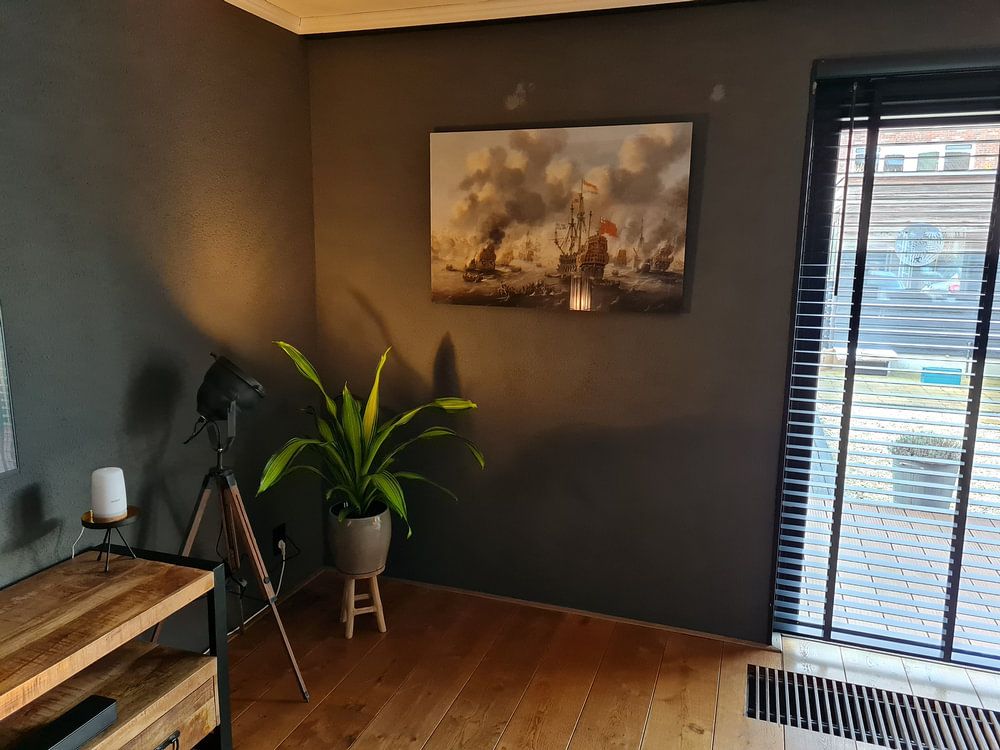
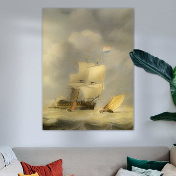
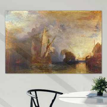
Both portrait and landscape formats are popular for these artworks, so your choice depends on your wall space. Portrait suits narrow walls and vertical spaces like hallways or beside doorways. Landscape works well above furniture or across wider walls. Choose what fits your available space and the flow of your room.

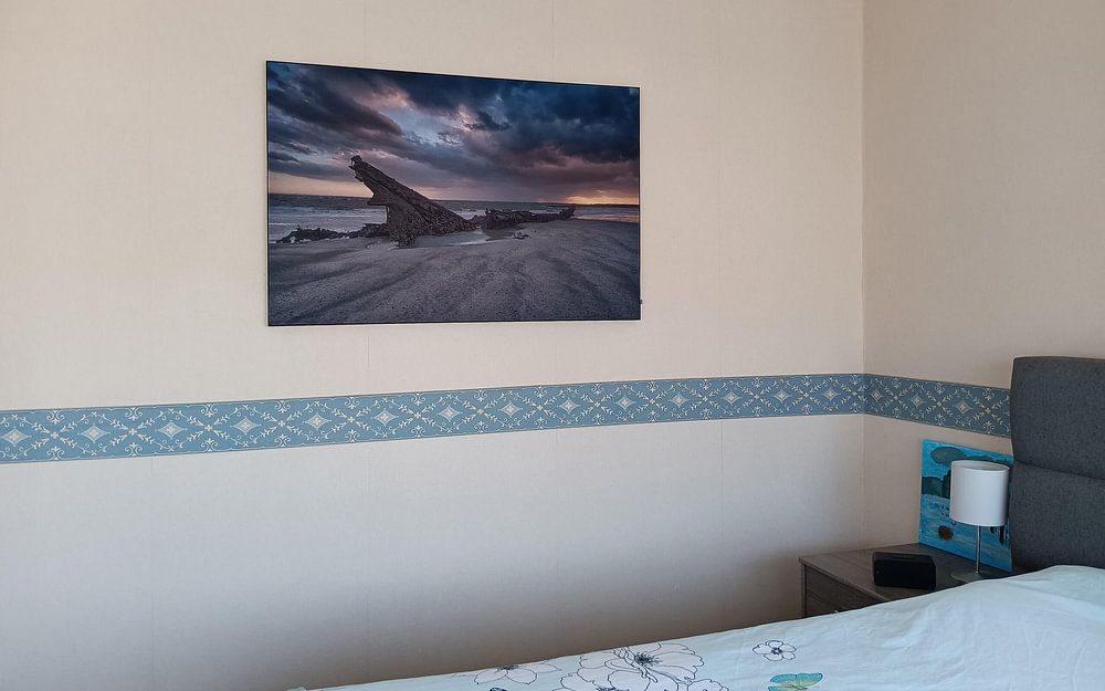
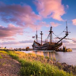
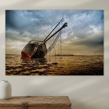
Nostalgic, reflective imagery suits personal spaces where you spend quiet time - bedrooms, home offices, or intimate seating areas. The weathered vessel in Rest carries a contemplative mood that works beautifully in calm, distraction-free rooms. Save more playful or dynamic scenes for social spaces if you prefer a livelier atmosphere there.

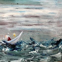
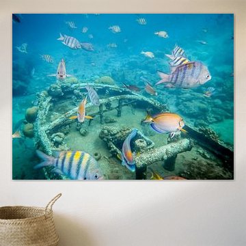
Teal and soft blue shades gain warmth when you pair them with taupe, beige, or natural wood. The combination prevents cool tones from feeling stark. Try placing artwork with aquatic blues near warm-toned furniture or wooden frames - the dreamlike underwater palette in Dream world Sea works well with sandy neutrals and natural textures.

Customers rate us 4.8!
Sustainable and long-lasting beauty
From small to large, anything is possible.
Made the moment you order.

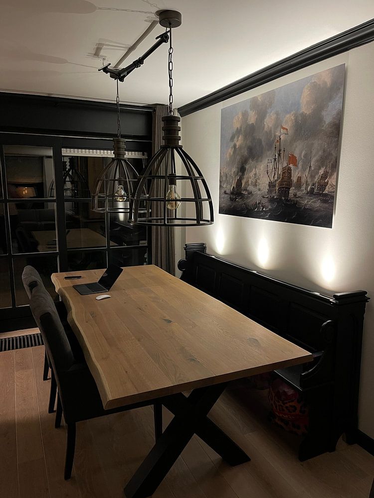
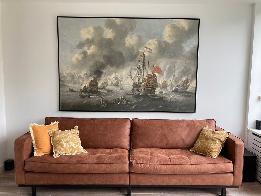
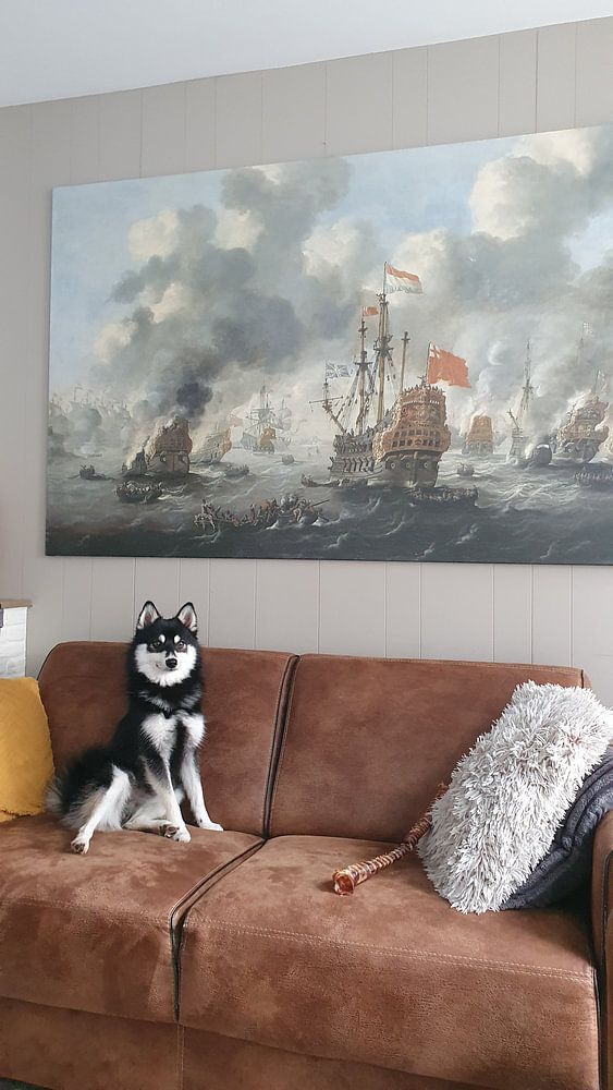
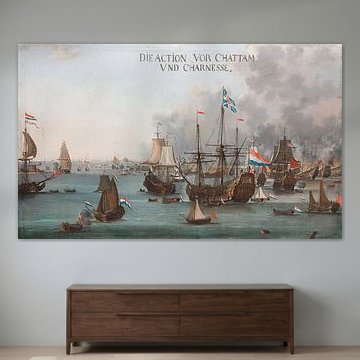
The living room is a good spot for Shipwreck artworks. The calm, nostalgic atmosphere these pieces bring helps create a reflective space where you can unwind after a busy day. Hang a large landscape format above your sofa to anchor the room, or position a portrait piece beside a reading nook. The blue and teal tones pair naturally with neutral furniture, while the melancholic mood adds depth without overwhelming your space.

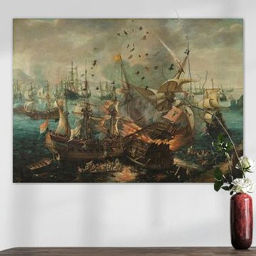
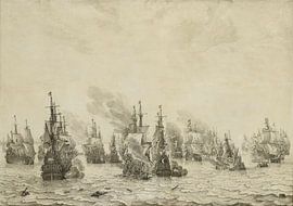
Combine Shipwreck artworks with natural materials and soft textures to enhance their nostalgic character. Weathered wood furniture, linen cushions, and ceramic vases in earthy tones complement the collection's maritime feel. Create a gallery wall mixing portrait and square formats for visual interest, or pair a single statement piece with subtle coastal accessories like driftwood or woven baskets. The black and white options work particularly well when you want to balance the deeper blue and teal pieces. Layer your Shipwreck artworks with objects that tell their own stories and bring warmth to the reflective mood.

Shipwreck comes to life on each of our premium materials. Whether you choose ArtFrame™, Canvas, or Poster, each enhances the unique details and colors.
Choose ArtFrame™ and you benefit from easy interchangeability and premium quality. When you want to refresh the melancholic, nostalgic atmosphere of Shipwreck with a different mood or color palette, simply swap the print in minutes without replacing the entire frame. The modern aluminum frame is available in gold, black, white, or silver, so you can match it to your interior as the blue and teal tones shift throughout the day. Beyond visual appeal, ArtFrame™ offers optional acoustic panels that reduce echo, making it particularly useful in living rooms where the calm mood of Shipwreck helps create a peaceful environment.
Still doubting which material suits your interior and chosen Shipwreck artwork? Use our material comparator to find the perfect match for your space.