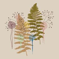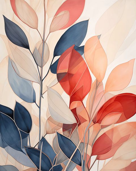
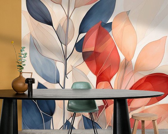
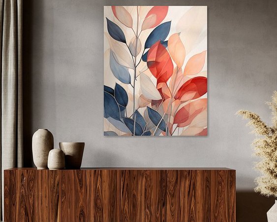
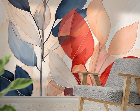
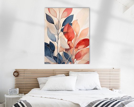


About ‘Botanical Contrast - Abstract nature in harmonious shades’ by Cas
Botanical Contrast is a graphic composition of leaves and flower shapes, composed of neutral Japandi shades combined with powerful colours like coral red and indigo blue. The shapes are abstract but recognisable as elements from nature, creating a balanced look. The combination of calm and expressive colours creates tension without…
Colors
Discover our ArtFrame
The modern canvas alternative
Your chosen art on a textile print, stretched in an aluminum or wooden frame. Quick and easy to change for a fresh look and exactly as you want it.
- High-quality print
- Easily replaceable
- Acoustic function
- Large formats possible

Meet the artist
Cas
Netherlands
I became an image maker at Work on the Wall because I couldn't find the art I was looking for myself. So I thought: then I'll just make it myself. My work is a mix of historical subjects, abstract forms and influences from other art movements. I like to combine stories from the past with modern techniques and forms, bridging different times and styles. The result is art that not only captivates visually, but also has a deep layer of meaning. If you are looking for…
Visit shop
Discover the artworks of Cas


Customer reviews
4.8/5

Related collections