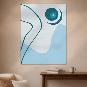
Cool Blue
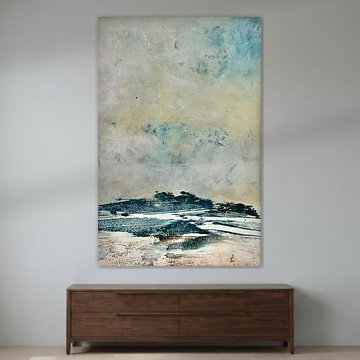
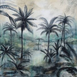
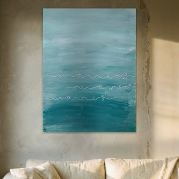
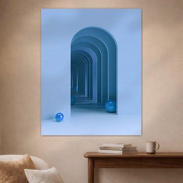
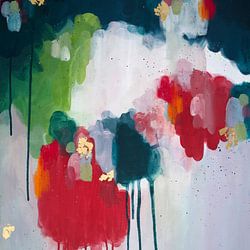
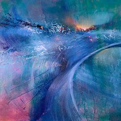
Cool blue tones bring calm to any interior. These shades create depth while keeping spaces airy and serene, which makes them ideal for modern and minimalist homes. From abstract seascapes to architectural forms, cool blue artworks range from misty landscapes to bold geometric designs that suit contemporary living.
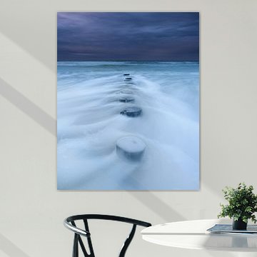
Whether you're drawn to the dreamy quality of The breath of the sea or prefer clean lines and structure, cool blue art adapts beautifully to your space. At Art Heroes, we print each piece to order - available as ArtFrame™, Canvas, Poster and more. Choose what works for your interior and discover the full collection.
-
More artworks below this tip
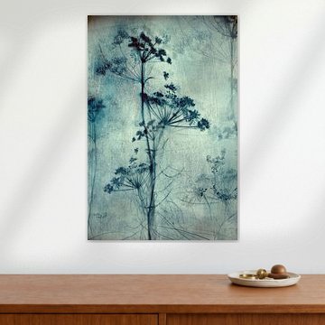
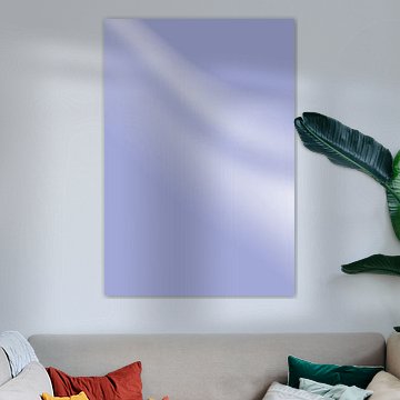
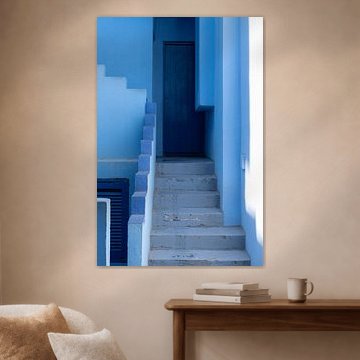
Pairing Cool Blue with your room
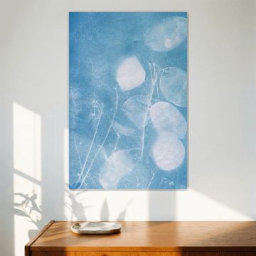
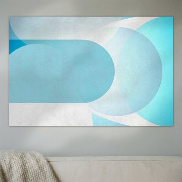
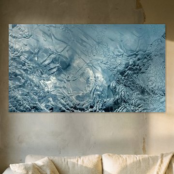
Tranquil blue tones work beautifully in bedrooms and bathrooms, where a sense of calm is welcome. The soft gradient in COOL COMPOSURE suits spaces where you want to unwind. In living areas, combine blue artworks with warm wood or natural textiles to balance the coolness.
LianneStylist & Customer service Questions? Check out our FAQ
 -
More artworks below this tip
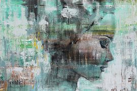
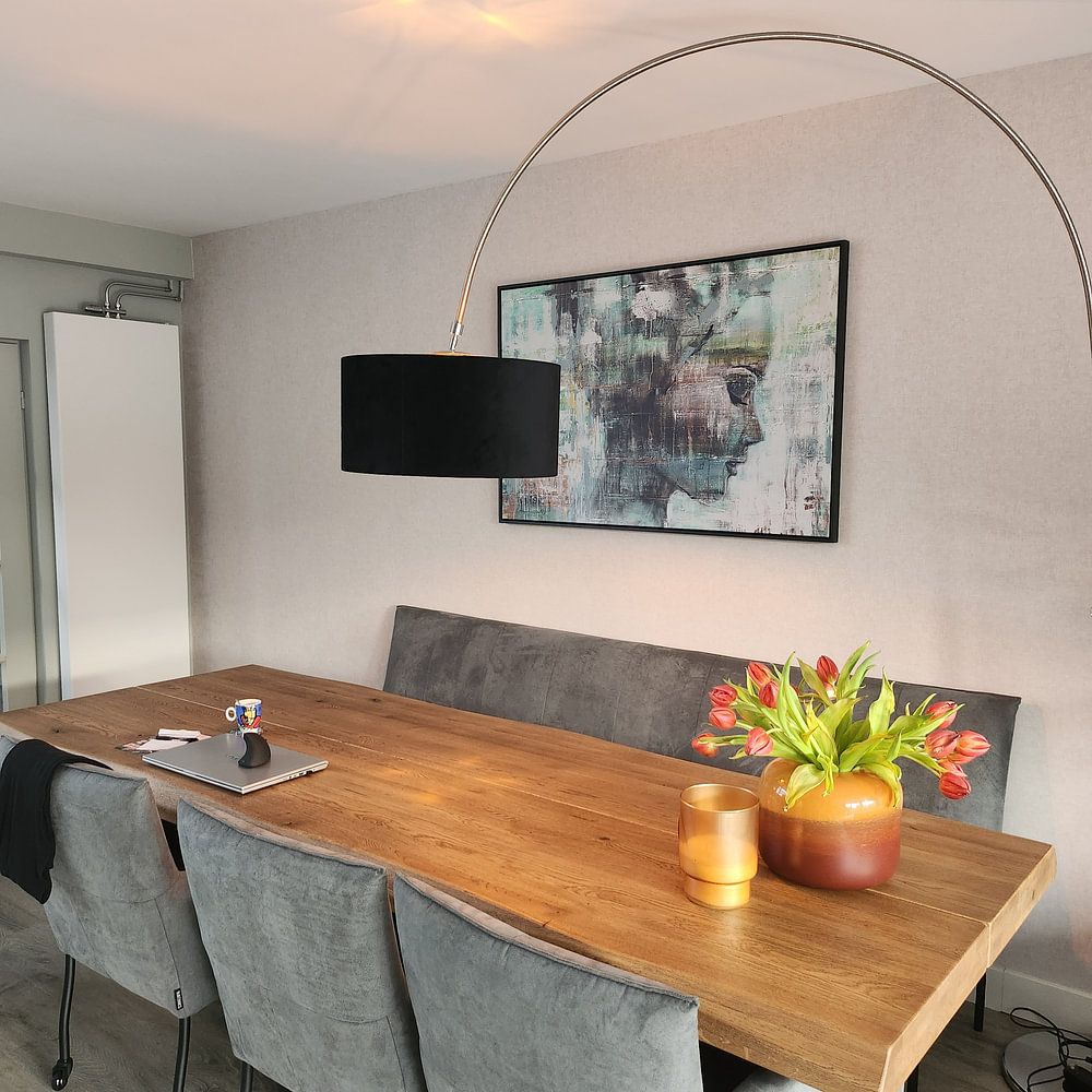
Combining colours in your space
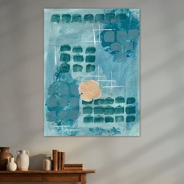
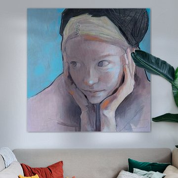
Blue pairs naturally with grey and beige for a layered, understated look. The mauve and grey tones in We came home smiling work well alongside soft linen furnishings or pale wood. Add a touch of teal or turquoise through cushions or ceramics to echo the cooler shades.
AnthiStylist & Customer service Questions? Check out our FAQ
 -
More artworks below this tip
Choosing your format
Portrait and square formats are equally popular in Cool Blue. Portrait prints suit narrow walls or spaces beside doorways and windows. Square formats bring balance to gallery walls or work well as standalone pieces above a console table. Choose what fits your wall dimensions.
RosanneStylist & Customer service Questions? Check out our FAQ


Trusted and loved
Customers rate us 4.8!
High-quality materials
Sustainable and long-lasting beauty
Different sizes
From small to large, anything is possible.
Made for you
Made the moment you order.
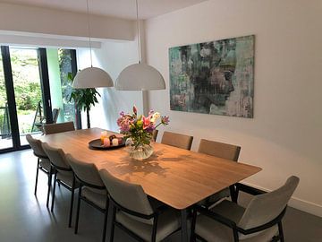
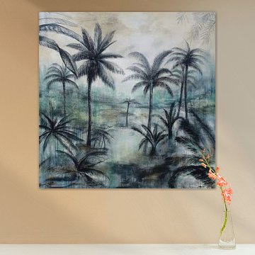
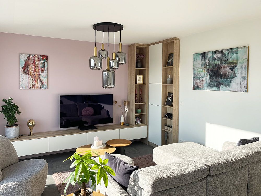
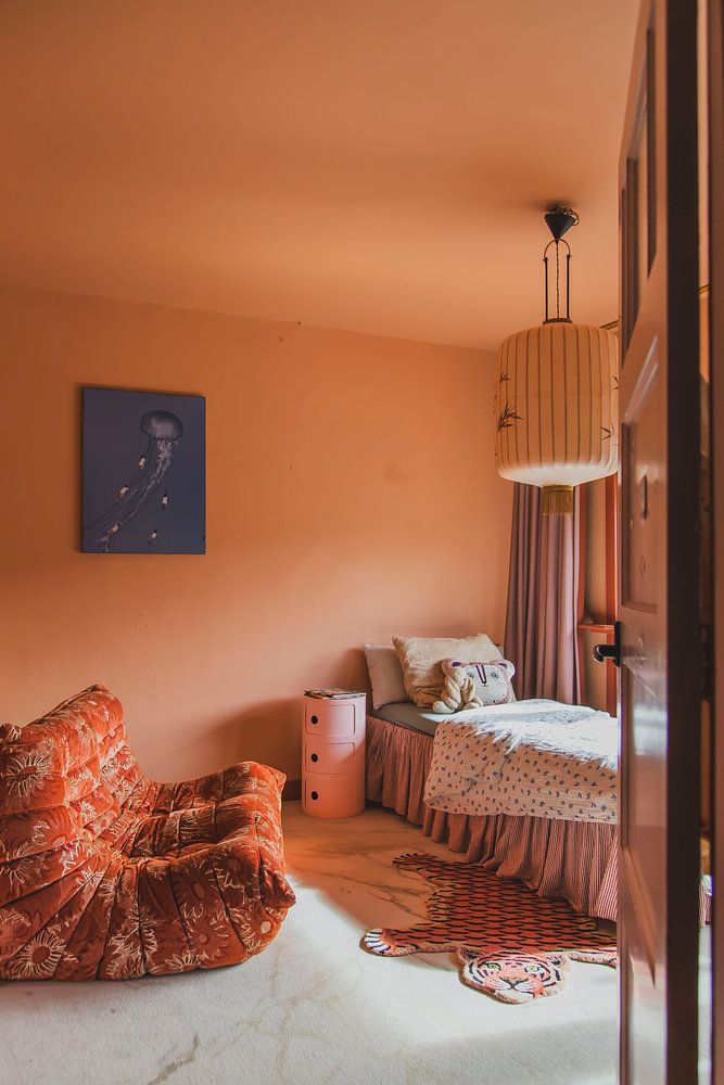
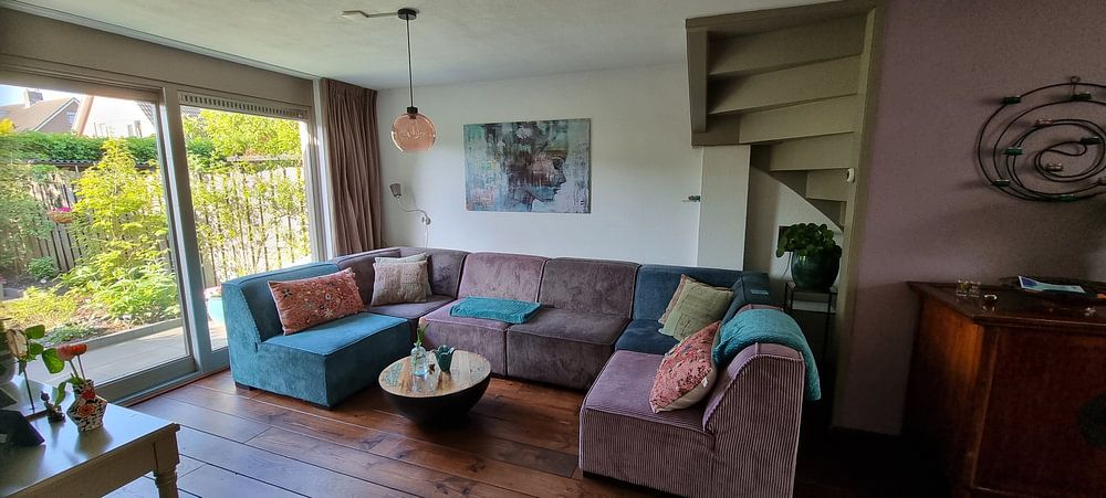
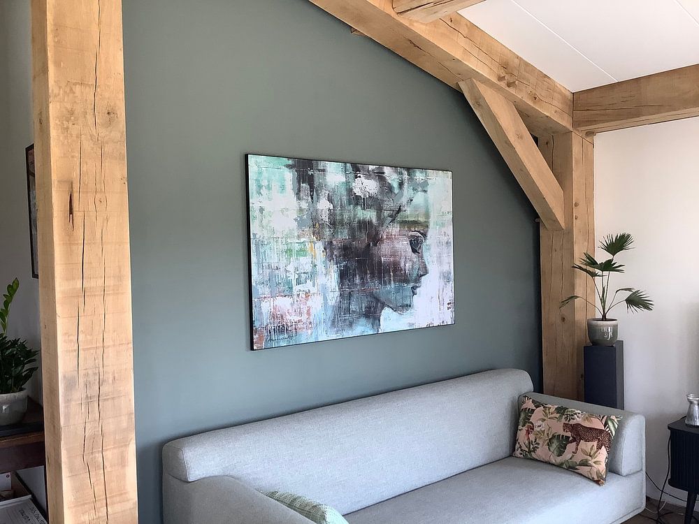
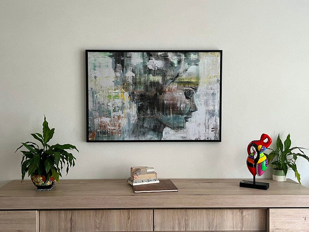
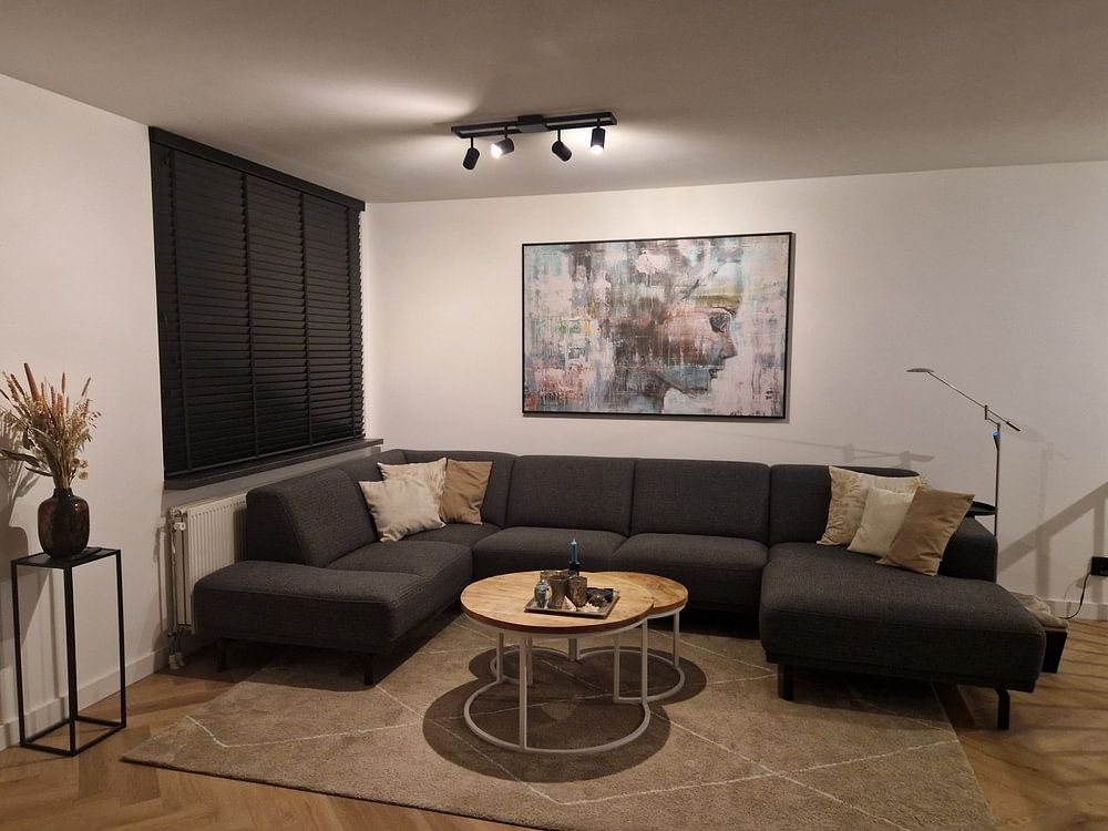
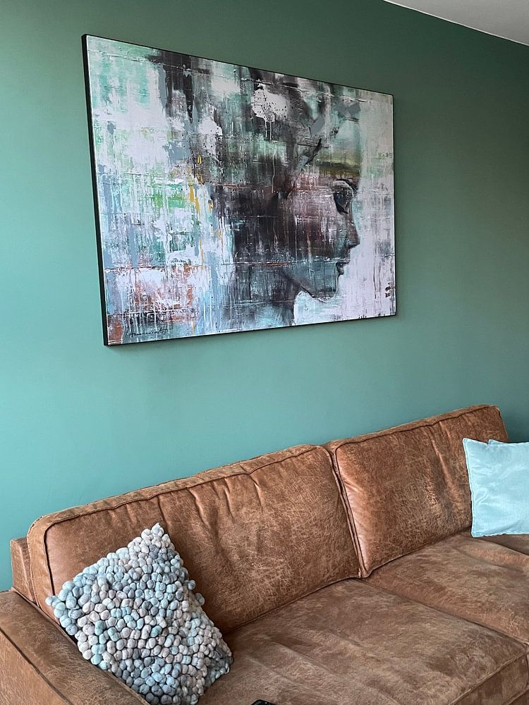
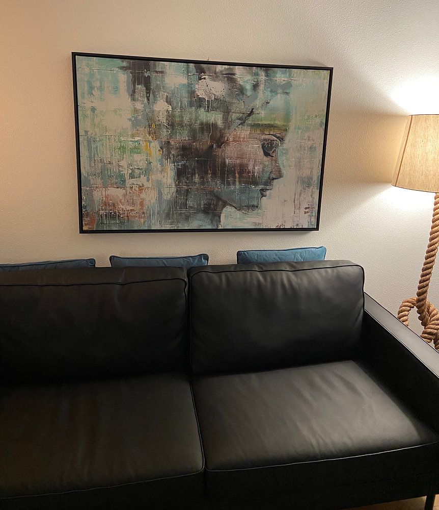
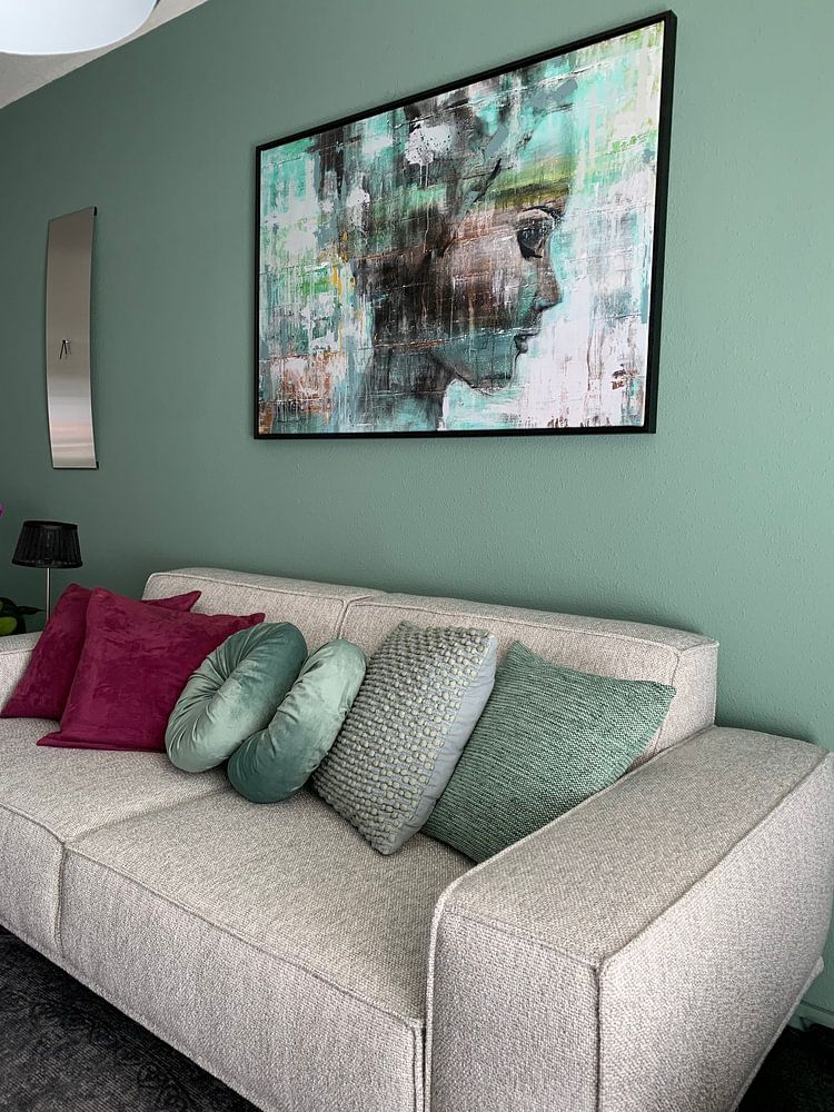
How they hang in other homes
Get inspired by beautiful artworks on other people's walls and see how they truly enhance an interior.


More like this


How can you style Cool Blue in your interior?

Cool Blue artworks pair beautifully with natural textures and soft accents to enhance their calm, mysterious atmosphere. Try combining these dreamy pieces with light wood furniture, linen textiles, or ceramic vases in complementary tones. For a layered gallery wall, mix portrait and square formats with subtle neutral frames to let the blue hues stand out. Adding greenery like eucalyptus or monstera plants brings organic warmth that balances the collection's cooler palette. Let Cool Blue set a serene, thoughtful mood that invites you to pause and reflect.
Where does Cool Blue work well in your home?

A bedroom is a good spot for Cool Blue artworks, where their calming tones and dreamy quality support relaxation and rest. The blend of blue, teal, and soft mauve shades creates a soothing backdrop that helps wind down after a busy day. Choose larger landscape formats above your bed or group smaller square pieces on a feature wall to add visual interest without overwhelming the space. Consider Canvas or ArtFrame™ to introduce subtle texture that complements soft bedding and natural wood nightstands, creating a cohesive retreat.
Which interior style suits Cool Blue best?

Cool Blue fits naturally into Scandinavian and minimalist interiors, where simplicity and subdued color palettes are key. The collection's blue, grey, and beige tones work well against white or light grey walls, creating gentle contrast without visual clutter. In a Scandinavian setting, pair these artworks with pale wood accents and soft textiles in natural fibers to maintain that clean, airy feel. For minimalist spaces, let Cool Blue pieces stand as quiet focal points alongside streamlined furniture and open surfaces, allowing the mysterious, calm mood to breathe and define the room.
