George Hendrik Breitner
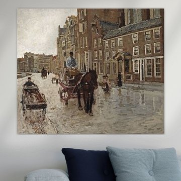
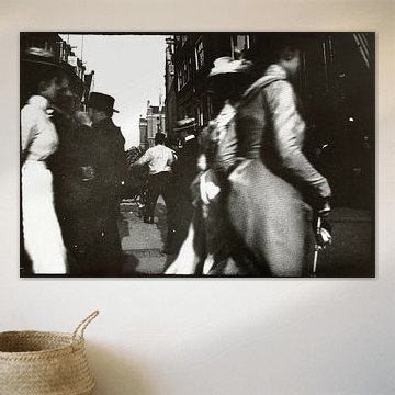
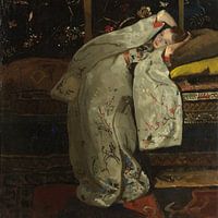
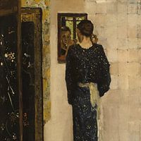
George Hendrik Breitner captured the essence of Amsterdam life with remarkable intimacy. His 1882 collection reveals a master who understood light, texture, and human emotion in equal measure. Whether drawn to his serene kimono series or atmospheric street scenes, you'll find artworks that bring depth and character to contemporary spaces.
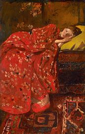
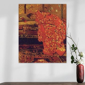
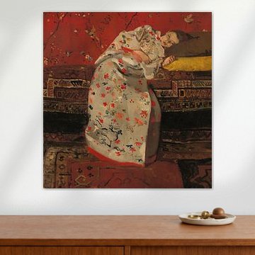
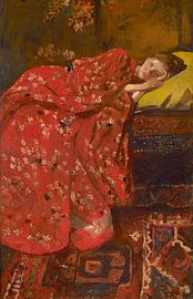
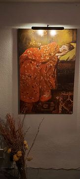
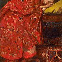
From soft, dreamlike compositions to nostalgic urban landscapes, Breitner's palette ranges from warm terracottas to muted sage greens. Artworks like Girl in red kimono, George Hendrik Breitner showcase his ability to blend rich patterns with peaceful moods. At Art Heroes, we offer these pieces as Canvas, Poster, and more - all custom-made with free shipping. Choose what suits your space.
-
More artworks below this tip
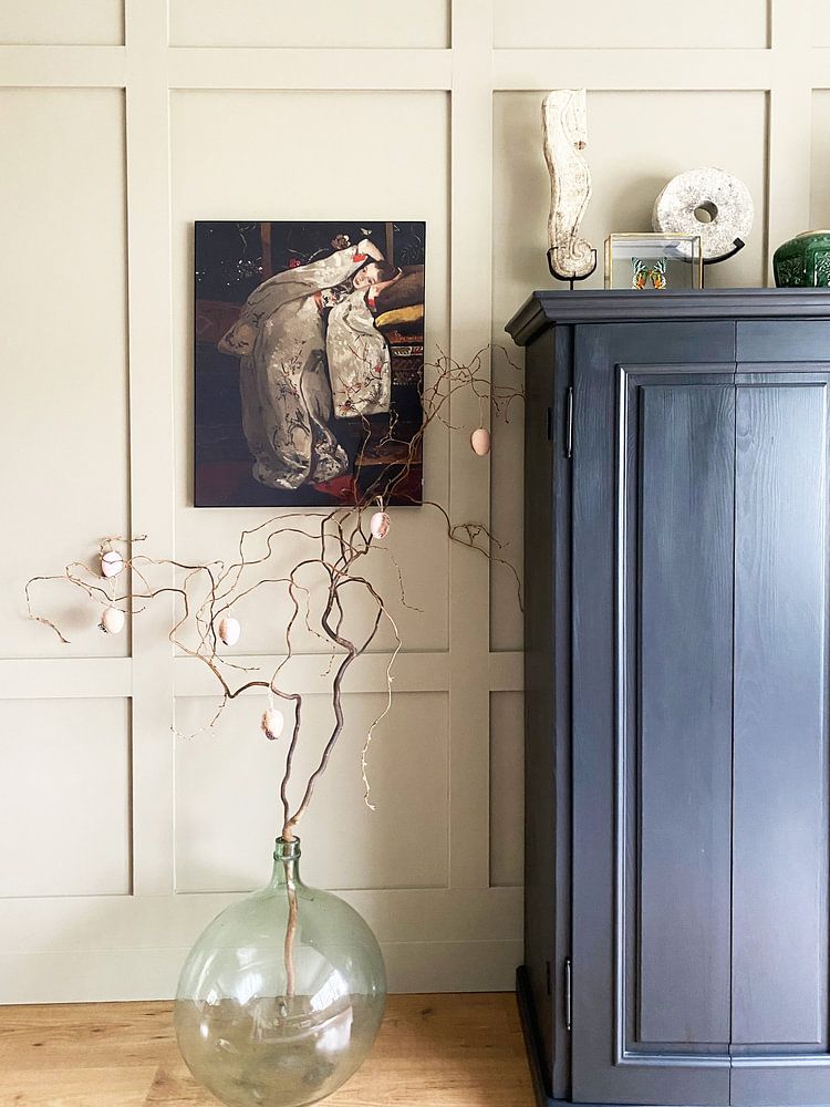
Pair earthy tones with natural textures
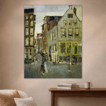
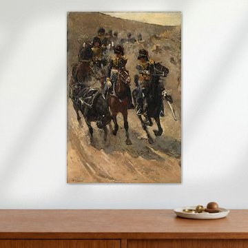
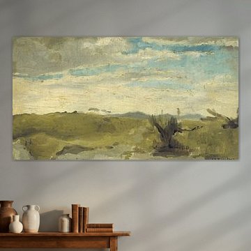
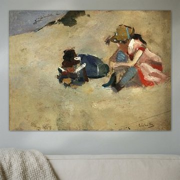
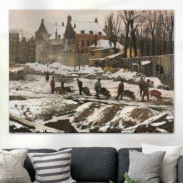
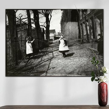
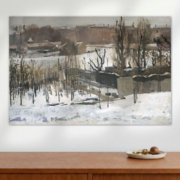
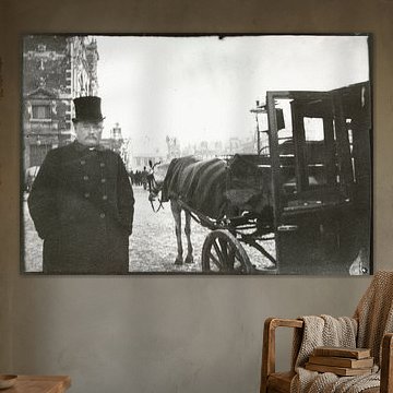
The warm beige and taupe palette creates a calm, grounded atmosphere in your home. These neutral shades work beautifully alongside natural materials like linen, jute, or wooden furniture. For a cohesive look, try pairing them with soft sage green accents - a good example is Children in the dunes, George Hendrik Breitner.
AnthiStylist & Customer service Questions? Check out our FAQ
 -
More artworks below this tip
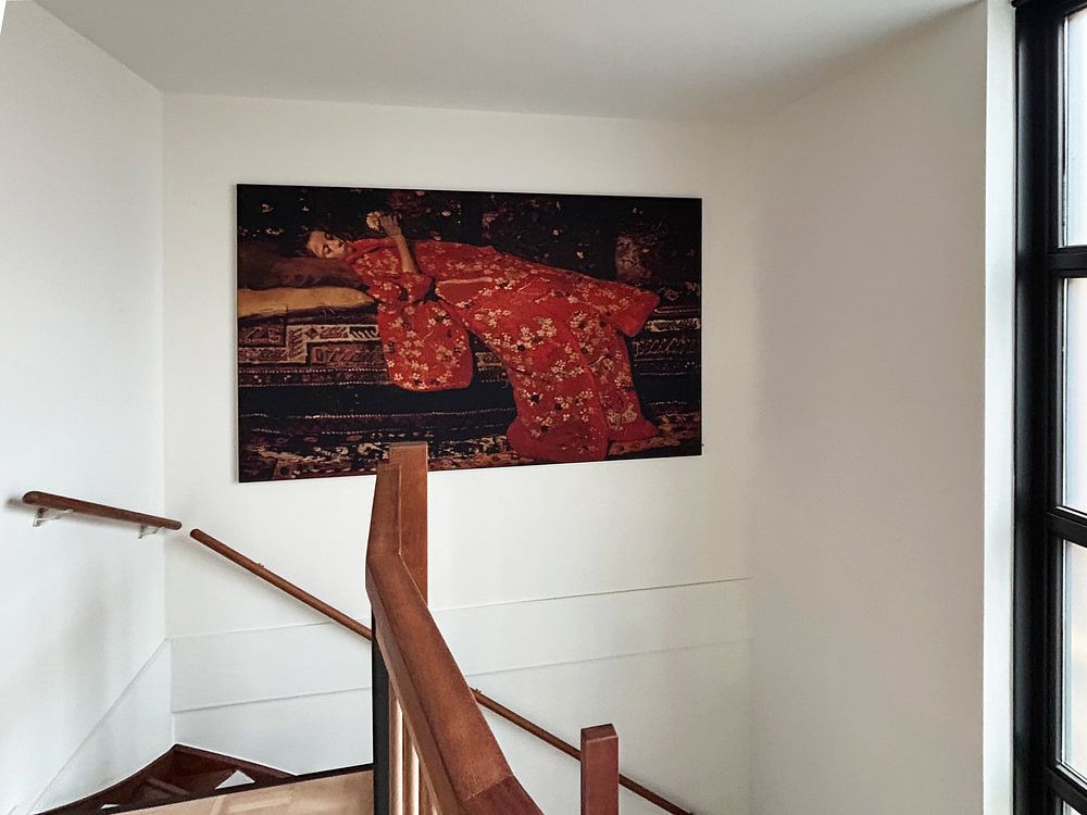
Balance bold color with neutral surroundings
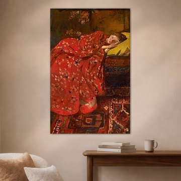
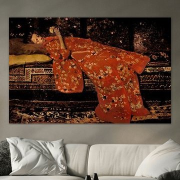
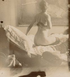
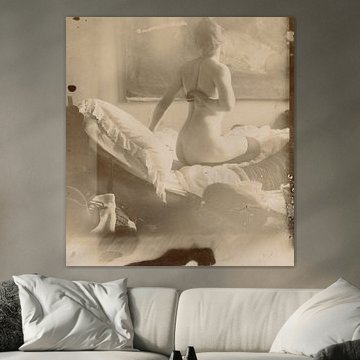
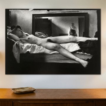
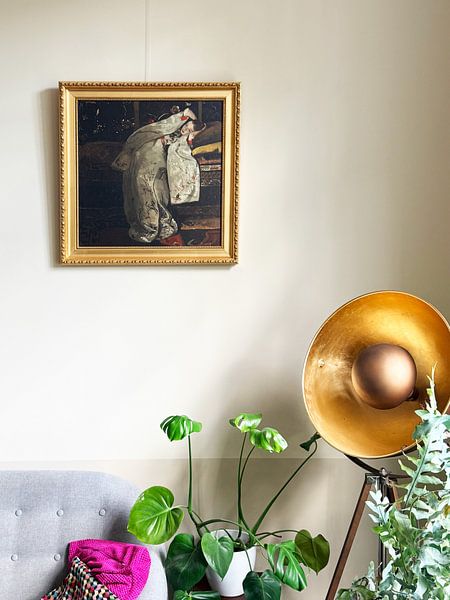
Rich terracotta and burgundy tones make a strong statement on your wall. To let these colors shine without overwhelming your room, surround them with neutral furniture and soft textiles in cream, grey, or natural linen. The depth in Naked with black stockings on a bed, George Hendrik Breitner stands out beautifully against a calm backdrop.
EileenStylist & Customer service Questions? Check out our FAQ
 -
More artworks below this tip
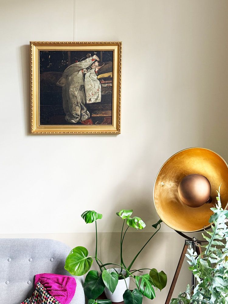
Hang artwork at eye level in quiet spaces
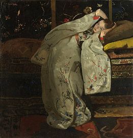
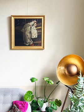
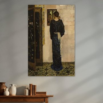
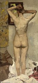
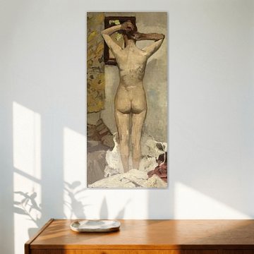
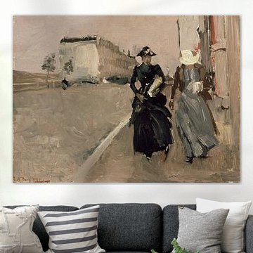
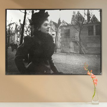
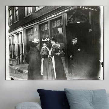
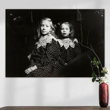
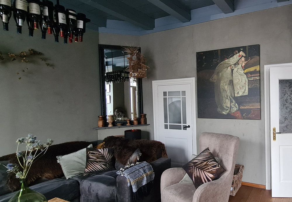
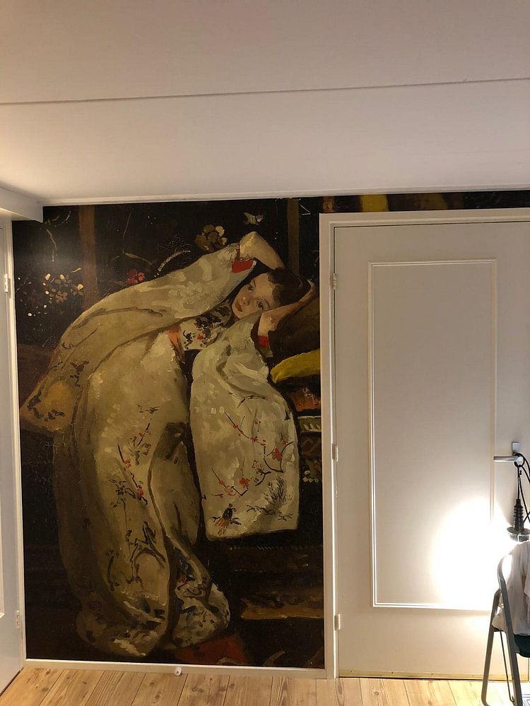
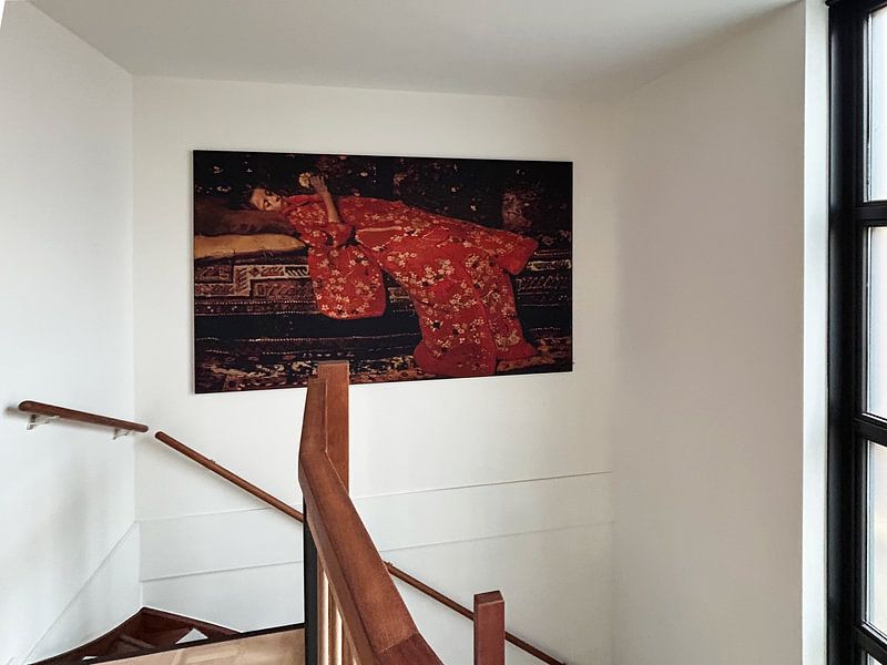
Position your George Hendrik Breitner artwork where you can appreciate the brushwork and detail. A hallway, reading nook, or bedroom wall works well for pieces that invite closer observation. Place Girl in a Red Kimono (Geesje Kwak), George Hendrik Breitner somewhere you naturally pause during the day - the composition rewards a slower look.
GinaStylist & Customer service Questions? Check out our FAQ


Be sure to check out the creative new masters
Our artists have created artworks inspired by the old masters.
Trusted and loved
Customers rate us 4.8!
High-quality materials
Sustainable and long-lasting beauty
Different sizes
From small to large, anything is possible.
Made for you
Made the moment you order.
How they hang in other homes
Get inspired by beautiful artworks on other people's walls and see how they truly enhance an interior.


More like this


Choosing the right material for George Hendrik Breitner
George Hendrik Breitner comes to life on each of our premium materials. Whether you choose Canvas, Poster, or ArtFrame™, each enhances the unique details and colors of his atmospheric urban scenes.
Choose Canvas and you benefit from a finish that brings out every brushstroke and tonal nuance. The bright white poly-cotton canvas fabric showcases the brown, grey, and taupe shades beautifully, creating depth in those nostalgic street scenes. The canvas material is particularly well-suited for George Hendrik Breitner reproductions because it honors the original painting technique. You also benefit from long-lasting quality, with a frame made from PEFC-certified sustainable wood and guaranteed durability of at least ten years. This means your artwork stays beautiful through daily life, preserving those calm, dreamy moods for years to come.
Still doubting which material suits your interior and chosen George Hendrik Breitner artwork? Use our material comparator to find the perfect match.
Creating a gallery wall with George Hendrik Breitner
The calm and nostalgic character of George Hendrik Breitner makes these artworks easy to combine in a gallery wall arrangement. Pair his muted street scenes with black-and-white photography or vintage botanical prints to create a cohesive story on your wall. The sage green and beige tones work beautifully alongside natural wood frames and linen textiles. Consider hanging a cluster above a sideboard in your hallway or dining room, where the dreamy atmosphere welcomes guests. Mix different sizes to add visual rhythm without overwhelming the space.
Which interior styles suit George Hendrik Breitner best

George Hendrik Breitner fits naturally into classic and Scandinavian interiors. The brown, grey, and taupe palette pairs beautifully with warm oak furniture and soft wool throws in a Scandinavian setting, creating a serene, understated look. For classic interiors, combine the sage green tones with darker wood accents and vintage brass details. The nostalgic mood of these artworks works particularly well in reading corners, home offices, or above a bed where you want a calming presence. Keep surrounding colors muted to let the subtle brushwork shine.
